kage
kage
getpolyglot.io
Design analysis
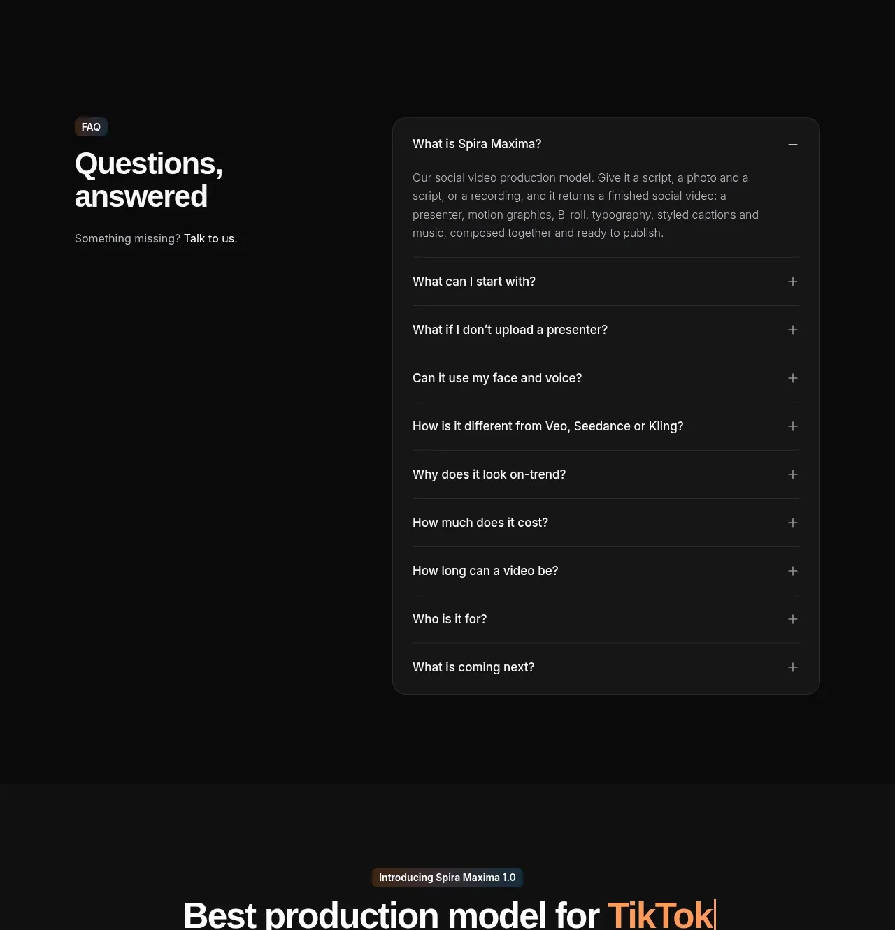
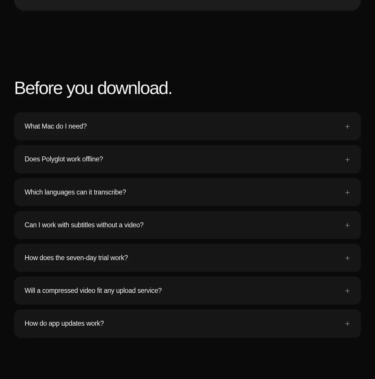
A simple FAQ section uses a large heading and full-width dark accordion rows with plus controls, making pre-download objections easy to scan.
Prompt preview
## Reference images

Study these alongside the description below: hierarchy, rhythm, spacing, colour. Build for the product you are asked about, using this design language.

- Component: https://kage-design-assets.t3.tigrisfiles.io/components/polyglot/16feff4e-ce5f-4860-8cf6-49c37e8ed17f-1790402685-8.webp
- Full page it was cut from: https://kage-design-assets.t3.tigrisfiles.io/screenshots/polyglot/16feff4e-ce5f-4860-8cf6-49c37e8ed17f-1790402570740-full.webp
- Component on Kage: https://kage.design/component/polyglot-faq

## Before you start
Ask what the user's product is, who it serves, and what brand personality and visual identity it should use. Apply these principles to that product rather than copying the reference.

Create a spacious FAQ section on a black background with a large left-aligned heading and a vertical list of full-width accordion rows. Each row should use a slightly lighter surface (#171717), 18–20px radius, 20–24px horizontal padding, and a plus icon aligned to the right. Use 17–18px question text, subdued borders or gaps between rows, and smooth height/opacity transitions when opened. Only one item may open at once if that suits the product; ensure buttons have clear focus states and accessible expanded labels. Keep the section width constrained and use 72–96px vertical padding.

Never use logos, product names, copy, illustrations, or imagery from the reference.