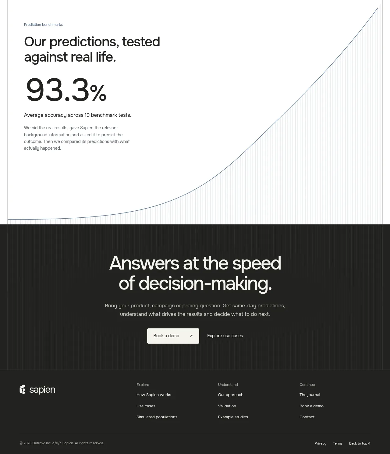
kage
kage
getpolyglot.io
Design analysis
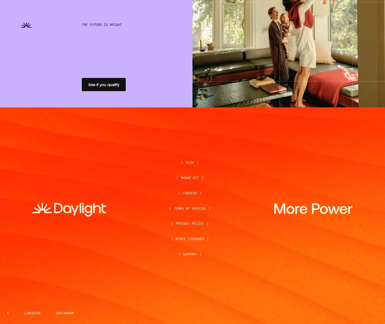
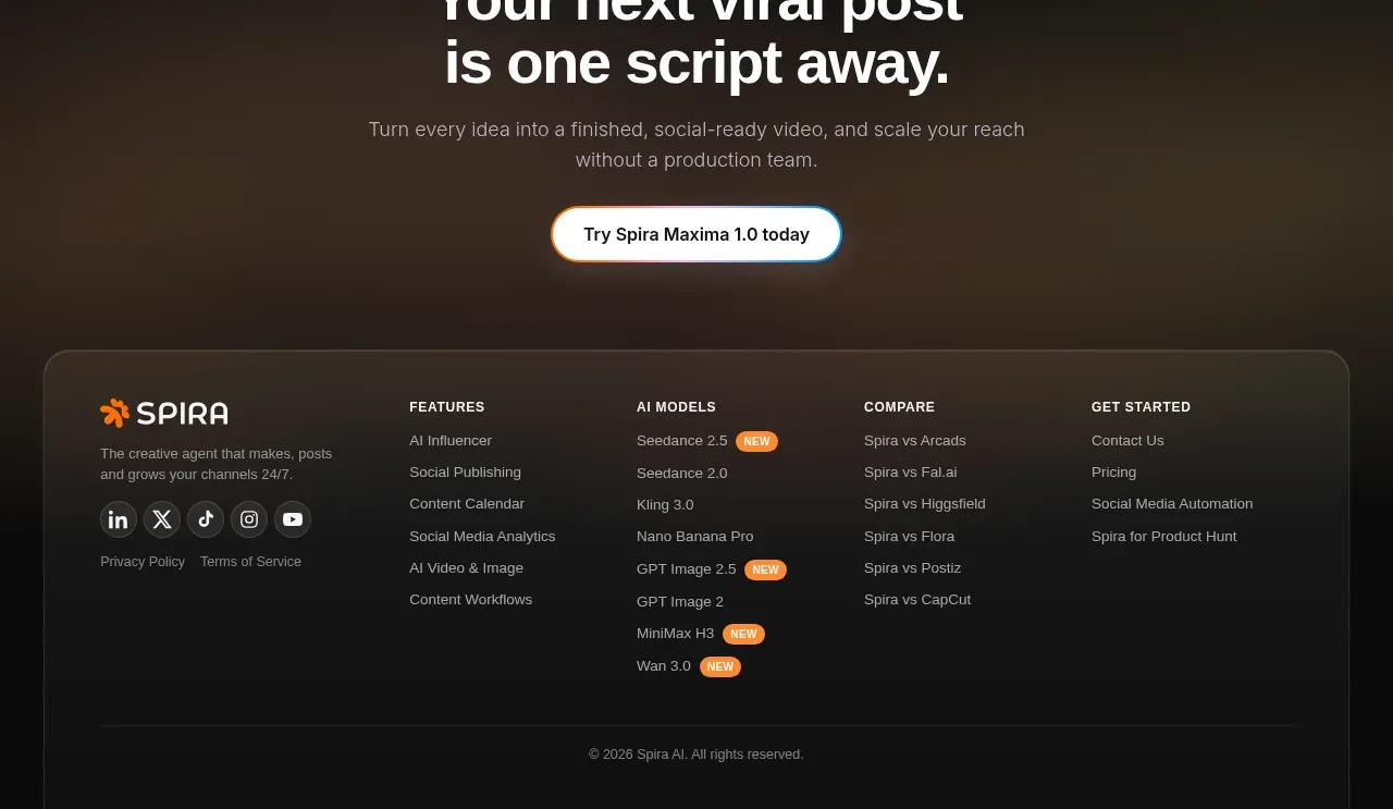
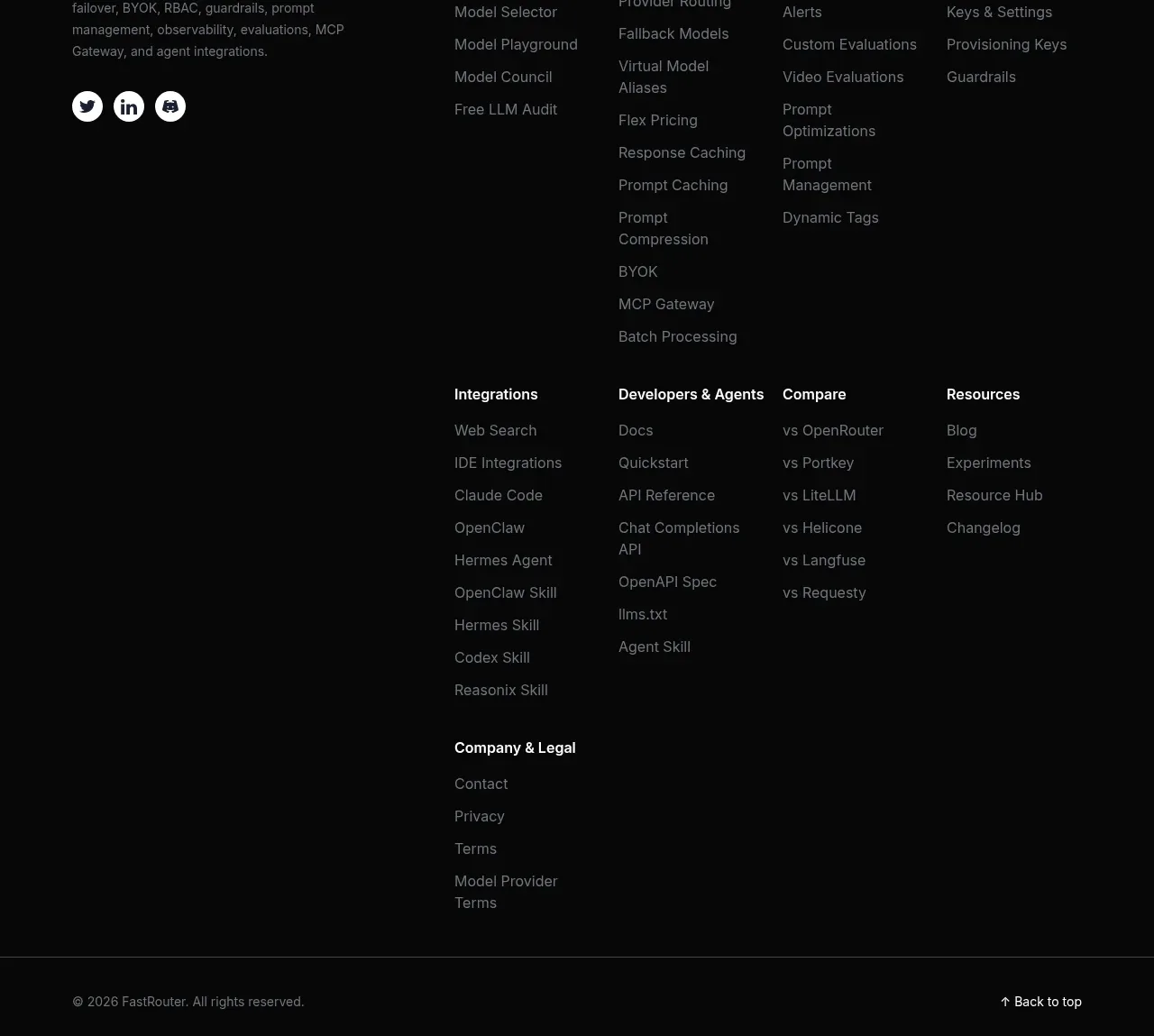
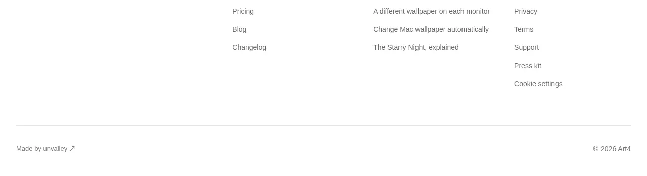
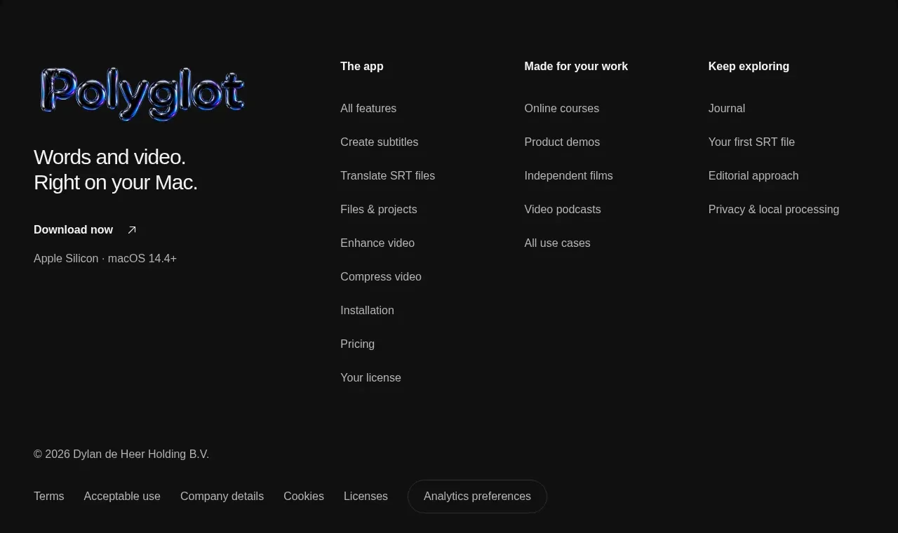
The footer closes with a large brand lockup and short positioning line, several organized link columns, download metadata, and a compact legal row.
Prompt preview
## Reference images

Study these alongside the description below: hierarchy, rhythm, spacing, colour. Build for the product you are asked about, using this design language.

- Component: https://kage-design-assets.t3.tigrisfiles.io/components/polyglot/16feff4e-ce5f-4860-8cf6-49c37e8ed17f-1790402685-10.webp
- Full page it was cut from: https://kage-design-assets.t3.tigrisfiles.io/screenshots/polyglot/16feff4e-ce5f-4860-8cf6-49c37e8ed17f-1790402570740-full.webp
- Component on Kage: https://kage.design/component/polyglot-footer

## Before you start
Ask what the user's product is, who it serves, and what brand personality and visual identity it should use. Apply these principles to that product rather than copying the reference.

Build a dark footer with a slightly differentiated surface (#101010) and generous top padding. Use a responsive grid: a larger left brand/positioning column with a download link and platform note, followed by two or three compact link columns with bold category labels and muted links. Separate the main links from a bottom legal row using whitespace or a subtle border. Use 14–16px body text, 12–13px metadata, #efefef headings, #8e8e8e links, and understated hover underlines or color changes. On mobile, stack the brand block and link groups, then keep legal links wrap-safe.

Never use logos, product names, copy, illustrations, or imagery from the reference.