 kage
kage
getpolyglot.io

Design analysis
Three short reassurance points reduce perceived risk immediately after the hero, each pairing a small line icon with a bold statement and a concise explanation.
Prompt preview
## Reference images

Study these alongside the description below: hierarchy, rhythm, spacing, colour. Build for the product you are asked about, using this design language.

- Component: https://kage-design-assets.t3.tigrisfiles.io/components/polyglot/16feff4e-ce5f-4860-8cf6-49c37e8ed17f-1790402683-2.webp
- Full page it was cut from: https://kage-design-assets.t3.tigrisfiles.io/screenshots/polyglot/16feff4e-ce5f-4860-8cf6-49c37e8ed17f-1790402570740-full.webp
- Component on Kage: https://kage.design/component/polyglot-stats

## Before you start
Ask what the user's product is, who it serves, and what brand personality and visual identity it should use. Apply these principles to that product rather than copying the reference.

Build a three-column reassurance strip on the same near-black background. Each item has a small monochrome icon, a bold 15–16px statement, and one muted sentence beneath it. Align the columns to a shared baseline inside a max-width container, use about 32px column gaps, and keep the strip compact with 48–64px vertical padding. Use off-white text (#ededed), muted gray (#8f8f8f), and extremely subtle separators only if needed. Stack columns on mobile while retaining clear spacing.

Never use logos, product names, copy, illustrations, or imagery from the reference.
More components
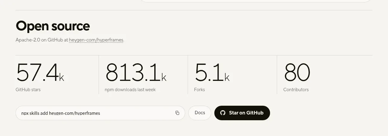
 Open-source proof and repository stats
HyperFrames Studio (Desktop) · Stats
Open-source proof and repository stats
HyperFrames Studio (Desktop) · Stats

 Quality, cost, and scale metrics
Spira Maxima · Stats
Quality, cost, and scale metrics
Spira Maxima · Stats
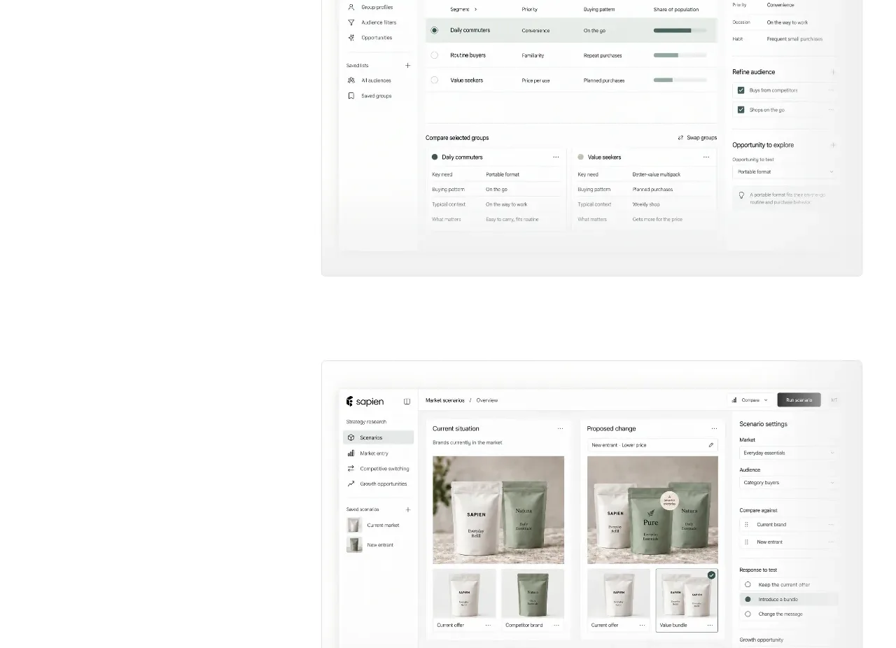
 Prediction benchmark statistic
Sapien · Stats
Prediction benchmark statistic
Sapien · Stats
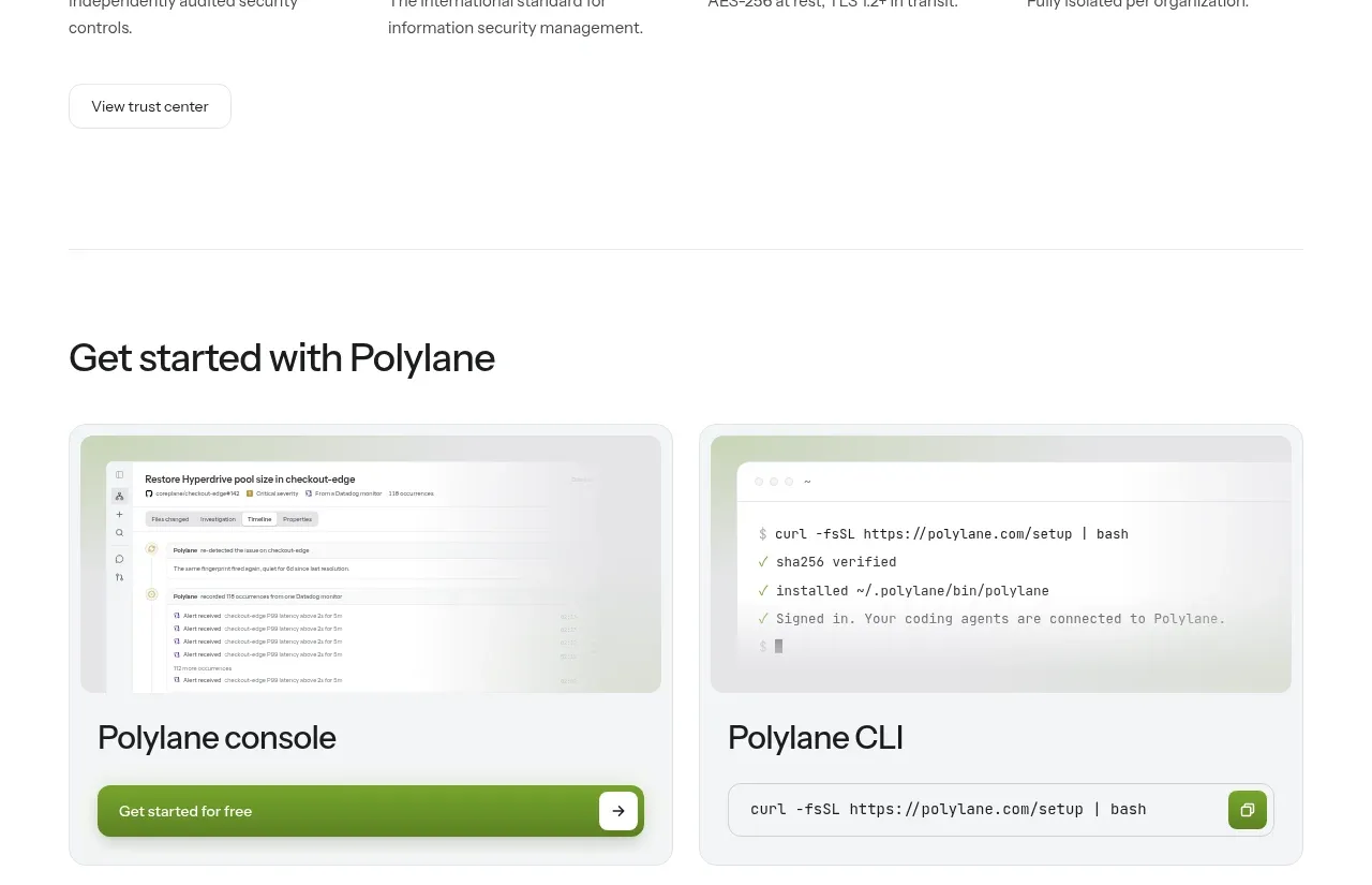
P
Security and trust assurances
Polylane · Stats

 Safety and control principles
Omnia Agent · Stats
Safety and control principles
Omnia Agent · Stats

 Customer proof and outcome grid
ColdIQ x Slack · Stats
Customer proof and outcome grid
ColdIQ x Slack · Stats