kage
kage
polylane.com

Design analysis
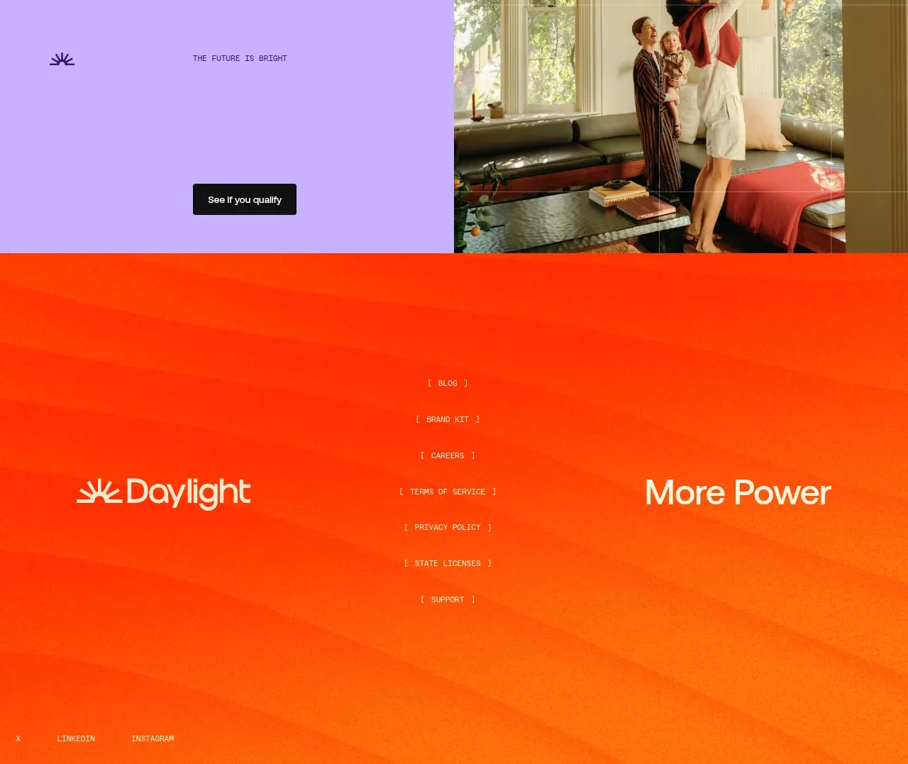
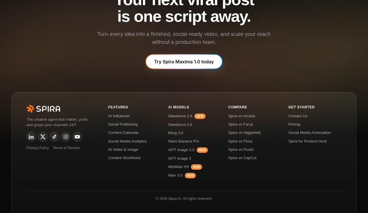
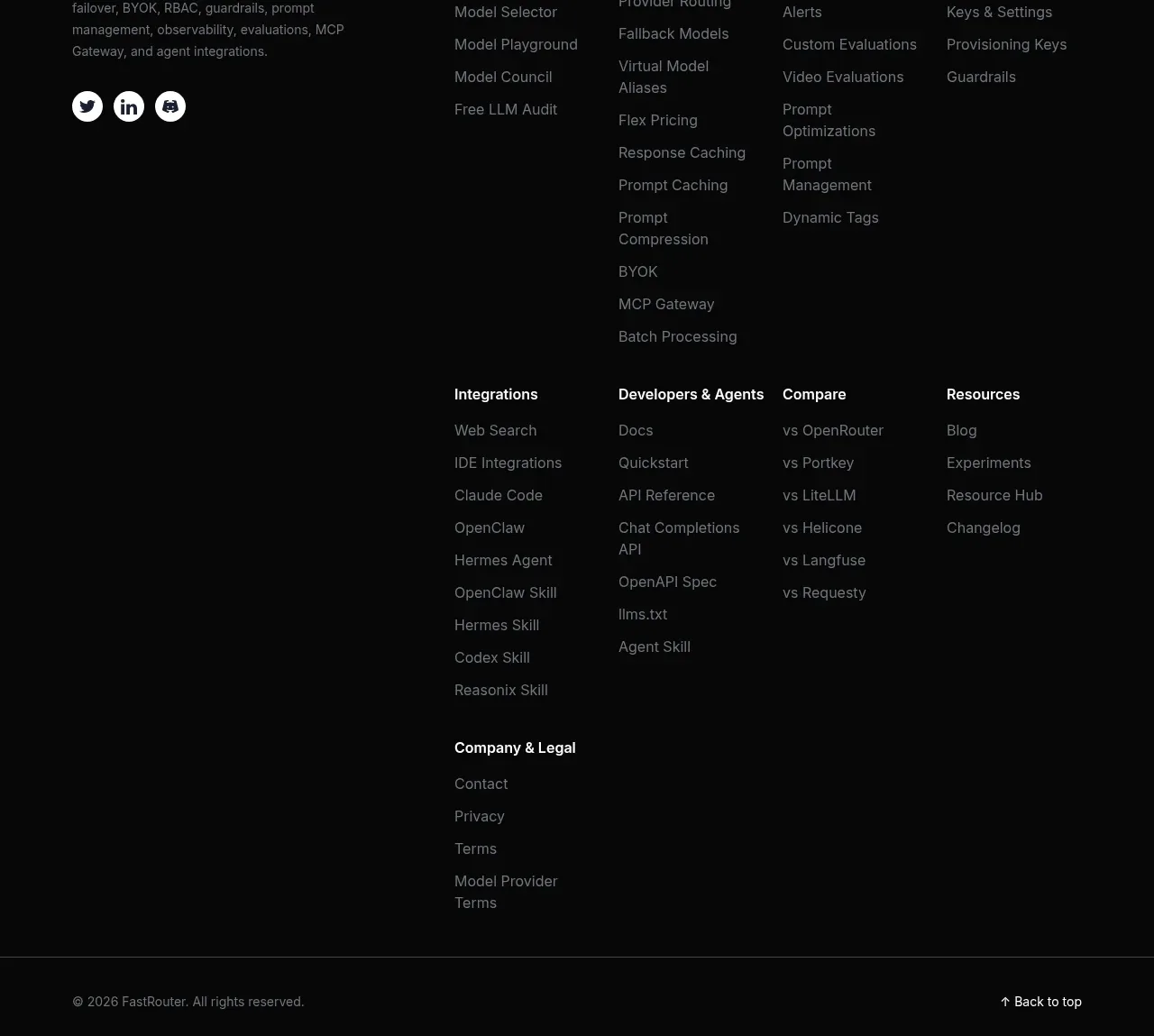
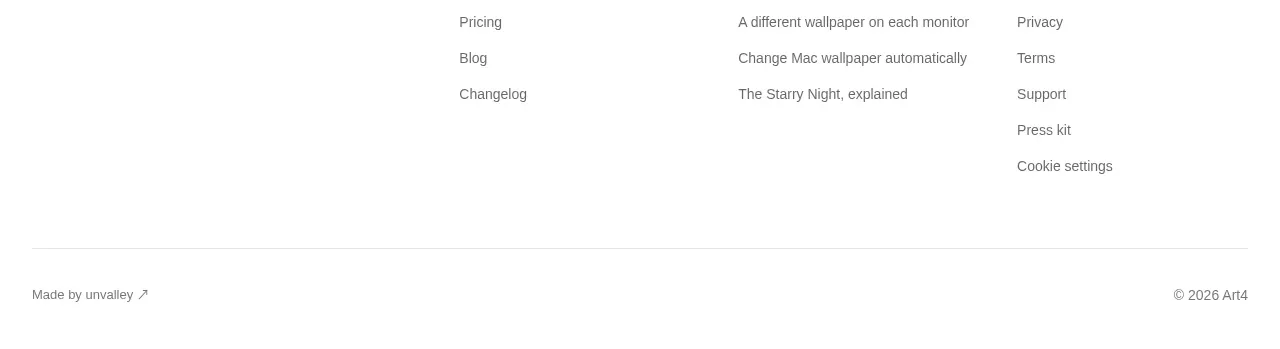
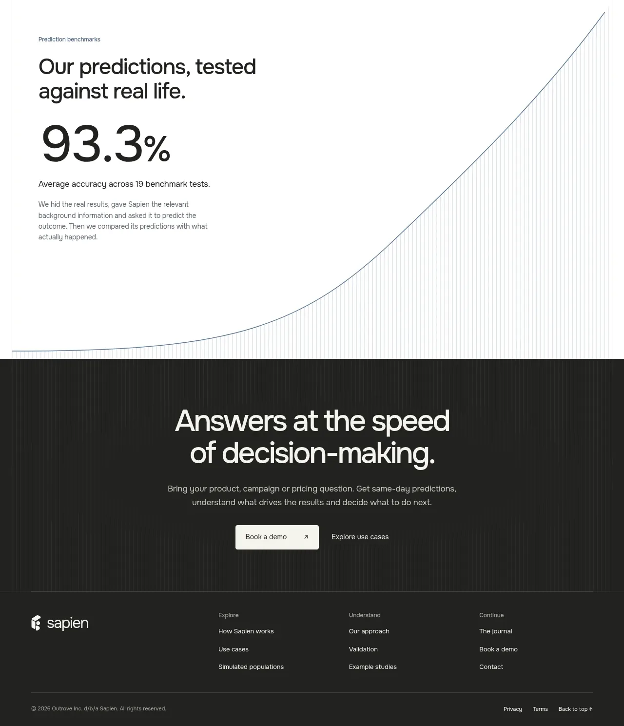
The footer closes with the product mark, grouped navigation columns, a small assistant or utility entry, and a legal/location row separated by generous whitespace.
Prompt preview
## Reference images

Study these alongside the description below: hierarchy, rhythm, spacing, colour. Build for the product you are asked about, using this design language.

- Component: https://kage-design-assets.t3.tigrisfiles.io/components/polylane/638c7112-70a9-484e-b85d-ab255c3ac21a-1790920982-9.webp
- Full page it was cut from: https://kage-design-assets.t3.tigrisfiles.io/screenshots/polylane/638c7112-70a9-484e-b85d-ab255c3ac21a-1790920937285-full.webp
- Component on Kage: https://kage.design/component/polylane-footer

## Before you start
Ask what navigation groups, support channels, legal links, social links, and regional details belong to the user's product. Apply the layout without importing any reference content.

Build a spacious SaaS footer with a centered max-width container. Put the brand mark at the top, then arrange 3–5 link columns with small muted headings and compact links. Add an optional support or assistant entry separately from the main navigation. Finish with a thin divider and a bottom utility row for copyright, privacy, terms, cookie controls, and location. On mobile, stack columns or make them collapsible.

Use #FFFFFF or #FAFAF8 background, #171717 for brand and link text, #777777 for headings and legal text, #E8E8E8 divider, and green #73AA2A for subtle interactive accents. Use 14px links, 12px utility text, 48–64px column gaps, 64–96px top padding, and 8px focus-visible outlines. Keep the footer calm and highly scannable.

Never: use logos, product names, copy, illustrations or imagery from the reference.