kage
kage
polylane.com

Design analysis
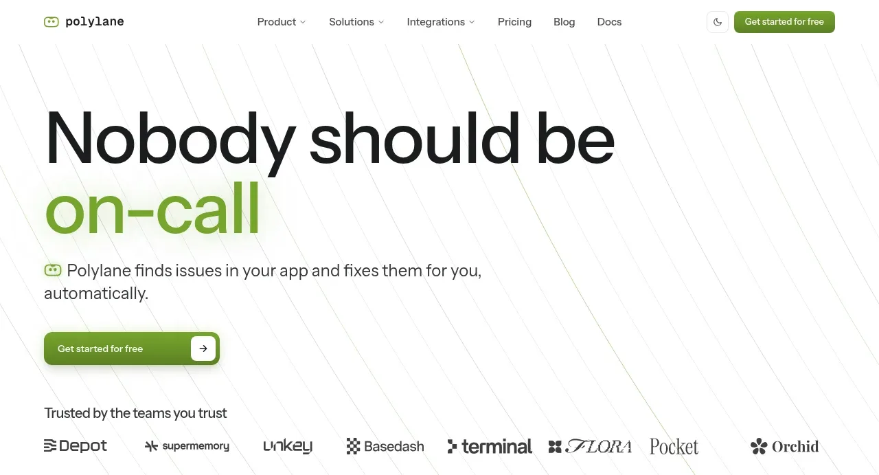
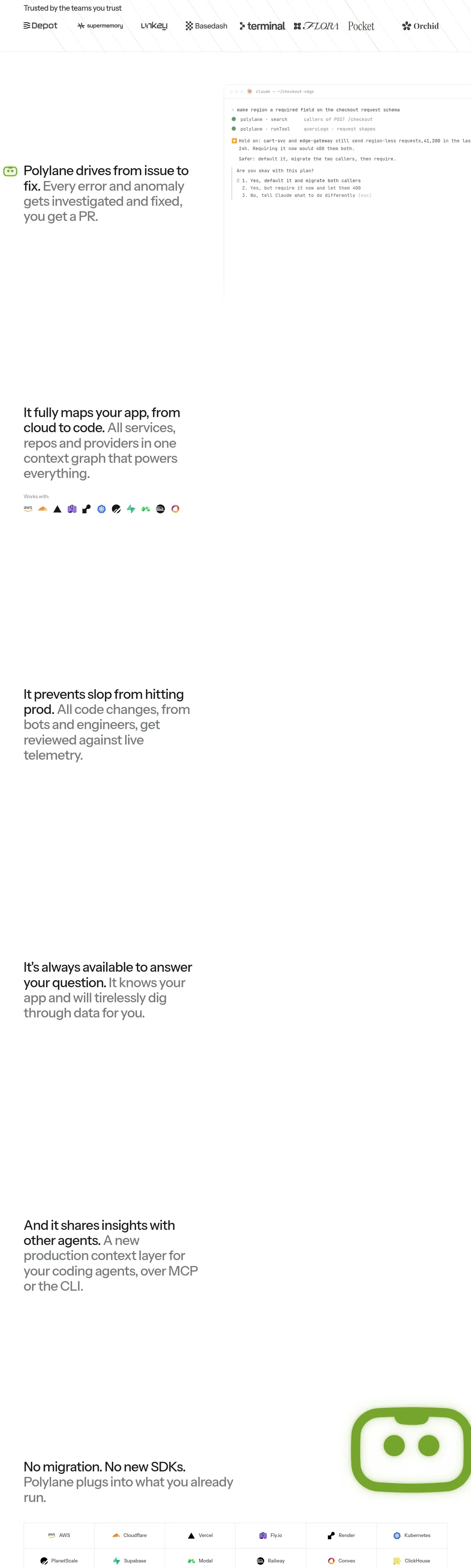
A very sparse, editorial developer-tools landing page uses oversized black typography with selective lime-green emphasis and a faint diagonal-line hero texture. After the compact hero and customer logos, the page stretches into widely spaced narrative feature statements, then becomes denser with an integration matrix, founder proof, security credentials, onboarding cards, FAQ rows, and a multi-column footer; thin gray rules and soft gray-green panels keep the long page structured without visual heaviness.
Prompt preview
## Reference images

Study these alongside the description below: hierarchy, rhythm, spacing, colour. Build for the product you are asked about, using this design language.

- Full page: https://kage-design-assets.t3.tigrisfiles.io/screenshots/polylane/638c7112-70a9-484e-b85d-ab255c3ac21a-1790920937285-full.webp
- Above the fold: https://kage-design-assets.t3.tigrisfiles.io/screenshots/polylane/638c7112-70a9-484e-b85d-ab255c3ac21a-1790920936321.webp
- Design on Kage: https://kage.design/designs/polylane-landing-page

## Before you start
Ask the user what they are building, who it is for, and what brand assets they already have (name, colours, type). Wait for their answers before designing. Apply everything below to their product, not to the reference product.

## Page structure
1. **Utility navigation:** Place a compact header at the top with a small product mark/name on the left, centered navigation links with a few dropdown indicators, and a theme/control affordance plus one green primary CTA on the right.
2. **Hero:** Use a tall, mostly white hero with a very large two-line headline aligned to the left; emphasize one key phrase in vivid green. Add a short supporting paragraph with a small product glyph, a wide green CTA, and a trusted-by logo strip beneath. Add subtle diagonal hairline strokes across the background without making them a focal illustration.
3. **First product proof:** Introduce the core value proposition as a two-column composition: a large text statement on the left and a pale, lightly bordered terminal or agent-workflow screenshot on the right. Keep the surrounding whitespace generous.
4. **Context graph feature:** Follow with a very tall sparse section containing a left-aligned statement about mapping the product/system, with a small “works with” line and a horizontal row of small integration marks beneath. Let the right side remain visually open for motion or deferred product visualisation.
5. **Production review feature:** Continue the same tall scroll rhythm with a left-aligned statement about preventing bad changes from reaching production. Use black for the first sentence and medium gray for the supporting sentence; keep supporting visuals understated or absent.
6. **Always-available agent feature:** Repeat the tall feature pattern with a statement about answering questions and investigating data. Preserve the same left column and large blank field to create a calm, sequential narrative.
7. **Agent-to-agent feature:** Add another sparse statement about sharing insights with other agents through interfaces such as an API, protocol, or CLI. Maintain the repeated vertical cadence while varying the copy and any subtle interaction or background treatment.
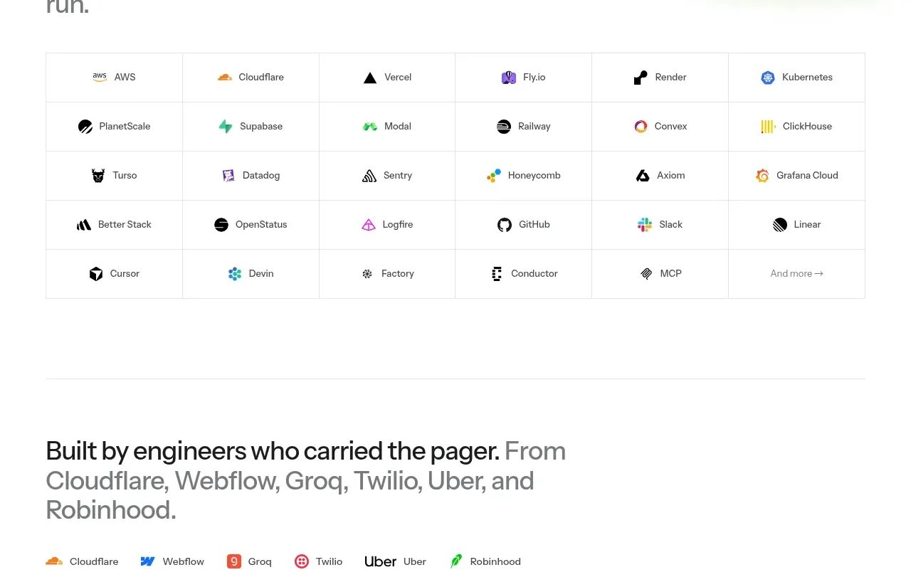
8. **Compatibility statement and integration matrix:** Shift into a more concrete section with a large product glyph on the right and a left statement about avoiding migration or new SDKs. Below, show a broad multi-column grid of integrations, each cell separated by very light rules and containing a small mark plus a label.
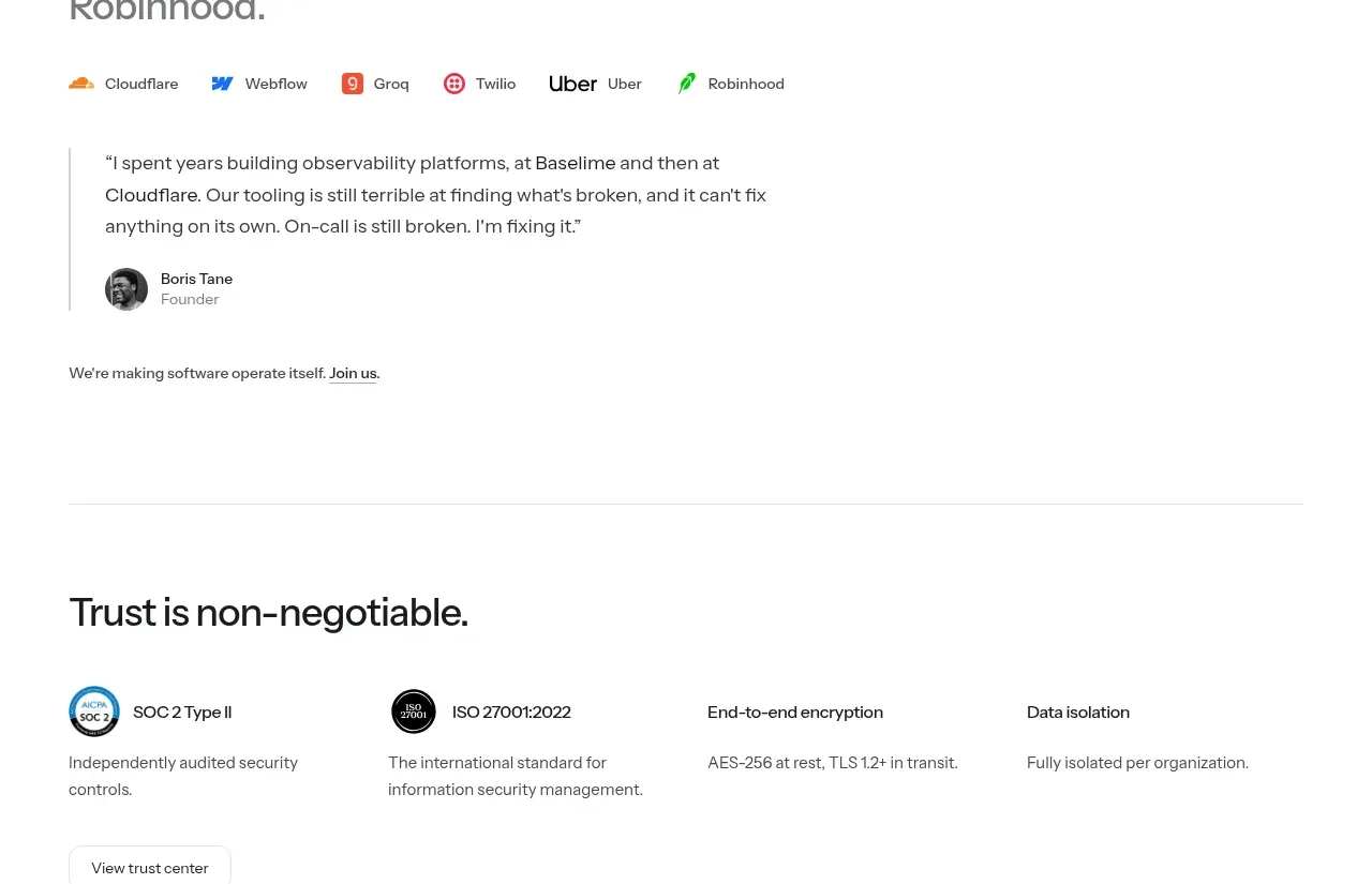
9. **Team credibility:** Add a bordered-off or rule-separated founder section. Lead with a large statement about the team’s engineering background, follow with a row of company marks, then include a compact testimonial with a thin vertical rule, small portrait, attribution, and a short hiring note.
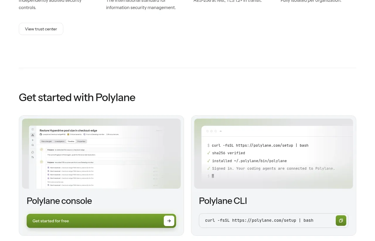
10. **Security and trust:** Present a heading about trust followed by four evenly spaced proof columns for certifications, encryption, and data isolation. Use small badges or restrained symbols, concise descriptions, and a quiet secondary button for the trust center.
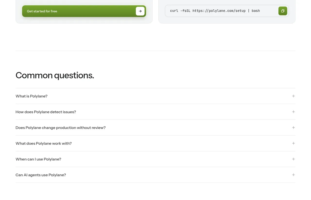
11. **Getting started cards:** Add a heading and two side-by-side rounded cards. The first card contains a softened console/product screenshot and a green CTA; the second contains a CLI/terminal screenshot and a copyable command field with a small green copy control.
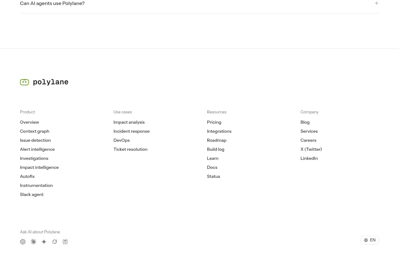
12. **FAQ:** Use a full-width heading and a simple accordion list. Each question occupies a row separated by thin gray lines and ends with a small plus sign; keep the answers collapsed in the initial state.
13. **Footer:** Separate the footer with a horizontal rule. Place the product mark/name at the top, then four columns of small navigation links grouped by product, use cases, resources, and company. Finish with a small AI/help prompt and minimal icon row, language selector, copyright, legal links, and location metadata.

## Design language
- Build hierarchy through scale and whitespace rather than cards: use an exceptionally large hero headline, medium-large feature statements, and small utility/meta text.
- Keep the page predominantly white, with near-black text around `#171817`, muted gray copy around `#747474`, and a lime/leaf green accent around `#75B82A` to `#8BCB35` for CTAs, highlighted words, marks, and active controls.
- Use a modern sans-serif with a clean geometric feel. Pair heavy or semibold display text with regular-weight body copy; make key phrases black and supporting phrases gray within the same statement.
- Establish a strong left reading rail across the hero and narrative sections. Alternate between sparse, tall text-led sections and denser proof sections so the page gradually moves from promise to evidence to conversion.
- Use thin, pale gray borders around grids, FAQ rows, cards, and section breaks; avoid dark outlines. Keep corners modestly rounded, approximately `10–16px` on interactive cards and buttons, with little or no shadow except a soft green-tinted lift on primary CTAs.
- Make primary buttons green with white text, compact height, and a right-side arrow or icon compartment. Secondary controls should be white or translucent with a thin gray border.
- Treat logos and integration marks as evidence: use small monochrome or native-color marks in orderly horizontal strips and tables, with ample cell padding and very light dividers.
- Use subtle motion only where useful: gently reveal large feature statements and product panels on scroll, animate the faint hero lines slowly, and provide clear hover states for links, FAQ rows, buttons, and copy controls without introducing visual noise.
- Keep terminal and product screenshots inside pale gray-green surfaces with soft blur/gradient treatment so they support the narrative without overpowering the typography.

## Never
- Do not use the reference product’s logos, wordmarks, product names, copy, illustrations, photography, screenshots, testimonials, or icon sets.
- Do not reproduce the reference brand or present the result as Polylane.
- Create original content, marks, interface examples, and integration placeholders appropriate to the user’s product while preserving the structural and visual principles above.
Components from this page
All components
P
Minimal product navigation
Polylane · Navigation
P
On-call replacement hero
Polylane · Hero

P
Trusted-by logo strip
Polylane · Logo cloud
P
Context-aware product benefits
Polylane · Feature grid
P
Integrations ecosystem
Polylane · Feature grid
P
Founder testimonial
Polylane · Testimonials
P
Security and trust assurances
Polylane · Stats
P
Getting-started paths
Polylane · Card
P
Common questions accordion
Polylane · FAQ

P
Multi-column product footer
Polylane · Footer