 kage
kage
polylane.com
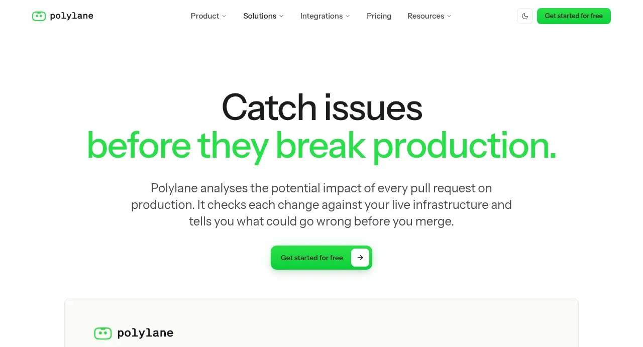
Design analysis
The hero uses a centered two-line statement with the key promise highlighted in green, concise explanatory copy, and a single rounded CTA.
Prompt preview
## Reference images

Study these alongside the description below: hierarchy, rhythm, spacing, colour. Build for the product you are asked about, using this design language.

- Component: https://kage-design-assets.t3.tigrisfiles.io/components/polylane-impact-analysis/878f0a8a-6be5-46ae-8786-d3cb31a469c0-1792130545-1.webp
- Full page it was cut from: https://kage-design-assets.t3.tigrisfiles.io/screenshots/polylane-impact-analysis/878f0a8a-6be5-46ae-8786-d3cb31a469c0-1792130477581-full.webp
- Component on Kage: https://kage.design/component/polylane-impact-analysis-hero

## Before you start
Ask what the user's product and brand are, then apply these principles to that product rather than reproducing this page.

Create a spacious centered hero directly below the navigation. Use a large two-line headline with the second line or key phrase in a vivid product accent green (#29d35d), a short 2–3 line explanation in muted charcoal (#505454), and one compact primary CTA with an arrow affordance. Use a max text width around 700px, headline size 52–64px desktop with tight 0.95 line-height, 18px body text, and 28–36px between copy and CTA. Keep the background white, alignment centered, and vertical padding generous enough to feel editorial rather than crowded. The CTA can use a green pill or rounded rectangle with a subtle shadow and a separate white arrow capsule.

Never: use logos, product names, copy, illustrations, or imagery from the reference.
More components
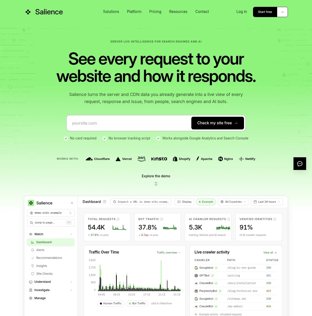
 Product promise and site checker hero
Salience · Hero
Product promise and site checker hero
Salience · Hero
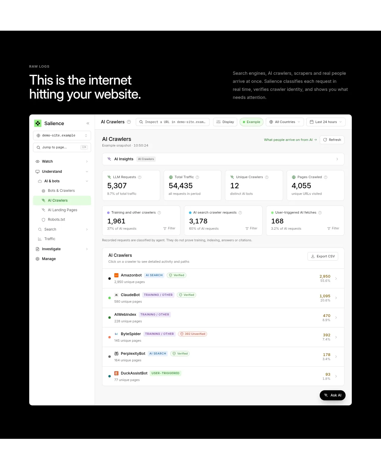 Raw activity dashboard showcase
Salience · Hero
Raw activity dashboard showcase
Salience · Hero
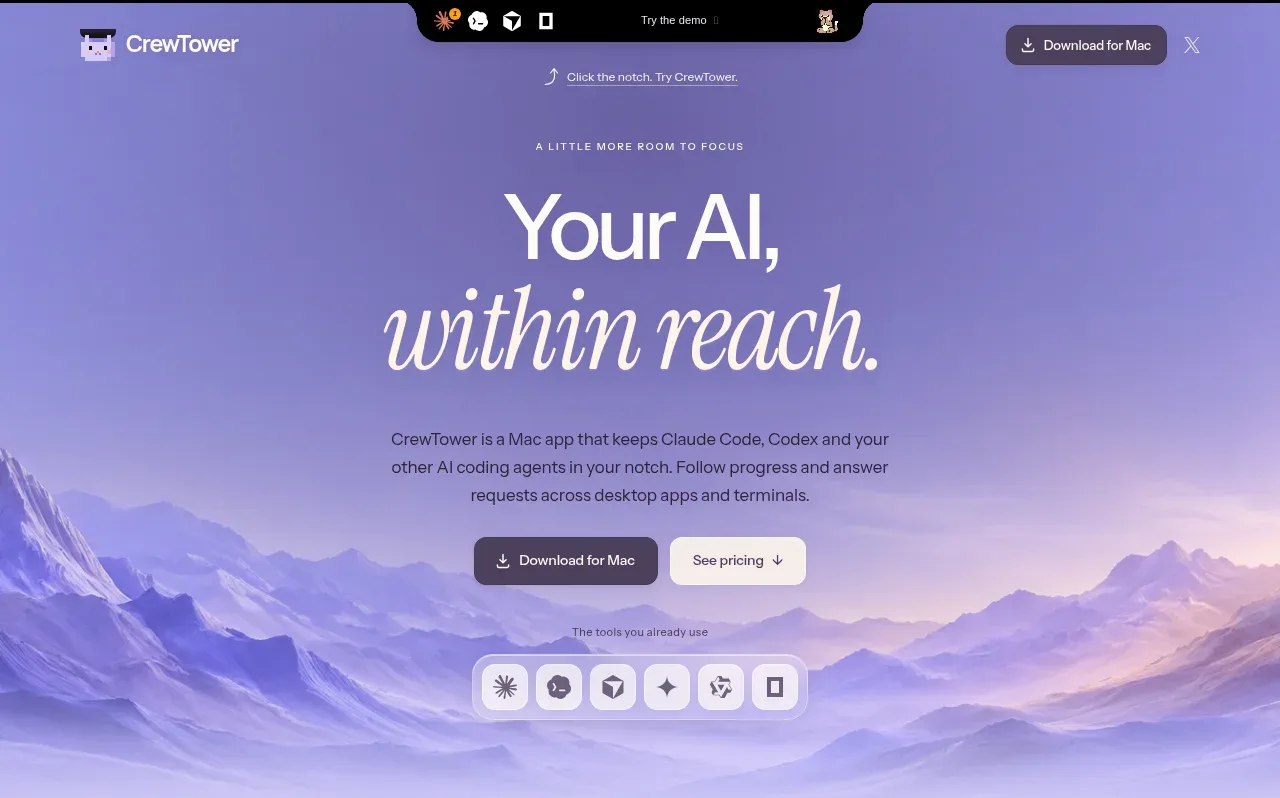
 Focus-oriented hero
CrewTower Mod for Claude Code · Hero
Focus-oriented hero
CrewTower Mod for Claude Code · Hero
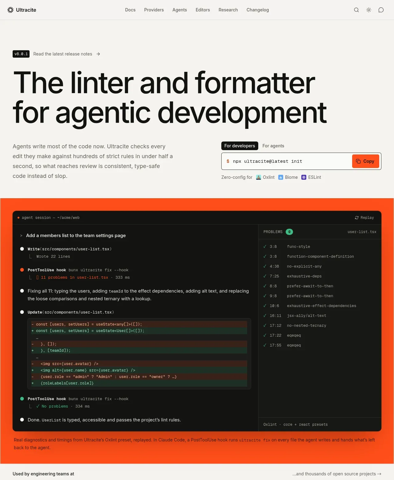
 Agentic development hero with live terminal preview
Ultracite v8 · Hero
Agentic development hero with live terminal preview
Ultracite v8 · Hero
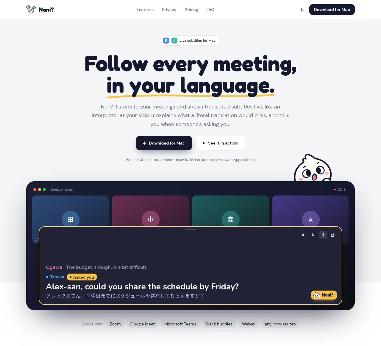
 Translation meeting hero
NANI??? · Hero
Translation meeting hero
NANI??? · Hero
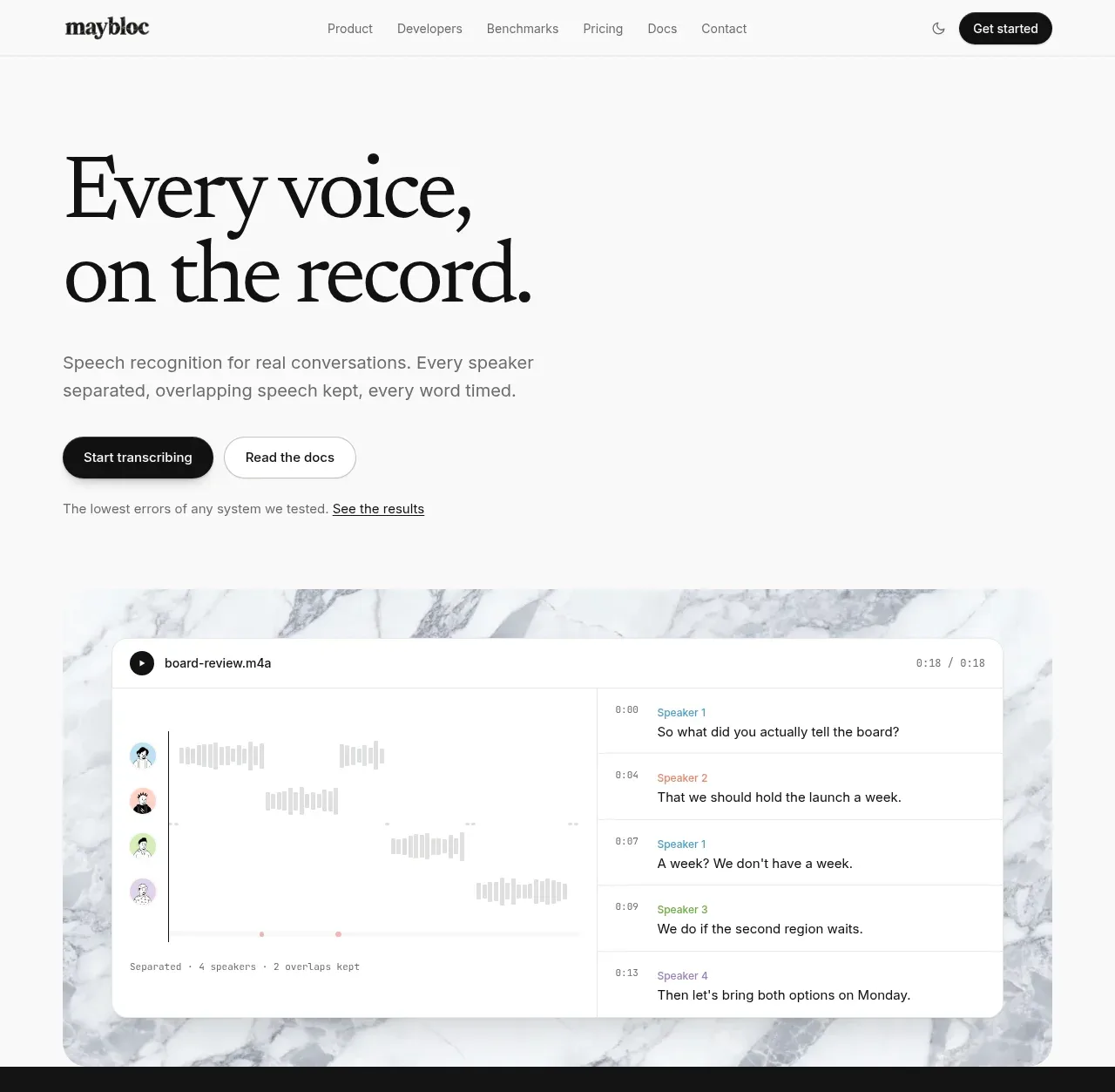
 Editorial speech transcription hero
Maybloc · Hero
Editorial speech transcription hero
Maybloc · Hero