kage
kage
polylane.com

Design analysis
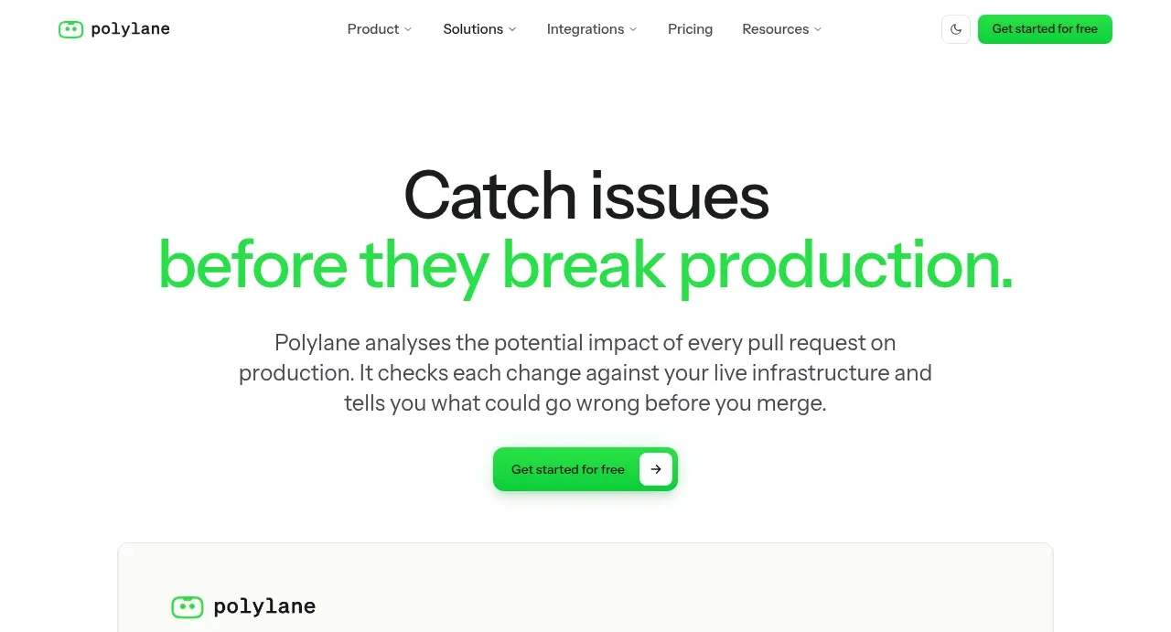
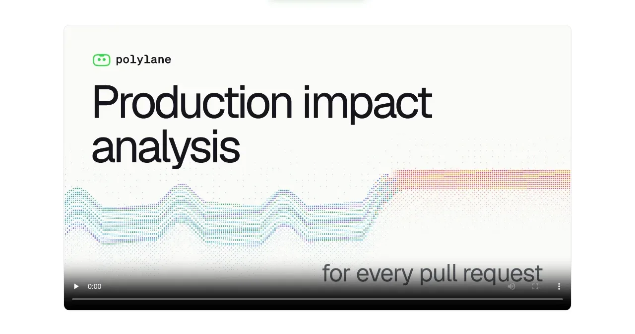
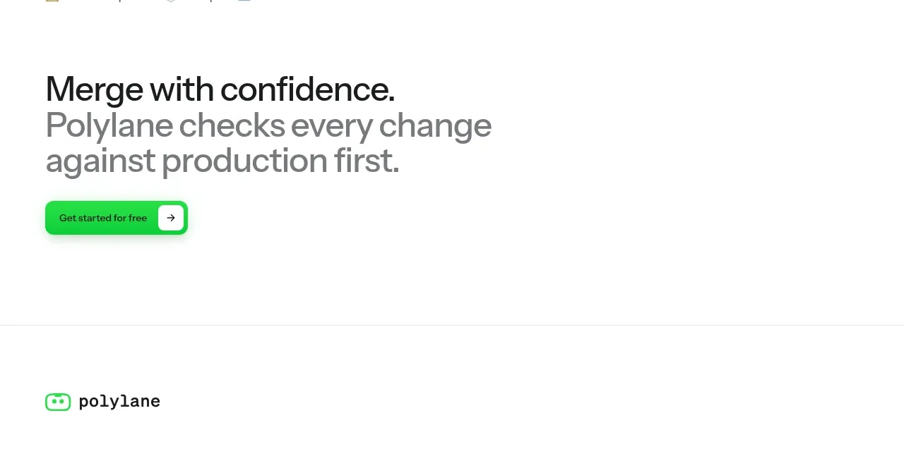
A restrained off-white developer-tool page carried almost entirely by typography, one saturated green accent and 1px hairline borders. The hero is a tight centred two-tone headline over a rounded video card with a dithered-wave motif, then three airy alternating feature rows with eyebrow pills and cropped product UI. Density shifts down the page: a bordered 3×2 capability grid, a 4×6 integration matrix, tweet-card testimonials, guide cards, an accordion FAQ and a left-aligned final CTA, all sharing the same flat, shadowless hairline system.
Prompt preview
## Reference images

Study these alongside the description below: hierarchy, rhythm, spacing, colour. Build for the product you are asked about, using this design language.

- Full page: https://kage-design-assets.t3.tigrisfiles.io/screenshots/polylane-impact-analysis/878f0a8a-6be5-46ae-8786-d3cb31a469c0-1792130477581-full.webp
- Above the fold: https://kage-design-assets.t3.tigrisfiles.io/screenshots/polylane-impact-analysis/878f0a8a-6be5-46ae-8786-d3cb31a469c0-1792130474947.webp
- Design on Kage: https://kage.design/designs/polylane-impact-analysis-landing-page

## Before you start
Ask the user what product they are building, who it is for, and what brand assets they already have (name, logo, colours, typeface). Wait for the answers before writing any code. Everything below is a design language to apply to *their* product, not a template of the reference site.

## Page structure
Build a single long marketing page for one product use case, in this order:

1. **Top nav** — slim bar on the page background: wordmark left, 4–5 centre links (two or three with dropdown carets), theme-toggle icon and a full green pill CTA on the right.
2. **Hero** — centred, two-line headline where the second line is set in the accent colour; both lines end with a period. Below it a 2–3 line grey sub-paragraph (~60ch) and a green pill CTA with a small arrow chip.
3. **Hero media** — a rounded, hairline-bordered video/demo card directly under the hero, dark player control bar at the bottom; the slide art uses a dithered/dotted gradient graphic.
4. **Logo wall** — a small centred microcopy line ("Trusted by…"), then two rows of ~10 customer wordmarks in grey; a few carry a tiny "Read story →" link.
5. **Feature row 1** — left column: uppercase eyebrow in a tinted pill, an H2 where the last phrase is green, a grey paragraph, and a small grey ghost button. Right column: a cropped, rounded product-UI screenshot bleeding toward the right edge (list rows with status chips and timestamps).
6. **Feature rows 2–3** — repeat the exact same grid (eyebrow, two-tone H2, paragraph, ghost button) twice more with different copy; keep the right media zone very light and airy so the sections breathe.
7. **Capability grid** — left-aligned section heading ending in a period, then a 3×2 grid of cards joined by hairline borders; each card has one small coloured line icon (rotate orange, blue, green, yellow, red), a short bold title and a two-line grey body.
8. **Integration matrix** — heading, then a 4-column × 6-row table of cells separated by hairlines, each cell a small third-party logo + name; the last cell is a text link "Every integration →".
9. **Testimonials** — heading, then a horizontal row of tweet-style cards (avatar, name + handle, short quote) with mentions/highlighted words tinted in the accent colour; let the last card clip at the viewport edge to imply a carousel.
10. **Related guides** — heading, then a 2-column grid of hairline cards each with a tiny "Guide" kicker, bold title and one-line summary.
11. **FAQ** — heading "Common questions.", then five accordion rows separated by hairlines with a "+" icon on the right.
12. **Cross-links** — small "More use cases" microcopy with three icon+label pill links.
13. **Final CTA** — left-aligned oversized headline: first line in ink, the continuation in a lighter grey, then the green pill CTA.
14. **Footer** — wordmark, four link columns (Product / Use cases / Resources / Company), a small "Ask AI about …" row of service icons, and a bottom legal bar (© line left; Privacy, Cookies, Terms, location right).

## Design language
- **Base palette:** warm off-white page `#FAFAF8`, pure-white cards, near-black ink `#161613`, secondary grey `#6F6F6A`, hairline borders `#E8E8E3`.
- **One accent:** a saturated green `#2FCB6B` (button fills, headline emphasis line, eyebrow pills, inline highlights) plus a pale green tint `#E9F7EE` for pill backgrounds. Everything else is monochrome; the only other colour is small per-card line icons (orange `#E8833A`, blue `#4A7DE0`, yellow `#E0B33A`, red `#D9534A`).
- **Type:** a single neo-grotesque sans throughout. Hero ~72–88px with tight tracking (-0.02em) and sentence case plus a terminal period; section H2s ~40–48px; body 15–16px / 1.6 in grey; eyebrows ~11px uppercase with +0.08em tracking. Build hierarchy with two-tone headlines (black lead-in, coloured emphasis line) rather than size jumps.
- **Buttons:** primary = green pill, white label, small circular arrow chip; secondary = light-grey pill with dark label, used for every feature row. No gradient or shadowed buttons.
- **Borders, radius, shadow:** flat hairline (1px) borders everywhere — cards, grids, accordions, media frames; radius 10–14px on cards/media, full rounding on pills; essentially no drop shadows.
- **Density rhythm:** open and centred at the top (hero, video, logo wall), very airy through the three feature rows (large vertical padding, ~160px+ gaps), then tighten into bordered grids (capabilities, integrations), then card rows and list-like FAQ, ending with a heavy left-aligned CTA. Alternate this loosening/tightening rather than repeating identical sections.
- **Imagery:** product screenshots are cropped tight on real UI detail (rows, chips, statuses) inside rounded frames; decorative art is a dithered/dotted gradient motif — no stock photography.
- **Motion:** restrained — link and button hover states, accordion expand with the "+" rotating to "×", no parallax or heavy scroll effects.

## Never
Do not reuse the reference product's name, wordmark, logo, mascot or glasses icon, its headline or body copy, its customer logos or testimonials, the specific integration list, its dithered-wave artwork, or its green-on-white identity verbatim. Never present the output as that product — apply the layout system, rhythm and hairline/green-accent language to the user's own brand and content.
Components from this page
All components
 Primary navigation
Polylane Impact Analysis · Navigation
Primary navigation
Polylane Impact Analysis · Navigation
 Impact analysis hero
Polylane Impact Analysis · Hero
Impact analysis hero
Polylane Impact Analysis · Hero
 Product demonstration video
Polylane Impact Analysis · Card
Product demonstration video
Polylane Impact Analysis · Card
 Customer trust logos
Polylane Impact Analysis · Logo cloud
Customer trust logos
Polylane Impact Analysis · Logo cloud
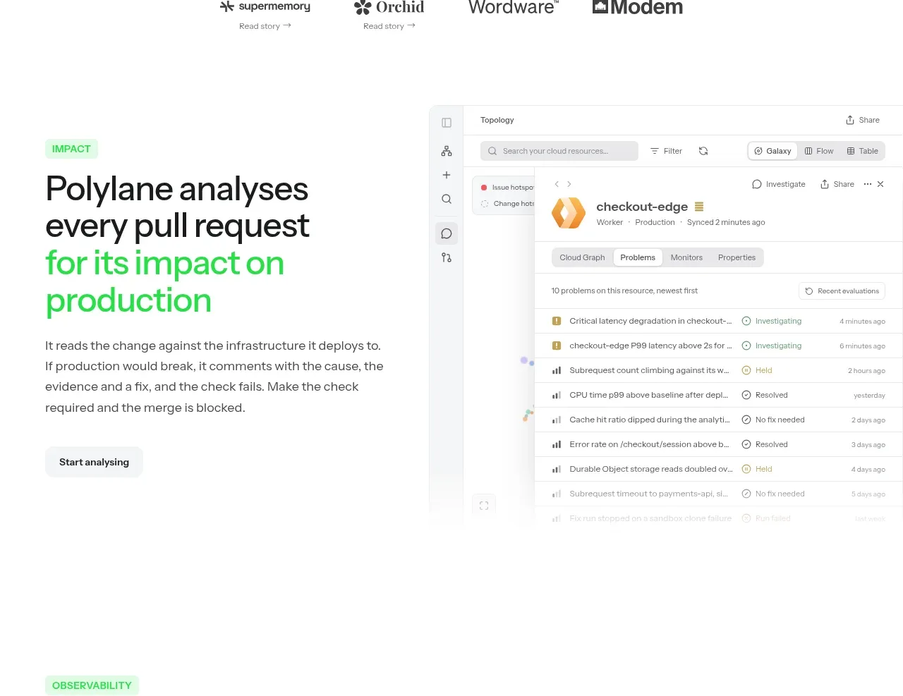 Impact analysis workflow
Polylane Impact Analysis · Feature grid
Impact analysis workflow
Polylane Impact Analysis · Feature grid
 Observability feature
Polylane Impact Analysis · Feature grid
Observability feature
Polylane Impact Analysis · Feature grid
 Post-deploy monitoring feature
Polylane Impact Analysis · Feature grid
Post-deploy monitoring feature
Polylane Impact Analysis · Feature grid
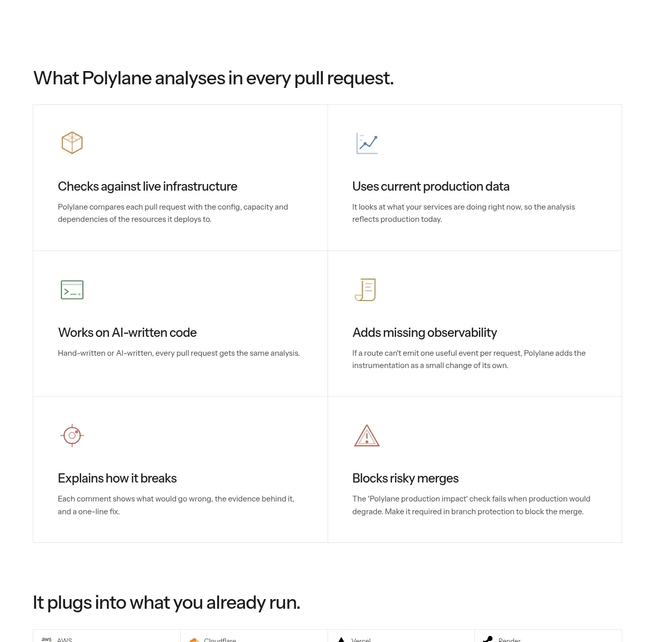 Analysis capabilities grid
Polylane Impact Analysis · Feature grid
Analysis capabilities grid
Polylane Impact Analysis · Feature grid
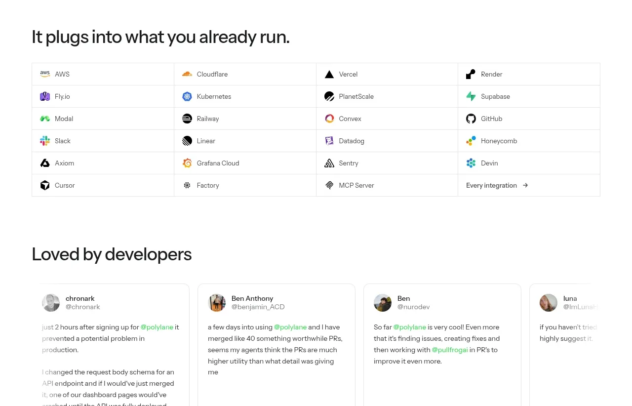 Integration directory
Polylane Impact Analysis · Logo cloud
Integration directory
Polylane Impact Analysis · Logo cloud
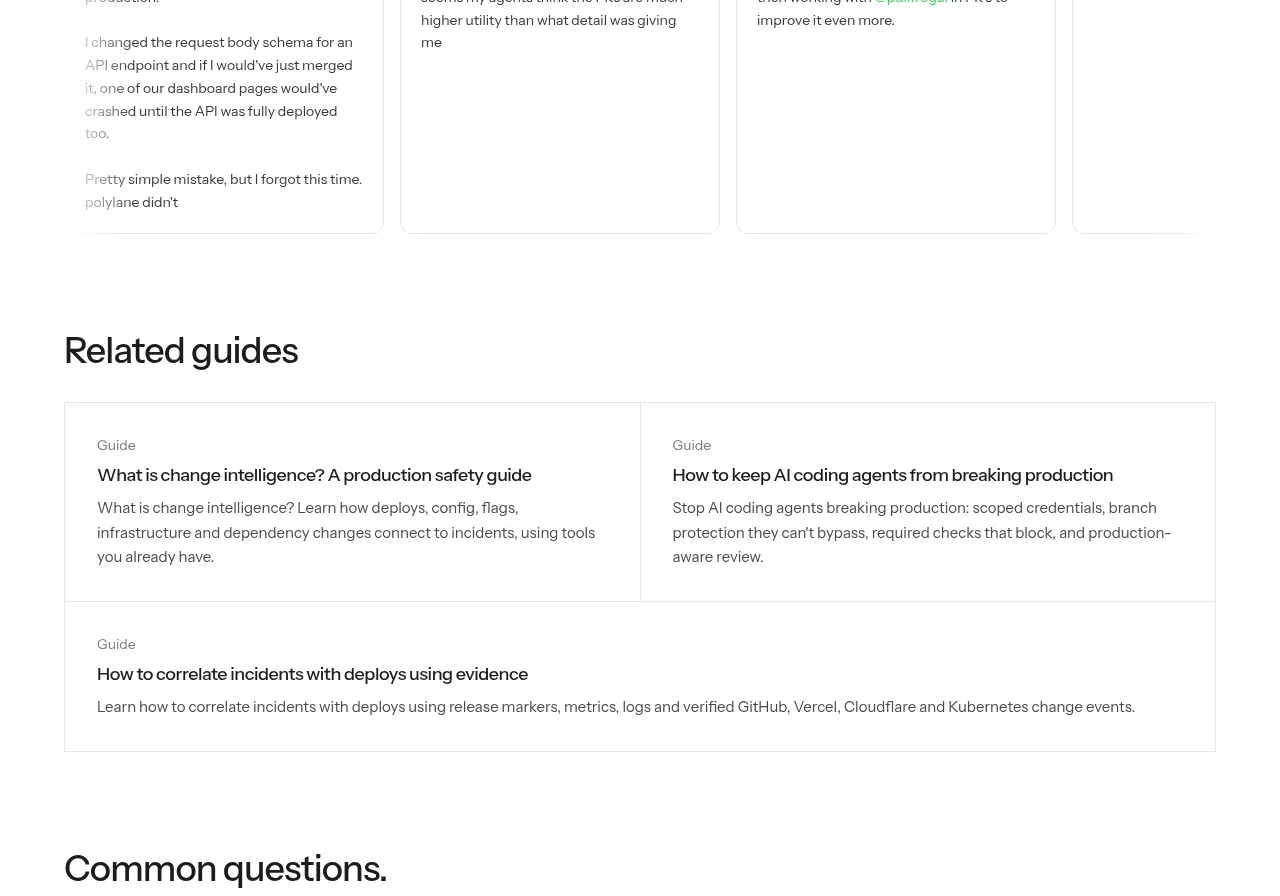 Developer testimonials
Polylane Impact Analysis · Testimonials
Developer testimonials
Polylane Impact Analysis · Testimonials
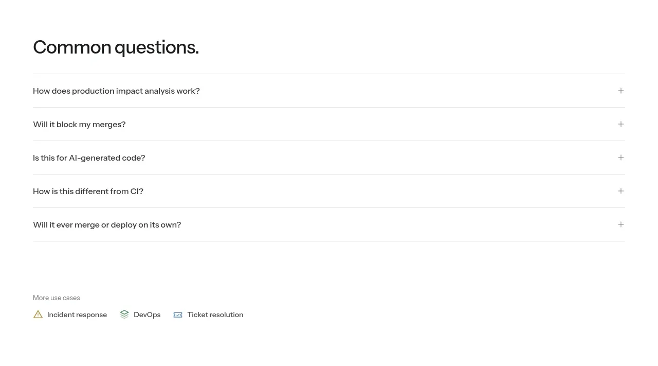 Related guides
Polylane Impact Analysis · Card
Related guides
Polylane Impact Analysis · Card
 Common questions
Polylane Impact Analysis · FAQ
Common questions
Polylane Impact Analysis · FAQ