 kage
kage
polylane.com
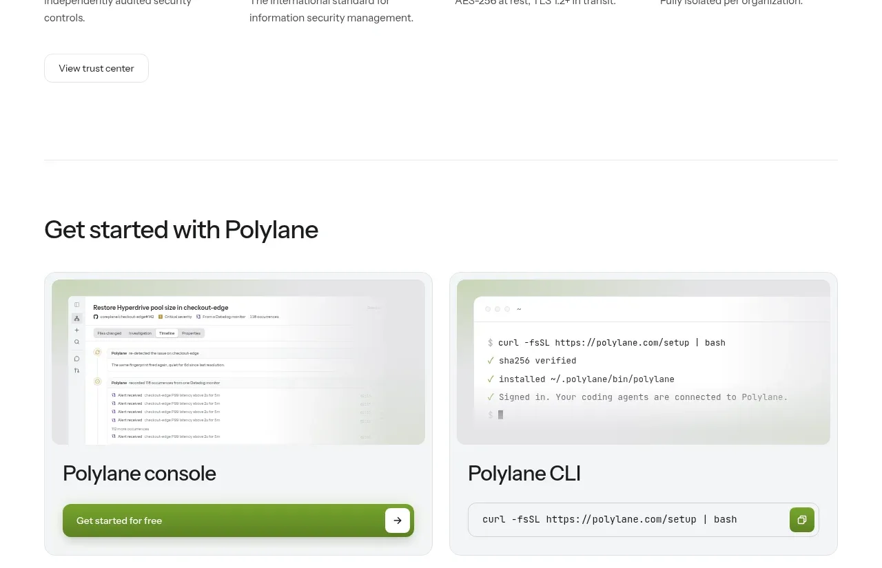
Design analysis
The trust section presents a direct heading, several compact assurance columns, and a secondary action, making security information easy to scan without alarmist styling.
Prompt preview
## Reference images

Study these alongside the description below: hierarchy, rhythm, spacing, colour. Build for the product you are asked about, using this design language.

- Component: https://kage-design-assets.t3.tigrisfiles.io/components/polylane/638c7112-70a9-484e-b85d-ab255c3ac21a-1790920981-6.webp
- Full page it was cut from: https://kage-design-assets.t3.tigrisfiles.io/screenshots/polylane/638c7112-70a9-484e-b85d-ab255c3ac21a-1790920937285-full.webp
- Component on Kage: https://kage.design/component/polylane-stats

## Before you start
Ask what security, privacy, compliance, and infrastructure assurances the user's product can prove. Do not invent certifications. Apply the layout to verified information only.

Create a trust section with a strong, plain-language heading followed by four concise assurance items in a horizontal row. Each item should have a small icon or certification badge only when legitimate, a short label, and one explanatory sentence. Finish with a quiet secondary button linking to deeper documentation. Use a clear information hierarchy so the labels scan first and details answer the next question.

Use white background, #171717 headings, #5F5F5F descriptions, green #73AA2A for verified accents, and #EEEEEE dividers. Use a 4-column grid with 24–32px gaps, heading around 32–40px, labels 14–16px, descriptions 13–14px, and 80–120px vertical padding. Collapse to two columns then one on mobile. Buttons should have white fill, #E5E5E5 border, 8px radius, and clear focus styling.

Never: use logos, product names, copy, illustrations or imagery from the reference.
More components
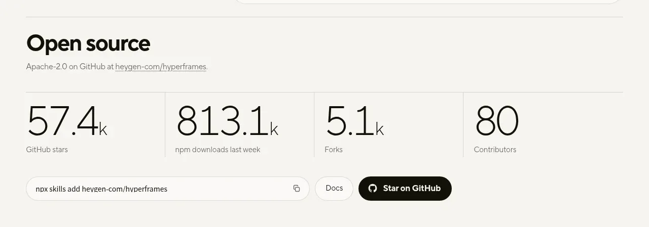
 Open-source proof and repository stats
HyperFrames Studio (Desktop) · Stats
Open-source proof and repository stats
HyperFrames Studio (Desktop) · Stats
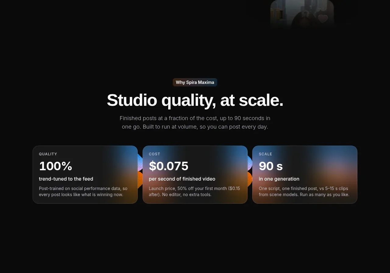
 Quality, cost, and scale metrics
Spira Maxima · Stats
Quality, cost, and scale metrics
Spira Maxima · Stats
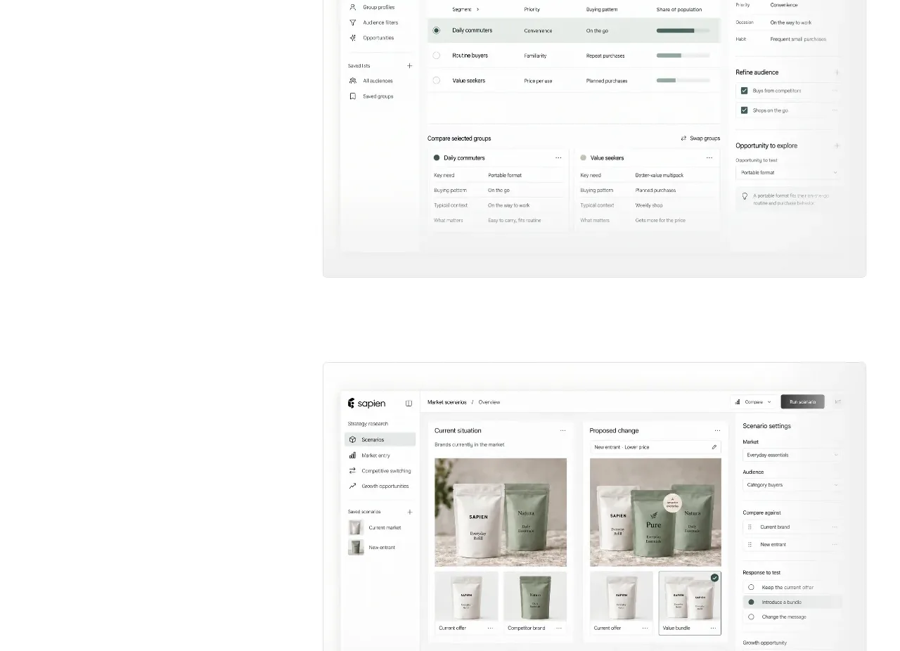
 Prediction benchmark statistic
Sapien · Stats
Prediction benchmark statistic
Sapien · Stats

 Safety and control principles
Omnia Agent · Stats
Safety and control principles
Omnia Agent · Stats

 Customer proof and outcome grid
ColdIQ x Slack · Stats
Customer proof and outcome grid
ColdIQ x Slack · Stats

 Real-world proof section
Humalike x GTA RP · Stats
Real-world proof section
Humalike x GTA RP · Stats