kage
kage
portfolioframe.com
Design analysis
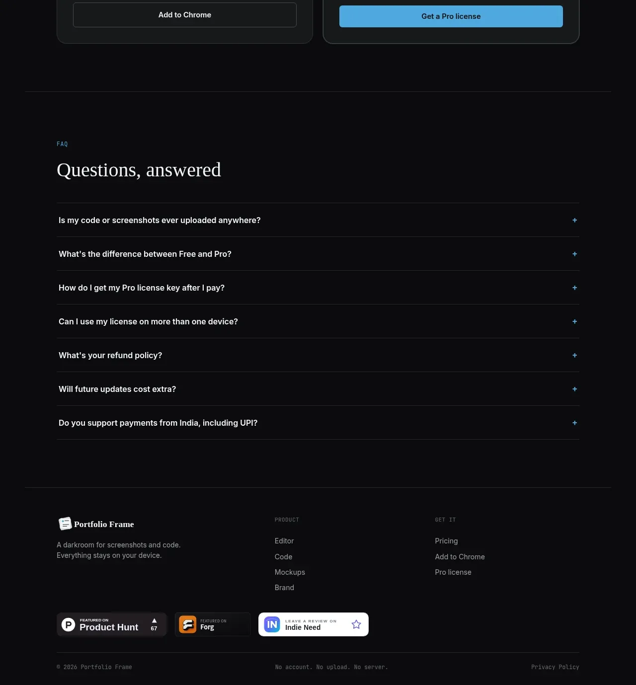
The footer closes with brand summary, grouped product and acquisition links, trust badges, legal links, and a quiet copyright row separated by rules.
Prompt preview
## Reference images

Study these alongside the description below: hierarchy, rhythm, spacing, colour. Build for the product you are asked about, using this design language.

- Component: https://kage-design-assets.t3.tigrisfiles.io/components/portfolio-frame/48220de1-a18c-43ab-aca5-f2ed5e4c7799-1789538575-10.webp
- Full page it was cut from: https://kage-design-assets.t3.tigrisfiles.io/screenshots/portfolio-frame/48220de1-a18c-43ab-aca5-f2ed5e4c7799-1789538513158-full.webp
- Component on Kage: https://kage.design/component/portfolio-frame-footer

## Before you start
Ask what the user's product and brand are, then apply the principles below to that product rather than reproducing the reference.

Build a dark footer with a centered max-width rail and generous top padding. Use a four-column upper area: brand description on the left, grouped navigation links in the middle, and an optional acquisition/support group on the right. Add a row of neutral third-party or trust badges only if the user's product genuinely has them; otherwise omit it. Finish with a 1px divider and a small bottom row containing copyright, a short privacy/legal link group, and a compact product note. Keep the palette near #0b0d0d with #f0f1f2 headings, #858b8e secondary text, #252b2b dividers, and a restrained blue accent for hover. Use 12–16px body text, mono uppercase group labels, consistent 24–40px gaps, and responsive stacking.

Never:
- use logos, product names, copy, illustrations, or imagery from the reference
- fabricate awards, badges, testimonials, or legal claims
- overcrowd the footer with every possible link