kage
kage
portfolioframe.com

Design analysis
A near-black canvas where light does all the work: serif sentence headlines with terminal periods, one electric blue accent, and white rounded "stage" cards that host lifelike product mockups alternating left and right as you scroll. Feature lists are drawn as hairline-bordered table grids with small blue square bullets and deliberately empty cells, so density stays controlled. Monospace eyebrows, mono captions and toggle-pill controls give every demo a spec-sheet feel that carries through to the license-key pricing card, the plus-icon FAQ accordion, and the badge-studded footer.
Prompt preview
## Reference images

Study these alongside the description below: hierarchy, rhythm, spacing, colour. Build for the product you are asked about, using this design language.

- Full page: https://kage-design-assets.t3.tigrisfiles.io/screenshots/portfolio-frame/48220de1-a18c-43ab-aca5-f2ed5e4c7799-1789538513158-full.webp
- Above the fold: https://kage-design-assets.t3.tigrisfiles.io/screenshots/portfolio-frame/48220de1-a18c-43ab-aca5-f2ed5e4c7799-1789538511400.webp
- Design on Kage: https://kage.design/designs/portfolio-frame-landing-page

## Before you start
Ask the user what product they are building, who it is for, and what brand assets they already have (name, colours, typefaces, logo). Wait for their answers before writing any code. Everything below is a design language to apply to *their* product — not a template of the reference site.

## Page structure
Build a single dark landing page with these sections, top to bottom:

1. **Top nav** — slim dark bar: small logo mark + wordmark left; centre-right links in tiny uppercase mono; a small language/locale pill; one filled primary CTA button at the far right. Sticky feel, hairline bottom border.
2. **Hero** — two columns. Left: tiny uppercase mono eyebrow ("a positioning statement"), a large serif headline written as a full sentence ending in a period, one short gray paragraph, then a filled blue CTA + a quiet underlined text link with a down arrow. Right: a dark rounded stage panel containing 2–3 overlapping, slightly perspective-tilted product mockups (e.g. a light app card and a dark code-editor card). Below the hero copy: a three-column spec strip with tiny uppercase mono labels (e.g. setup / storage / privacy) each answered in one short sentence.
3. **Feature intro** — left column: eyebrow (two mono words separated by a dot), serif sentence heading, 2–3 line paragraph. Right: a 2-column grid of feature cells separated by 1px hairline borders (not card shadows). Each cell: small blue square bullet, bold short title, 1–2 line gray description. Leave one cell empty on purpose for asymmetry.
4. **Demo section A (interactive-feeling)** — heading + paragraph left; right, a large light rounded "stage" card containing: a row of segmented toggle pills (two pill groups), a realistic product mockup in the middle (dark syntax-highlighted code window with traffic-light dots and filename tab), and a centred 12px mono caption underneath explaining the controls. Below the stage card: a hairline grid of 5 feature cells (one empty).
5. **Demo section B (flipped)** — same anatomy but the light stage card sits on the LEFT, with toggle pills for themes/variants and a realistic social-post mockup (avatar, name, verified tick, timestamp, stat chips), mono caption below. Beneath it a single-column stack of 3 feature rows separated by hairlines. This flip is the page's main rhythm change.
6. **Demo section C** — heading left; light stage card right with two pill groups (category pills + pose pills) and a device mockup on a moody dark gradient backdrop inside the light card; mono caption. Below: 2×2 hairline feature grid.
7. **Demo section D** — heading left; light stage card right with tool pills and a white app mockup showing redaction boxes/annotations over sensitive strings; mono caption. Below: hairline grid with one deliberately blank cell.
8. **Demo section E (watermarking/branding)** — heading left; light stage card right with pills (text / logo / QR, tiled on/off) and a dark window mockup carrying a small signature badge; mono caption. Below: two feature cells.
9. **Pricing** — eyebrow, big serif sentence heading, one paragraph. Two cards side by side on slightly raised dark surfaces with hairline borders: a Free card (price, one-line summary, bulleted list, quiet outline button pinned to the bottom) and a Pro card (price, "one-time payment" line, longer bullet list, a license-key input styled like a code field with a verification chip, filled blue CTA, and a small badge pill top-right).
10. **FAQ** — serif sentence heading ("Questions, answered" energy). A single-column accordion of 6–8 rows separated by hairlines, each row a question in regular weight with a thin plus icon right; generous row height.
11. **Footer** — logo + one-line positioning sentence left; two small uppercase-mono link columns (product / get-it); a row of 2–3 "featured on"-style badge chips; bottom bar with copyright, a tiny mono motto, and a privacy link.

## Design language
- **Canvas**: near-black page background (#0b0b0c); alternate section surfaces a step lighter (#121214); hairline borders #26262a; body gray #9a9aa0; white text #f2f2f2. Use light only where it means something.
- **Accent discipline**: one electric blue (#3f9bf5) for the primary buttons, 8px square bullets on feature cells, and small active-state pills. No gradients on UI chrome; never two accent colours.
- **Stage cards**: white-to-off-white panels (#ededee → #f4f4f2), radius ~16–20px, no border, no shadow — they pop purely by value contrast against the dark page. Every stage card ends with a centred monospace caption, ~12px, muted gray.
- **Type pairing**: an editorial serif for headlines only, written as complete sentences with terminal periods, scaled clamp(2.2rem → 3.5rem); a neutral sans for body; a monospace for eyebrows, nav links, captions, labels and the legal/motto lines, set in 10–12px uppercase with ~0.15em tracking. Never use the serif for body or UI.
- **Hierarchy**: eyebrow → serif sentence → short paragraph → feature grid. Each section restarts this pattern so the eye re-orients; the flipped demo section and the blank grid cells supply the variation.
- **Density rhythm**: sparse and airy at hero and section intros; tight table-like density inside hairline grids; back to airy for pricing, FAQ and footer. Full-bleed hairline dividers separate major bands.
- **Feature cells**: 1px hairline borders forming a shared grid (collapsing borders, not gaps), transparent fills, square or barely-rounded corners, no shadows; blue square bullet + bold 14–15px title + 13px gray copy.
- **Buttons & controls**: pill-radius buttons — filled blue primary, outline or plain-text secondary with a down-arrow; segmented toggle pill groups with one active pill per group; small uppercase mono everywhere in controls.
- **Mockups as proof**: every demo shows real-looking UI chrome — window dots, filename tabs, syntax-highlighted code, avatars, stat chips — so the page demonstrates the product instead of describing it.
- **Motion**: restrained. Slight perspective tilt on hero mockups, subtle hover brightness on rows/buttons, plus-icon rotation on the accordion. No parallax, no marquees.

## Never
Never copy the reference's logos, wordmark, product name ("Portfolio Frame"), headline or body copy, tweet content or @handles, syntax-theme names, pricing numbers, FAQ questions, or the Product Hunt / Forge / Indie Need badges. Do not reuse its illustrations, screenshots or icon sets. Never present the result as that product or imply any affiliation.
Components from this page
All components
 Top navigation bar
Portfolio Frame · Navigation
Top navigation bar
Portfolio Frame · Navigation
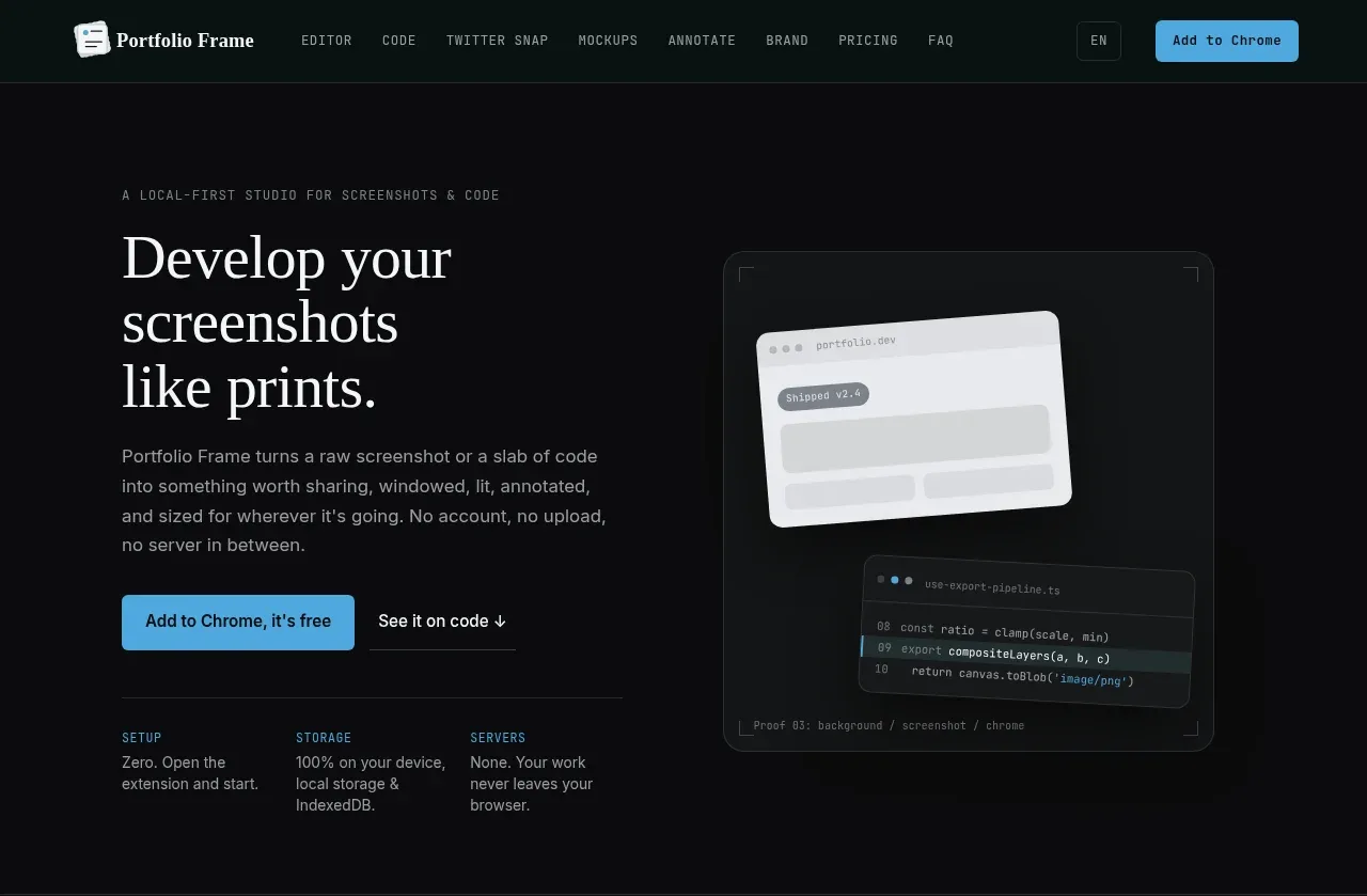 Product introduction hero
Portfolio Frame · Hero
Product introduction hero
Portfolio Frame · Hero
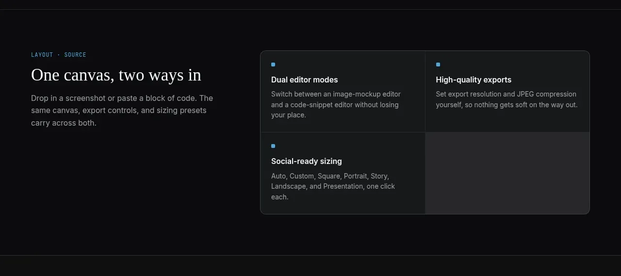 Dual editor and export features
Portfolio Frame · Feature grid
Dual editor and export features
Portfolio Frame · Feature grid
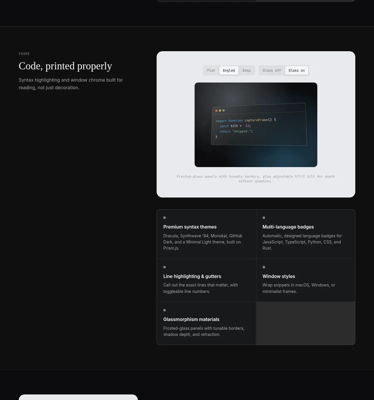 Code presentation feature section
Portfolio Frame · Feature grid
Code presentation feature section
Portfolio Frame · Feature grid
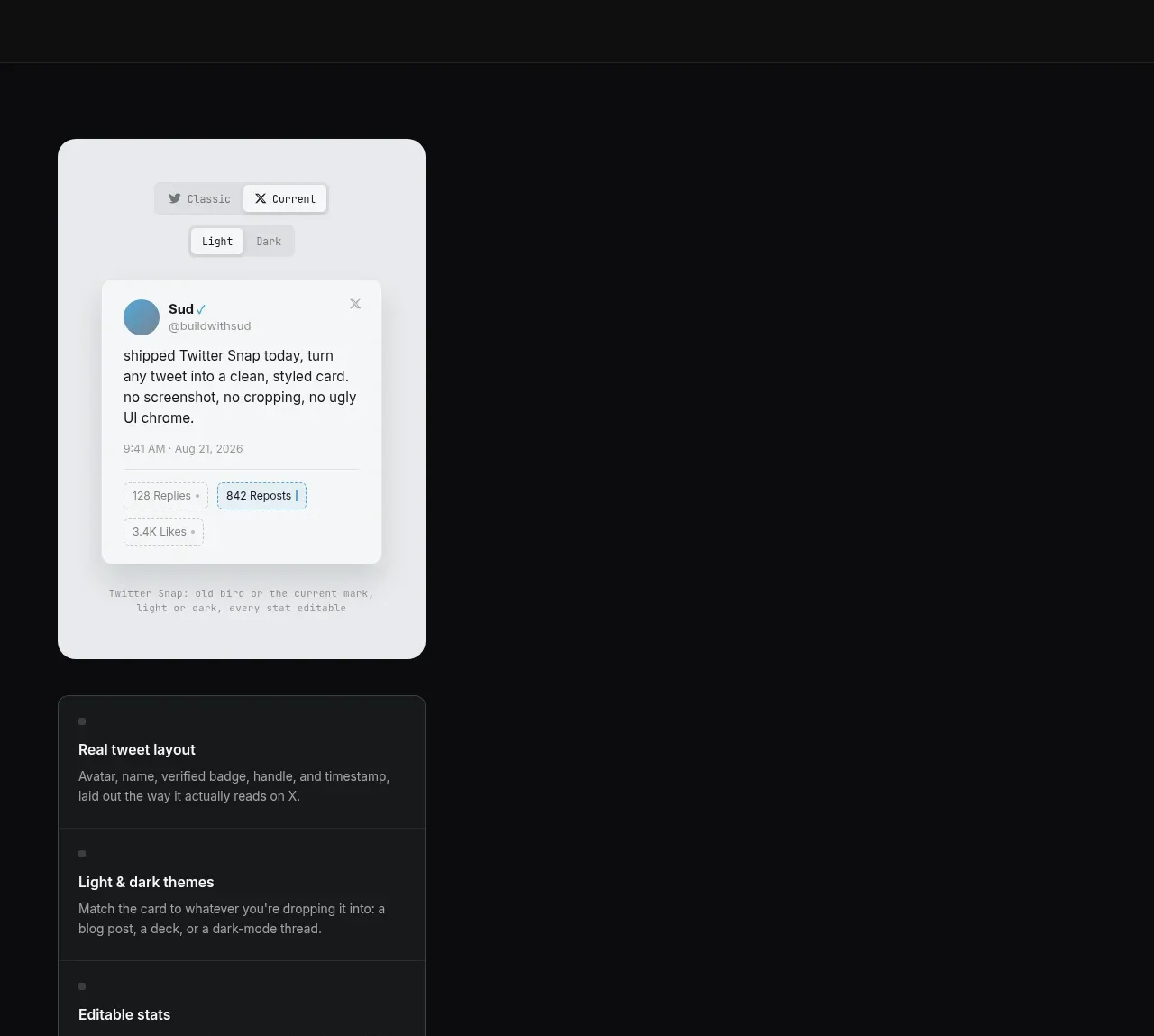 Social post mockup features
Portfolio Frame · Feature grid
Social post mockup features
Portfolio Frame · Feature grid
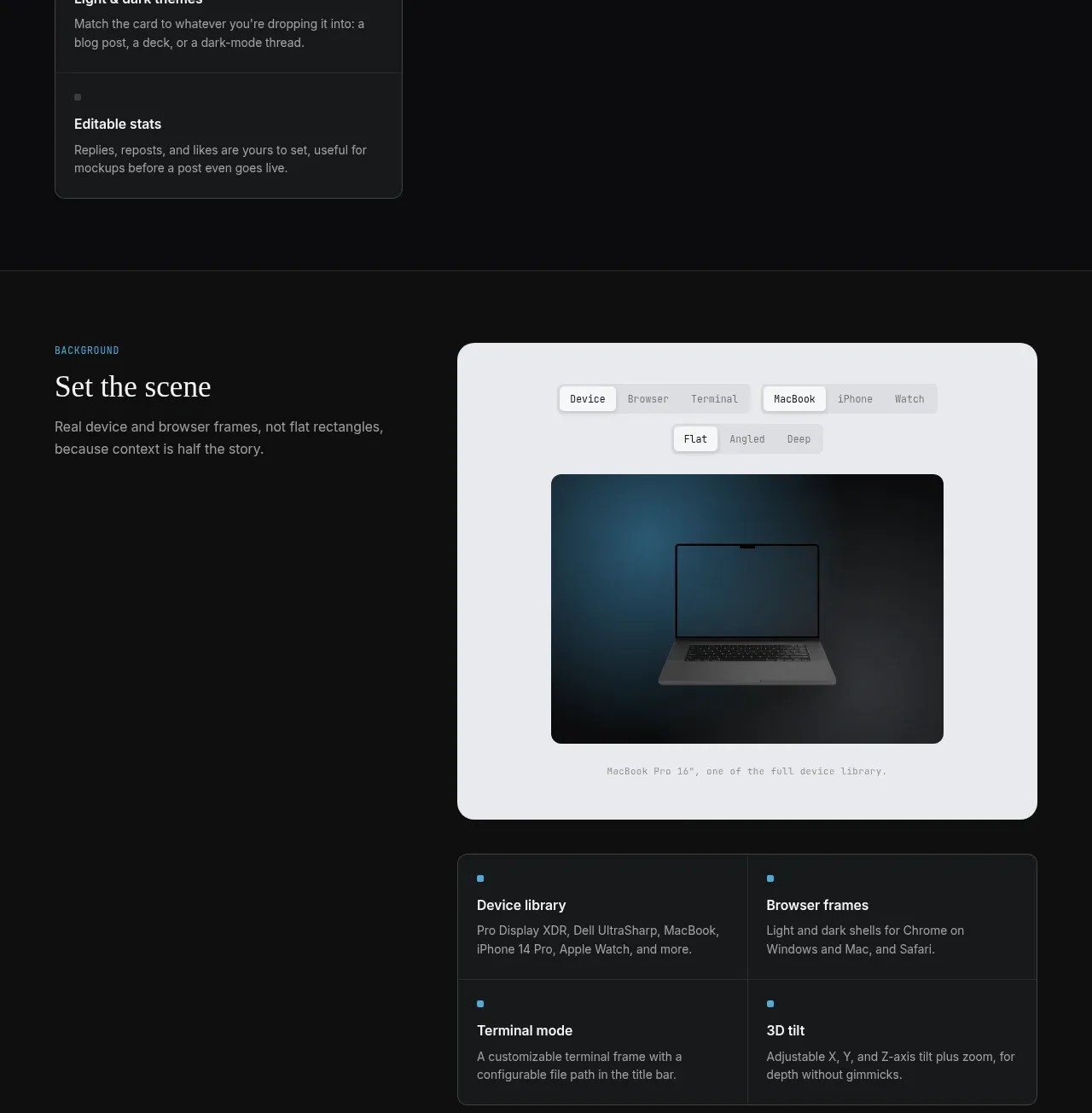 Device and browser frame features
Portfolio Frame · Feature grid
Device and browser frame features
Portfolio Frame · Feature grid
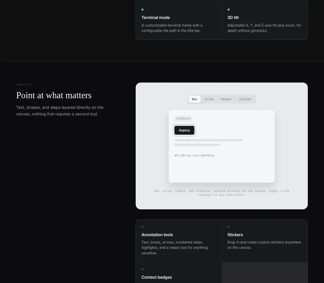 Annotation tools feature section
Portfolio Frame · Feature grid
Annotation tools feature section
Portfolio Frame · Feature grid
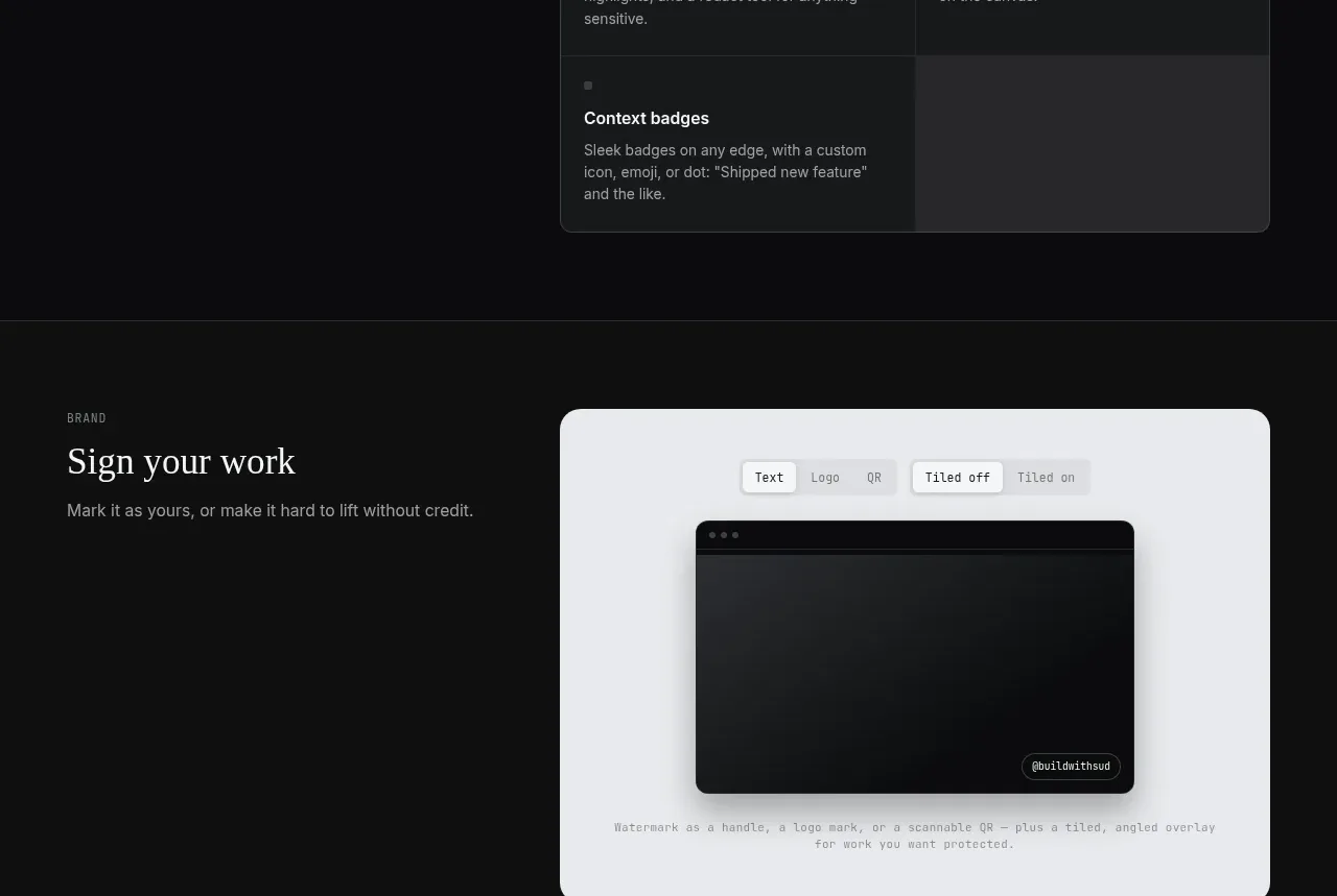 Branding and watermark features
Portfolio Frame · Feature grid
Branding and watermark features
Portfolio Frame · Feature grid
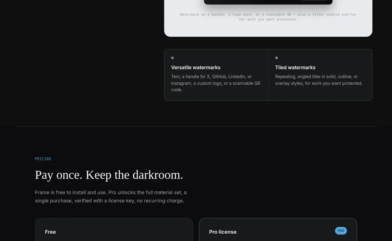 Free and paid license pricing
Portfolio Frame · Pricing table
Free and paid license pricing
Portfolio Frame · Pricing table
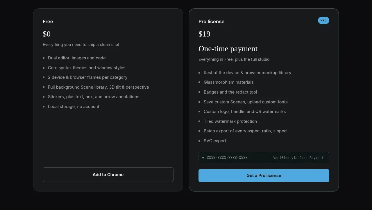 Frequently asked questions
Portfolio Frame · FAQ
Frequently asked questions
Portfolio Frame · FAQ
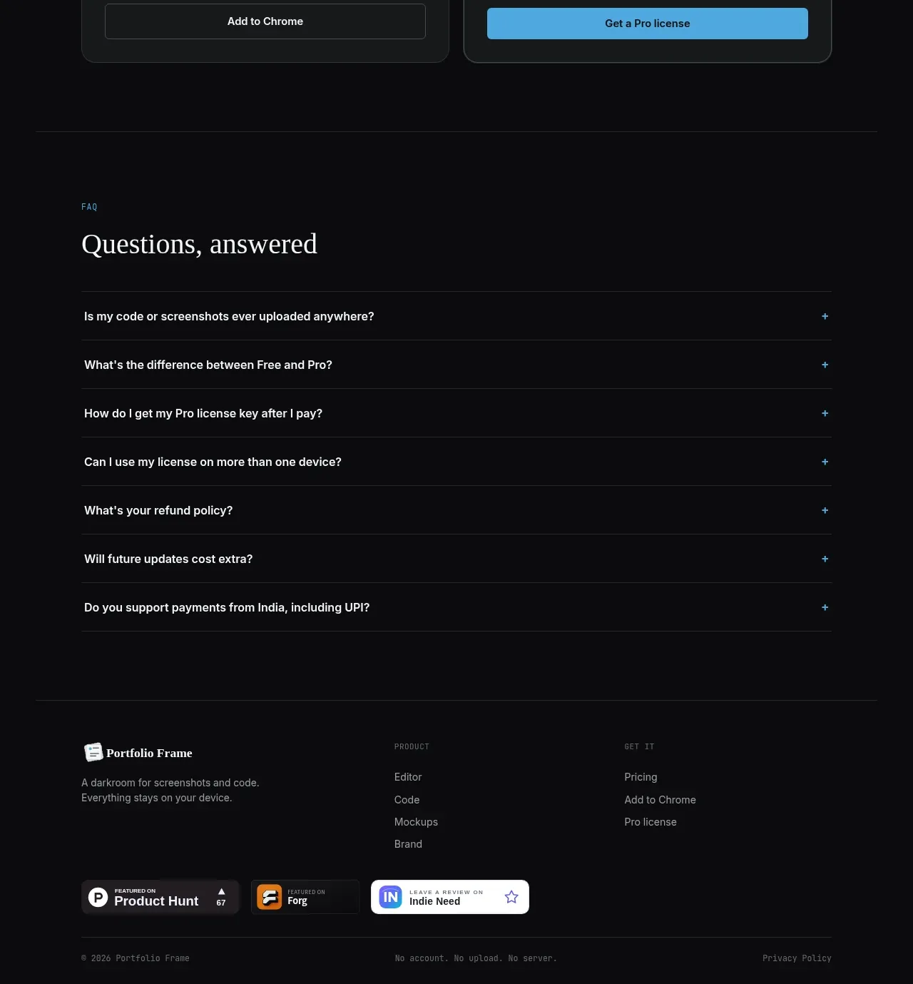 Site footer
Portfolio Frame · Footer
Site footer
Portfolio Frame · Footer