 kage
kage
postsider.com
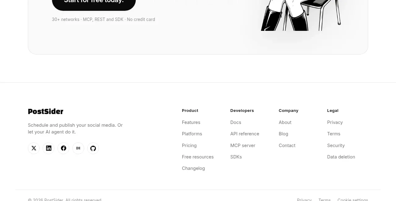
Design analysis
A rounded bordered panel closes the marketing narrative with a large autopilot-style promise, one dominant CTA, supporting reassurance, and an original character illustration.
Prompt preview
## Reference images

Study these alongside the description below: hierarchy, rhythm, spacing, colour. Build for the product you are asked about, using this design language.

- Component: https://kage-design-assets.t3.tigrisfiles.io/components/postsider/9db522ee-ab56-4492-bd61-aeca6aa2f318-1790057110-11.webp
- Full page it was cut from: https://kage-design-assets.t3.tigrisfiles.io/screenshots/postsider/9db522ee-ab56-4492-bd61-aeca6aa2f318-1790056967277-full.webp
- Component on Kage: https://kage.design/component/postsider-cta

## Before you start
Ask what the user's final conversion action is, what reassurance belongs beside it, and whether the brand has an approved illustration or image. Apply the structure to that product.

Build a large final CTA inside a centered rounded panel with a very light #fafafa fill, 1px #e6e6e6 border, and 18–24px radius. Use a two-column layout: left has a small eyebrow, a bold 38–48px multi-line promise, one sentence of supporting copy, a black pill CTA, and a tiny reassurance line; right has an original abstract illustration, product diagram, or approved brand asset that supports the concept without overpowering the text. Add a subtle grid texture only behind the visual if it remains accessible. On mobile, stack the visual below the CTA and keep the button full-width.

Never: use logos, product names, copy, illustrations, or imagery from the reference.
More components
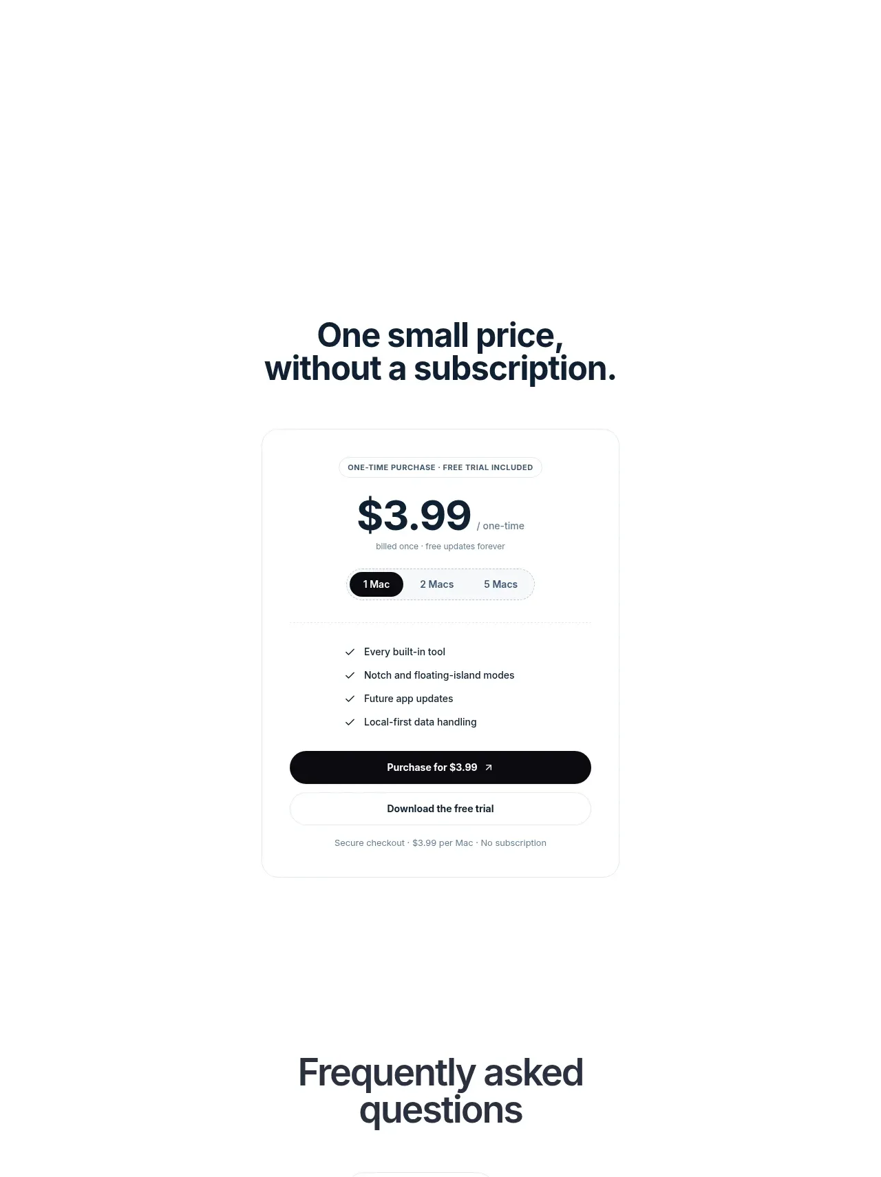
 Visual closing product statement
NotchPop · Call to action
Visual closing product statement
NotchPop · Call to action

 System positioning statement
IntellAgents.io · Call to action
System positioning statement
IntellAgents.io · Call to action
 Final conversion banner
IntellAgents.io · Call to action
Final conversion banner
IntellAgents.io · Call to action
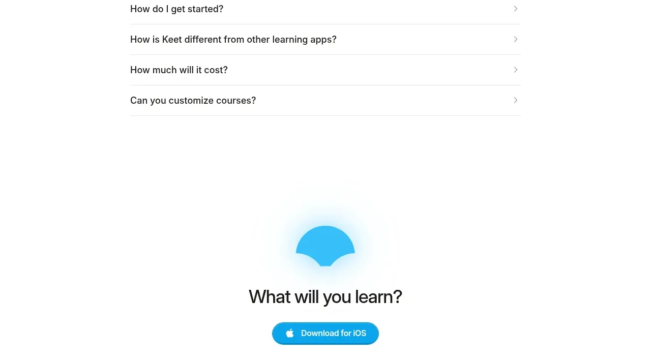
 Final app-download call to action
Keet · Call to action
Final app-download call to action
Keet · Call to action
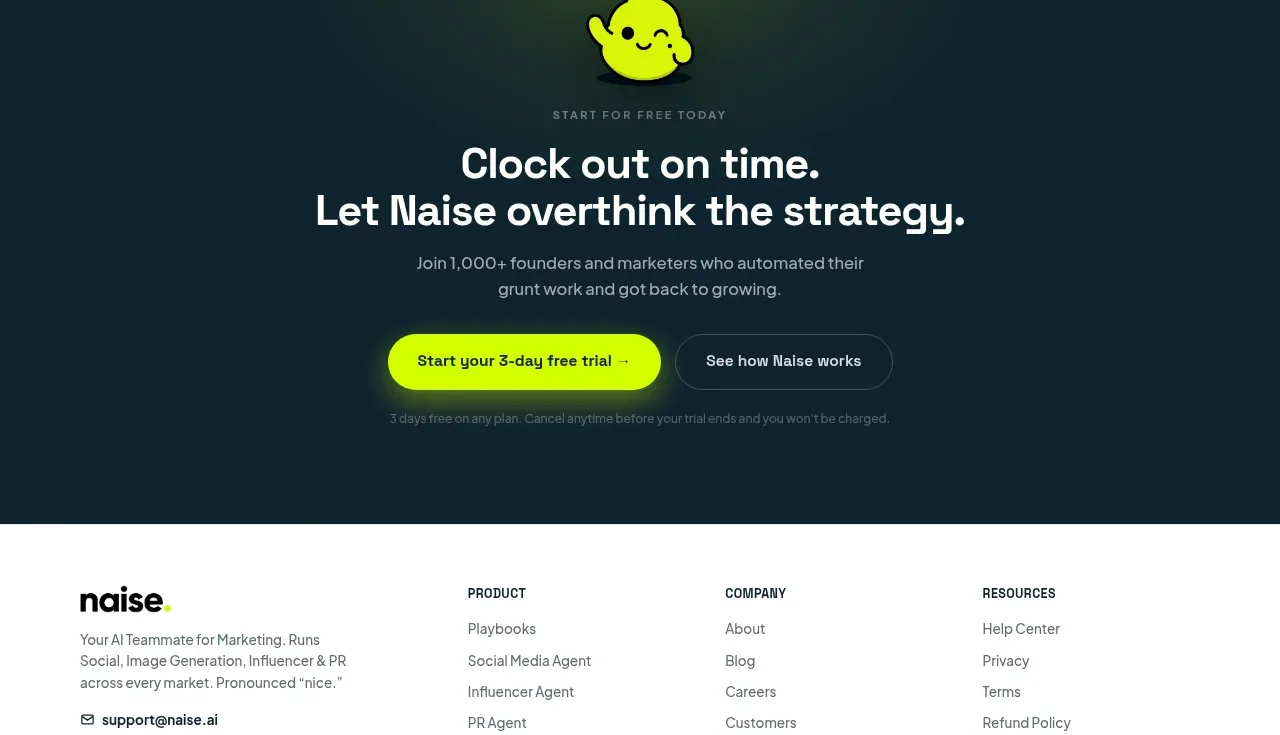
 Dark conversion call to action
Naise AI · Call to action
Dark conversion call to action
Naise AI · Call to action
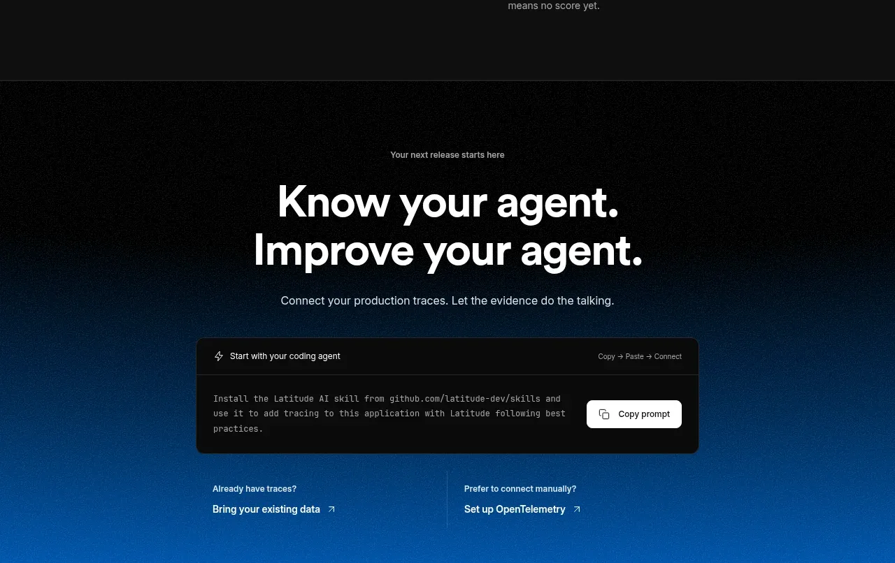
 Connect data and start improving
AgentScore · Call to action
Connect data and start improving
AgentScore · Call to action