kage
kage
postsider.com
Design analysis
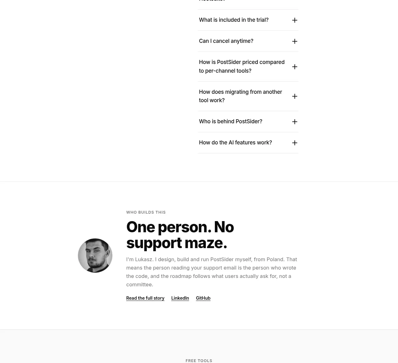
A two-column FAQ uses a large left heading and a tightly aligned right list of questions with plus controls to address buying objections.
Prompt preview
## Reference images

Study these alongside the description below: hierarchy, rhythm, spacing, colour. Build for the product you are asked about, using this design language.

- Component: https://kage-design-assets.t3.tigrisfiles.io/components/postsider/9db522ee-ab56-4492-bd61-aeca6aa2f318-1790057110-9.webp
- Full page it was cut from: https://kage-design-assets.t3.tigrisfiles.io/screenshots/postsider/9db522ee-ab56-4492-bd61-aeca6aa2f318-1790056967277-full.webp
- Component on Kage: https://kage.design/component/postsider-faq

## Before you start
Ask which questions customers repeatedly ask before adopting the user's product. Prioritize objections around setup, compatibility, security, pricing, and cancellation.

Create an FAQ section with a generous two-column layout: a small eyebrow and 34–42px heading on the left, and a vertical accordion list on the right. Each row should have a question, a plus/minus disclosure control, generous 16–20px vertical padding, and a thin #eeeeee divider. Animate height and icon rotation subtly, preserve keyboard navigation and visible focus, and ensure only the needed answers expand. Use near-black text, muted gray answers, and a clean white background. Collapse to one column on mobile with the heading above the questions.

Never: use logos, product names, copy, illustrations, or imagery from the reference.