kage
kage
postsider.com
Design analysis
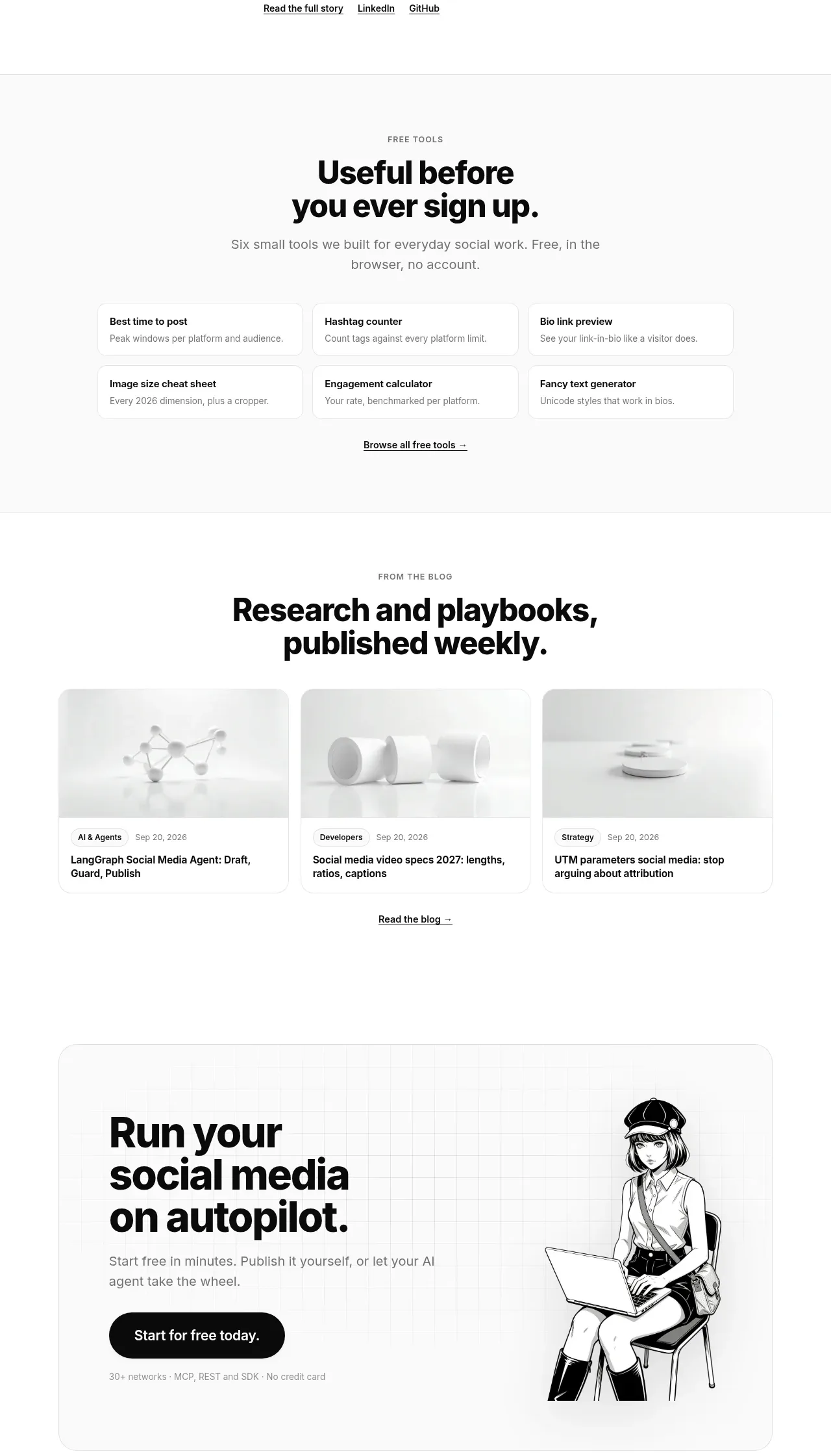
The lower page groups a founder story, a free-tools grid, and a three-card blog preview, creating trust and useful content before the final conversion block.
Prompt preview
## Reference images

Study these alongside the description below: hierarchy, rhythm, spacing, colour. Build for the product you are asked about, using this design language.

- Component: https://kage-design-assets.t3.tigrisfiles.io/components/postsider/9db522ee-ab56-4492-bd61-aeca6aa2f318-1790057110-10.webp
- Full page it was cut from: https://kage-design-assets.t3.tigrisfiles.io/screenshots/postsider/9db522ee-ab56-4492-bd61-aeca6aa2f318-1790056967277-full.webp
- Component on Kage: https://kage.design/component/postsider-gallery

## Before you start
Ask what proof, educational resources, free tools, and editorial content the user's product can offer. Use real people and assets only when the user supplies permission and source material.

Build a resources area with three distinct subsections. First, make a compact founder or company-story row with a small circular portrait or neutral avatar, an eyebrow, bold statement, short bio, and text links. Second, create a centered free-tools heading followed by six compact cards in a 3×2 grid; each card has a title and one-line utility description. Third, create a centered editorial heading and three equal article cards with restrained original thumbnails, category/date metadata, title, and a read-more link. Use white surfaces, #eeeeee borders, 12–16px radii, consistent card padding, and subtle hover lift. Keep each subsection visually separated by whitespace and responsive stacking.

Never: use logos, product names, copy, illustrations, or imagery from the reference.