kage
kage
postsider.com

Design analysis
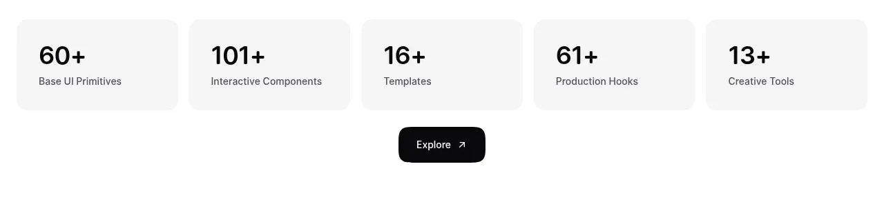
A narrow light strip presents five evenly spaced quantitative claims, making product scale and trial reassurance scannable immediately after the dark capability section.
Prompt preview
## Reference images

Study these alongside the description below: hierarchy, rhythm, spacing, colour. Build for the product you are asked about, using this design language.

- Component: https://kage-design-assets.t3.tigrisfiles.io/components/postsider/9db522ee-ab56-4492-bd61-aeca6aa2f318-1790057108-4.webp
- Full page it was cut from: https://kage-design-assets.t3.tigrisfiles.io/screenshots/postsider/9db522ee-ab56-4492-bd61-aeca6aa2f318-1790056967277-full.webp
- Component on Kage: https://kage.design/component/postsider-stats

## Before you start
Ask which verified numbers best communicate scale, reliability, or customer value for the user's product. Use only truthful, product-specific metrics.

Build a full-width metrics strip with a very light background and a thin top and bottom divider. Arrange five equal columns on desktop, each with a large bold value in #111 and a compact two-line label in #777. Use generous horizontal padding, consistent baseline alignment, and responsive wrapping into two rows on small screens. Keep the strip quiet and factual; no icons are necessary. Add a small hover or focus state only if a metric links to evidence.

Never: use logos, product names, copy, illustrations, or imagery from the reference.