 kage
kage
prisma.io

Design analysis
This section makes pricing feel concrete by pairing a concise value proposition with proof points, then comparing the user's existing stack against a simpler product-led option. Scenario tabs and side-by-side cards turn an abstract pricing decision into a scannable, outcome-focused comparison.
Prompt preview
## Reference images

Study these alongside the description below: hierarchy, rhythm, spacing, colour. Build for the product you are asked about, using this design language.

- Component: https://kage-design-assets.t3.tigrisfiles.io/components/prisma-io/a9579200-8b41-4bc5-a193-79d074877e51-1789073820-7.webp
- Full page it was cut from: https://kage-design-assets.t3.tigrisfiles.io/screenshots/prisma-io/a9579200-8b41-4bc5-a193-79d074877e51-1789073789-full.webp
- Component on Kage: https://kage.design/component/prisma-pricing-table

## Before you start
Ask the user what their product is, who it serves, what is being priced, and what their brand voice and visual identity are. Then apply the following principles to create an original pricing-comparison section for that product—not a copy of the reference.

## Build this section
Create a responsive pricing comparison section that explains why the product scales well, supports the claim with a compact benefits list, and gives visitors a clear path to inspect pricing.

### Layout and alignment
- Use a spacious, centered section with a maximum width of roughly 1180–1240px and generous vertical padding.
- Start with a two-column introduction on desktop: a left column for the headline, explanatory paragraph, and primary CTA; a right column for 5–6 concise benefit statements.
- Align both columns to the top. Keep the text column narrower than the benefits column so the headline remains highly legible.
- Place the comparison module below the introduction with a small horizontal scenario selector. Scenarios should represent meaningful customer contexts or usage levels, not arbitrary plan names.
- Under the selector, show two large comparison cards: an incumbent/current-stack option on the left and the product's preferred option on the right. On small screens, stack the intro columns and cards vertically; make the scenario selector horizontally scrollable or wrap cleanly.
- Use a subtle full-width comparison backdrop behind the cards, with a very restrained, soft multi-colour glow or gradient only if it fits the user's brand.

### Typography hierarchy
- Use a modern sans-serif or the user's existing brand typeface.
- Make the headline large and compact, approximately 44–52px on desktop, 36–42px on mobile, with tight line height around 0.98–1.08 and medium-to-bold weight.
- Use 16–18px body text with 1.5–1.65 line height and a muted neutral colour.
- Benefit statements should be around 15–16px. Bold the meaningful clause and use regular weight for its explanation.
- In cards, make the option label 14–16px semibold, the price or estimated range 36–42px, and supporting billing text 12–14px.
- Keep labels, metadata, and scenario volume descriptors visibly smaller than primary content.

### Content structure
- Write a headline about predictable growth, fit, savings, or reduced complexity.
- Add a short paragraph that explains the pricing model in plain language and reduces anxiety around hidden costs.
- Use checkmark-led benefits on the right. Each item should communicate one concrete advantage, such as predictable limits, included usage, transparent billing, or security coverage.
- Include one high-contrast CTA with action-oriented text such as “Explore pricing” or “Compare plans.”
- Make the two cards intentionally contrast the current approach with the proposed approach. The first may show fragmented costs or trade-offs; the second should show a consolidated price and 3–4 clear advantages.
- Do not invent regulated certifications, savings claims, or exact pricing unless the user provides them. Use realistic placeholders where necessary.

### Colour and visual language
- Default to a warm or neutral near-white page background, approximately #FFFFFF or #FAFAF8.
- Use near-black text around #171717 and secondary text around #6B6B6B.
- Use an accent checkmark colour suited to the user's brand; a restrained teal around #18AAA8 works as a neutral starting point.
- Use a near-black primary button around #111111 with white text, or the user's brand primary colour. Add a subtle hover transition rather than a dramatic effect.
- Keep the comparison surface very light, around #F7F7F6, with an optional blurred pastel glow using low-opacity cyan, yellow, pink, or the brand's accent colours.
- Avoid excessive gradients, saturation, or decorative effects that compete with the pricing information.

### Borders, radius, and spacing
- Use 1px borders in a light neutral such as #E7E7E5.
- Give cards a generous radius around 14–18px and the selector a radius around 12–16px.
- Use approximately 32–48px between the introduction and comparison module, 20–28px card padding, and 14–18px between list items.
- Give the primary CTA a pill-like radius around 999px, with comfortable horizontal padding and a minimum height of 46px.
- Preserve generous whitespace around the headline and do not let card content become cramped.

### Interaction and accessibility
- Scenario tabs should be real buttons with selected, hover, focus, and keyboard states. Updating a scenario should change the relevant prices, labels, or comparison details without a full page reload.
- Clearly indicate the active scenario using a stronger background, border, or text colour—not colour alone.
- Use semantic headings, lists, buttons, and accessible labels. Ensure check and cross symbols have text equivalents or are paired with meaningful copy.
- Keep comparison heights stable where practical to avoid distracting layout shifts.
- Make the CTA and tabs easy to tap on touch devices, with at least roughly 44px hit areas.
- Respect reduced-motion preferences and use only subtle transitions.

## Never
- Never reuse the reference product's logo, product name, pricing, copy, claims, certification list, or exact wording.
- Never copy the reference layout pixel-for-pixel; adapt the structure to the user's product, audience, and brand.
- Never include logos, product names, copy, illustrations, or imagery from the reference.
- Never fabricate pricing, savings, security certifications, usage limits, or customer outcomes.
- Never hide important pricing conditions behind hover-only interactions or make the comparison inaccessible on mobile.
More components
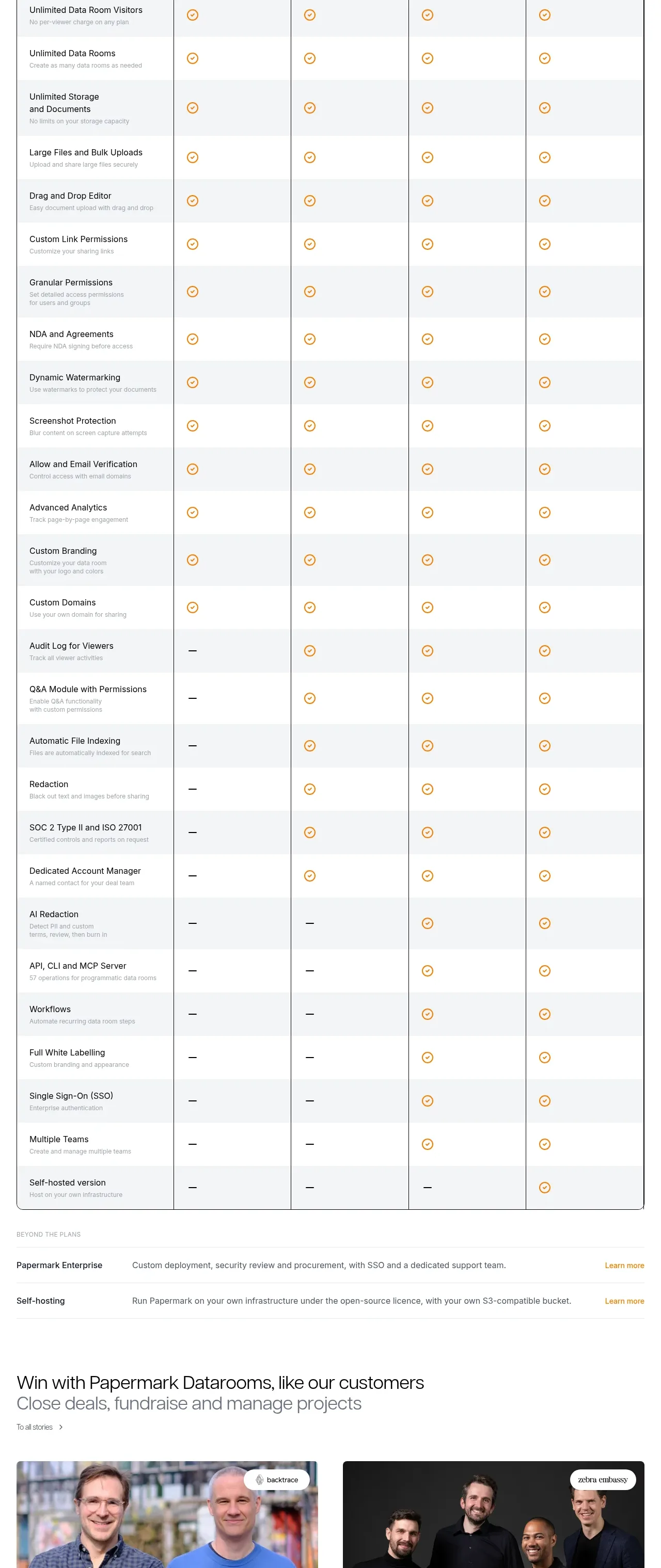
 Plan comparison table
Papermark Data Rooms · Pricing table
Plan comparison table
Papermark Data Rooms · Pricing table
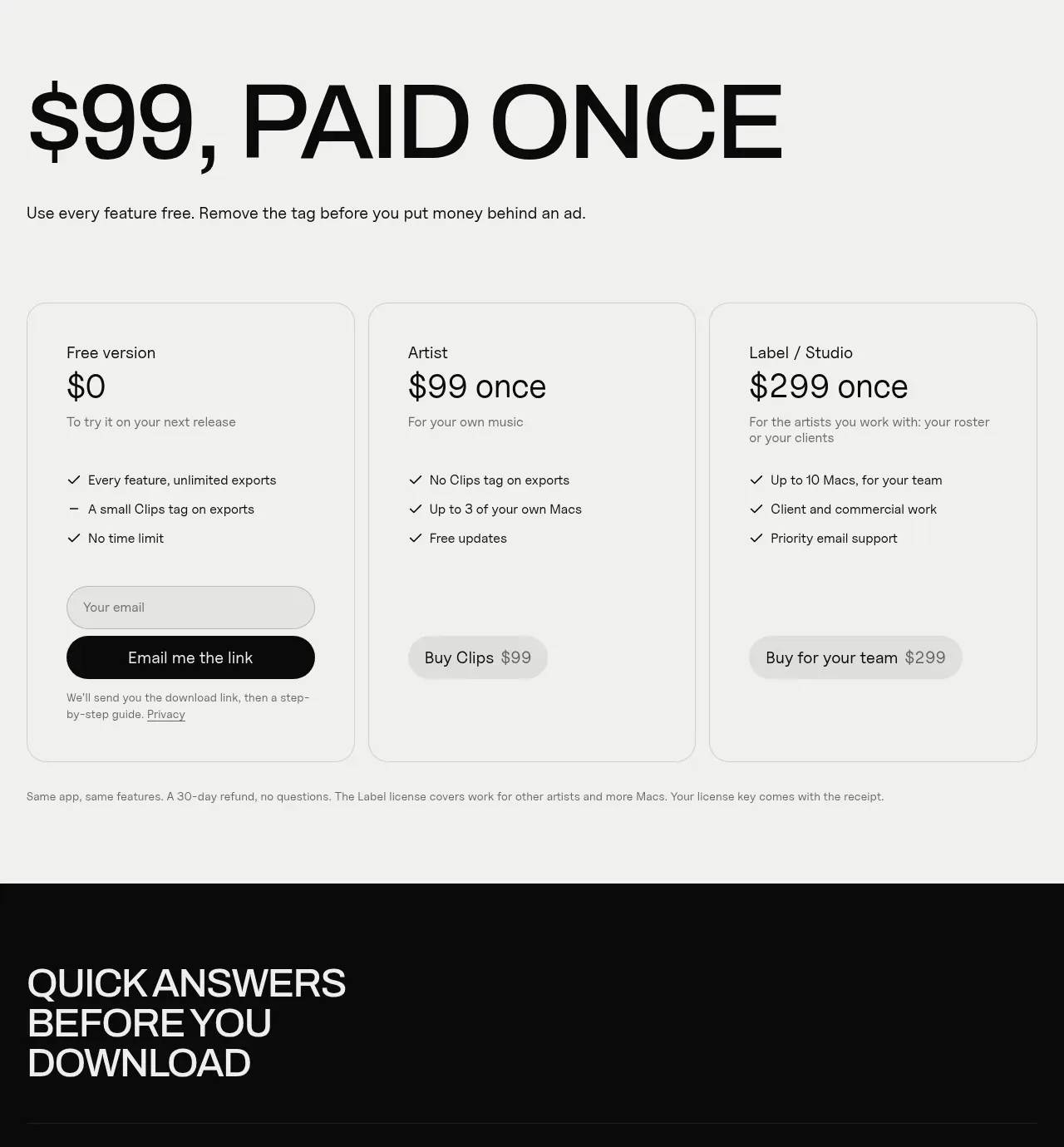
 One-time purchase pricing
Clips by Plastic · Pricing table
One-time purchase pricing
Clips by Plastic · Pricing table
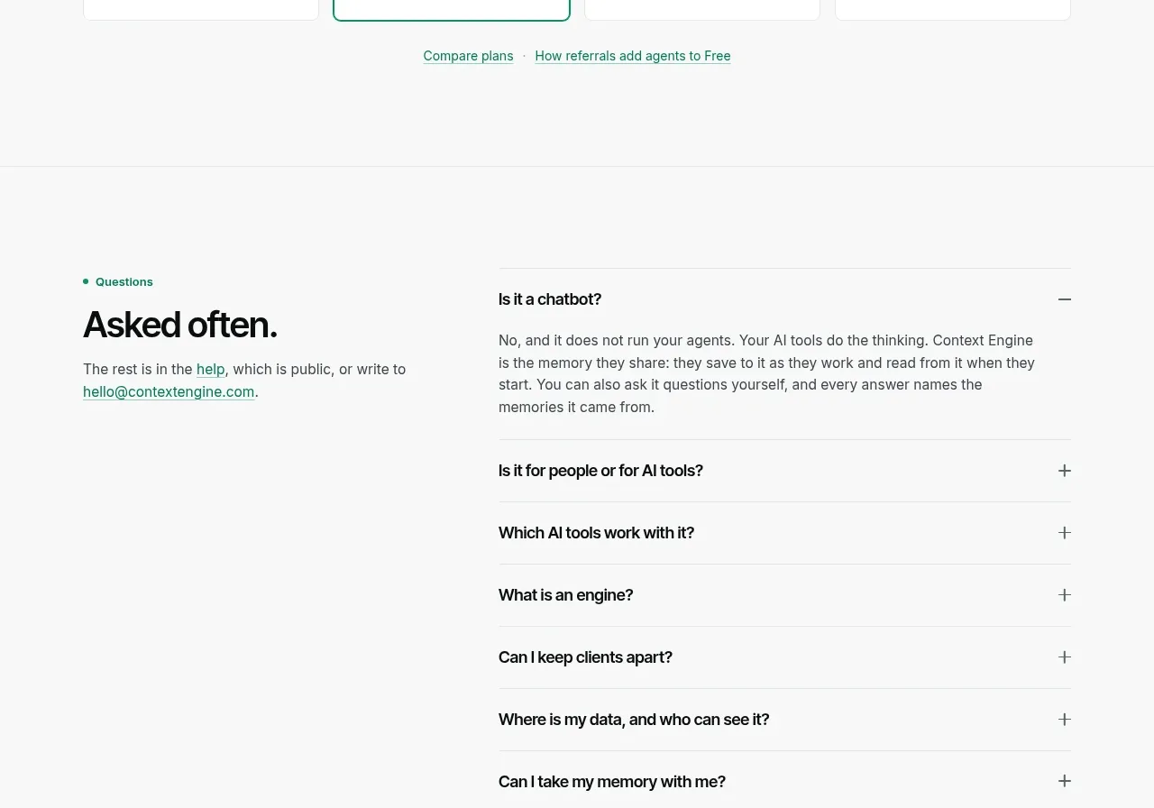
 Per-unit pricing table
Context Engine · Pricing table
Per-unit pricing table
Context Engine · Pricing table
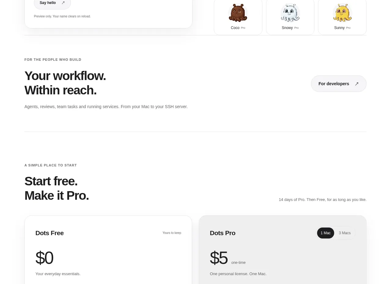
 Free and pro pricing cards
Dots · Pricing table
Free and pro pricing cards
Dots · Pricing table
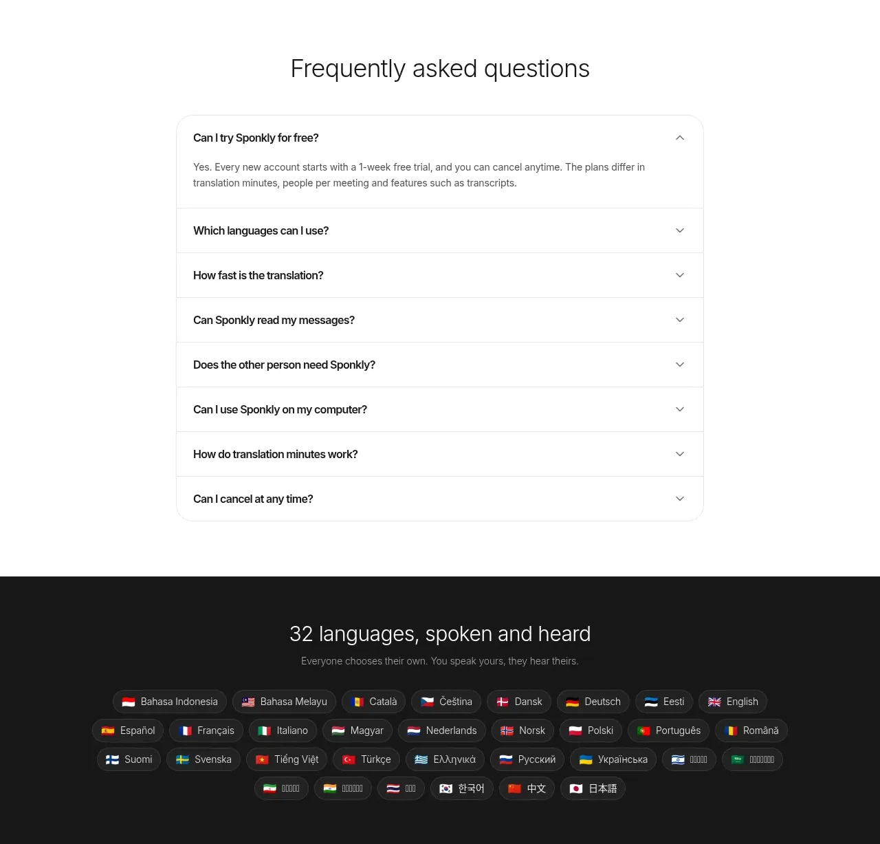
 Transparent multi-tier pricing
Sponkly · Pricing table
Transparent multi-tier pricing
Sponkly · Pricing table
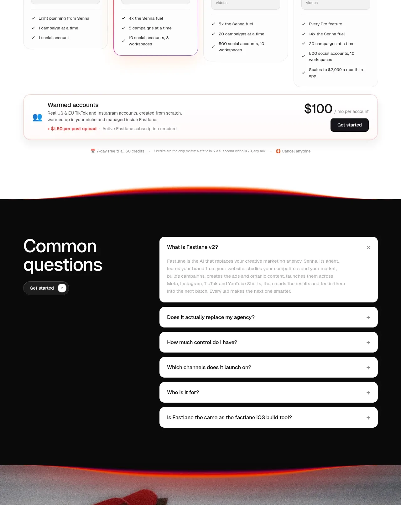
 Four-tier pricing table
Fastlane 2.0 · Pricing table
Four-tier pricing table
Fastlane 2.0 · Pricing table