kage
kage
prisma.io

Design analysis
A white canvas with near-black display type, black pill CTAs and soft pastel gradient washes (mint-to-pink) that frame the hero, product mockups and closing CTA, punctuated by Prisma's cyan/yellow/coral ribbon motif. The page alternates rhythm down its length: a centered hero with a console mockup, a grayscale logo band, a before/after comparison pair, three tinted step cards, alternating product rows linked by file-chip connectors, a tabbed cost-comparison card, a testimonial grid, a FAQ accordion, and a gradient CTA card before a light footer that ends in a giant cropped wordmark. Hierarchy is carried almost entirely by type scale and hairline-bordered white cards, keeping dense product information airy.
Prompt preview
## Reference images

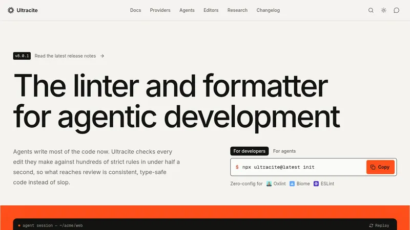
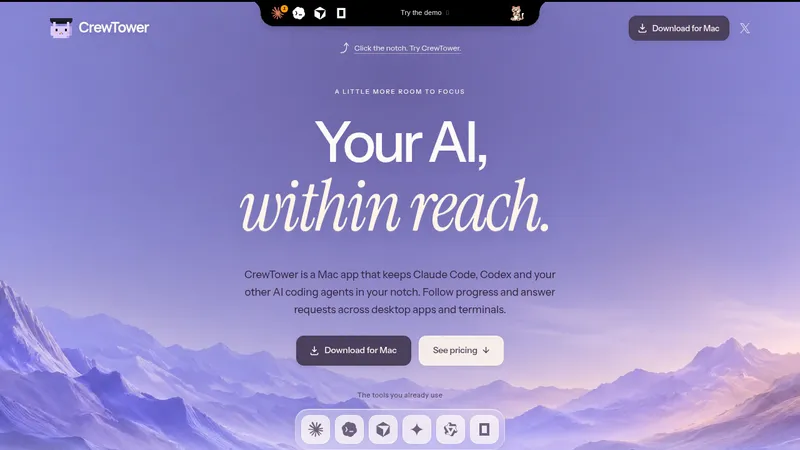
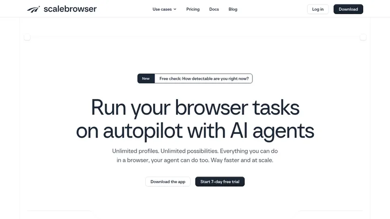
Study these alongside the description below: hierarchy, rhythm, spacing, colour. Build for the product you are asked about, using this design language.

- Full page: https://kage-design-assets.t3.tigrisfiles.io/screenshots/prisma-io/a9579200-8b41-4bc5-a193-79d074877e51-1789073789-full.webp
- Above the fold: https://kage-design-assets.t3.tigrisfiles.io/screenshots/prisma-io/a9579200-8b41-4bc5-a193-79d074877e51-1789073656522.webp
- Design on Kage: https://kage.design/designs/prisma-landing-page

## Before you start
Ask the user what product they are building, who it is for, and what brand assets they already have (name, logo, colours, typeface). Wait for the answers before writing any code. Apply the design language below to *their* product — do not reproduce this reference site's name, copy, logos, illustrations or imagery.

## Page structure
Build a single long marketing homepage in this order:
1. **Announcement bar** — slim full-width dark strip at the very top: one-line event/announcement text, a small pill button on the right, and a dismiss ×. Keep it 40–48px tall.
2. **Navigation** — logo left; centred nav links (one with a dropdown caret); right side: search icon, text link, and a black pill CTA. White background, hairline bottom border.
3. **Hero** — centred. Large display headline (2 lines), a 2–3 sentence gray sub-paragraph, a row of three short checkmark claims, then a dual CTA row (black pill + outlined pill). Under that, a slim social-proof stat row (three small facts separated with dots). Close the hero with a large product-console mockup card sitting on a soft pastel gradient wash with a colourful ribbon graphic running behind it.
4. **Logo band** — tiny uppercase eyebrow ("Trusted by…") plus one row of grayscale customer logos, evenly spaced.
5. **Before/After comparison** — centred H2, then two side-by-side cards: "Before" deliberately dull (grayed-out panels, red ✗ bullet list of pains) vs "After" crisp (clean mockup, dark button, green ✓ bullet list of gains). This contrast is the section's whole idea.
6. **Three steps** — left-aligned H2, then three equal cards. Each card: a mockup thumbnail on a different pastel tint (mint / cream / pink), a numbered label (1 · 2 · 3), a short title, and 2–3 lines of body. One outlined pill CTA below the row, left-aligned.
7. **Integrated stack** — centred H2 + one-line subtitle. Then three alternating product rows (text block with bullets and "Learn more →" link on one side, rich mockup card on the other, swapping sides each row). Between rows, join them with a small pill "file chip" naming a shared config file and a one-line caption — it visually threads the products together. End the section with a two-column utility row (two small feature blurbs with icons).
8. **Value proposition** — left-aligned H2 with three icon + title + line bullet blocks stacked beneath; right side holds one large supporting visual (e.g. a circular loop diagram with the user's agent at the centre).
9. **Pricing** — left column: H2, short paragraph, black pill CTA; right column: five–six green ✓ claims. Below, a comparison card with three plan-size tabs on top and two panels inside: a plain panel for the "typical stack" price with red ✗ caveats, and a highlighted white panel for this product's cheaper range with green ✓ points.
10. **Testimonials** — centred H2, then a 2-row × 4-column grid of borderless quote cards: quote text, small round avatar, name, role.
11. **FAQ** — centred H2 and a single-column accordion (6–7 questions, first one expanded by default, hairline separators).
12. **Final CTA** — full-width rounded card filled with the pastel gradient: centred H2, one-line sub, a row of three checkmark claims, dual CTA row (black pill + outlined pill).
13. **Footer** — light background: logo + one-paragraph description + contact email + social icons on the left; four link columns (Product / Company / Resources / Social) on the right; a legal bar (©, Privacy, Terms, …); and finish with a giant cropped brand wordmark in black across the full page width, clipped at the bottom edge.

## Design language
- **Base & hierarchy**: white (#ffffff) canvas; near-black text (#141419) for headings, gray (#6f6f78) for body. Hierarchy comes from a big scale jump — hero ~64–76px, section H2 ~40–44px, body 16–17px, small uppercase 12px eyebrows with wide letter-spacing — not from colour.
- **Buttons**: primary is a black pill (#141419, white text, fully rounded); secondary is a white pill with a 1px gray border; tertiary links are text with "→". Never gradient buttons.
- **Pastel gradients**: use soft multi-colour washes only as *frames* — behind the hero mockup, behind mockup cards, and on the closing CTA card. Blend mint (#d7f3e8 → #7de3c0), pink (#fbd2de → #ffb3c7), and cream (#fdf0cf); always low saturation, never touching the text.
- **Ribbon accent**: one signature graphic element (a striped ribbon in 3 brand hues — cyan #4fd8e0, yellow #ffd45e, coral #ff7a76) used sparingly: once behind the hero mockup, once inside a product card. This is the only loud colour on the page.
- **Cards & mockups**: white cards, 12–16px radius, 1px hairline border (#e8e8ec), near-flat shadows (0 1px 2px rgba(0,0,0,.05)). Product mockups are framed as believable app UIs (sidebar + content + terminal snippet) in miniature; step-card thumbnails sit on pastel-tinted panels.
- **Lists with semantic marks**: green ✓ (#22a06b) for benefits, muted red ✗ (#f0705f) for pains/competitor caveats — consistent across hero claims, before/after, and pricing.
- **Rhythm & density**: alternate centred and left-aligned sections so no two consecutive sections align the same way; vertical padding ~96–120px between sections, tighter (~40px) inside card clusters; use small connector chips between related rows to create narrative flow.
- **Comparison pattern**: tabbed scenario switcher above a two-panel cost comparison — the competitor panel stays visually quiet, your panel is elevated (white card, border, slight lift).
- **Motion**: restrained — accordion expand/collapse, card hover lift of 1–2px, no parallax or heavy animation.
- **Typeface**: one geometric sans throughout, medium weight for headings, regular for body; tighten letter-spacing slightly on large sizes.

## Never
- Do not use the Prisma name, logo, wordmark, console copy, testimonial text or quotes, customer logos, or its ribbon/cylinder illustrations and icon set.
- Do not clone the page's copy, pricing numbers, product claims, or present the result as Prisma.
- Do not reuse competitor names (Neon, Vercel, Drizzle, Vercel/Neon stack) from the reference; if a comparison is needed, use the user's actual competitors or neutral placeholders.
Components from this page
All components
 Announcement Bar and Floating Navigation
prisma.io · Navigation
Announcement Bar and Floating Navigation
prisma.io · Navigation
 Product platform hero
prisma.io · Hero
Product platform hero
prisma.io · Hero
 Trusted-by logo strip
prisma.io · Logo cloud
Trusted-by logo strip
prisma.io · Logo cloud
 Before-and-after feature comparison
prisma.io · Feature grid
Before-and-after feature comparison
prisma.io · Feature grid
 Three-step feature card grid
prisma.io · Feature grid
Three-step feature card grid
prisma.io · Feature grid
 Integrated product stack feature grid
prisma.io · Feature grid
Integrated product stack feature grid
prisma.io · Feature grid
 Integrated feature grid
prisma.io · Feature grid
Integrated feature grid
prisma.io · Feature grid
 Outcome-led pricing comparison
prisma.io · Pricing table
Outcome-led pricing comparison
prisma.io · Pricing table
 Horizontal testimonial grid
prisma.io · Testimonials
Horizontal testimonial grid
prisma.io · Testimonials
 Minimal accordion FAQ
prisma.io · FAQ
Minimal accordion FAQ
prisma.io · FAQ
 Atmospheric full-loop CTA
prisma.io · Call to action
Atmospheric full-loop CTA
prisma.io · Call to action
 Branded multi-column footer
prisma.io · Footer
Branded multi-column footer
prisma.io · Footer