 kage
kage
procboss.com
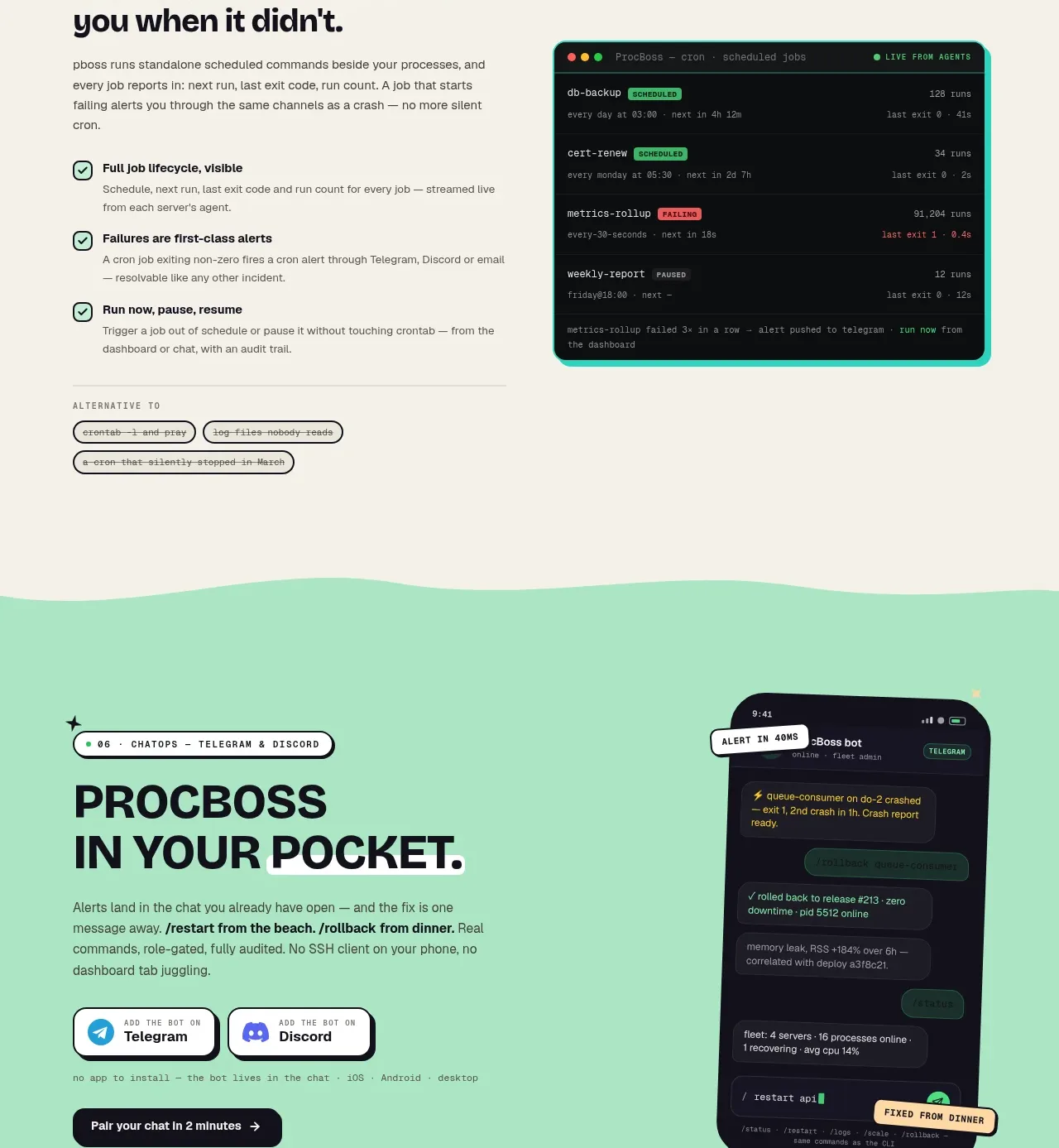
Design analysis
A mint CTA section translates the product into an approachable mobile/chat experience, pairing a bold headline and integration buttons with a tilted phone visual.
Prompt preview
## Reference images

Study these alongside the description below: hierarchy, rhythm, spacing, colour. Build for the product you are asked about, using this design language.

- Component: https://kage-design-assets.t3.tigrisfiles.io/components/procboss/3737396f-2984-4e55-9600-739ab09d7da3-1791525906-6.webp
- Full page it was cut from: https://kage-design-assets.t3.tigrisfiles.io/screenshots/procboss/3737396f-2984-4e55-9600-739ab09d7da3-1791525801598-full.webp
- Component on Kage: https://kage.design/component/procboss-cta

## Before you start
Ask what the user's strongest secondary conversion is and which devices or integrations make it feel immediate. Use the user's product and brand instead of the reference details.

Build a full-width mint CTA band with a soft organic top and bottom transition. Use a two-column layout: left side has a small eyebrow, large compact headline, reassuring paragraph, two integration or platform buttons, and a dark primary action; right side has a single product-on-phone or relevant mobile visual, angled slightly for energy. Include small supporting metadata beneath the buttons. Keep the composition spacious and playful but functional, with #A8E5C1, #171720, cream surfaces, 2px outlines, and 18–28px radii. On mobile place the visual below the copy and remove the rotation if it causes clipping.

Never copy the reference's logos, product names, copy, illustrations or imagery.
More components
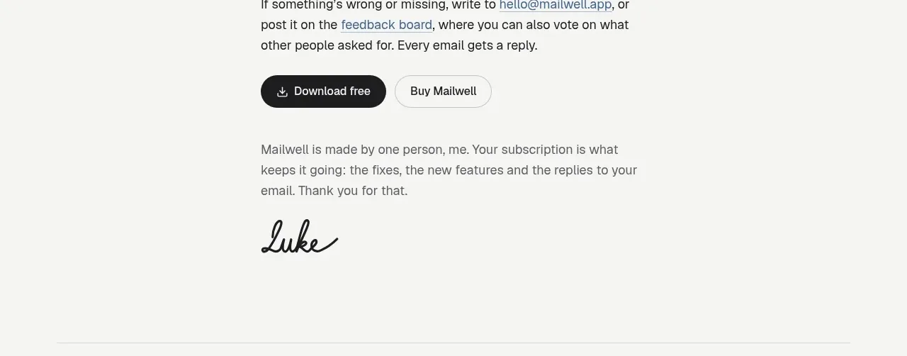
 Trial and purchase call to action
Mailwell · Call to action
Trial and purchase call to action
Mailwell · Call to action

 Dark final conversion band
ProcBoss · Call to action
Dark final conversion band
ProcBoss · Call to action
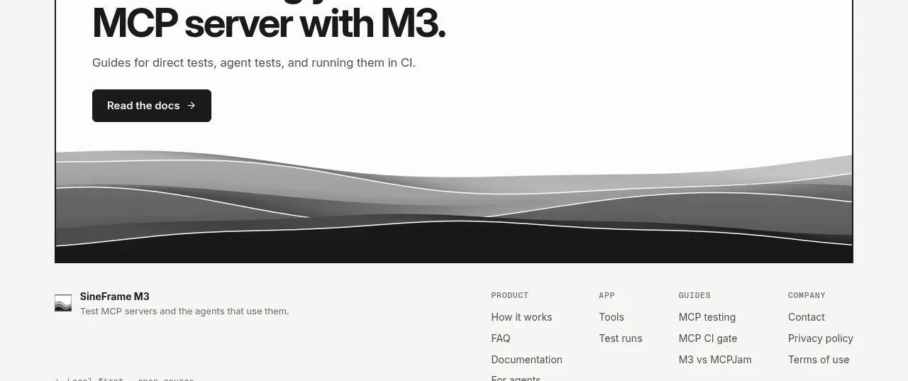
 Documentation call to action
SineFrame M3 · Call to action
Documentation call to action
SineFrame M3 · Call to action
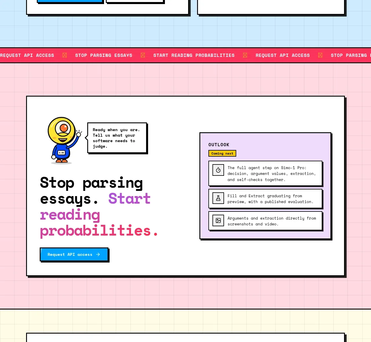
 Conversion call to action
Simo · Call to action
Conversion call to action
Simo · Call to action
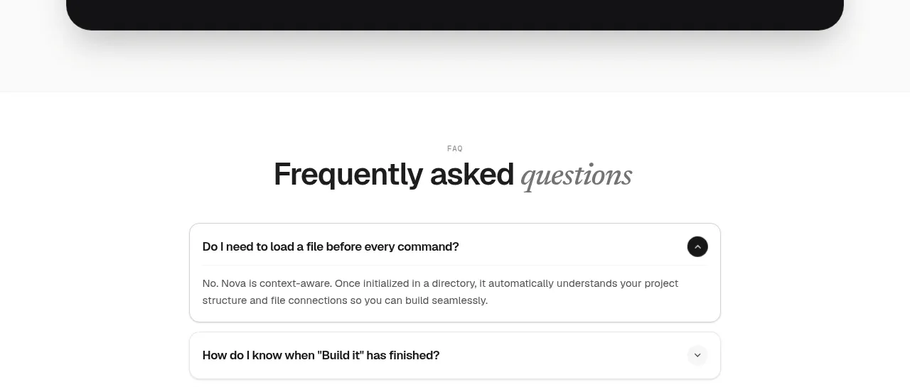
 Install command CTA
NOVA CLI v1.0 · Call to action
Install command CTA
NOVA CLI v1.0 · Call to action

 Manifesto statement
Hark · Call to action
Manifesto statement
Hark · Call to action