kage
kage
procboss.com

Design analysis
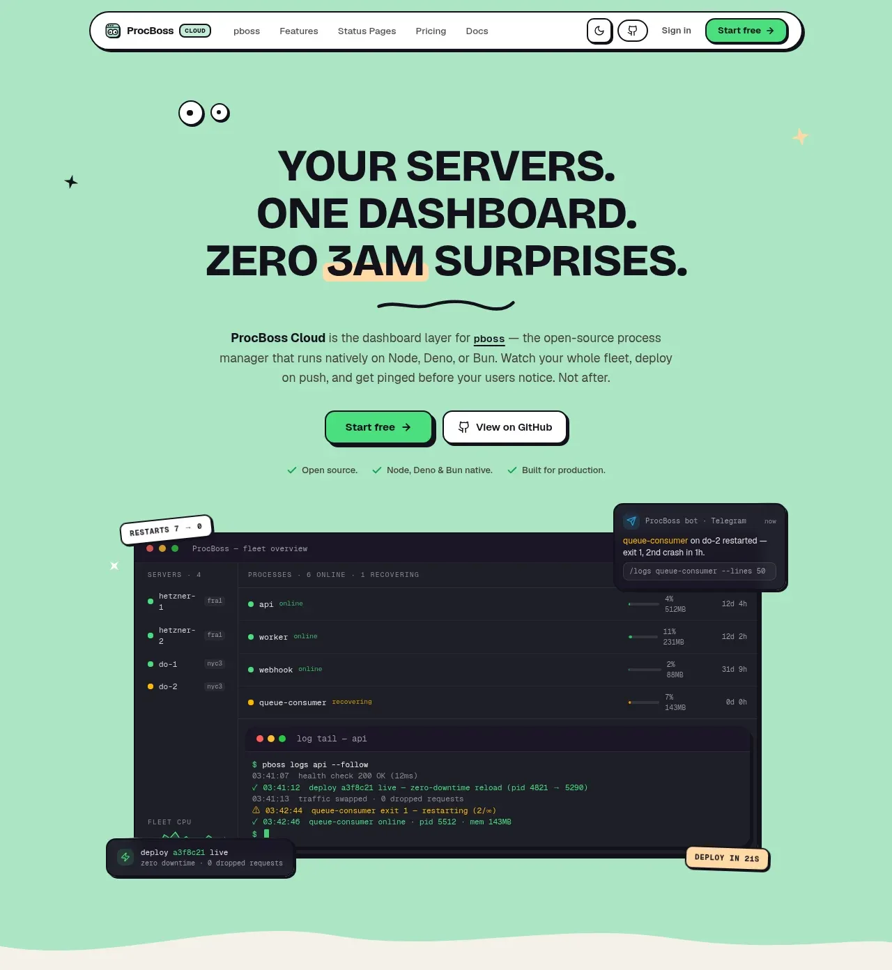
A long-form infrastructure product page uses a mint, cream, and near-black palette with oversized condensed-looking bold headlines, hand-drawn star accents, pill labels, and thick black outlines. The page shifts rhythm from a spacious hero with a dark dashboard mockup, to cream feature explanations and alternating product panels, then into a mint command-center grid, detailed deployment sections, a phone/chat block, pricing, testimonials, FAQ, and a dark closing CTA/footer; wavy separators make each major colour chapter feel distinct.
Prompt preview
## Reference images

Study these alongside the description below: hierarchy, rhythm, spacing, colour. Build for the product you are asked about, using this design language.

- Full page: https://kage-design-assets.t3.tigrisfiles.io/screenshots/procboss/3737396f-2984-4e55-9600-739ab09d7da3-1791525801598-full.webp
- Above the fold: https://kage-design-assets.t3.tigrisfiles.io/screenshots/procboss/3737396f-2984-4e55-9600-739ab09d7da3-1791525796889.webp
- Design on Kage: https://kage.design/designs/procboss-landing-page

## Before you start
Ask the user what they are building, who it is for, and what brand assets they already have (product name, colours, typefaces, logo or other visual assets). Wait for their answers before designing. Apply the system below to their product, not to the reference product, and use their brand assets wherever available.

## Page structure
Build a long-form product landing page from top to bottom:
1. **Floating navigation** — A compact white pill-shaped navbar sits near the top with a small product mark, links, utility controls, sign-in text, and a bright primary CTA.
2. **Hero section** — Use a large mint-green field with tiny star/eye-like decorative marks, a centered three-line headline, short explanatory paragraph, paired CTAs, proof bullets, and a large dark dashboard/terminal product mockup anchored below the copy. Add small floating status callouts around the mockup.
3. **Open-core foundation section** — Transition with a soft wavy edge into a warm cream background. Use a two-column layout: a bold stacked heading and explanatory copy/checklist on the left, and a dark terminal card with performance metric tiles on the right. Follow it with a bordered quote callout spanning the content width.
4. **CLI/processes section** — On cream, center a small pill eyebrow, a two-line headline, and a short paragraph. Below, show three bordered cards in a row describing operational problems or workflows; use two light cards and one dark card for contrast.
5. **Command-center overview** — Change to a mint background with a wavy transition. Center the section heading and supporting copy, then present four large feature cards in a 2x2 grid. Give each card a distinct restrained accent colour and include miniature dashboard/status visualizations inside.
6. **Cloud-layer introduction** — Return to cream with a centered eyebrow, heading, and paragraph introducing the expanded product layer.
7. **Deployment feature sequence** — Create five alternating two-column feature rows, numbered with pill labels: deploy, fleet, alerts, crash analysis, and scheduled jobs. Each row pairs a left or right text block containing a heading, paragraph, three checkmarked benefits, and small alternative-tool pills with a framed terminal/dashboard illustration on the opposite side. Alternate image placement to create a steady zig-zag rhythm.
8. **ChatOps/mobile section** — Use another mint wave section. Place a bold left-aligned heading, supporting copy, Telegram/Discord-style action buttons, and a dark phone mockup on the right, with small decorative stars and a dark CTA.
9. **Pricing section** — Return to cream. Center the pricing eyebrow, headline, description, and monthly/annual toggle. Show four bordered pricing cards in a row, emphasize the recommended middle tier with mint fill and a small badge, then add a full-width enterprise strip beneath.
10. **Social proof and FAQ section** — Switch to mint. Add a star rating and centered “wall of love” style heading, followed by six testimonial cards in a 3x2 grid with small avatar/role badges. Under that, add a centered FAQ heading and two-column rows of rounded accordion bars.
11. **Closing CTA and footer** — Transition with a wavy edge into a near-black footer. First show small open-source/stat counters, then a centered final CTA with large light headline, supporting copy, paired buttons, and three onboarding/resource cards. Finish with a multi-column footer navigation, compact product description, legal links, and a thin bottom metadata row.

## Design language
- Build hierarchy through very large, heavy, tightly stacked headlines, short eyebrow labels in outlined capsules, and compact supporting text. Use a display sans or condensed grotesk for headings and a plain readable sans for body copy; use uppercase micro-labels and generous tracking for metadata.
- Let the page rhythm change by chapter: spacious centered hero, dense two-column explanation, compact three-card problem section, structured 2x2 feature grid, then long alternating feature rows with more technical detail. Keep content inside a centered max-width and use generous vertical padding between colour chapters.
- Use a limited palette: mint around `#A9E5C5` / `#BCEFD4`, warm cream around `#F5F1E7`, near-black around `#11101B`, white around `#FCFCF8`, and bright green CTA accents around `#42E883`. Add small restrained yellow, orange, lavender, or red accents only for status states and card variation.
- Treat colour as a structural device. Mint marks product optimism and feature chapters, cream carries explanatory/product-detail content, and near-black is reserved for terminal UI, selected cards, the closing CTA, and footer. Use wavy section boundaries rather than hard rectangular transitions where possible.
- Use thick near-black outlines, approximately 2px, around cards, buttons, mockups, pricing panels, and pills. Keep radii moderate and friendly—roughly 10–16px for cards, 999px for labels and navbar controls—and use offset black shadows or layered borders sparingly to create a tactile printed-object feel.
- Render technical product visuals as dark terminal/dashboard panels with monospaced text, tiny status dots, subtle grids, green live indicators, and occasional coloured alert lines. Keep mockups legible but subordinate to the marketing hierarchy.
- Use checkmark lists, small status chips, metric tiles, quote boxes, toggle controls, and compact “alternative to” pills as recurring interface motifs. Make CTAs high-contrast, short, and visibly bordered; primary buttons use bright green while secondary buttons are white or dark.
- Add small hand-drawn-feeling stars, dots, eyes, or simple abstract marks as sparse decoration, especially near hero and CTA sections. Do not let decoration compete with text or product screens.
- Keep interaction restrained: buttons and pills should have a slight lift/offset on hover, cards can translate a few pixels with a stronger shadow, FAQ rows should expand inline, and pricing toggle changes should update visible prices without changing the layout. Use gentle reveal motion for alternating feature rows, not continuous animation.

## Never
- Do not reuse the reference product’s logos, wordmarks, product names, copy, illustrations, screenshots, icon set, or exact UI content.
- Do not present the result as ProcBoss or imply affiliation with it.
- Create original product visuals, examples, terminology, testimonials, pricing, and brand assets for the user’s product while preserving only the reusable layout and design principles.
Components from this page
All components
 Compact product navigation
ProcBoss · Navigation
Compact product navigation
ProcBoss · Navigation
 Mint dashboard hero
ProcBoss · Hero
Mint dashboard hero
ProcBoss · Hero
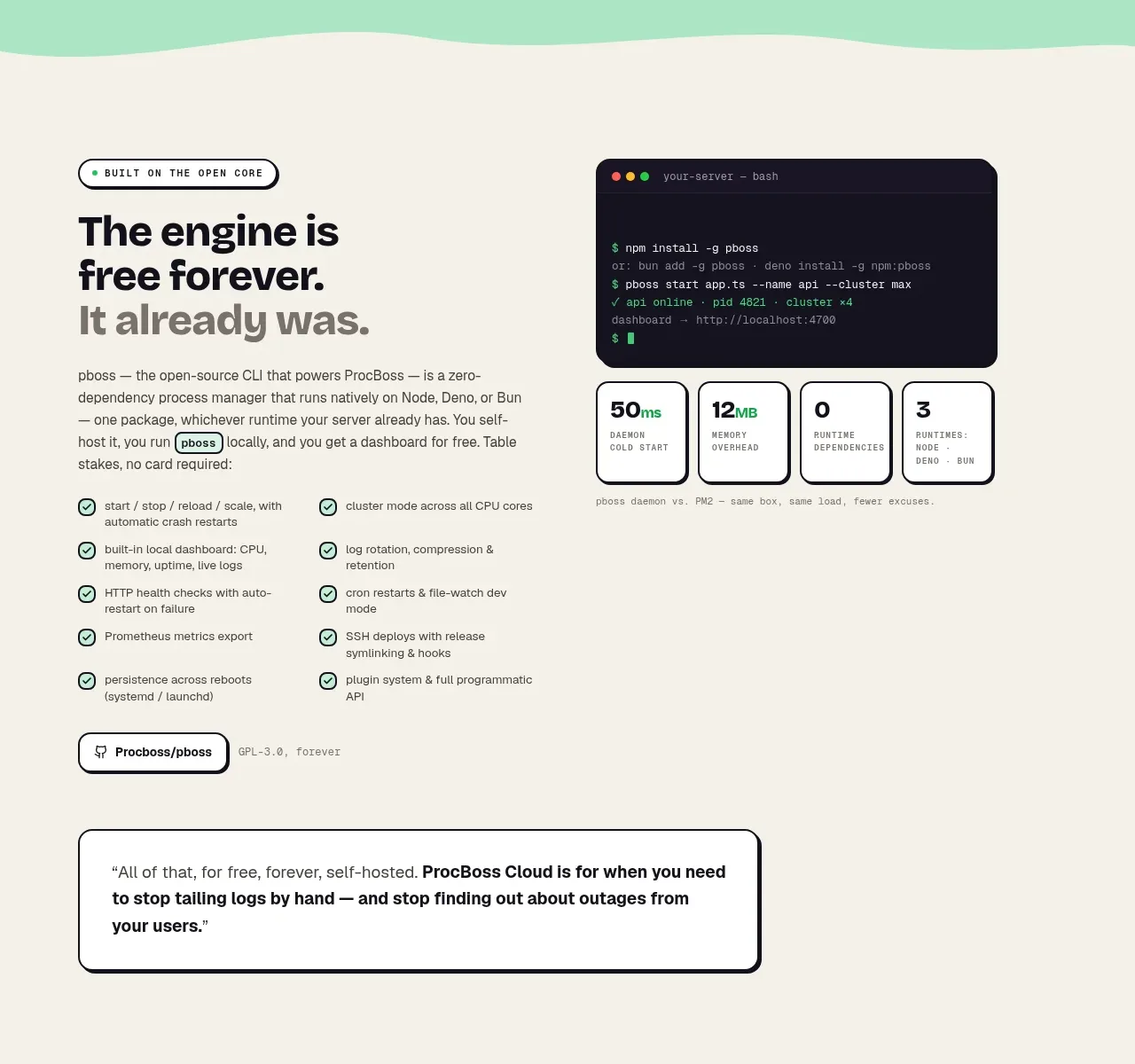 Free forever foundation
ProcBoss · Feature grid
Free forever foundation
ProcBoss · Feature grid
 Operational blind spots
ProcBoss · Feature grid
Operational blind spots
ProcBoss · Feature grid
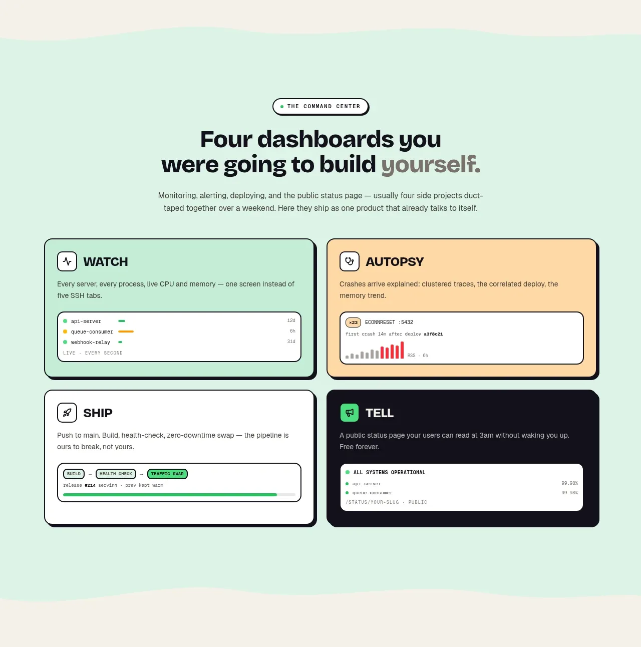 Four product surfaces
ProcBoss · Feature grid
Four product surfaces
ProcBoss · Feature grid
 Cloud layer workflows
ProcBoss · Feature grid
Cloud layer workflows
ProcBoss · Feature grid
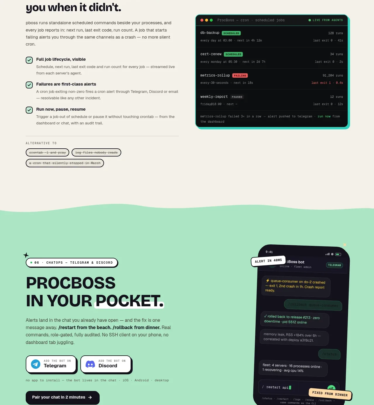 Pocket alerts call to action
ProcBoss · Call to action
Pocket alerts call to action
ProcBoss · Call to action
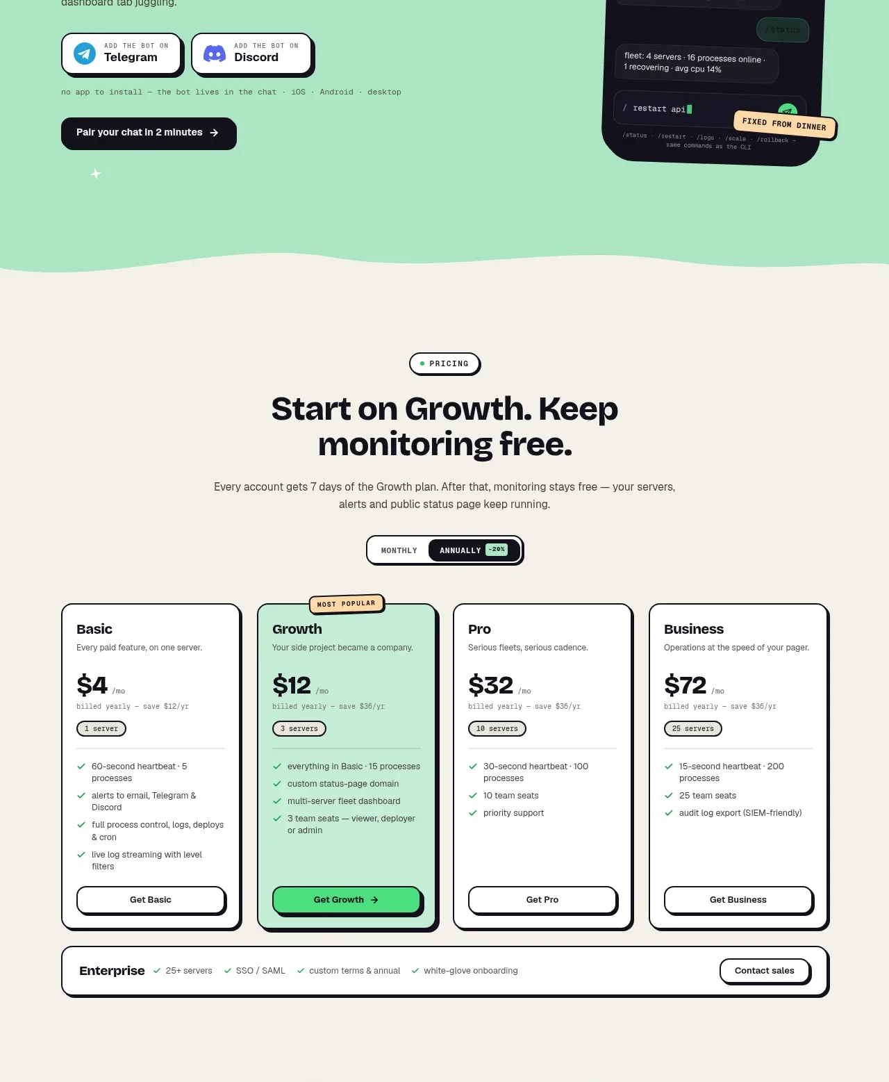 Four-tier pricing
ProcBoss · Pricing table
Four-tier pricing
ProcBoss · Pricing table
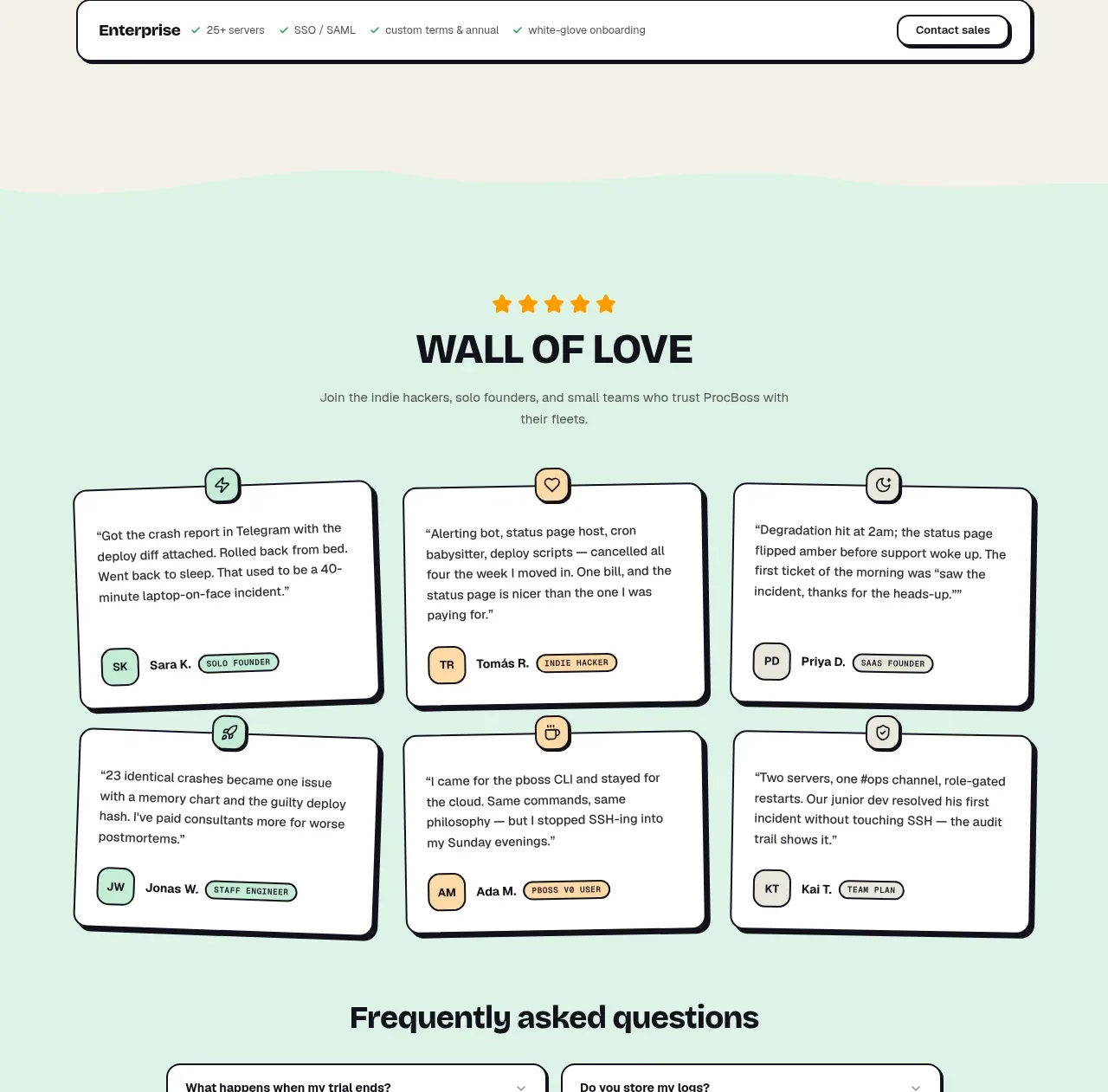 Wall of love
ProcBoss · Testimonials
Wall of love
ProcBoss · Testimonials
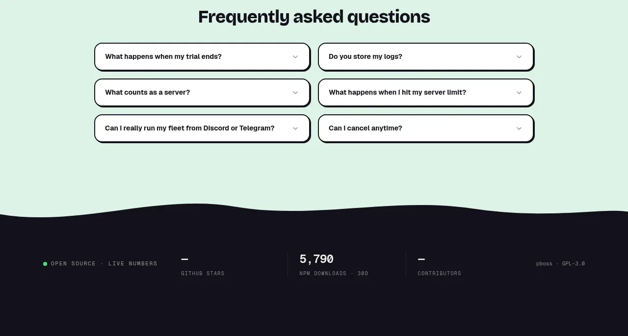 Frequently asked questions
ProcBoss · FAQ
Frequently asked questions
ProcBoss · FAQ
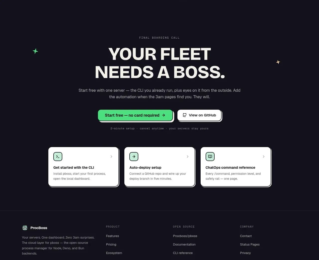 Dark final conversion band
ProcBoss · Call to action
Dark final conversion band
ProcBoss · Call to action
 Minimal dark footer
ProcBoss · Footer
Minimal dark footer
ProcBoss · Footer