 kage
kage
procboss.com

Design analysis
The dark closing band combines lightweight open-source stats, a high-impact final headline, paired CTAs, and three onboarding cards before the footer.
Prompt preview
## Reference images

Study these alongside the description below: hierarchy, rhythm, spacing, colour. Build for the product you are asked about, using this design language.

- Component: https://kage-design-assets.t3.tigrisfiles.io/components/procboss/3737396f-2984-4e55-9600-739ab09d7da3-1791525908-10.webp
- Full page it was cut from: https://kage-design-assets.t3.tigrisfiles.io/screenshots/procboss/3737396f-2984-4e55-9600-739ab09d7da3-1791525801598-full.webp
- Component on Kage: https://kage.design/component/procboss-cta-2

## Before you start
Ask what final action matters most, what friction should be removed, and which three onboarding steps help users start quickly. Adapt the promise to the user's product.

Create a near-black closing CTA band. Begin with a slim row of small credibility or ecosystem stats separated by subtle vertical rules. Center a small eyebrow, oversized light headline, concise supporting copy, and paired primary/secondary buttons. Beneath, add three compact light cards that explain the first three steps, each with a small icon, title, short description, and chevron. Use cream text, muted gray secondary text, mint or green primary action, white outlined secondary action, 1px low-contrast dividers, and 14–18px card radii. Maintain strong contrast and stack the stats, CTA, and cards gracefully on mobile.

Never copy the reference's logos, product names, copy, illustrations or imagery.
More components
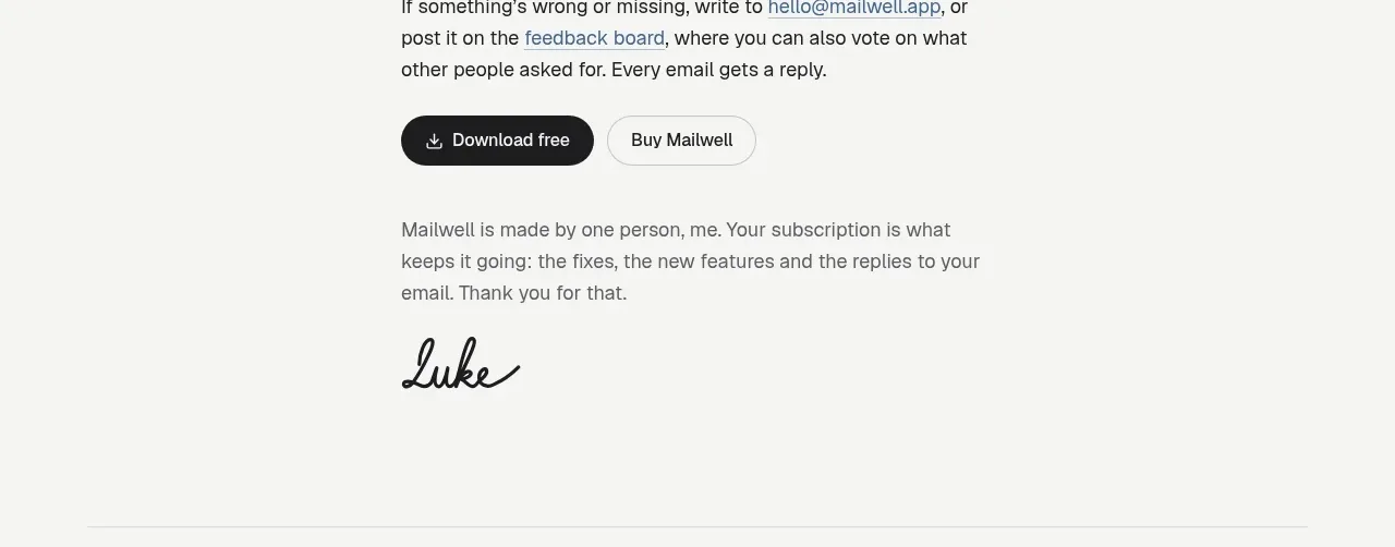
 Trial and purchase call to action
Mailwell · Call to action
Trial and purchase call to action
Mailwell · Call to action
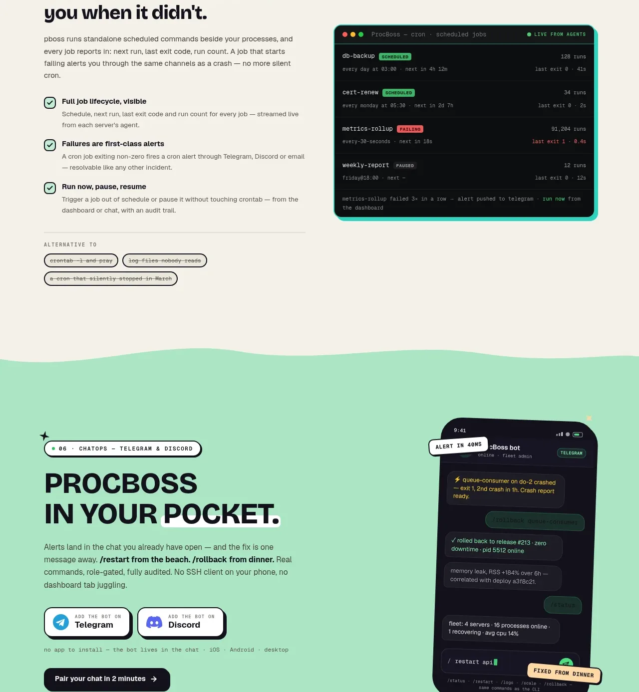
 Pocket alerts call to action
ProcBoss · Call to action
Pocket alerts call to action
ProcBoss · Call to action
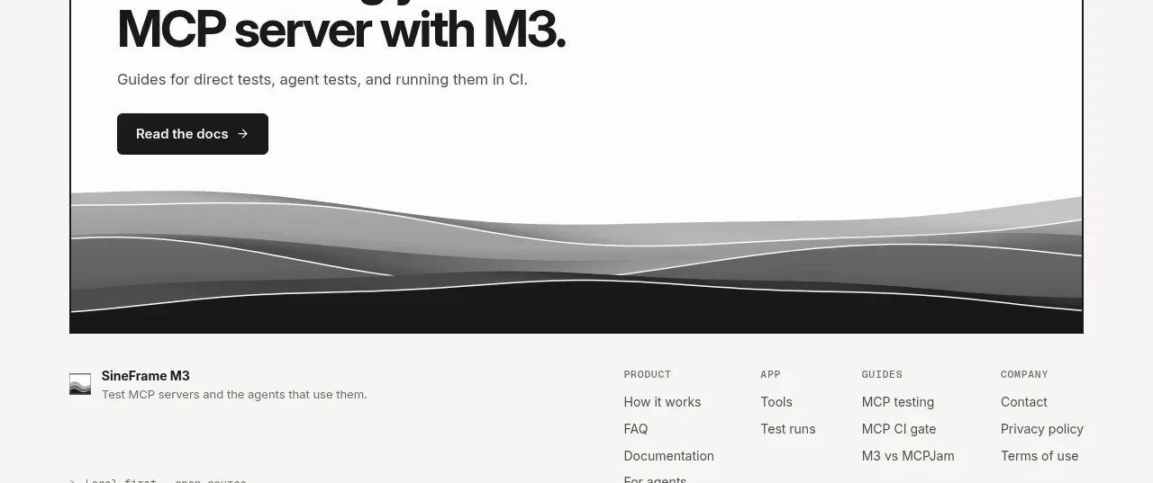
 Documentation call to action
SineFrame M3 · Call to action
Documentation call to action
SineFrame M3 · Call to action
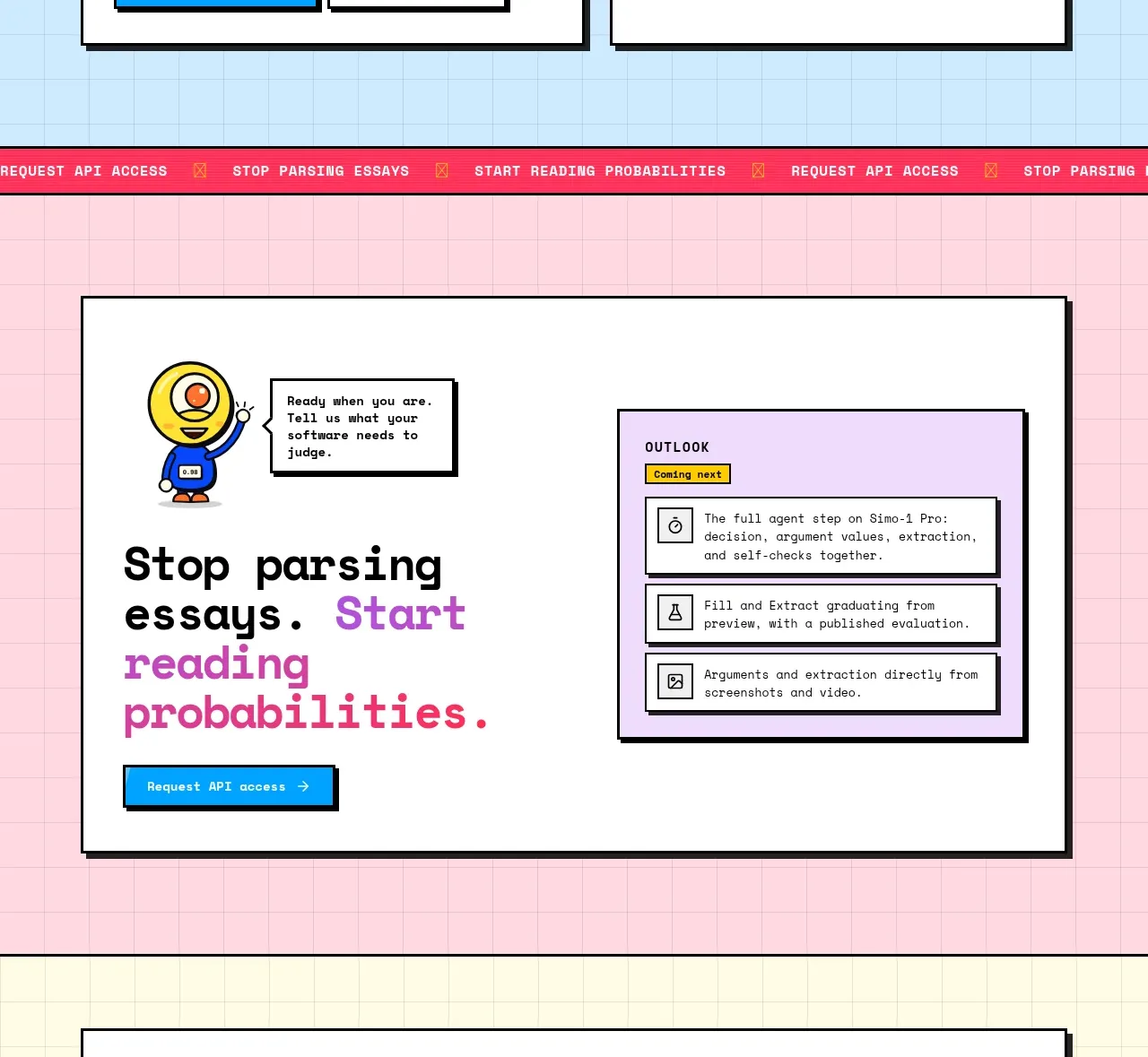
 Conversion call to action
Simo · Call to action
Conversion call to action
Simo · Call to action
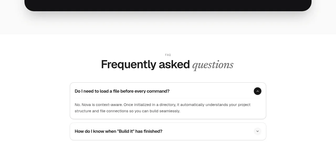
 Install command CTA
NOVA CLI v1.0 · Call to action
Install command CTA
NOVA CLI v1.0 · Call to action

 Manifesto statement
Hark · Call to action
Manifesto statement
Hark · Call to action