kage
kage
procboss.com
Design analysis
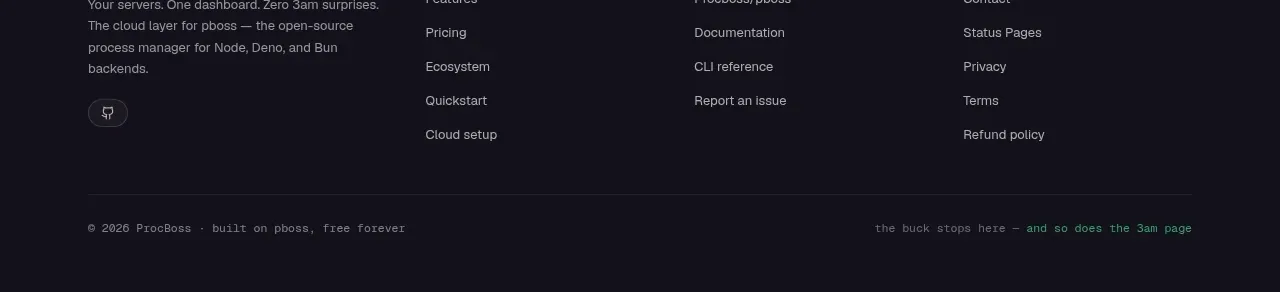
The footer is a restrained dark closing area with a brand summary, grouped navigation links, legal links, and a small copyright line.
Prompt preview
## Reference images

Study these alongside the description below: hierarchy, rhythm, spacing, colour. Build for the product you are asked about, using this design language.

- Component: https://kage-design-assets.t3.tigrisfiles.io/components/procboss/3737396f-2984-4e55-9600-739ab09d7da3-1791525909-11.webp
- Full page it was cut from: https://kage-design-assets.t3.tigrisfiles.io/screenshots/procboss/3737396f-2984-4e55-9600-739ab09d7da3-1791525801598-full.webp
- Component on Kage: https://kage.design/component/procboss-footer

## Before you start
Ask what footer destinations, support links, legal pages, social links, and brand summary the user's product needs. Use the user's information architecture.

Build a dark footer that continues the final CTA palette. Use a four-column desktop layout: brand mark and one-sentence summary on the left, then grouped product, resources/open-source, and company links. Finish with a thin divider and a small copyright or status line. Use 11–13px muted text, brightened hover states, compact vertical gaps, and a low-contrast border. Keep the footer short and scannable, collapse columns into stacked groups on mobile, and ensure all links have visible focus states.

Never copy the reference's logos, product names, copy, illustrations or imagery.