 kage
kage
promptic.eu
Design analysis
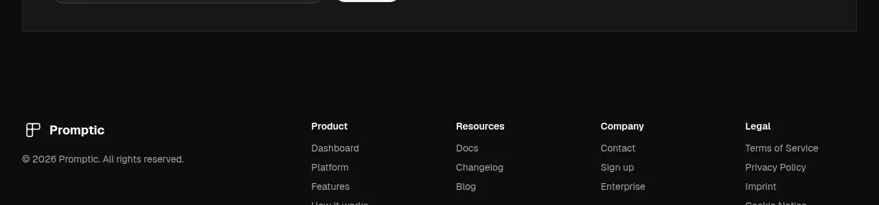
A bordered charcoal callout closes the content with a clear subscription promise and a compact email field plus high-contrast submit button.
Prompt preview
## Reference images

Study these alongside the description below: hierarchy, rhythm, spacing, colour. Build for the product you are asked about, using this design language.

- Component: https://kage-design-assets.t3.tigrisfiles.io/components/promptic/b6d3638e-158e-4f4b-839a-22e1c64a625e-1790402543-9.webp
- Full page it was cut from: https://kage-design-assets.t3.tigrisfiles.io/screenshots/promptic/b6d3638e-158e-4f4b-839a-22e1c64a625e-1790402502341-full.webp
- Component on Kage: https://kage.design/component/promptic-cta

## Before you start
Ask what ongoing value the user's audience receives, what email field and consent requirements apply, and what the brand's primary CTA colour is. Apply the same structure to that offer.

Create a closing newsletter CTA inside a wide inset card with #181818 fill, #292929 1px border, and 4–8px radius. Use a small monospaced section label, then a bold 30–40px headline with a muted continuation. Place a single rounded email input and compact high-contrast submit button beneath or alongside the heading, depending on viewport width. Use #f1f1f1 text, #a0a0a0 placeholder text, an orange #f16b24 or brand accent button, and 999px radius for controls. Include validation, success, error, focus-visible, and privacy/consent affordances without making the card feel heavy.

Never: use logos, product names, copy, illustrations, or imagery from the reference.
More components

 Split closing CTA
godaylight.com · Call to action
Split closing CTA
godaylight.com · Call to action
 Network growth CTA
godaylight.com · Call to action
Network growth CTA
godaylight.com · Call to action

 Closing conversion banner
FastRouter.ai · Call to action
Closing conversion banner
FastRouter.ai · Call to action

 Final download call to action
Blenny · Call to action
Final download call to action
Blenny · Call to action

 Visual download call to action
Art4 · Call to action
Visual download call to action
Art4 · Call to action

 Sponsor call to action
opensend.cc · Call to action
Sponsor call to action
opensend.cc · Call to action