kage
kage
promptic.eu

Design analysis
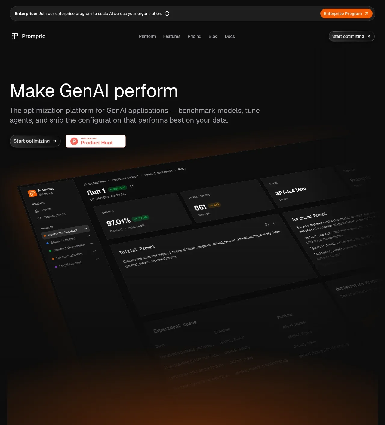
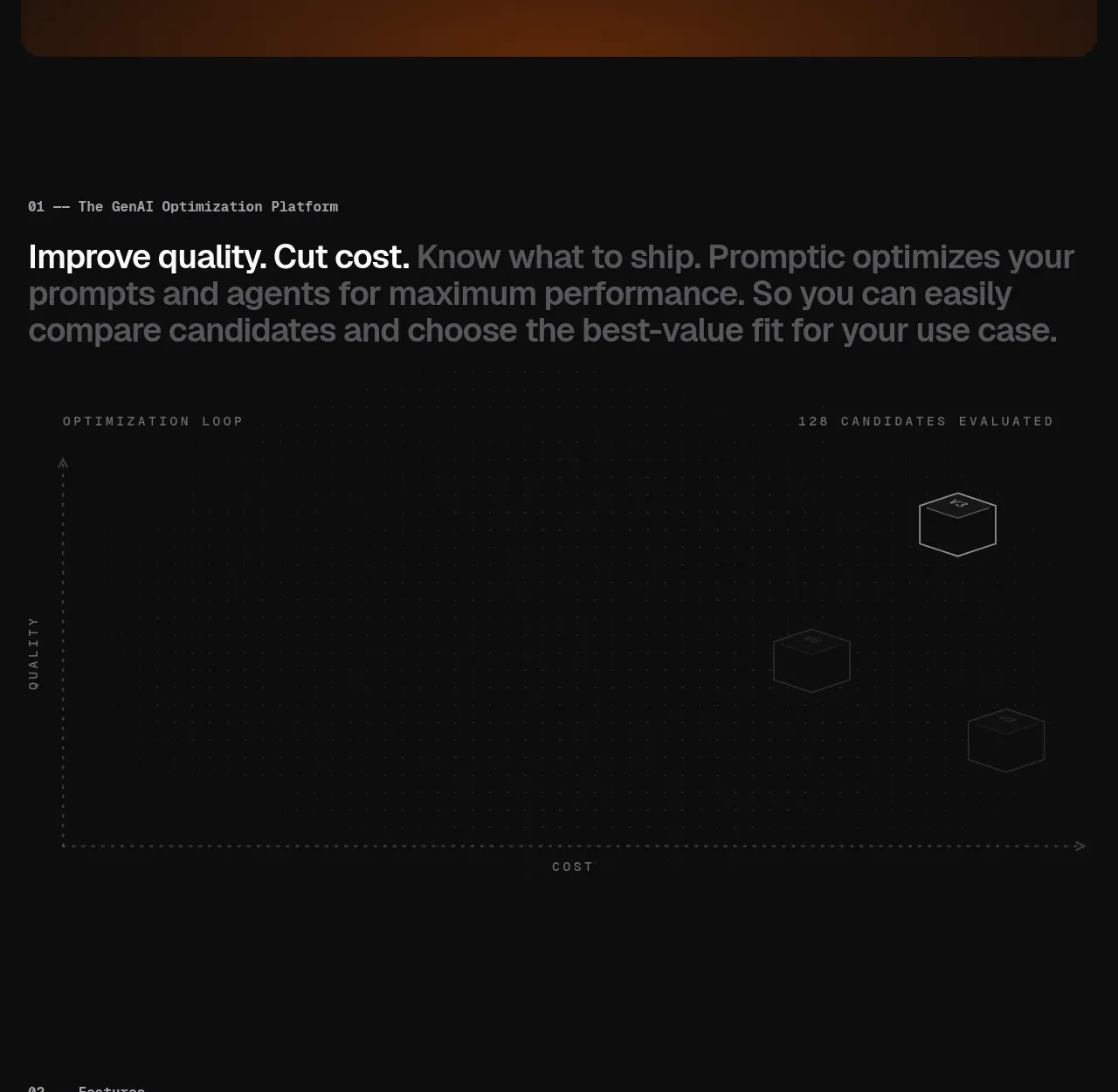
A dark, highly structured SaaS landing page uses near-black surfaces, thin gray rules, and restrained orange accents to frame a technical GenAI optimization product. The hero transitions from a large product screenshot into a sparse quality-versus-cost visualization, then progressively increases information density through a feature grid, workflow and tracing diagrams, coding-agent panel, pricing bands, FAQ rows, newsletter card, and compact footer.
Prompt preview
## Reference images

Study these alongside the description below: hierarchy, rhythm, spacing, colour. Build for the product you are asked about, using this design language.

- Full page: https://kage-design-assets.t3.tigrisfiles.io/screenshots/promptic/b6d3638e-158e-4f4b-839a-22e1c64a625e-1790402502341-full.webp
- Above the fold: https://kage-design-assets.t3.tigrisfiles.io/screenshots/promptic/b6d3638e-158e-4f4b-839a-22e1c64a625e-1790402498296.webp
- Design on Kage: https://kage.design/designs/promptic-landing-page

## Before you start
Ask the user what they are building, who it is for, and which brand assets they already have (name, colours, type choices, logo, and imagery). Wait for their answers before proceeding. Apply the design system below to their product, not to the reference product, and write original copy for their audience.

## Page structure
1. **Announcement bar:** Place a slim, rounded enterprise message at the very top, with compact text, a small circular info affordance, and an orange pill CTA aligned right.
2. **Primary navigation:** Follow with a simple dark navigation row: small product mark and name on the left, restrained text links in the centre, and an outlined pill CTA on the right.
3. **Hero copy:** Use a large left-aligned headline, a muted two-line supporting paragraph, and a primary pill CTA beside a small credibility badge. Keep the copy area spacious and let the product visual carry the lower half.
4. **Hero product visual:** Show a large angled dark application interface inside a rounded rectangular frame. Add a warm, very subtle orange glow behind the lower portion; fade the screenshot toward black so it feels integrated rather than like a hard-edged mockup.
5. **Section 01 — platform introduction:** Add a numbered monospace eyebrow, then a large sentence where the first clause is bright white and later clauses progressively become gray. Under it, place a very sparse quality-versus-cost optimization graphic with dotted axes, tiny labels, and outlined 3D candidate blocks.
6. **Section 02 — features:** Use a two-column heading row with the section title on the left and a concise explanatory paragraph on the right. Below, build a large bordered matrix of dark feature cells showing miniature product/UI diagrams: classification examples, optimization metrics, model comparison, prompt diffs, agent architecture layers, document extraction, and tool selection. Give each cell a short bottom caption.
7. **Section 03 — how it works:** Repeat the numbered eyebrow and two-column heading/description pattern. Pair a wireframe layered-data illustration on the left with a vertical four-step list on the right. Highlight the active first step with a darker panel and orange outline/icon; keep remaining steps flatter.
8. **Section 04 — tracing:** Introduce the tracing capability with a two-column heading and explanatory copy. Beneath it, show a wide dark observability panel containing a horizontal execution timeline, colored span bars, and a right-side detail card with model, provider, duration, tokens, cost, input, and output.
9. **Section 05 — closing the loop:** Use another two-column intro. Put a vertical workflow list on the left with the first item selected in a bordered card, and a large coding-agent conversation/interface mockup on the right with a white chat bubble, tool-call rows, chips, metrics, and a bottom input field.
10. **Section 06 — pricing:** Present a full-width heading with bold emphasis on selected words. Add a bordered promotional card with title, explanatory text, orange and neutral CTAs, then a compact two-by-two grid of pricing tiers with large prices and thin dividers.
11. **Section 07 — FAQ:** Use a large heading followed by a full-width accordion list. Each question sits in a shallow row with a bottom rule and a small chevron aligned to the far right; keep all answers collapsed initially.
12. **Section 08 — newsletter:** Add a bordered, slightly lighter dark panel with a monospace eyebrow, large two-line subscription headline, rounded email input, and light filled subscribe button.
13. **Footer:** Finish with a four/five-column footer. Keep the brand block on the left with a small mark, copyright, and muted text; group product, resources, company, and legal links into compact vertical lists.

## Design language
- Build hierarchy through scale and weight, not decoration: use a large geometric sans-serif hero, medium section headings, compact body copy, and bold spans inside otherwise regular headlines.
- Use a near-black page background around `#0b0b0b`, slightly lighter panels around `#151515`–`#1b1b1b`, white text around `#f2f2f2`, and muted gray text around `#858585`.
- Reserve a burnt orange accent around `#f06418` for primary actions, active states, small diagram highlights, selected borders, and warm hero glow. Use green, red, blue, and purple only as tiny semantic data colors inside product mockups.
- Pair a clean sans-serif for headings and UI copy with a restrained monospace for numbered eyebrows, diagram labels, metrics, code snippets, and technical metadata. Use uppercase or spaced-out monospace labels sparingly.
- Keep a wide desktop container with generous horizontal margins and very large vertical gaps between numbered sections. Let the hero be atmospheric and sparse, the feature matrix dense, then alternate diagram-heavy sections with quiet whitespace to control pacing.
- Treat borders as hairline separators in low-contrast gray around `#292929`; use square or minimally rounded cards for technical panels and small corner radii for controls. Reserve pill radii for buttons, badges, inputs, and the announcement bar.
- Avoid heavy shadows. Create depth with tonal contrast, layered panels, subtle inner borders, soft black fades, and the single warm glow behind the hero artwork.
- Make diagrams feel like instrument panels: thin outlines, dotted grids, compact labels, terminal-like snippets, timeline bars, metric cards, and restrained glow on active orange elements.
- Keep interactions quiet and functional: buttons brighten slightly on hover, accordion chevrons rotate when opened, feature/workflow active states use an orange edge or icon, and mockup panels can reveal detail without large animation. Use slow, subtle opacity/translate reveals as sections enter the viewport.
- Preserve the page’s rhythm on smaller screens by stacking two-column intros and diagrams, allowing feature cells to become a single-column or two-column grid, and keeping technical mockups horizontally scrollable rather than shrinking their labels unreadably.

## Never
- Do not copy the reference product’s logo, wordmark, product name, tagline, copy, screenshots, illustrations, diagrams, icon set, pricing values, or exact interface content.
- Do not present the result as Promptic or imply affiliation with it.
- Do not turn the dark technical style into a generic neon cyberpunk theme; keep the palette restrained, the typography readable, and orange accents sparse.
Components from this page
All components
 Announcement bar and primary navigation
Promptic · Navigation
Announcement bar and primary navigation
Promptic · Navigation
 Optimization platform hero
Promptic · Hero
Optimization platform hero
Promptic · Hero
 Platform value proposition and evaluation graphic
Promptic · Hero
Platform value proposition and evaluation graphic
Promptic · Hero
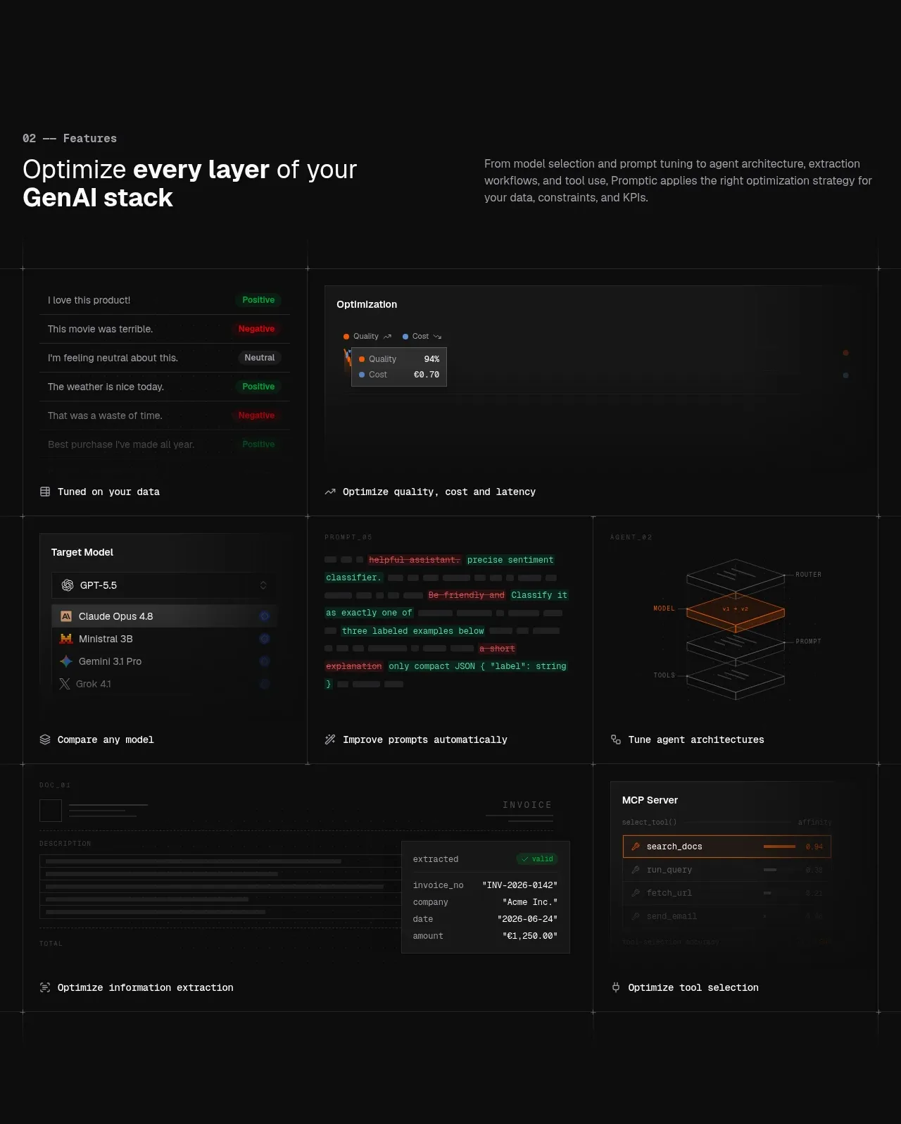 GenAI stack capabilities
Promptic · Feature grid
GenAI stack capabilities
Promptic · Feature grid
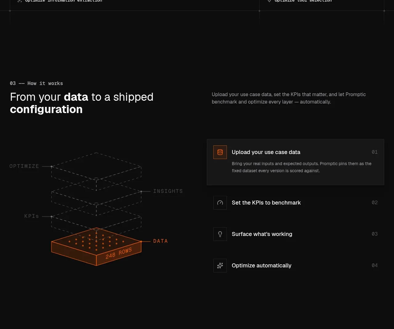 Data-to-configuration workflow
Promptic · Feature grid
Data-to-configuration workflow
Promptic · Feature grid
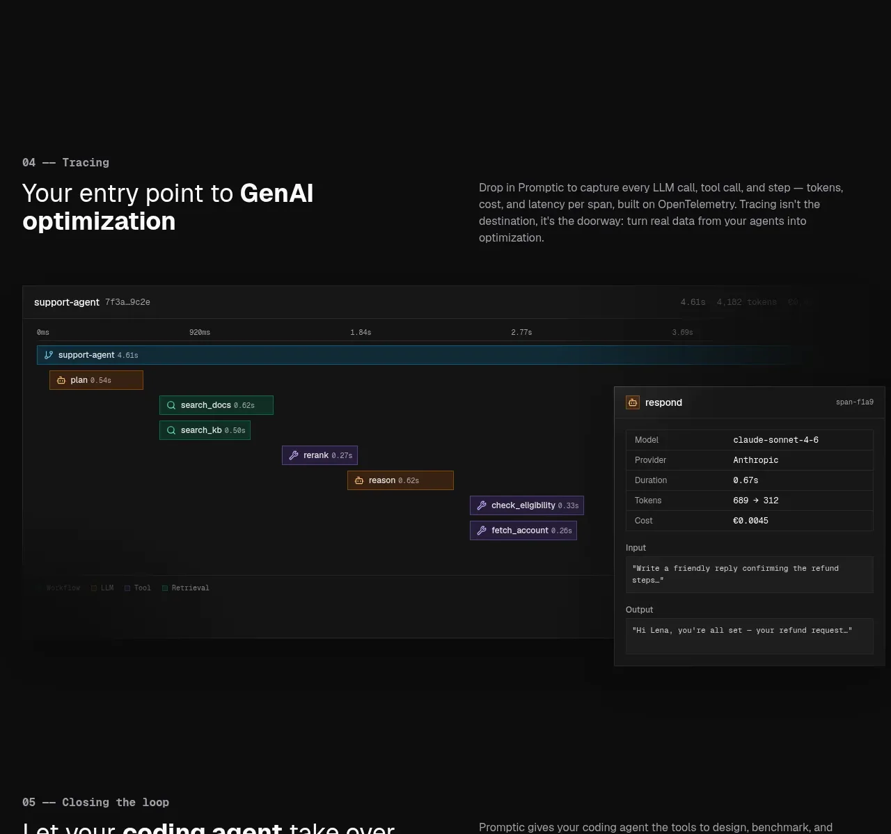 Tracing and observability view
Promptic · Feature grid
Tracing and observability view
Promptic · Feature grid
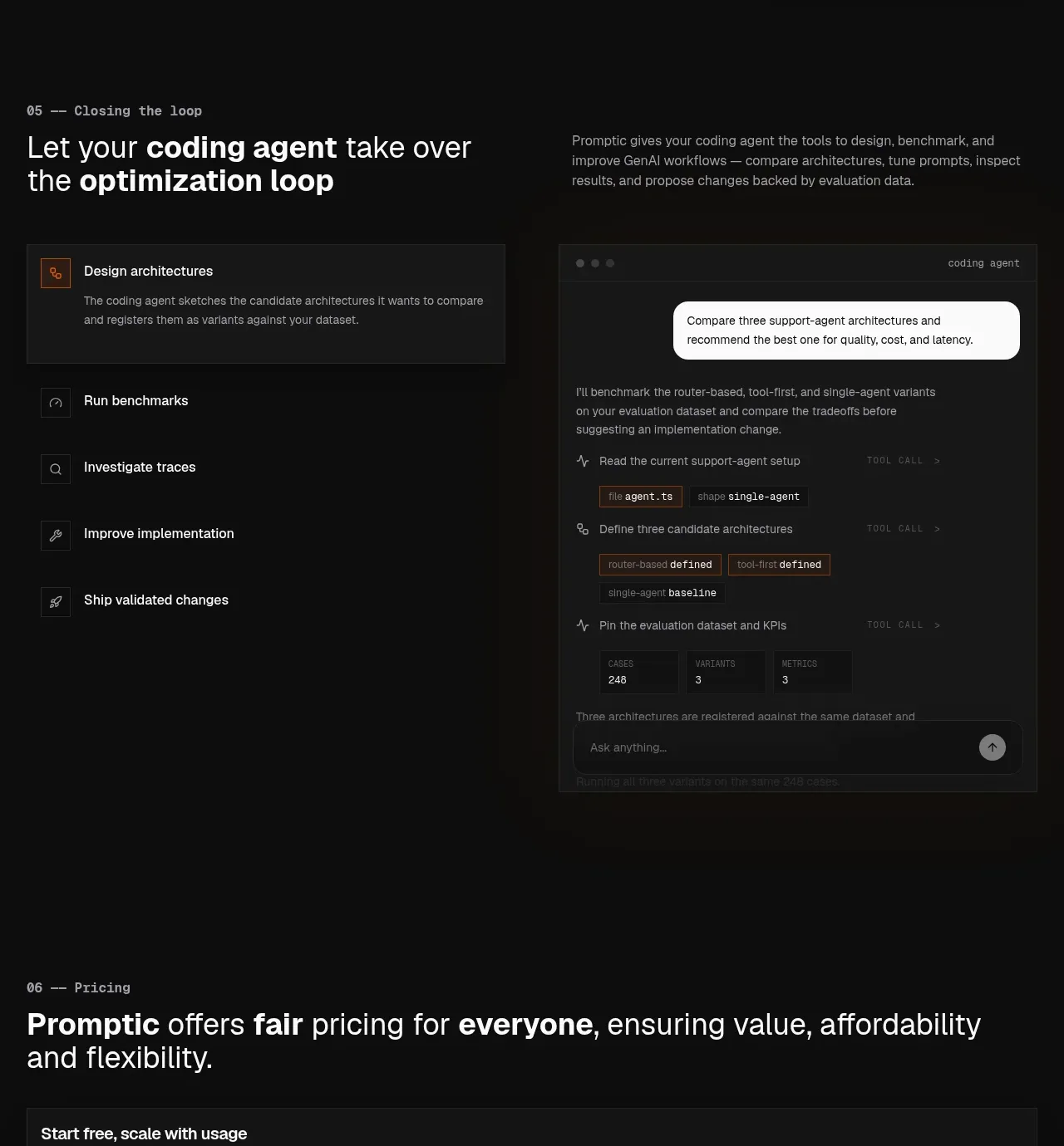 Agent-led optimization loop
Promptic · Feature grid
Agent-led optimization loop
Promptic · Feature grid
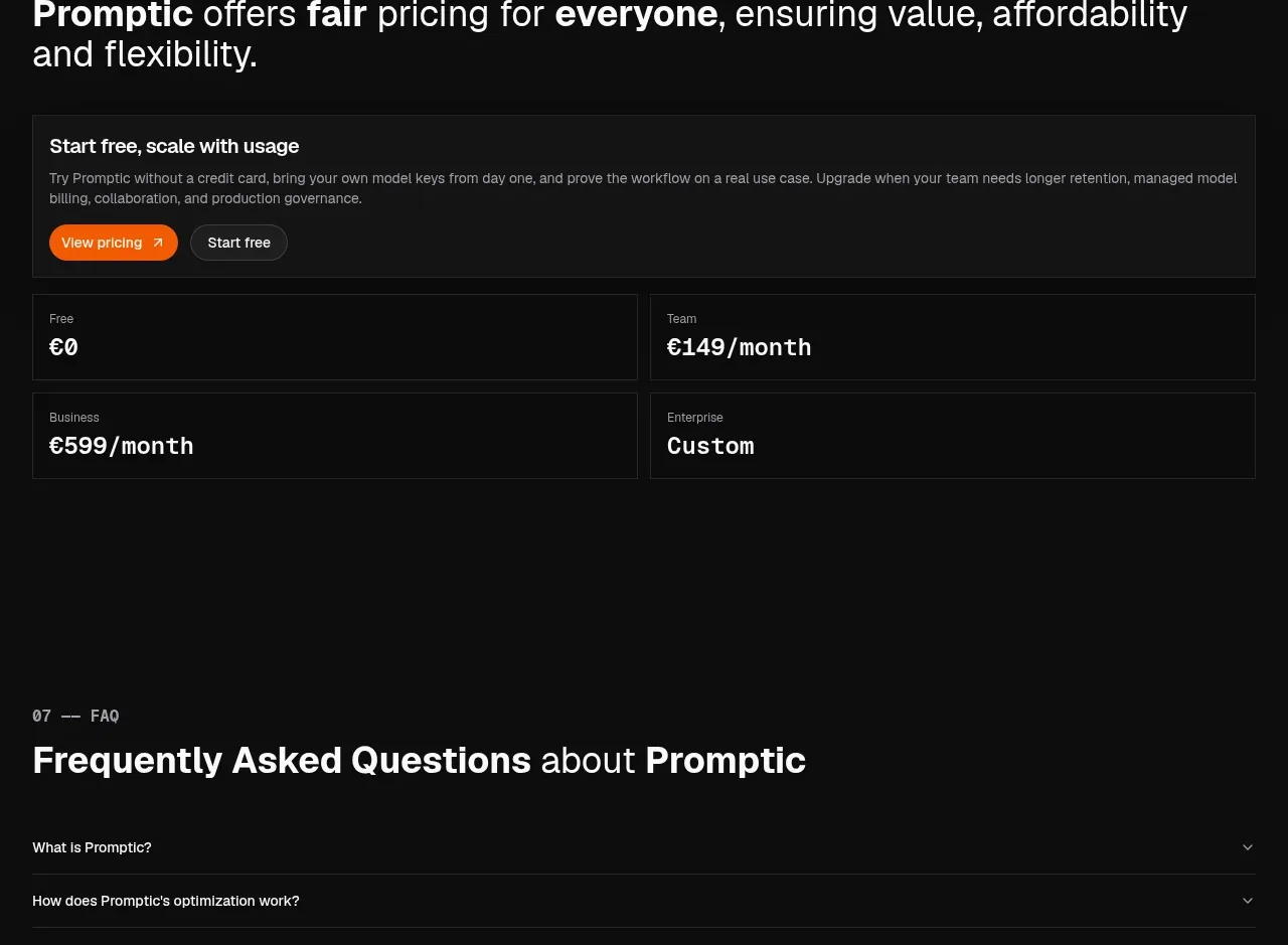 Flexible pricing overview
Promptic · Pricing table
Flexible pricing overview
Promptic · Pricing table
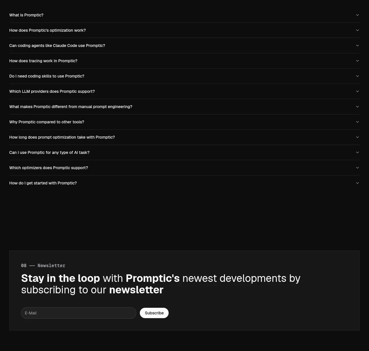 Frequently asked questions
Promptic · FAQ
Frequently asked questions
Promptic · FAQ
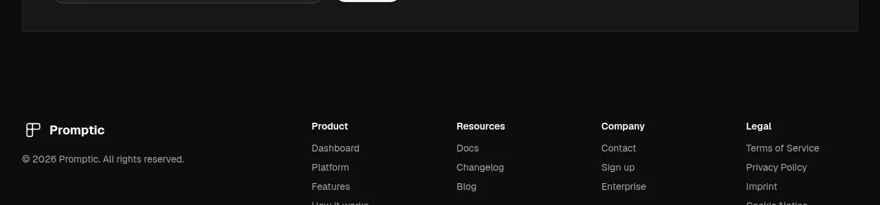 Newsletter signup
Promptic · Call to action
Newsletter signup
Promptic · Call to action
 Multi-column site footer
Promptic · Footer
Multi-column site footer
Promptic · Footer