kage
kage
promptic.eu
Design analysis
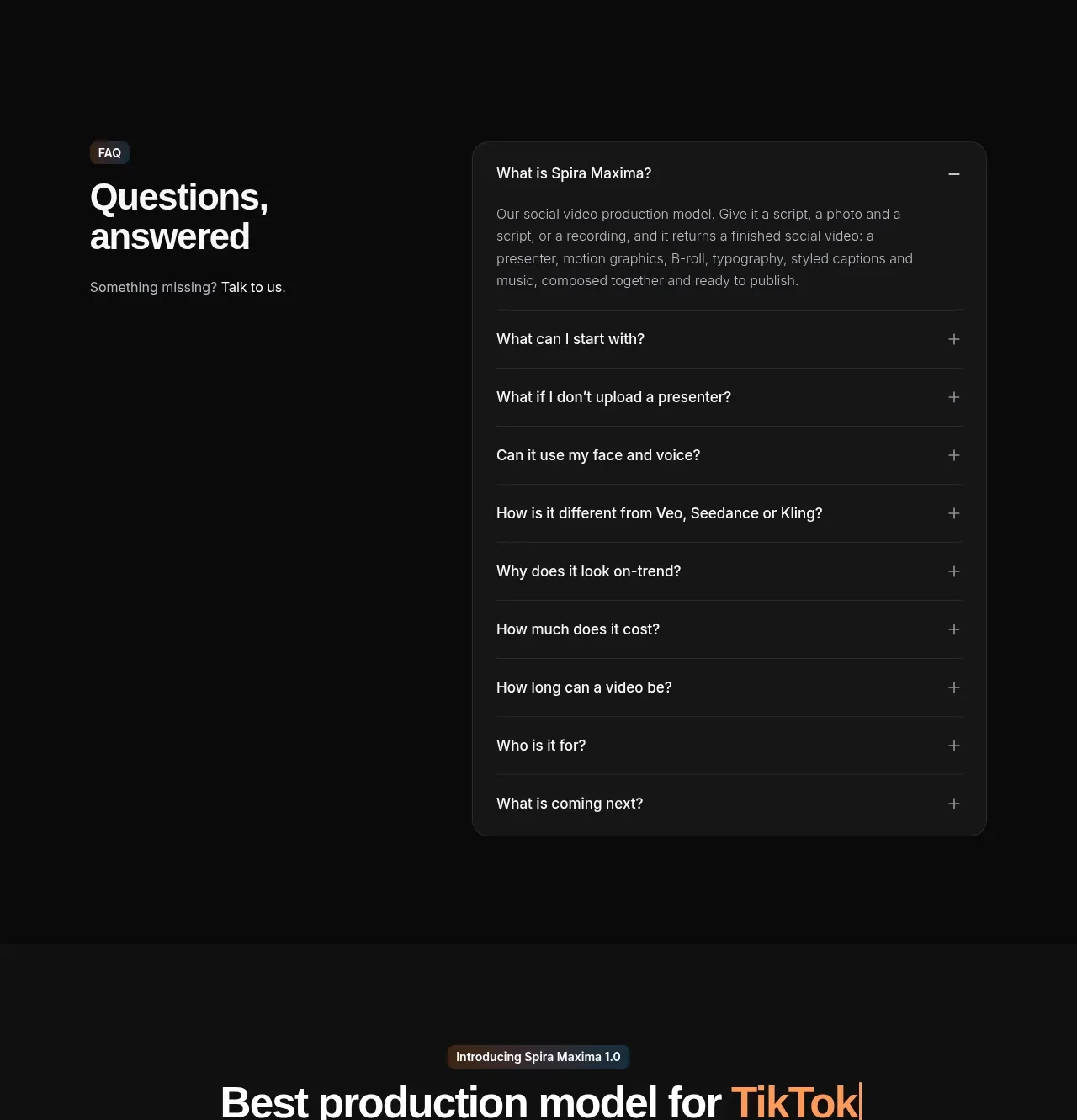
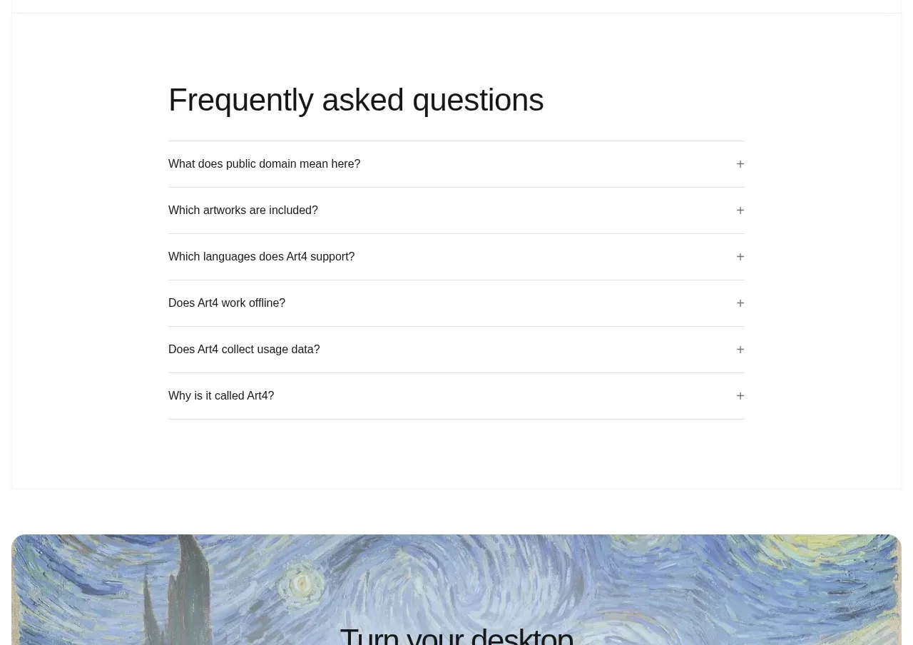
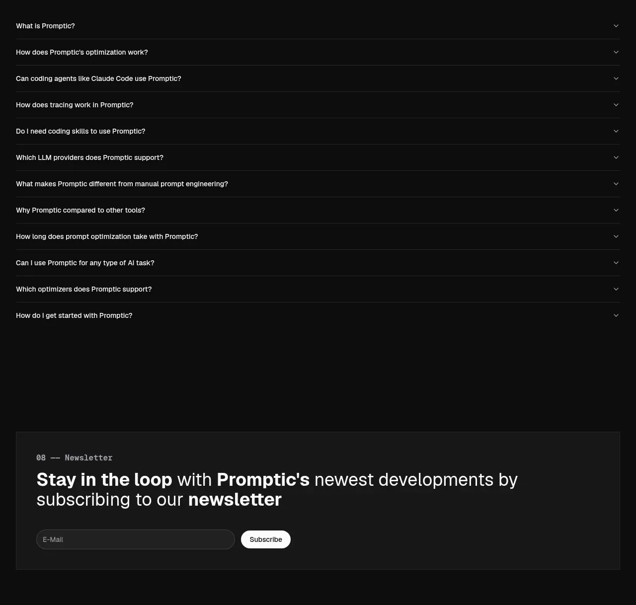
A simple heading introduces a long, full-width accordion list. Thin separators and right-aligned chevrons keep the support content easy to scan.
Prompt preview
## Reference images

Study these alongside the description below: hierarchy, rhythm, spacing, colour. Build for the product you are asked about, using this design language.

- Component: https://kage-design-assets.t3.tigrisfiles.io/components/promptic/b6d3638e-158e-4f4b-839a-22e1c64a625e-1790402543-8.webp
- Full page it was cut from: https://kage-design-assets.t3.tigrisfiles.io/screenshots/promptic/b6d3638e-158e-4f4b-839a-22e1c64a625e-1790402502341-full.webp
- Component on Kage: https://kage.design/component/promptic-faq

## Before you start
Ask what prospective customers most often need to know, which answers can be public, and whether any question should be open by default. Then create a content model for those questions.

Build a dark FAQ section with a numbered eyebrow and a large left-aligned heading. Below, render a full-width accordion list with 1px horizontal separators in #252525, 16–18px question text, muted right-aligned chevrons, and generous 20–24px vertical padding. Keep the background #0b0b0b and use #f3f3f3 for questions and #969696 for expanded answers. Animate height and chevron rotation subtly, but support reduced motion. Make each row a semantic button with keyboard focus, aria-expanded, and a comfortable mobile tap target.

Never: use logos, product names, copy, illustrations, or imagery from the reference.