kage
kage
promptic.eu

Design analysis
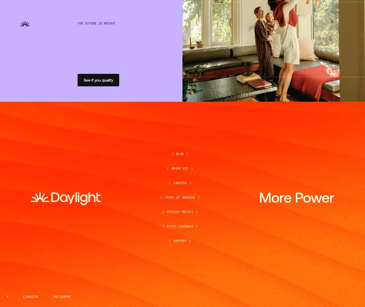
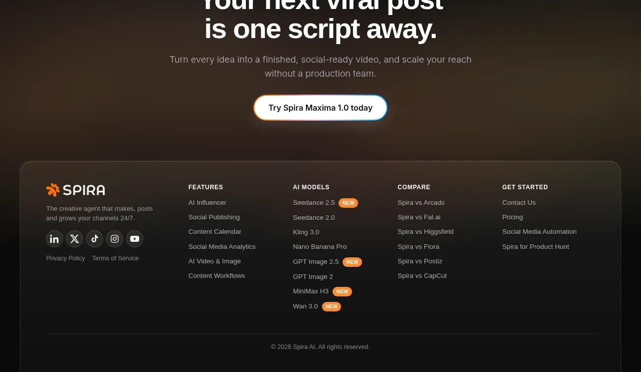
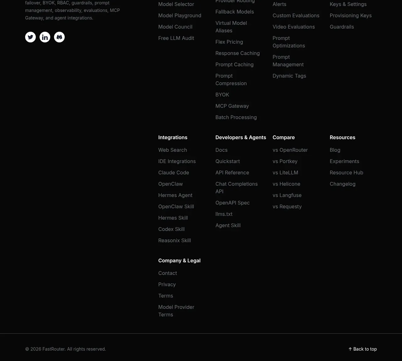
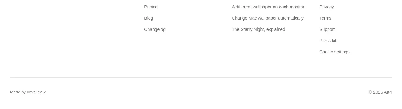
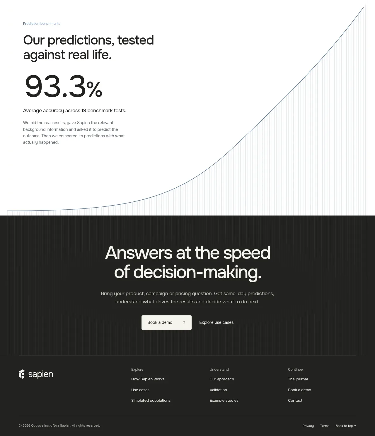
The footer is intentionally restrained: a compact brand/copyright block sits beside grouped product, resource, company, and legal links.
Prompt preview
## Reference images

Study these alongside the description below: hierarchy, rhythm, spacing, colour. Build for the product you are asked about, using this design language.

- Component: https://kage-design-assets.t3.tigrisfiles.io/components/promptic/b6d3638e-158e-4f4b-839a-22e1c64a625e-1790402544-10.webp
- Full page it was cut from: https://kage-design-assets.t3.tigrisfiles.io/screenshots/promptic/b6d3638e-158e-4f4b-839a-22e1c64a625e-1790402502341-full.webp
- Component on Kage: https://kage.design/component/promptic-footer

## Before you start
Ask which destinations, legal links, social channels, and copyright details the user's product needs. Ask whether the footer should include a compact secondary CTA or status link.

Build a minimal dark footer with a top border around #222222 and a max-width container. Align a small brand/copyright block on the left with four compact link groups on the right: product, resources, company, and legal. Use 12–14px text, #8f8f8f for links, #ededed for group labels, 20–32px column gaps, and generous but compact vertical padding. Add hover underlines or colour changes and visible keyboard focus. Collapse to stacked groups or a two-column grid on mobile while preserving the legal links.

Never: use logos, product names, copy, illustrations, or imagery from the reference.