 kage
kage
proofrr.com
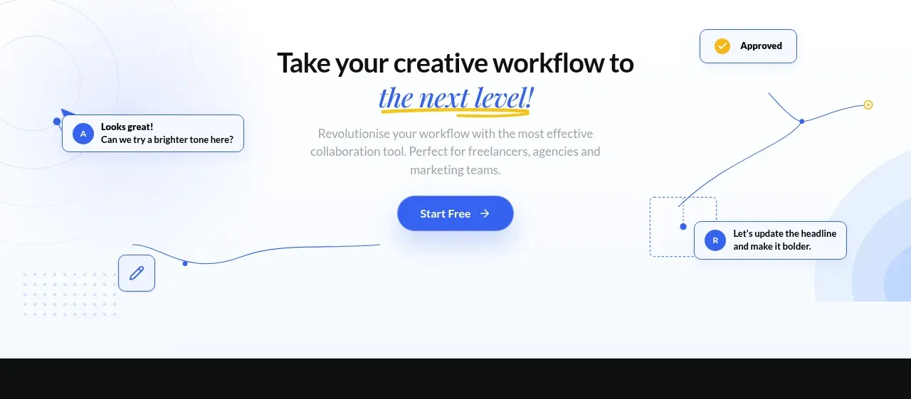
Design analysis
A pale, airy closing CTA centers the promise and primary button while lightweight comment/approval motifs frame the content.
Prompt preview
## Reference images

Study these alongside the description below: hierarchy, rhythm, spacing, colour. Build for the product you are asked about, using this design language.

- Component: https://kage-design-assets.t3.tigrisfiles.io/components/proofrr/efb49965-9fe0-4b8e-8298-39615e0bc43e-1789538491-6.webp
- Full page it was cut from: https://kage-design-assets.t3.tigrisfiles.io/screenshots/proofrr/efb49965-9fe0-4b8e-8298-39615e0bc43e-1789538465981-full.webp
- Component on Kage: https://kage.design/component/proofrr-cta

## Before you start
Ask what the user's product and brand are, then write an original conversion message that fits their value proposition.

Build a closing CTA section with a very pale blue-white background, approximately #F7FAFF, and subtle abstract collaboration motifs around the edges: thin curved connector lines, small outlined nodes, and generic comment or approval chips. Keep the center clean and centered. Use a large dark headline with an italic blue accent on the final phrase, a short muted supporting paragraph, and a prominent blue pill button with white text and a right arrow. Provide generous top and bottom padding, a clear focal hierarchy, and ensure decorative elements are hidden or simplified on mobile. Use 18–24px corner radii for floating chips and a restrained shadow.

Never: use logos, product names, copy, illustrations, or imagery from the reference.
More components

 Final conversion banner
tiun. · Call to action
Final conversion banner
tiun. · Call to action

 Mobile app conversion CTA
Payflip · Call to action
Mobile app conversion CTA
Payflip · Call to action

 Final download call to action
Grimo AI · Call to action
Final download call to action
Grimo AI · Call to action

 Download conversion panel
Kilo Code for iOS and Android · Call to action
Download conversion panel
Kilo Code for iOS and Android · Call to action
 Final conversion CTA
is.team · Call to action
Final conversion CTA
is.team · Call to action

 Studio closing call to action
FATHER · Call to action
Studio closing call to action
FATHER · Call to action