kage
kage
proofrr.com
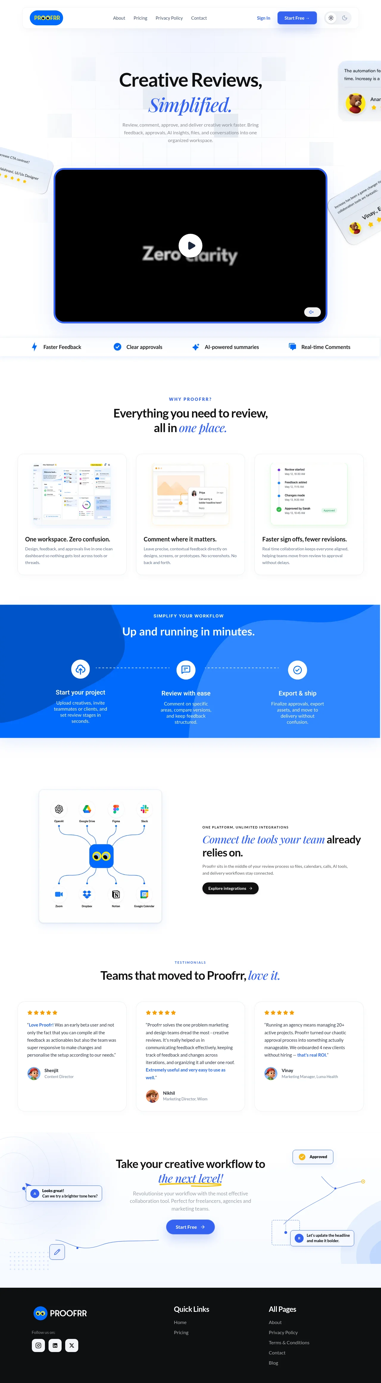
Design analysis
A spacious SaaS landing page uses a white canvas, thin gray rules, soft shadows, and vivid blue accents to frame a creative-review workflow. The hero combines a large black-and-blue typographic headline with a prominent video player and floating feedback cards; below it, the rhythm shifts from a compact benefits strip to three feature cards, a saturated blue process band, an integrations split layout, testimonials, and a lightly illustrated final CTA before the dark footer.
Prompt preview
## Reference images

Study these alongside the description below: hierarchy, rhythm, spacing, colour. Build for the product you are asked about, using this design language.

- Full page: https://kage-design-assets.t3.tigrisfiles.io/screenshots/proofrr/efb49965-9fe0-4b8e-8298-39615e0bc43e-1789538465981-full.webp
- Above the fold: https://kage-design-assets.t3.tigrisfiles.io/screenshots/proofrr/efb49965-9fe0-4b8e-8298-39615e0bc43e-1789538462917.webp
- Design on Kage: https://kage.design/designs/proofrr-landing-page

## Before you start
Ask the user what they are building, who it is for, and which brand assets they already have (name, colours, typefaces, logos, imagery, and existing UI). Wait for their answers before designing. Apply the guidance below to their product, not to the reference product.

## Page structure
1. **Top navigation** — Build a slim, centered header with a small brand mark at left, simple text links in the middle, sign-in and a filled primary CTA at right, plus compact light/dark appearance controls.
2. **Hero** — Use a tall, airy hero with a faint pale-blue grid and abstract translucent blocks in the background. Center a large two-line headline, pairing a heavy upright line with a blue italic serif emphasis line, followed by a short explanatory paragraph.
3. **Hero video and floating feedback cards** — Place a wide black video player beneath the copy, framed with a bright blue rounded border and a central circular play control. Let small tilted review/comment cards enter from the sides and partially crop at the viewport edges to make the workflow feel active.
4. **Benefits strip** — Follow the hero with a thin full-width row of four evenly spaced benefits, each using a small blue icon and concise label; separate it from the hero with a subtle border or shadow.
5. **Why-this-product section** — Add a centered eyebrow and headline explaining the product’s core value, again using blue italic serif styling for a short emphasis phrase.
6. **Three feature cards** — Present three equal-width white cards in a three-column grid. Each has a softly framed product screenshot or workflow illustration at the top, a bold short heading, and a compact gray paragraph beneath; use consistent height, padding, border, and shadow.
7. **Workflow process band** — Change rhythm with a full-width vivid blue section containing a darker/lighter organic abstract shape treatment. Center an eyebrow and white heading, then show three connected steps horizontally with white circular icons, dotted connectors, bold labels, and short supporting text.
8. **Integrations split section** — Return to a spacious white background. Put a rounded integration-network graphic in a bordered card on the left and an editorial text block on the right with an eyebrow, a large heading mixing black sans-serif and blue italic serif, supporting copy, and a dark pill-shaped button.
9. **Testimonials heading** — Center a small blue eyebrow and a large heading introducing customer proof, with an italic blue phrase for emphasis.
10. **Testimonial cards** — Add three equal cards in a row with gold star ratings, readable quotation text, highlighted blue fragments, and a small avatar/name/role row at the bottom. Keep the cards white with thin borders and soft shadows.
11. **Final CTA** — Use a very light blue-white illustrated backdrop with faint curves, dotted patterns, thin blue connector lines, comment bubbles, approval pills, and small control motifs. Center the headline, supporting copy, and a prominent blue CTA button.
12. **Footer** — Finish with a dense near-black footer. Place the brand mark and social buttons in the first column, quick links in the next, and a longer all-pages link list on the right, using white headings and muted gray body text.

## Design language
- Build hierarchy with a restrained sans-serif scale: compact 12–14px navigation and eyebrow labels, 16–18px body copy, 28–42px section headings, and a very large hero headline around 56–76px on desktop.
- Pair a clean geometric sans-serif for interface and body text with a high-contrast italic serif for selected words such as the emotional or conceptual emphasis. Use the serif sparingly, never for whole paragraphs.
- Keep the page predominantly white (#ffffff) with cool near-white backgrounds (#f7faff) and pale blue-gray surfaces (#eef5ff). Use a saturated blue primary accent around #1769e8–#2878f5, darker blue around #0757c9, and black/near-black text around #101114.
- Use colour to signal action and emphasis rather than decorate every section: blue for CTAs, icons, links, selected italic words, borders around the hero video, and the process band; gold (#f3b516) is reserved for ratings and tiny approval details.
- Maintain generous vertical whitespace in the hero, integrations, testimonials, and CTA areas. Increase density in the benefits strip and card grids, then create a strong visual reset with the full-bleed blue workflow band.
- Use thin #e5e9ef borders, subtle white-to-gray shadows, and moderate 12–18px corner radii. Cards should feel lightly elevated rather than glossy; avoid heavy shadows and excessive glass effects.
- Prefer rounded pill buttons and compact circular icon containers. Keep controls crisp and functional, with clear hover states that deepen blue, lift the button slightly, or increase border contrast.
- Use screenshots and diagrams inside generous white frames with restrained radii. For decorative workflow elements, use thin blue connector lines, dotted paths, small comment bubbles, and translucent pale-blue shapes instead of large illustrations.
- Let sections change rhythm: centered editorial hero, compact horizontal benefits, three-card explanation, high-contrast process diagram, asymmetric integration story, social-proof grid, then an illustrated centered CTA and dense dark footer.
- Keep motion subtle: fade and rise content on scroll, gently animate connector paths or floating comments, and provide a clear play interaction for the hero video without autoplaying disruptive sound.
- Ensure the responsive version collapses grids to one column, turns the benefits strip into a wrapped or scrollable row, stacks the integration graphic above the copy, and preserves readable headline line lengths.

## Never
- Do not copy the reference product’s logos, wordmarks, product name, copy, illustrations, screenshots, avatars, or icon set.
- Do not reproduce its exact testimonial text, integration brands, video frame, or decorative artwork.
- Do not present the result as Proofrr or imply affiliation with it; create original content and visual assets for the user’s product.
Components from this page
All components
 Top navigation bar
Proofrr · Navigation
Top navigation bar
Proofrr · Navigation
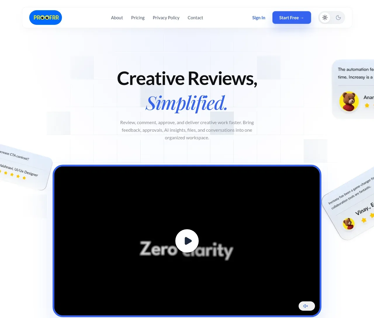 Creative review hero
Proofrr · Hero
Creative review hero
Proofrr · Hero
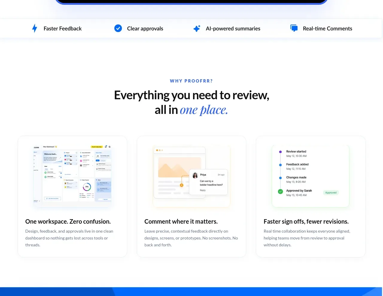 Review workflow benefits
Proofrr · Feature grid
Review workflow benefits
Proofrr · Feature grid
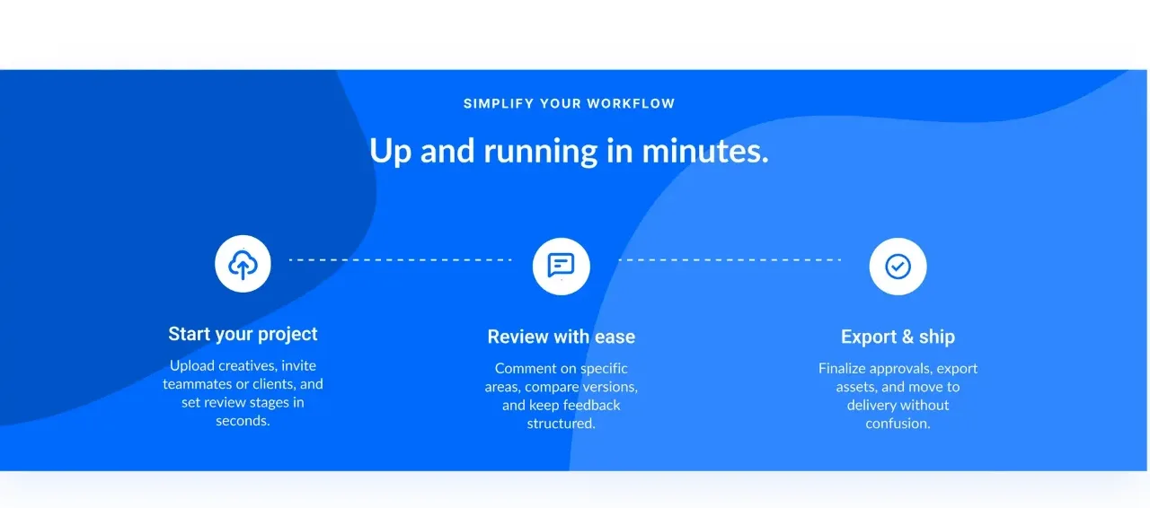 Three-step workflow
Proofrr · Feature grid
Three-step workflow
Proofrr · Feature grid
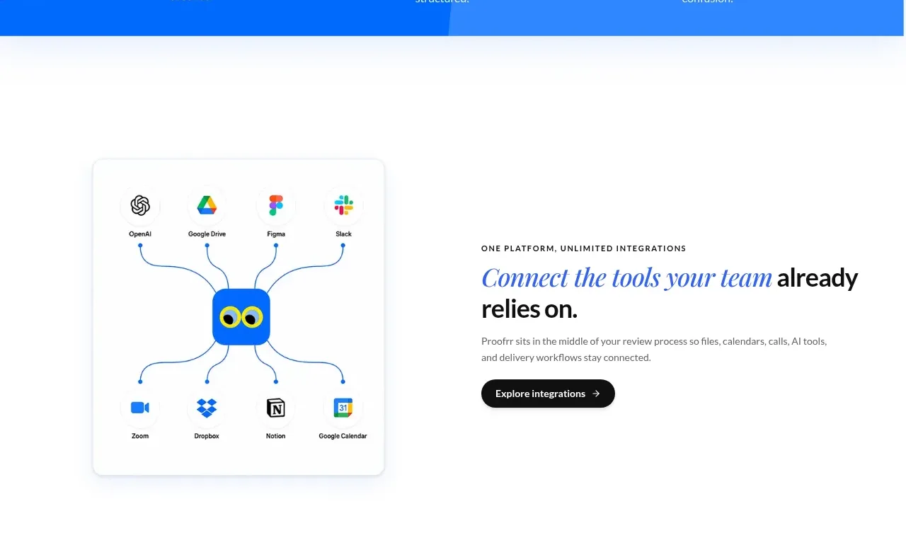 Integrations spotlight
Proofrr · Feature grid
Integrations spotlight
Proofrr · Feature grid
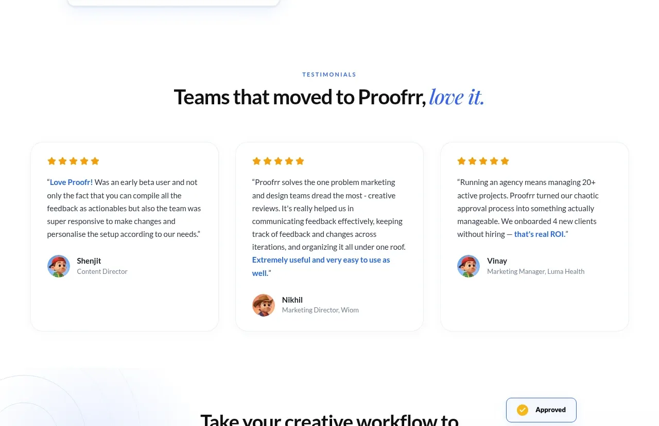 Customer testimonials
Proofrr · Testimonials
Customer testimonials
Proofrr · Testimonials
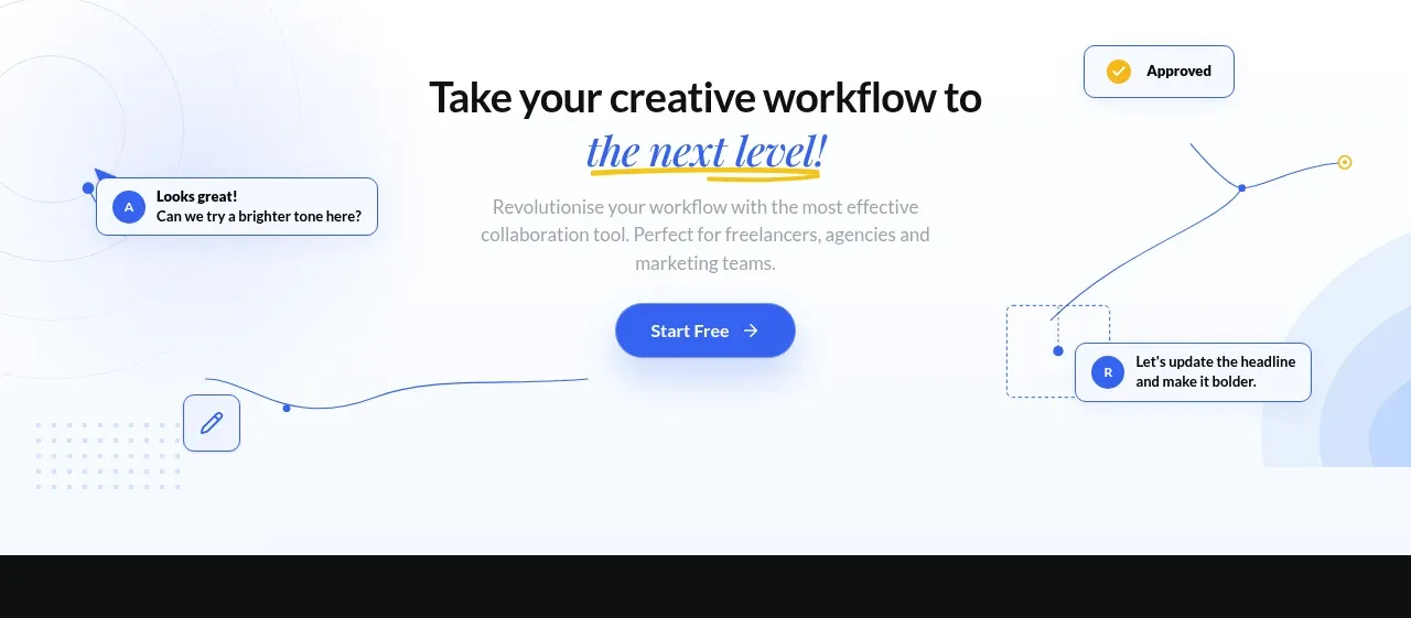 Final conversion call to action
Proofrr · Call to action
Final conversion call to action
Proofrr · Call to action
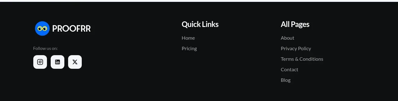 Site footer
Proofrr · Footer
Site footer
Proofrr · Footer