kage
kage
proofrr.com

Design analysis
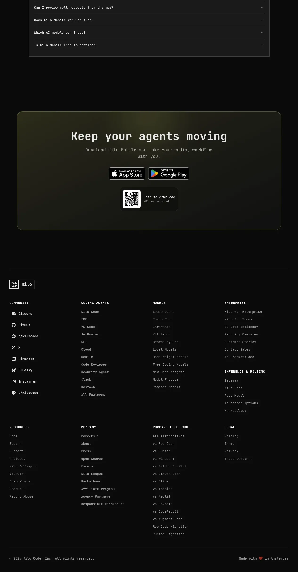
A dark footer provides the brand area, social buttons, and two compact link columns with strong contrast and ample padding.
Prompt preview
## Reference images

Study these alongside the description below: hierarchy, rhythm, spacing, colour. Build for the product you are asked about, using this design language.

- Component: https://kage-design-assets.t3.tigrisfiles.io/components/proofrr/efb49965-9fe0-4b8e-8298-39615e0bc43e-1789538491-7.webp
- Full page it was cut from: https://kage-design-assets.t3.tigrisfiles.io/screenshots/proofrr/efb49965-9fe0-4b8e-8298-39615e0bc43e-1789538465981-full.webp
- Component on Kage: https://kage.design/component/proofrr-footer

## Before you start
Ask what the user's product and brand are, then adapt this footer structure without reusing reference content.

Build a dark, full-width footer using #101113 or a similar near-black surface. Arrange three areas in a horizontal layout: a brand/wordmark block with a short follow-us label and three small rounded social buttons, then two link columns with concise headings and vertically spaced links. Use white or near-white heading text, #A7AFBC secondary text, 14px links, and 24–32px gaps. Give the footer 56–72px vertical padding and a subtle top border. On mobile, stack the brand and link groups, preserving comfortable tap targets and visible focus states.

Never: use logos, product names, copy, illustrations, or imagery from the reference.