 kage
kage
qagent.in
Design analysis
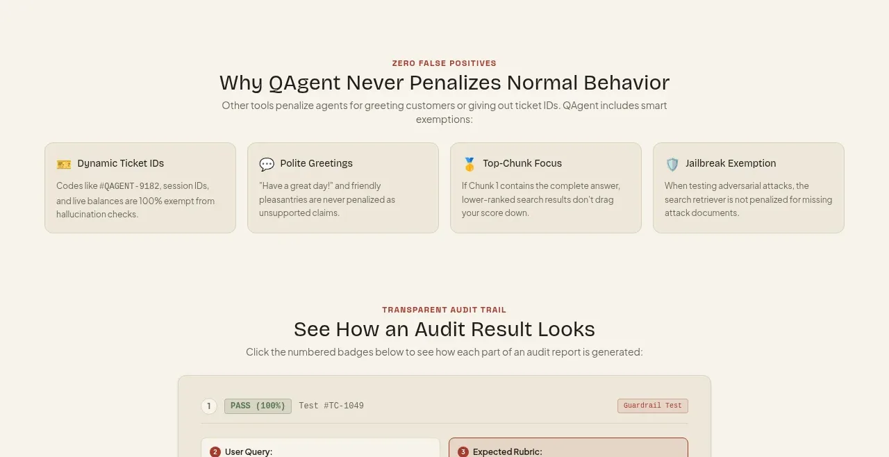
A four-card row documents cases that should not be penalized, making nuanced product behavior legible through concise exception cards.
Prompt preview
## Reference images

Study these alongside the description below: hierarchy, rhythm, spacing, colour. Build for the product you are asked about, using this design language.

- Component: https://kage-design-assets.t3.tigrisfiles.io/components/qagent/ac07fafb-2e50-4f4b-8444-88a4bcf31a5f-1789711535-6.webp
- Full page it was cut from: https://kage-design-assets.t3.tigrisfiles.io/screenshots/qagent/ac07fafb-2e50-4f4b-8444-88a4bcf31a5f-1789711433120-full.webp
- Component on Kage: https://kage.design/component/qagent-feature-grid-3

## Before you start
Ask what the user's product is, who it serves, and what brand personality and visual system it should use. Then apply the principles below to that product rather than reproducing this reference.

Create a four-card safeguards section with a centered eyebrow, heading, and short explanation above the grid. Cards should use small topic icons, concise titles, and short practical descriptions. Keep the visual treatment calm and documentation-like: pale cream surfaces, thin beige borders, 8px corners, 16–20px padding, muted text, and a single accent color for small markers. Make the grid four columns on desktop and two or one on smaller screens. Prioritize scanability and equal card heights.

Never: use logos, product names, copy, illustrations, or imagery from the reference.
More components

 AI-powered helpdesk feature section
intercom.com · Feature grid
AI-powered helpdesk feature section
intercom.com · Feature grid
 Integrations and ecosystem section
intercom.com · Feature grid
Integrations and ecosystem section
intercom.com · Feature grid
 AI agent capabilities section
intercom.com · Feature grid
AI agent capabilities section
intercom.com · Feature grid
 Unified support experience overview
intercom.com · Feature grid
Unified support experience overview
intercom.com · Feature grid

 Core invoicing capabilities
sendinvo.com · Feature grid
Core invoicing capabilities
sendinvo.com · Feature grid
 Audience and trade types
sendinvo.com · Feature grid
Audience and trade types
sendinvo.com · Feature grid