 kage
throxy.com
Design analysis
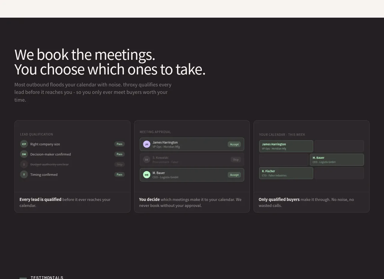
A dark proof section uses an explanatory heading followed by three equal cards that visualize qualification, approval, and calendar filtering.
Prompt preview
## Reference images

Study these alongside the description below: hierarchy, rhythm, spacing, colour. Build for the product you are asked about, using this design language.

- Component: https://kage-design-assets.t3.tigrisfiles.io/components/throxy/4d577be3-3944-4c06-b2f6-094c0e693ab7-1793253969-3.webp
- Full page it was cut from: https://kage-design-assets.t3.tigrisfiles.io/screenshots/throxy/4d577be3-3944-4c06-b2f6-094c0e693ab7-1793253814515-full.webp
- Component on Kage: https://kage.design/component/throxy-feature-grid-2

### Before you start
Ask what the user's product, audience, and brand are, then apply these principles to that product.

Create a dark workflow section using #211D20 or a similar near-black surface. Start with a large light heading and a low-contrast supporting paragraph, then place three equal-width cards in one row. Each card should combine a subtle UI illustration made from semantic panels and chips with a concise bold takeaway and one explanatory line. Use 18–22px card radius, faint #3A343A borders, muted gray text, and small mint, lavender, and gray status accents. Keep the card heights aligned, the visual hierarchy consistent, and provide hover elevation without excessive animation.

Never: use logos, product names, copy, illustrations, or imagery from the reference.
More components
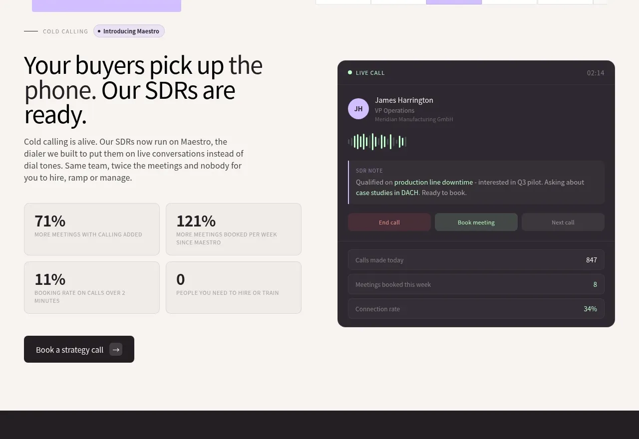
 Cold-calling performance section
throxy · Feature grid
 Outbound partner benefits
throxy · Feature grid
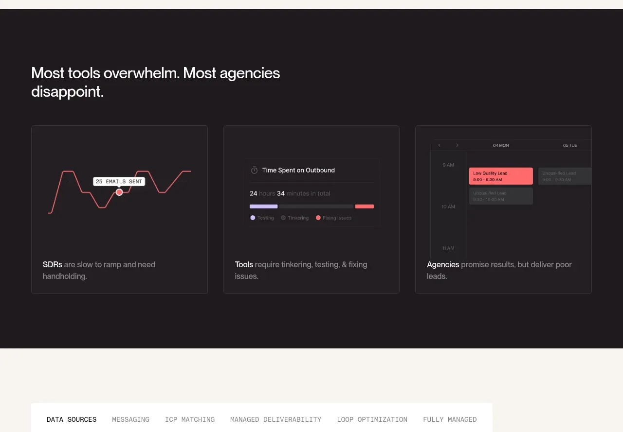 Why alternatives disappoint
throxy · Feature grid
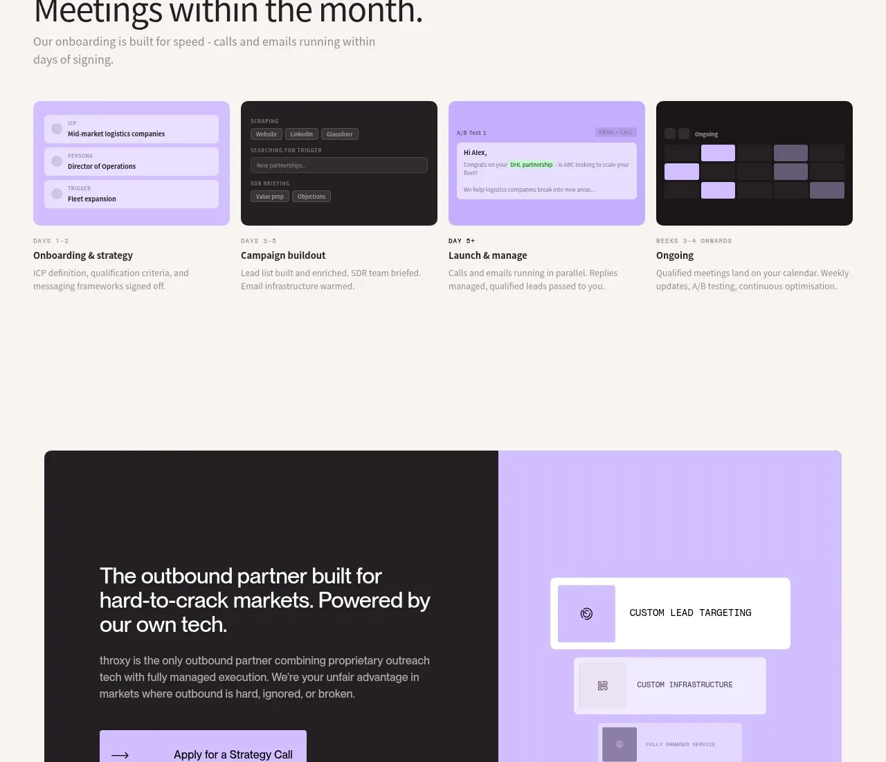 Rapid onboarding timeline
throxy · Feature grid

 Analytics capability showcase
Basedash View-only members · Feature grid
 Platform foundation features
Basedash View-only members · Feature grid