 kage
basedash.com
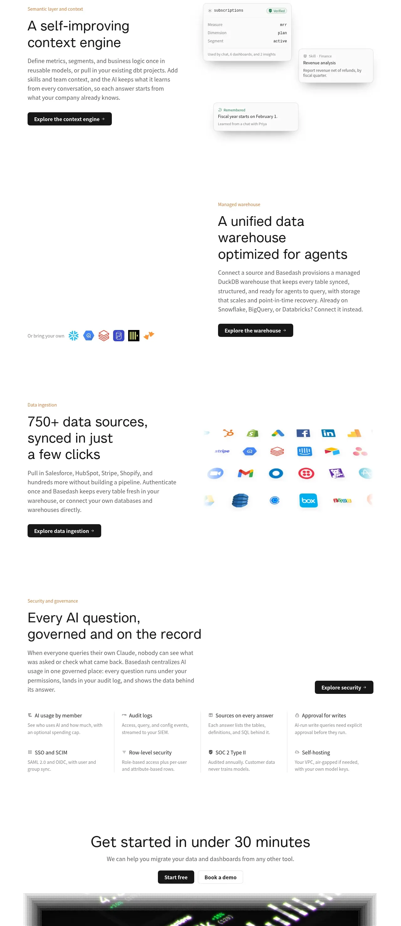
Design analysis
A sequence of platform rows covers context, warehouse, ingestion, and governance, ending with a compact governance detail grid.
Prompt preview
## Reference images

Study these alongside the description below: hierarchy, rhythm, spacing, colour. Build for the product you are asked about, using this design language.

- Component: https://kage-design-assets.t3.tigrisfiles.io/components/basedash-view-only-members/6dbd0b50-cdba-4977-b7dc-6a7ba68a352e-1793253919-8.webp
- Full page it was cut from: https://kage-design-assets.t3.tigrisfiles.io/screenshots/basedash-view-only-members/6dbd0b50-cdba-4977-b7dc-6a7ba68a352e-1793253800610-full.webp
- Component on Kage: https://kage.design/component/basedash-view-only-members-feature-grid-2

## Before you start
Ask what the user's platform architecture, data sources, and trust requirements are. Ask which capabilities should be grouped together, then apply this layout system to that product.

Build a vertical platform-features section with four content rows and a final governance detail grid. Use alternating two-column rows: a warm muted eyebrow, 32–40px heading, concise 15–17px paragraph, and dark CTA on one side; a restrained interface mockup, integration diagram, source-logo substitute, or data visualization on the other. Keep rows spacious with 90–130px vertical padding and consistent max-width around 780px. For the final governance row, use a heading and intro above a four-column list of trust capabilities with small monochrome icons, 14–16px titles, and 12–14px descriptions. Use #fff background, #171717 headings, #666 copy, #a18463 accent labels, #e7e7e7 borders, 10–14px radii, and soft shadows only on UI panels. Make all visuals responsive and avoid excessive visual noise.

Never: use logos, product names, copy, illustrations, or imagery from the reference.
More components
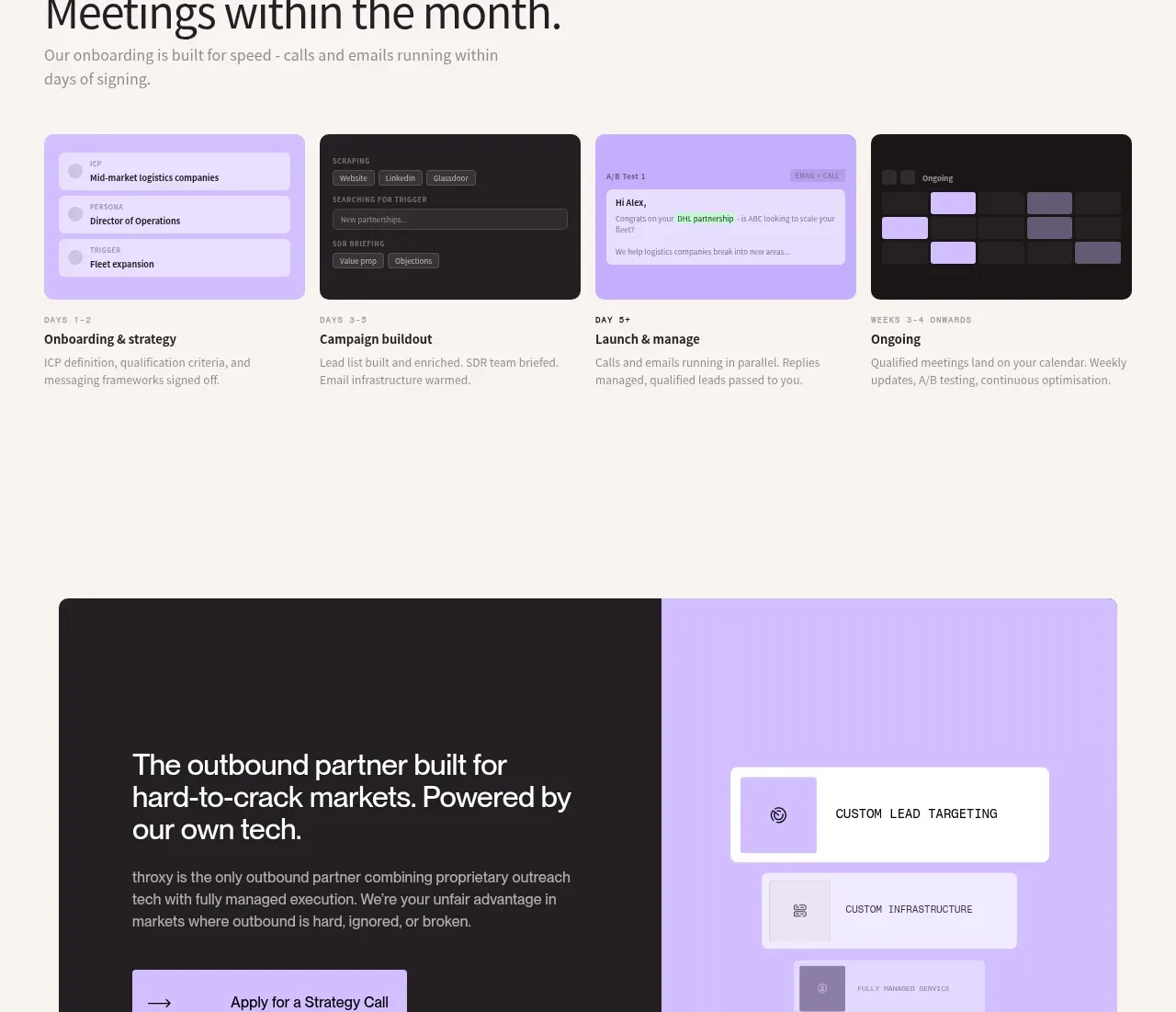
 Rapid onboarding timeline
throxy · Feature grid
 Outbound partner benefits
throxy · Feature grid
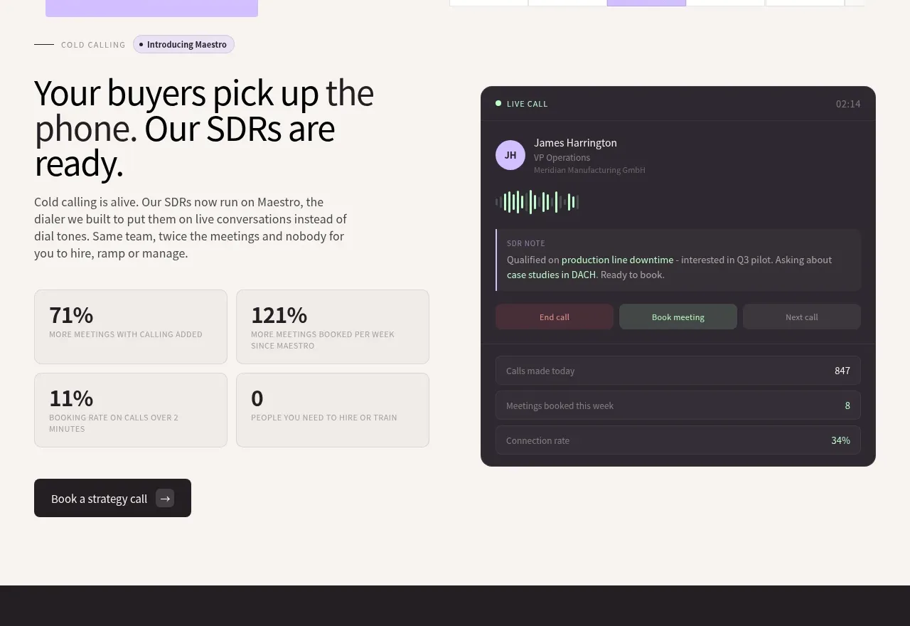 Cold-calling performance section
throxy · Feature grid
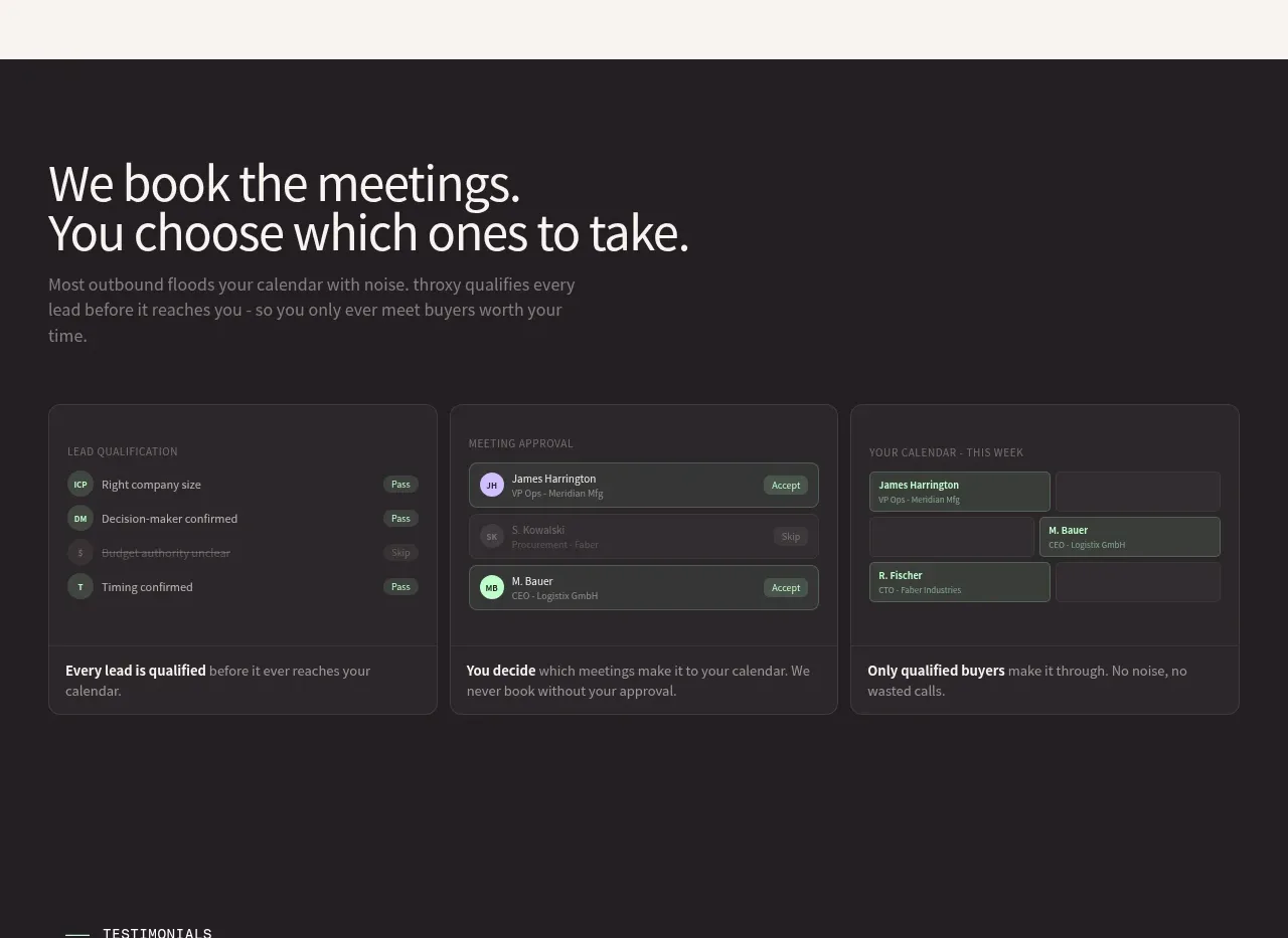 Qualification workflow cards
throxy · Feature grid
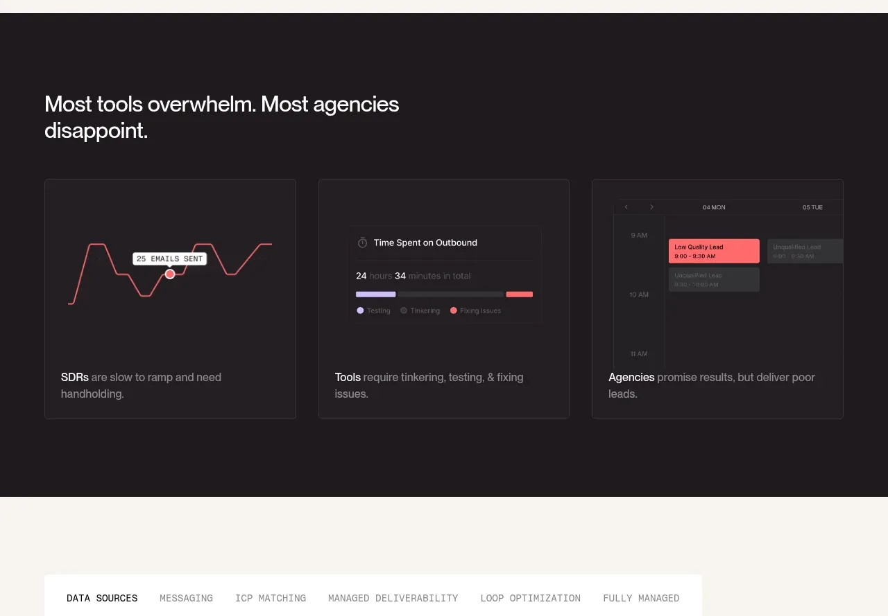 Why alternatives disappoint
throxy · Feature grid
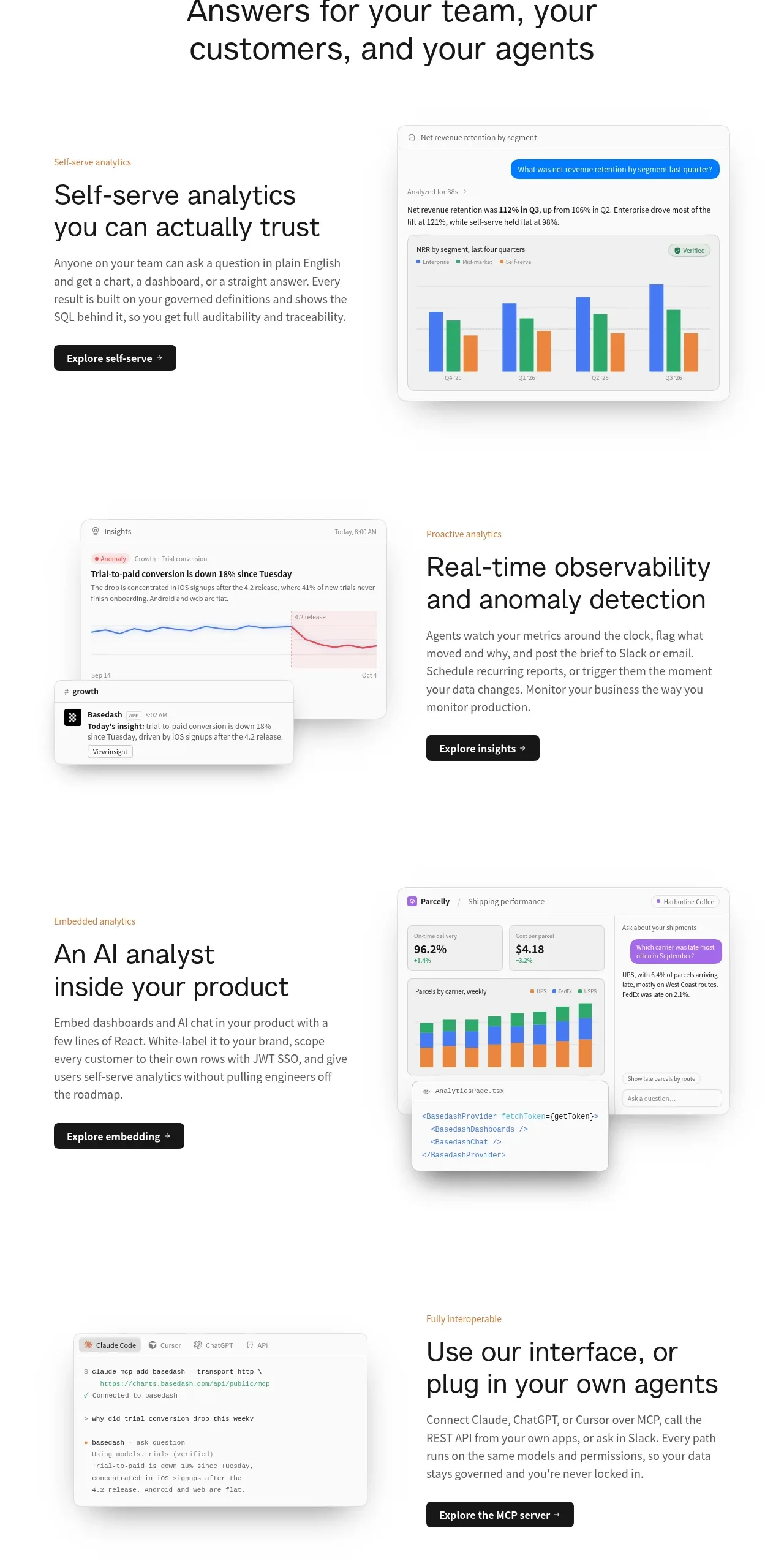
 Analytics capability showcase
Basedash View-only members · Feature grid