 kage
kage
qagent.in
Design analysis
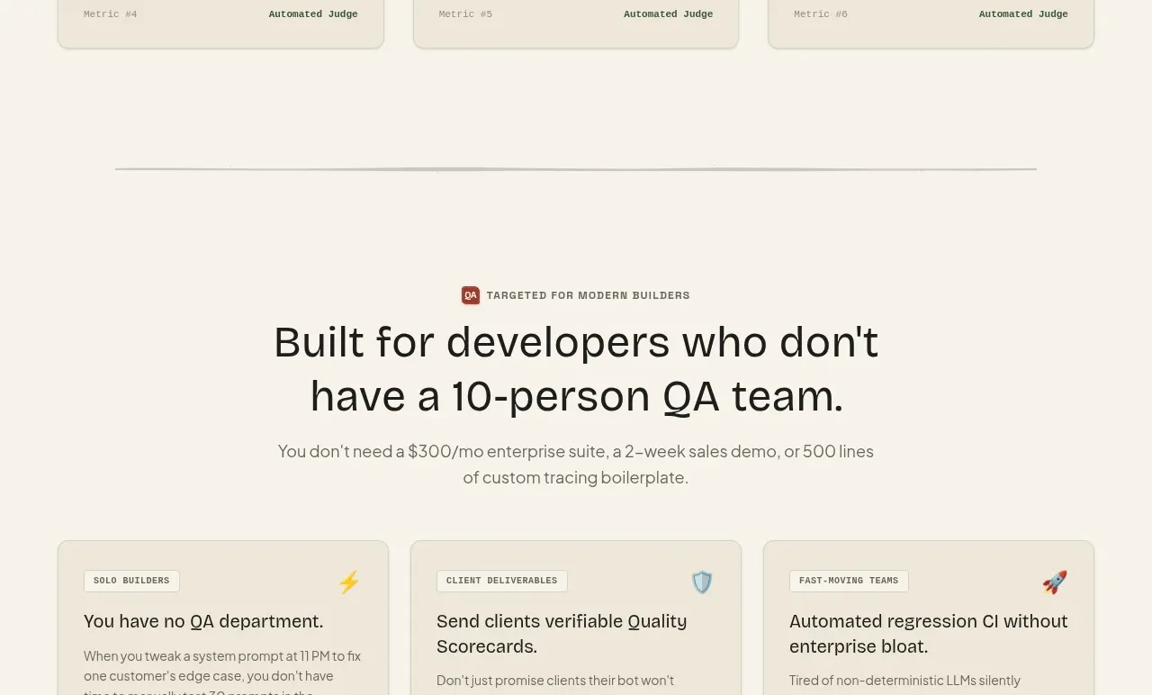
Three cards translate the product into distinct buyer or team outcomes, with small category labels, strong benefit headings, descriptions, and a footer guarantee line.
Prompt preview
## Reference images

Study these alongside the description below: hierarchy, rhythm, spacing, colour. Build for the product you are asked about, using this design language.

- Component: https://kage-design-assets.t3.tigrisfiles.io/components/qagent/ac07fafb-2e50-4f4b-8444-88a4bcf31a5f-1789711536-10.webp
- Full page it was cut from: https://kage-design-assets.t3.tigrisfiles.io/screenshots/qagent/ac07fafb-2e50-4f4b-8444-88a4bcf31a5f-1789711433120-full.webp
- Component on Kage: https://kage.design/component/qagent-feature-grid-5

## Before you start
Ask what the user's product is, who it serves, and what brand personality and visual system it should use. Then apply the principles below to that product rather than reproducing this reference.

Create a three-column use-case section with a centered eyebrow, heading, and supporting sentence. Each card should begin with a small category pill and icon, continue with a benefit-led heading and paragraph, and end with a subtle divider plus a compact guarantee or proof line. Use ivory background (#f6f2e8), cream cards (#eee8da), beige borders (#d8d0c0), 8px radius, 20px padding, charcoal text, muted gray copy, and brick-red micro-accents. Keep card content balanced and stack on narrow screens.

Never: use logos, product names, copy, illustrations, or imagery from the reference.
More components

 AI-powered helpdesk feature section
intercom.com · Feature grid
AI-powered helpdesk feature section
intercom.com · Feature grid
 Integrations and ecosystem section
intercom.com · Feature grid
Integrations and ecosystem section
intercom.com · Feature grid
 AI agent capabilities section
intercom.com · Feature grid
AI agent capabilities section
intercom.com · Feature grid
 Unified support experience overview
intercom.com · Feature grid
Unified support experience overview
intercom.com · Feature grid

 Core invoicing capabilities
sendinvo.com · Feature grid
Core invoicing capabilities
sendinvo.com · Feature grid
 Audience and trade types
sendinvo.com · Feature grid
Audience and trade types
sendinvo.com · Feature grid