kage
kage
qagent.in

Design analysis
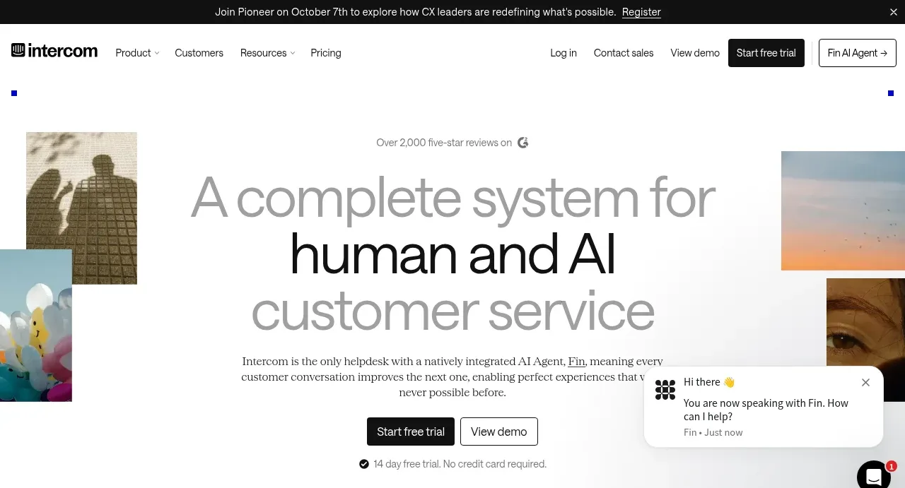
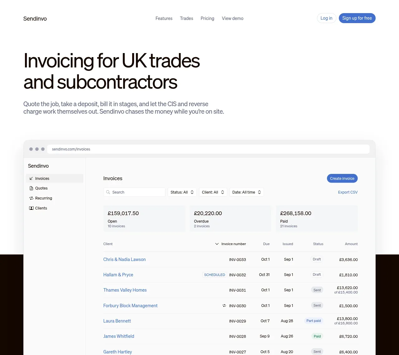
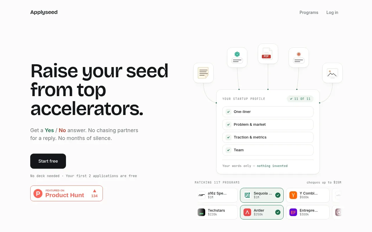
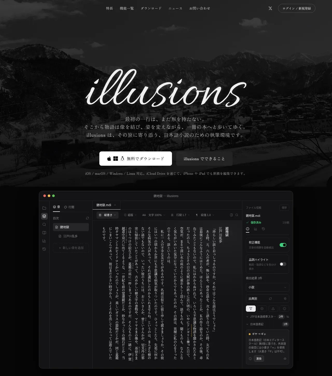
The hero pairs a large two-tone statement and explanatory copy with a quality-score product preview, followed by a primary CTA and compact trust points.
Prompt preview
## Reference images

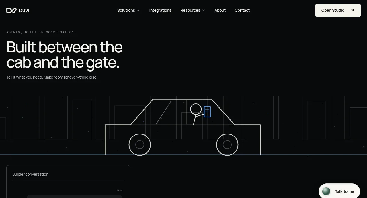
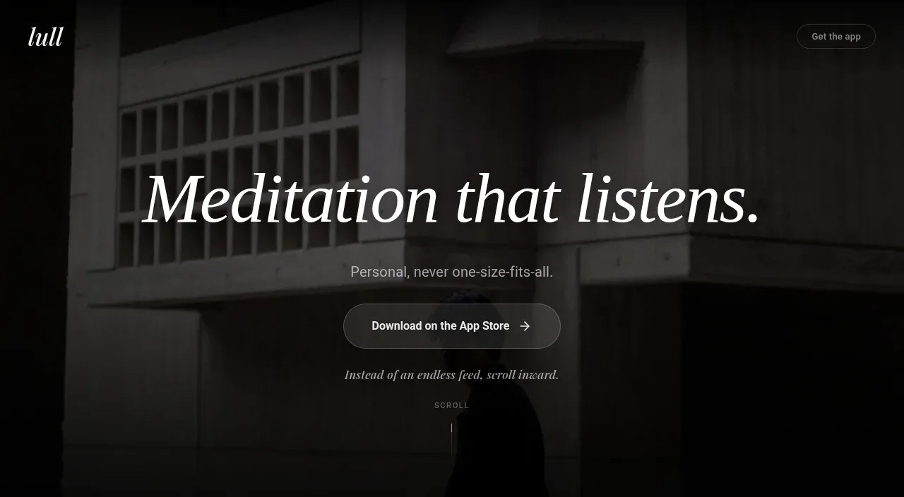
Study these alongside the description below: hierarchy, rhythm, spacing, colour. Build for the product you are asked about, using this design language.

- Component: https://kage-design-assets.t3.tigrisfiles.io/components/qagent/ac07fafb-2e50-4f4b-8444-88a4bcf31a5f-1789711533-1.webp
- Full page it was cut from: https://kage-design-assets.t3.tigrisfiles.io/screenshots/qagent/ac07fafb-2e50-4f4b-8444-88a4bcf31a5f-1789711433120-full.webp
- Component on Kage: https://kage.design/component/qagent-hero

## Before you start
Ask what the user's product is, who it serves, and what brand personality and visual system it should use. Then apply the principles below to that product rather than reproducing this reference.

Create a spacious two-column SaaS hero directly below the navigation. Align all content to a centered max-width grid, with the left column carrying a small eyebrow, a large 48–64px headline with one accent-colored phrase, concise supporting copy, a prominent primary CTA, and two or three compact reassurance bullets. Use the right column for a believable product UI preview or metric panel with clear hierarchy, subtle shadow, and enough detail to communicate value without overwhelming the headline. Use a warm ivory background (#f6f2e8), charcoal text (#22211d), muted copy (#77736a), brick-red accent (#a94439), pale cream cards (#eee8da), thin beige borders (#d8d0c0), and 10–14px radii. Give the hero generous top and bottom whitespace; stack the columns on mobile.

Never: use logos, product names, copy, illustrations, or imagery from the reference.