 kage
throxy.com
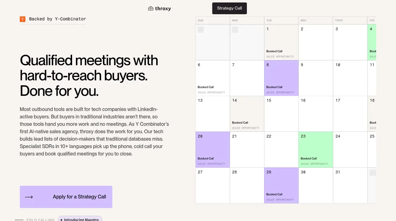
Design analysis
The hero pairs a large, direct outcome statement and explanatory paragraph with a large scheduling-calendar visual, then ends with a lavender primary CTA.
Prompt preview
## Reference images

Study these alongside the description below: hierarchy, rhythm, spacing, colour. Build for the product you are asked about, using this design language.

- Component: https://kage-design-assets.t3.tigrisfiles.io/components/throxy/4d577be3-3944-4c06-b2f6-094c0e693ab7-1793253968-1.webp
- Full page it was cut from: https://kage-design-assets.t3.tigrisfiles.io/screenshots/throxy/4d577be3-3944-4c06-b2f6-094c0e693ab7-1793253814515-full.webp
- Component on Kage: https://kage.design/component/throxy-hero

### Before you start
Ask what the user's product, audience, and brand are, then apply these principles to that product.

Create a split hero on a warm ivory canvas. Put the text in a left column occupying roughly 45% of the container: a very large black sans-serif headline with tight line-height, a readable 15–17px supporting paragraph, and a rectangular lavender CTA with a small arrow treatment. Put a tall, lightly bordered scheduling or workflow visual on the right, extending upward behind the text rhythm without overpowering it. Use a 44–56px headline, 24–32px column gap, 80–110px vertical padding, soft gray borders, and a restrained palette of approximately #F7F5F0, #111011, #CDB7FF, and #D9D5CE. Preserve a clear focal hierarchy and ensure the CTA is prominent and accessible.

Never: use logos, product names, copy, illustrations, or imagery from the reference.
More components
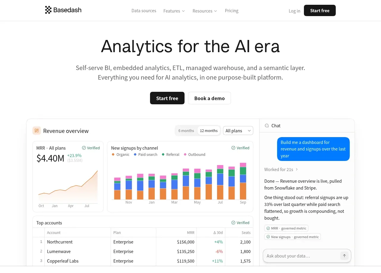
 Analytics product hero
Basedash View-only members · Hero

 AI customer experience hero
Open For sales · Hero
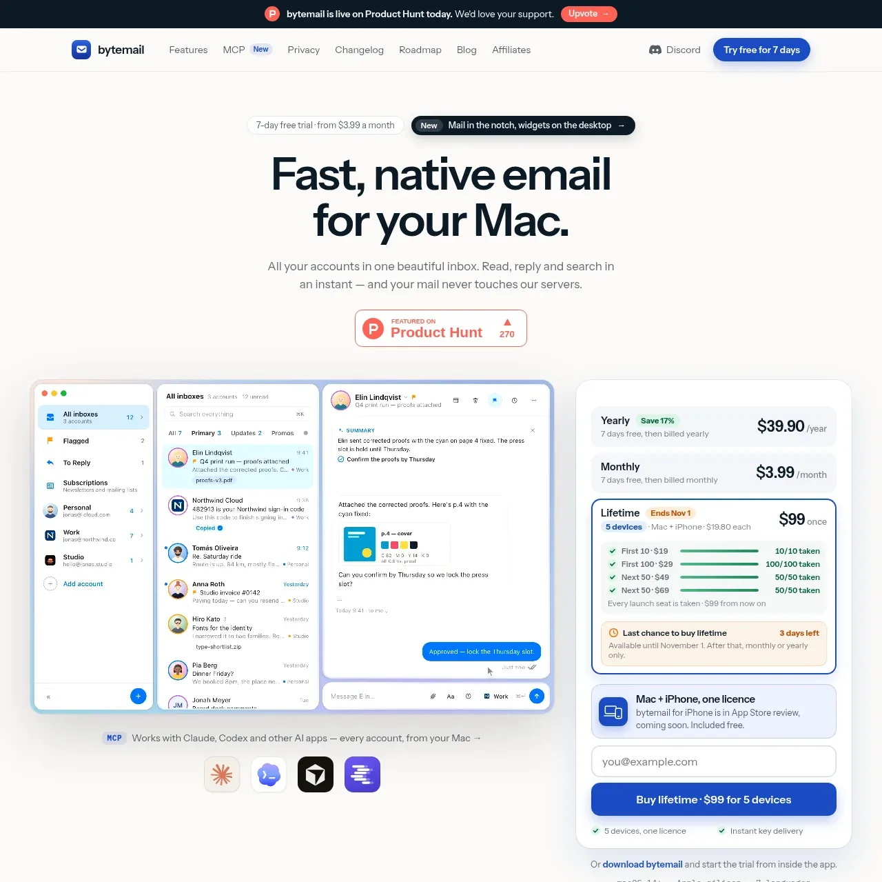
 Mac email product hero
bytemail · Hero
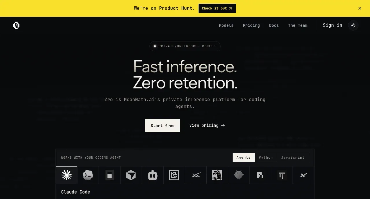
 Private inference hero
Zro: Uncensored Security Models · Hero
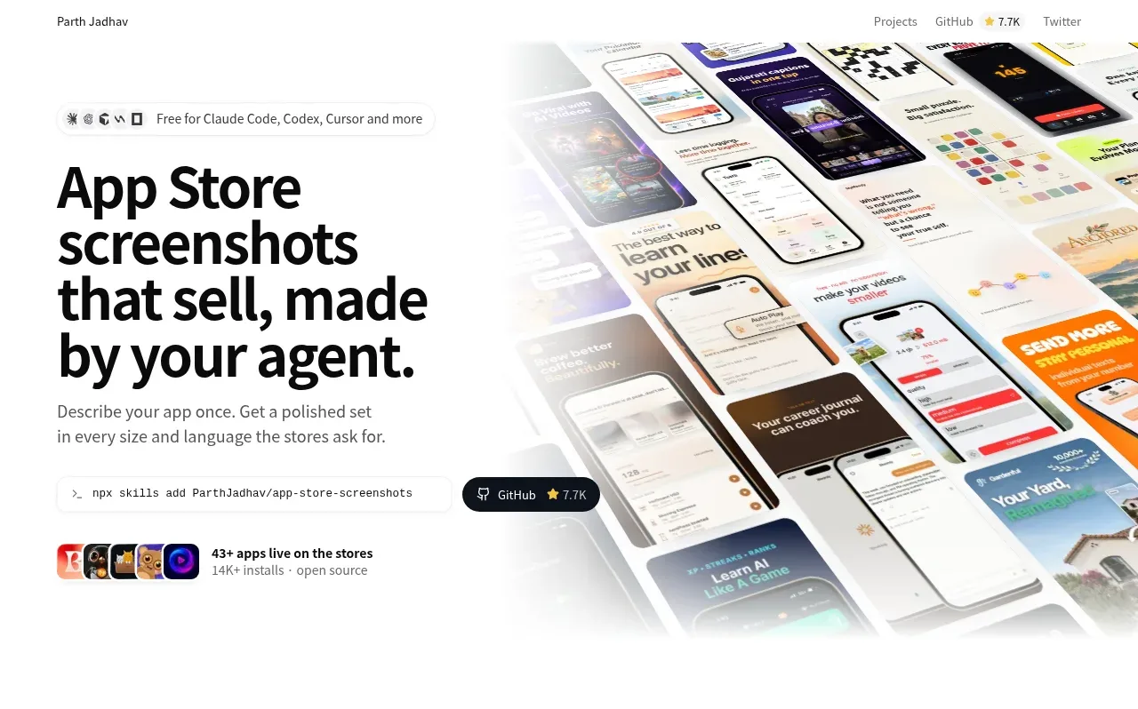
 Product hero with screenshot collage
App Store Screenshots · Hero

 Character-led product hero
Dotverse · Hero