 kage
kage
qagent.in
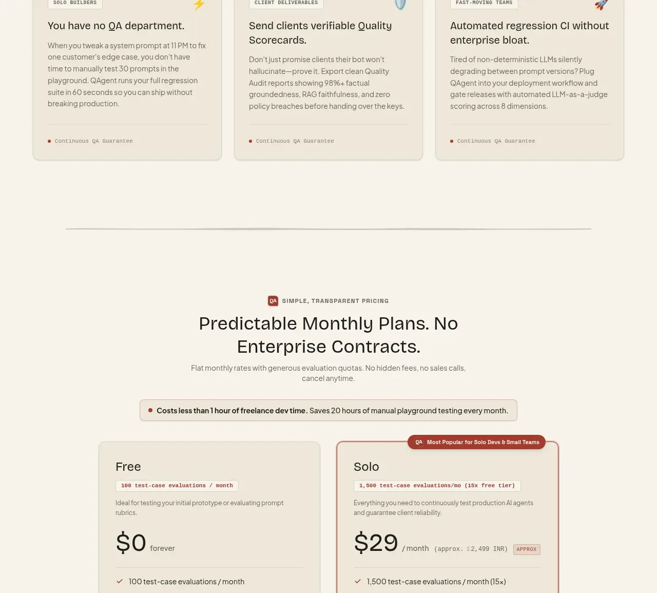
Design analysis
A simple pricing section contrasts a free plan with a highlighted paid plan, using feature lists and distinct CTAs to make the upgrade path obvious.
Prompt preview
## Reference images

Study these alongside the description below: hierarchy, rhythm, spacing, colour. Build for the product you are asked about, using this design language.

- Component: https://kage-design-assets.t3.tigrisfiles.io/components/qagent/ac07fafb-2e50-4f4b-8444-88a4bcf31a5f-1789711536-11.webp
- Full page it was cut from: https://kage-design-assets.t3.tigrisfiles.io/screenshots/qagent/ac07fafb-2e50-4f4b-8444-88a4bcf31a5f-1789711433120-full.webp
- Component on Kage: https://kage.design/component/qagent-pricing-table

## Before you start
Ask what the user's product is, who it serves, and what brand personality and visual system it should use. Then apply the principles below to that product rather than reproducing this reference.

Build a two-tier pricing section with a centered eyebrow, heading, subtitle, and a small reassurance strip above the cards. Use two large plan cards with equal widths, clear plan names, a short descriptor, prominent price and billing unit, feature checklists, and full-width CTA buttons. Visually emphasize the recommended plan with a brick-red border (#a94439), a small floating badge, and a filled accent button; keep the free plan quieter with a neutral outline button. Use #f6f2e8 page background, #eee8da cards, #d8d0c0 borders, #292721 text, #77736b copy, 10px radius, and 24–30px padding. Include responsive stacking and make billing/CTA labels accessible.

Never: use logos, product names, copy, illustrations, or imagery from the reference.
More components
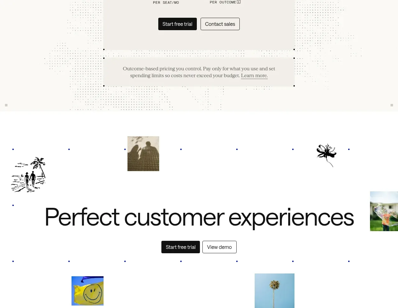
 Transparent pricing card
intercom.com · Pricing table
Transparent pricing card
intercom.com · Pricing table
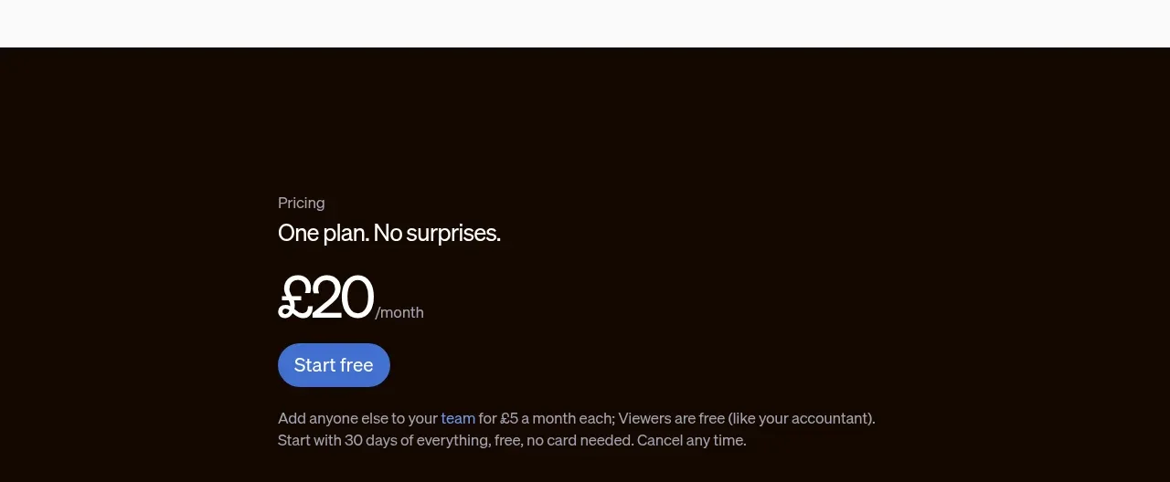
 Single-plan pricing offer
sendinvo.com · Pricing table
Single-plan pricing offer
sendinvo.com · Pricing table
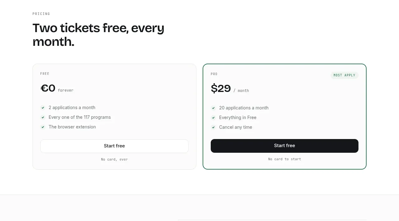
 Two-tier pricing table
ApplySeed · Pricing table
Two-tier pricing table
ApplySeed · Pricing table
F
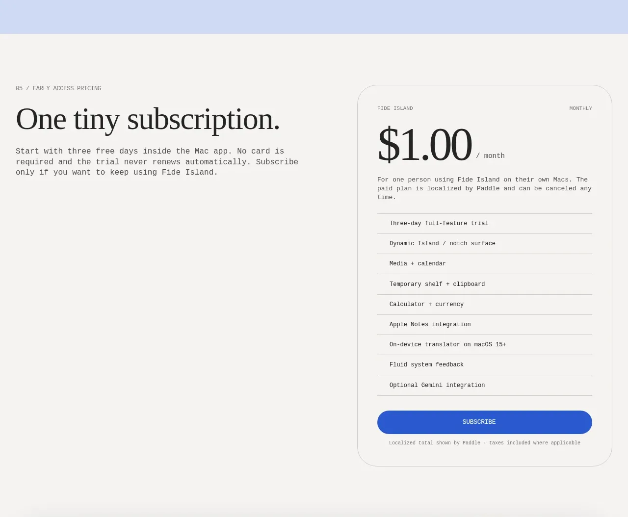
Single-plan early access pricing
Fide Island · Pricing table
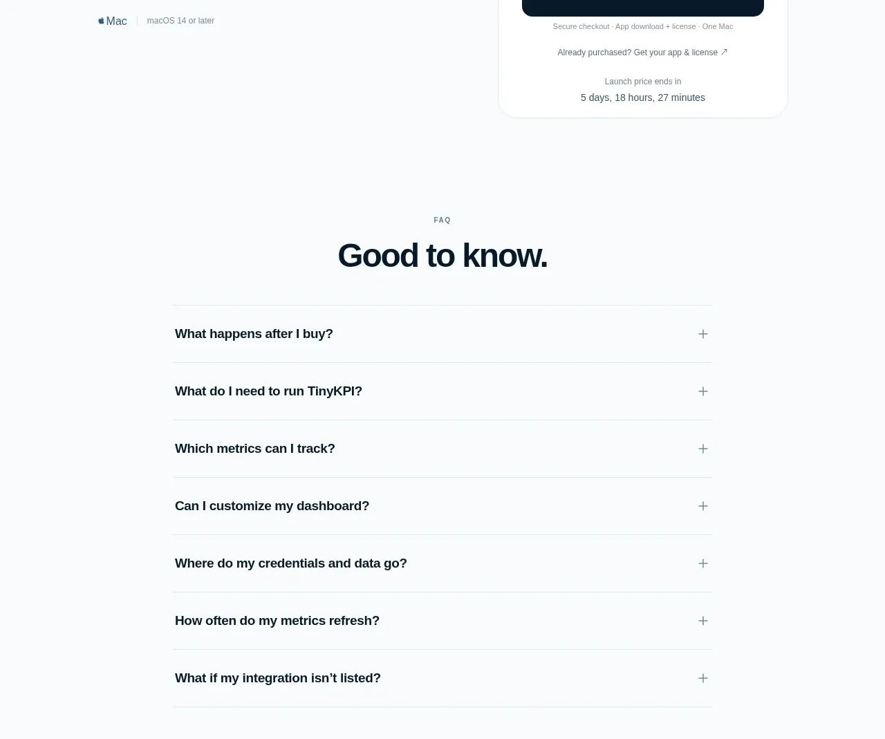
 Single launch price offer
TinyKPI · Pricing table
Single launch price offer
TinyKPI · Pricing table
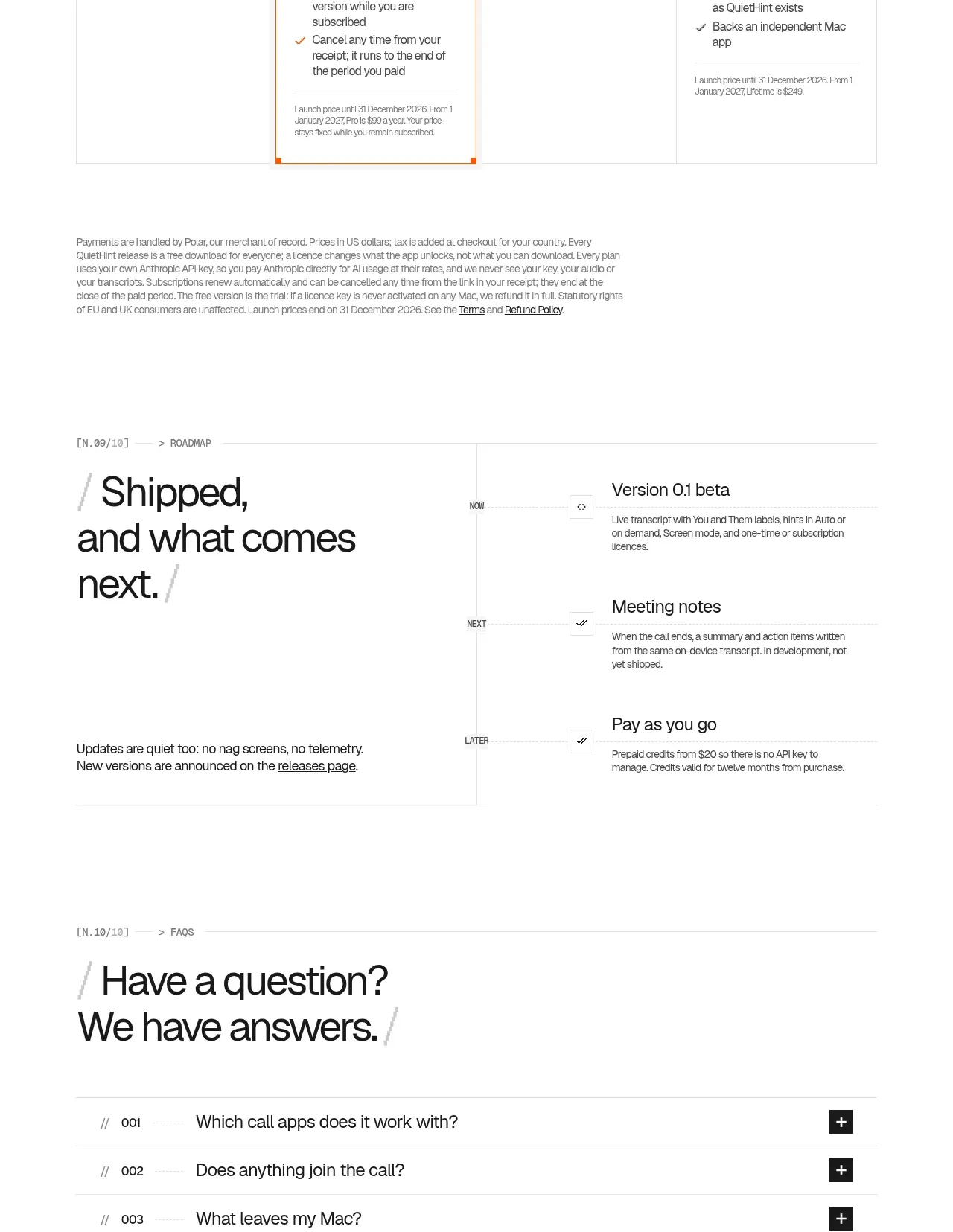
 Flexible four-plan pricing
QuietHint® · Pricing table
Flexible four-plan pricing
QuietHint® · Pricing table