 kage
vibeide.dev
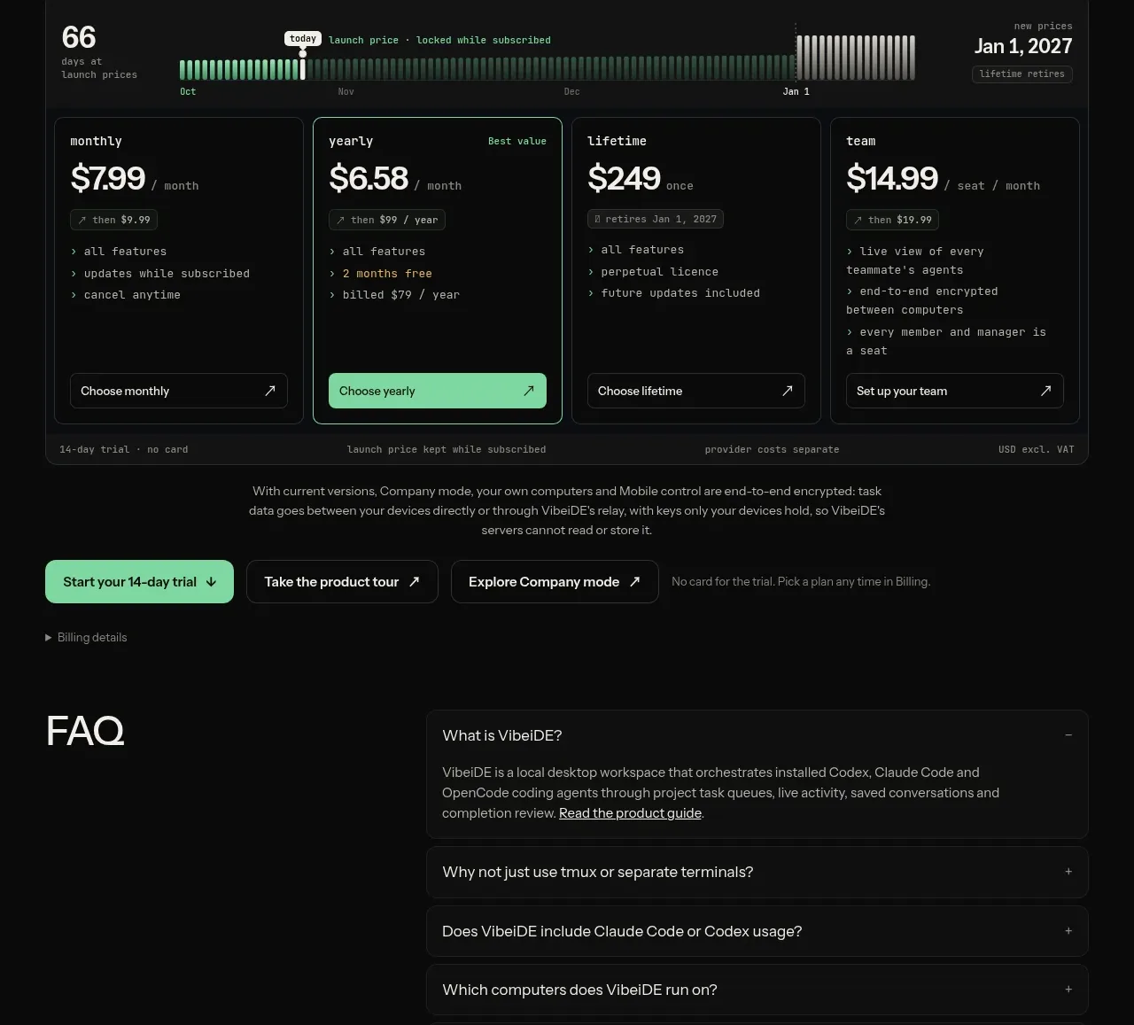
Design analysis
Pricing uses a launch-price timeline above four compact plan cards, then reinforces trust with trial, security, and provider-cost notes plus supporting CTAs.
Prompt preview
## Reference images

Study these alongside the description below: hierarchy, rhythm, spacing, colour. Build for the product you are asked about, using this design language.

- Component: https://kage-design-assets.t3.tigrisfiles.io/components/vibeide/07b340e8-2f64-4d74-b3e0-eba165a9aca9-1793080890-5.webp
- Full page it was cut from: https://kage-design-assets.t3.tigrisfiles.io/screenshots/vibeide/07b340e8-2f64-4d74-b3e0-eba165a9aca9-1793080830929-full.webp
- Component on Kage: https://kage.design/component/vibeide-pricing-table

## Before you start
Ask what the user's product and brand are, then apply the principles below to that product rather than reproducing this reference.

Create a dark pricing section with a left-aligned heading, a bordered launch/timeline strip, and four equal-width plan cards. Each card needs a small plan label, prominent price, billing unit, short bullet list, and full-width bottom CTA; visually emphasize one recommended card with a mint border or filled button. Add a compact note row for trial terms, billing behavior, and tax/provider caveats, followed by optional secondary actions. Use #080909, cards #101211, borders #2a2d2b, white #f1f1ed, muted #8e918c, mint #82e0ae, and radius 8–10px. Keep typography monospaced or tabular for prices and use a responsive two-column/mobile stack. Make billing-period controls keyboard accessible and update prices without layout shifts.

Never use the reference prices, product name, copy, plan names, timeline, or exact terms.
More components
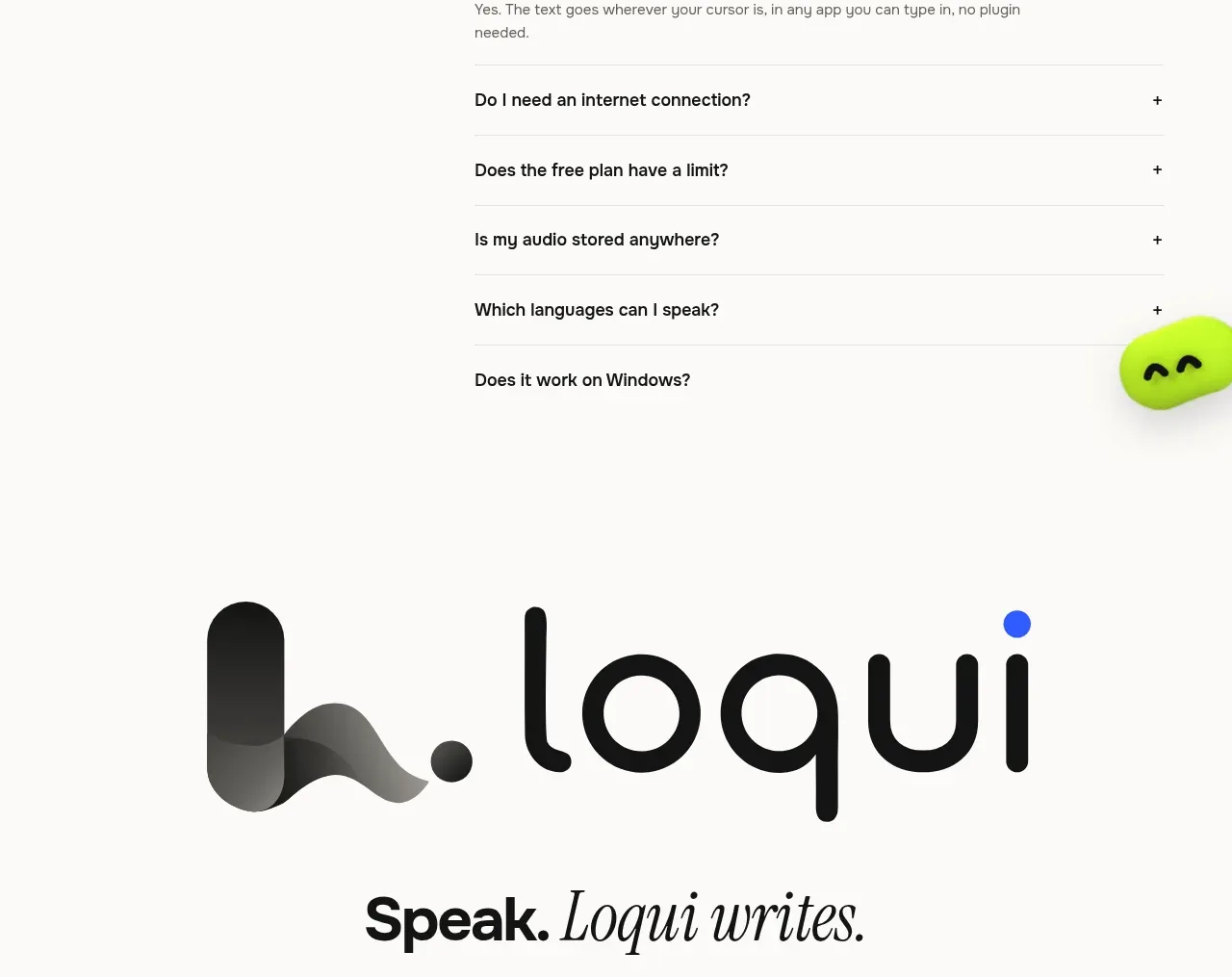
 Three-tier pricing plans
Loqui · Pricing table
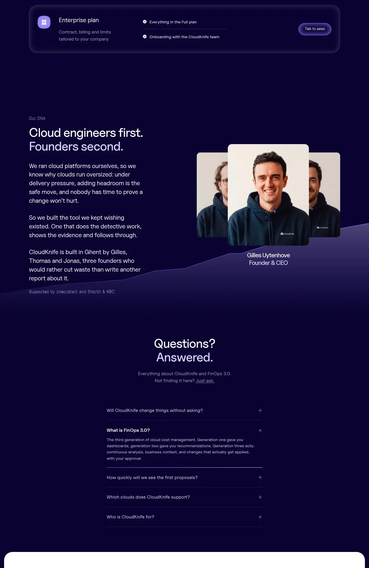
 Tiered pricing table
CloudKnife · Pricing table
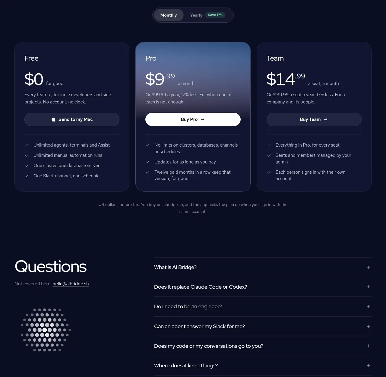
 Three-plan pricing table
AI Bridge · Pricing table
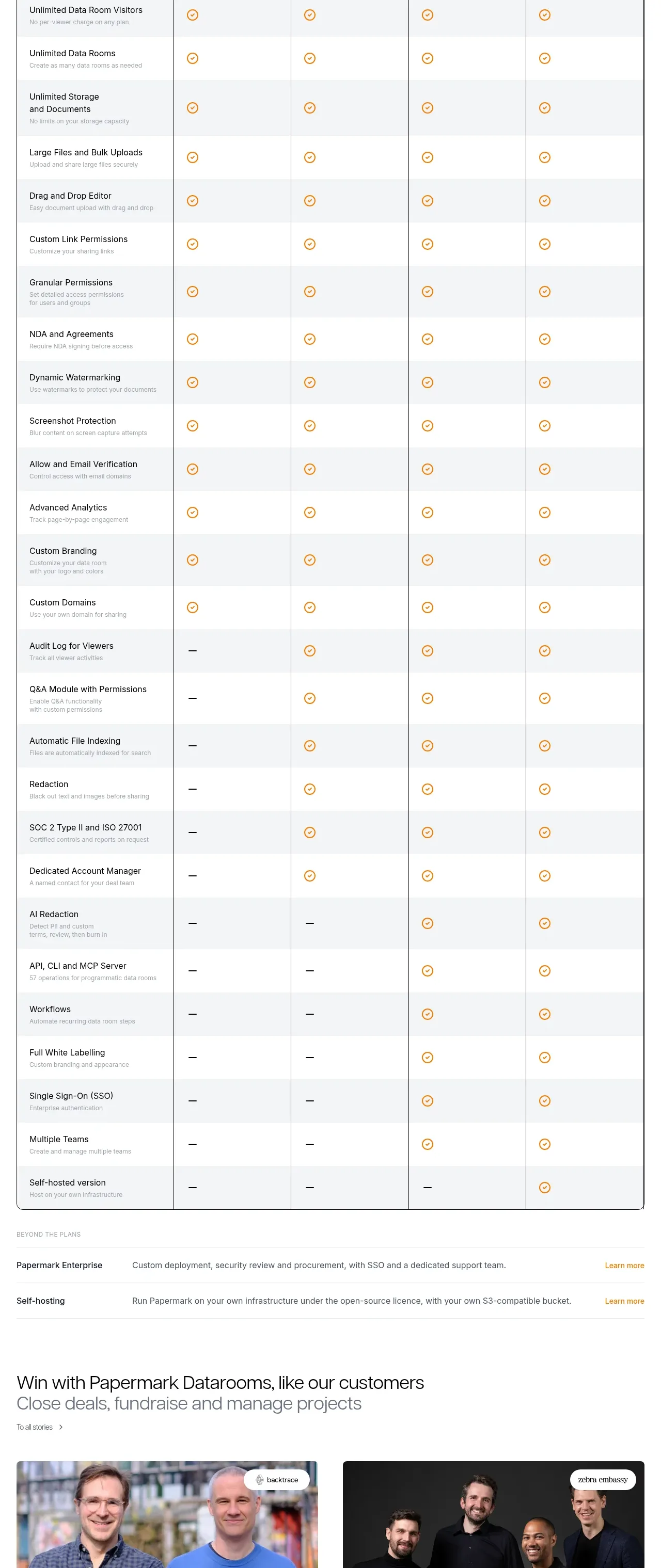
 Plan comparison table
Papermark Data Rooms · Pricing table
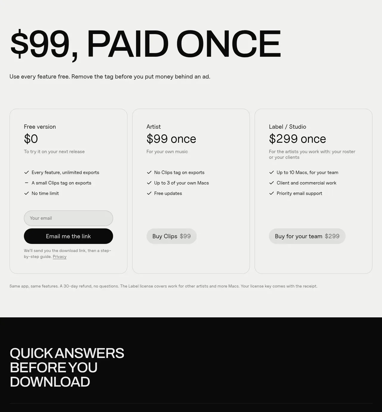
 One-time purchase pricing
Clips by Plastic · Pricing table
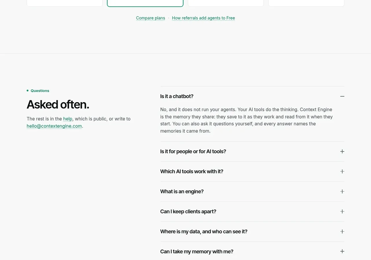
 Per-unit pricing table
Context Engine · Pricing table