 kage
cloudknife.com
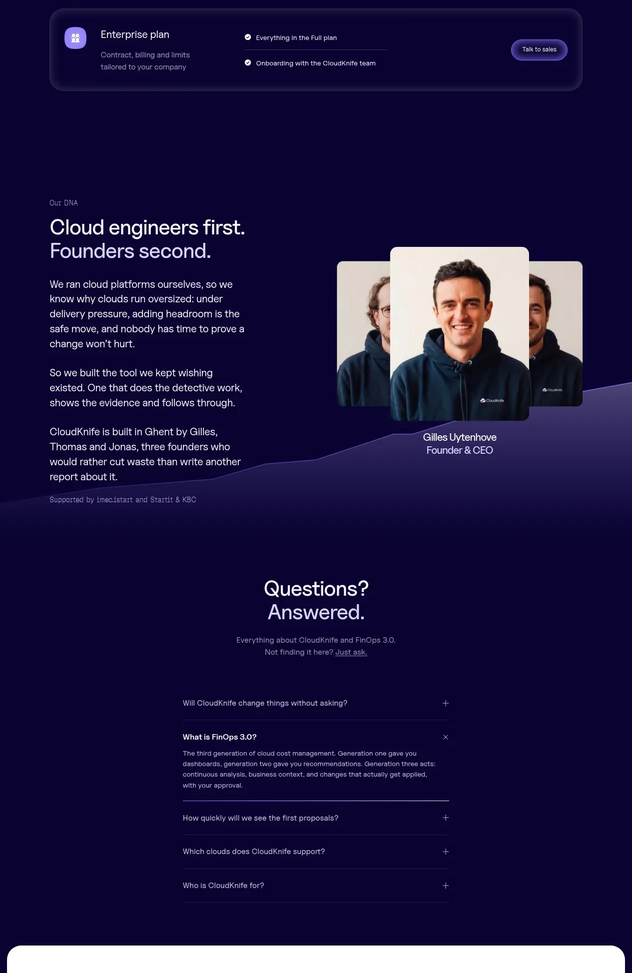
Design analysis
The pricing section combines a billing toggle, spend slider, three primary plans, and a full-width enterprise row in a consistent dark card system.
Prompt preview
## Reference images

Study these alongside the description below: hierarchy, rhythm, spacing, colour. Build for the product you are asked about, using this design language.

- Component: https://kage-design-assets.t3.tigrisfiles.io/components/cloudknife/9dafaa08-16c6-4721-8c78-296bafbb7abc-1793081093-10.webp
- Full page it was cut from: https://kage-design-assets.t3.tigrisfiles.io/screenshots/cloudknife/9dafaa08-16c6-4721-8c78-296bafbb7abc-1793080968695-full.webp
- Component on Kage: https://kage.design/component/cloudknife-pricing-table

## Before you start
Ask what the user's product is, who it serves, and what their brand personality and visual identity are. Apply the following principles to that product rather than copying the reference.

Design a dark pricing section with a centered eyebrow and two-line heading. Add a segmented billing toggle, then a wide monthly-spend slider with a prominent value. Below, show three equal-width pricing cards and a full-width enterprise strip. Each plan card needs a plan label, audience description, large price, billing note, CTA, and a vertically spaced feature list with check icons. Visually distinguish the recommended plan with a brighter lavender border or filled CTA, not an oversized card. Use #0b0630 page background, #15103f cards, #21194e borders, #faf9ff text, #aaa4c4 muted copy, and #907bff accent. Use 18–22px radii, 24px padding, and maintain equal card heights. Make the toggle and slider keyboard accessible; on mobile allow horizontal scrolling or stack plans clearly.

Never: use logos, product names, copy, illustrations, or imagery from the reference.
More components
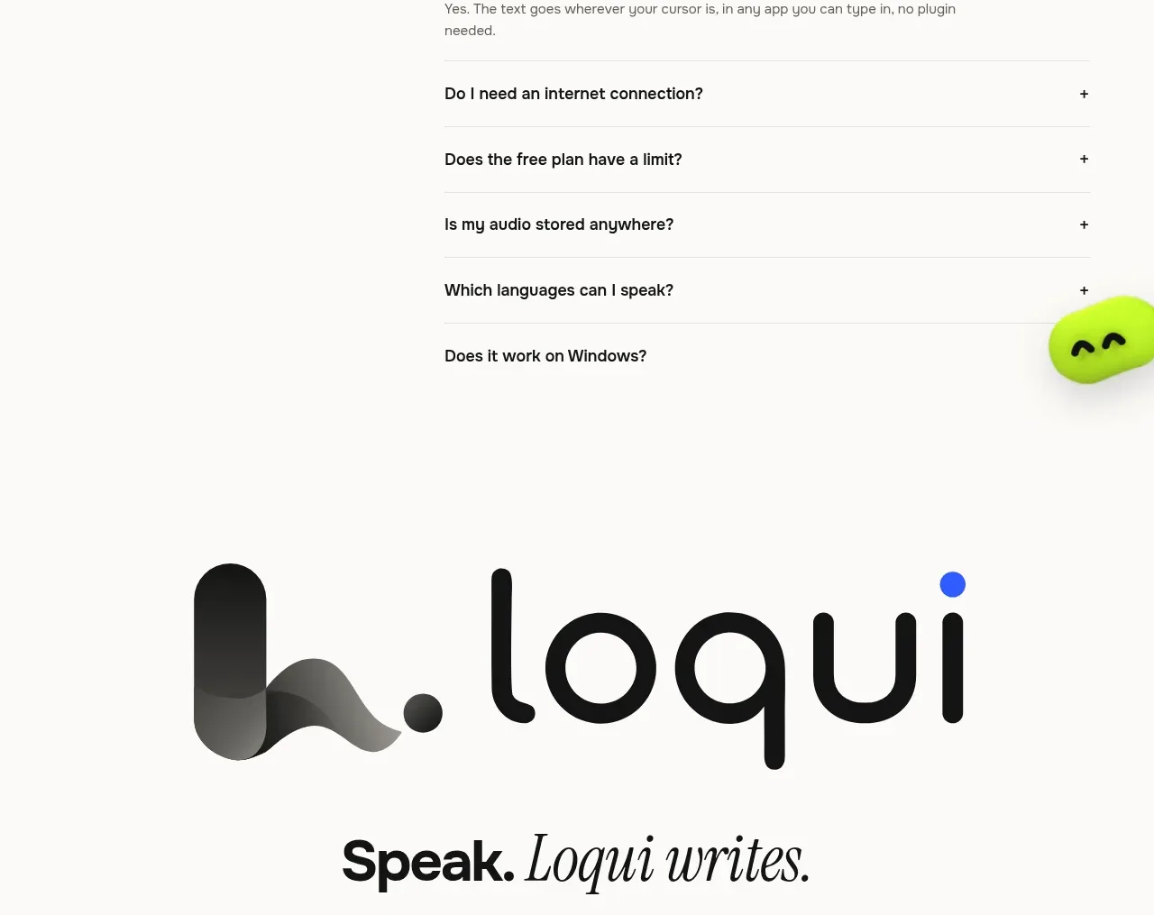
 Three-tier pricing plans
Loqui · Pricing table
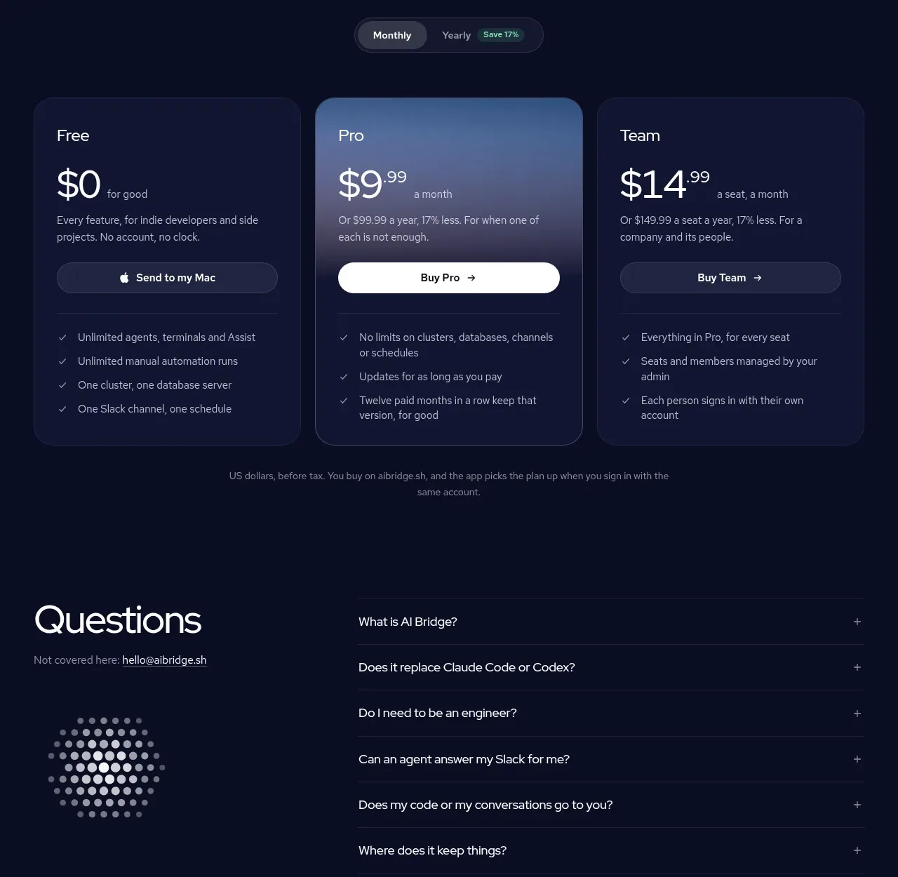
 Three-plan pricing table
AI Bridge · Pricing table
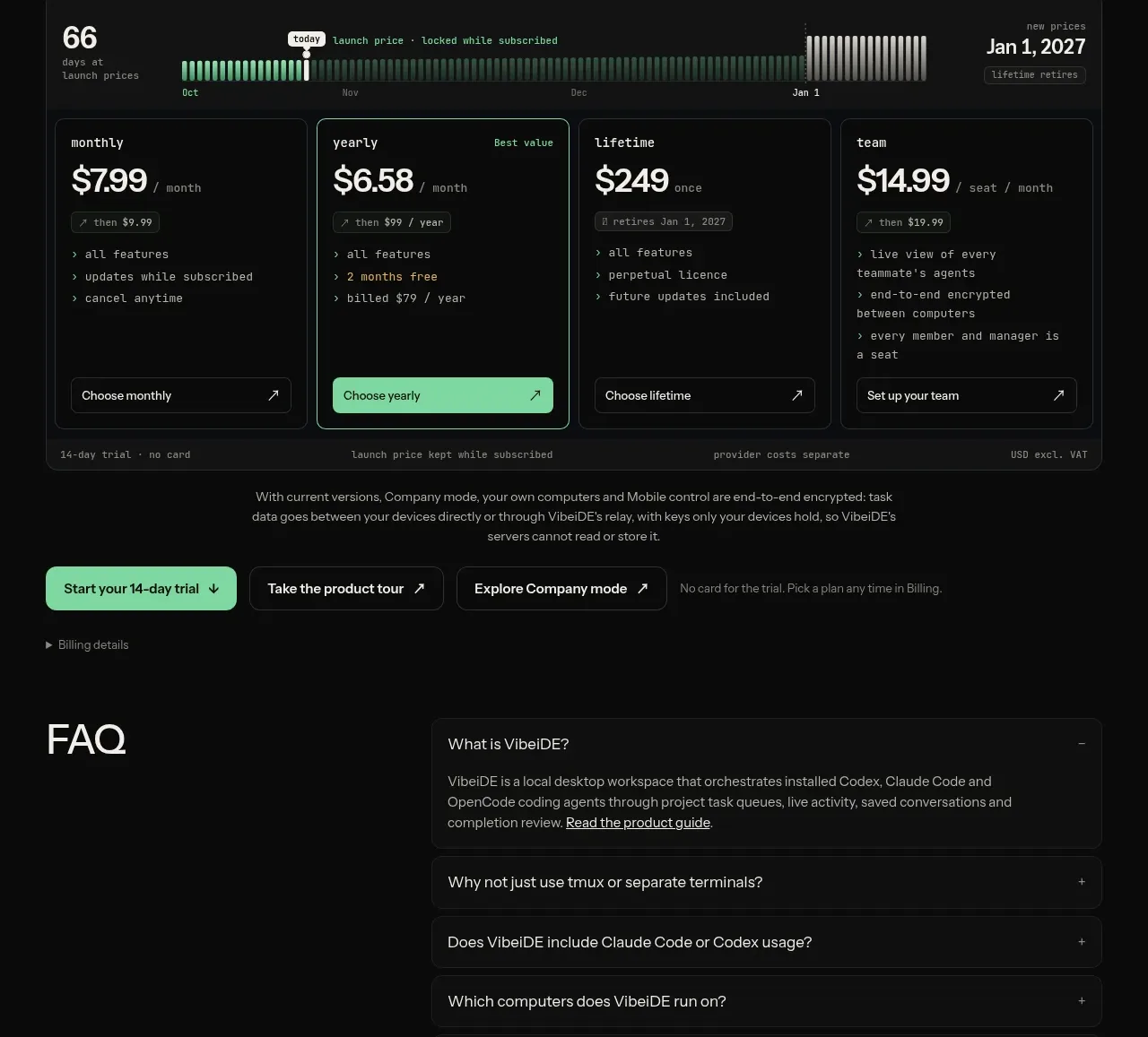
V
Four-plan pricing table
VibeiDE · Pricing table
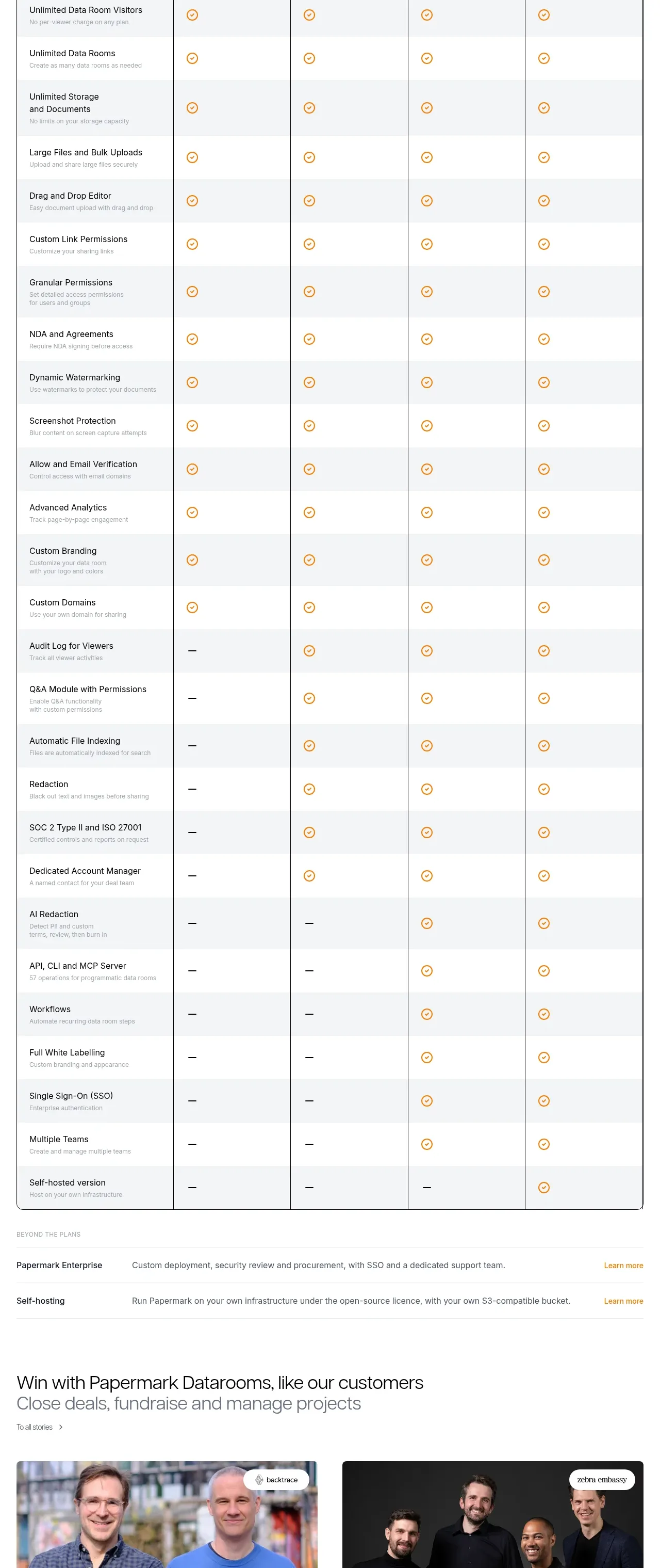
 Plan comparison table
Papermark Data Rooms · Pricing table
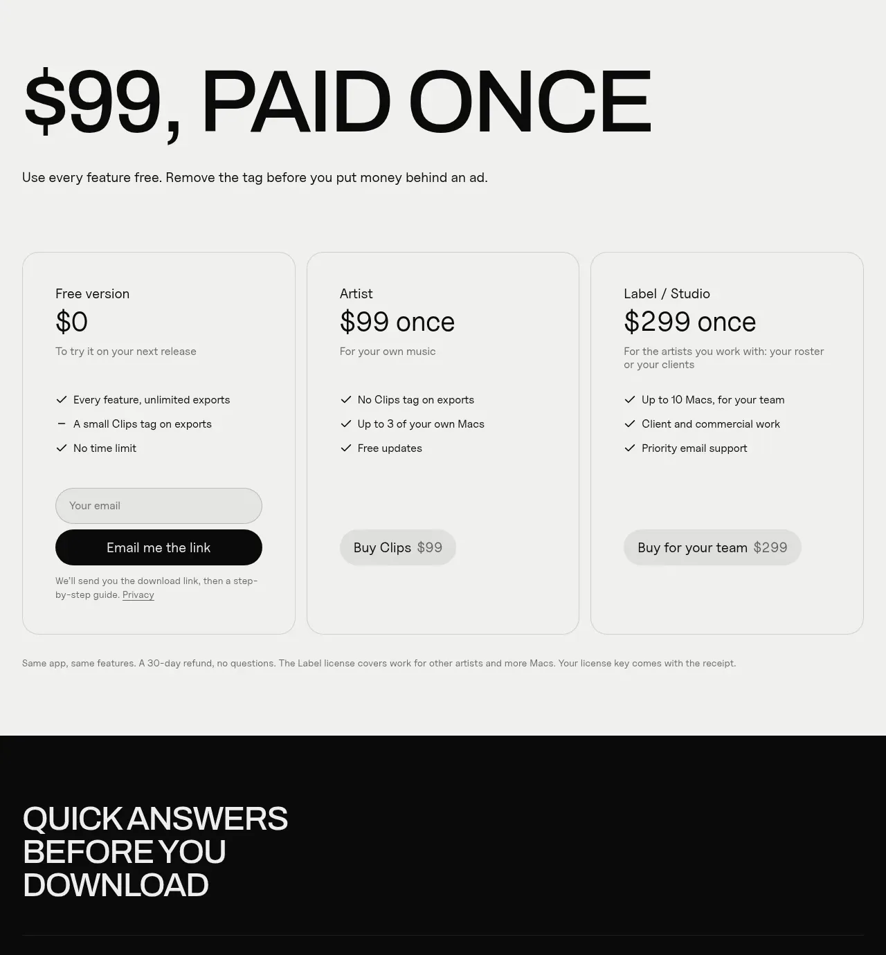
 One-time purchase pricing
Clips by Plastic · Pricing table
 Per-unit pricing table
Context Engine · Pricing table