 kage
loquime.com
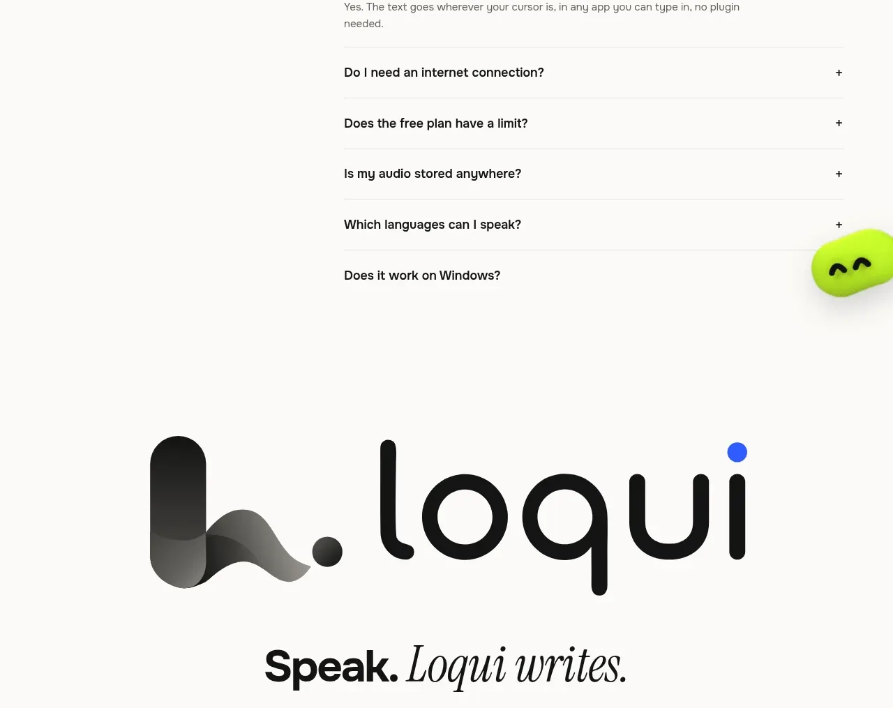
Design analysis
Three evenly weighted cards make plan comparison immediate, with the middle plan visually prioritised in blue. Each card includes a price, short audience description, feature summary, and one clear action.
Prompt preview
## Reference images

Study these alongside the description below: hierarchy, rhythm, spacing, colour. Build for the product you are asked about, using this design language.

- Component: https://kage-design-assets.t3.tigrisfiles.io/components/loqui/a3dfb9eb-3572-4db1-a73a-a6d0266fe180-1793081143-9.webp
- Full page it was cut from: https://kage-design-assets.t3.tigrisfiles.io/screenshots/loqui/a3dfb9eb-3572-4db1-a73a-a6d0266fe180-1793080985787-full.webp
- Component on Kage: https://kage.design/component/loqui-pricing-table

## Before you start
Ask about the user's actual plans, billing model, target customer for each tier, and primary conversion action. Build a truthful comparison using those answers.

Create a centered pricing section with an editorial heading and three plan cards. Use a neutral free tier, a highlighted primary tier, and a higher tier for advanced usage. Keep each card concise: name, price, billing note, audience description, key inclusions, and CTA.

Design rules:
- Use three equal columns in a max-width container with 14–18px gaps.
- Give cards 20–24px radii, #eeece8 neutral surfaces, and a saturated blue #3158f5 surface for the featured plan.
- Use dark text on neutral cards and white text on the featured card; keep CTA buttons high contrast with white pill surfaces.
- Align prices and CTAs consistently so comparison is effortless.
- Use a short underlined comparison link below the cards.
- Include focus states, clear monthly/annual billing semantics, and a responsive stacked layout.

Never:
- Never use logos, product names, copy, illustrations, or imagery from the reference.
- Never copy the reference's plan names, prices, feature limits, or CTA labels.
More components
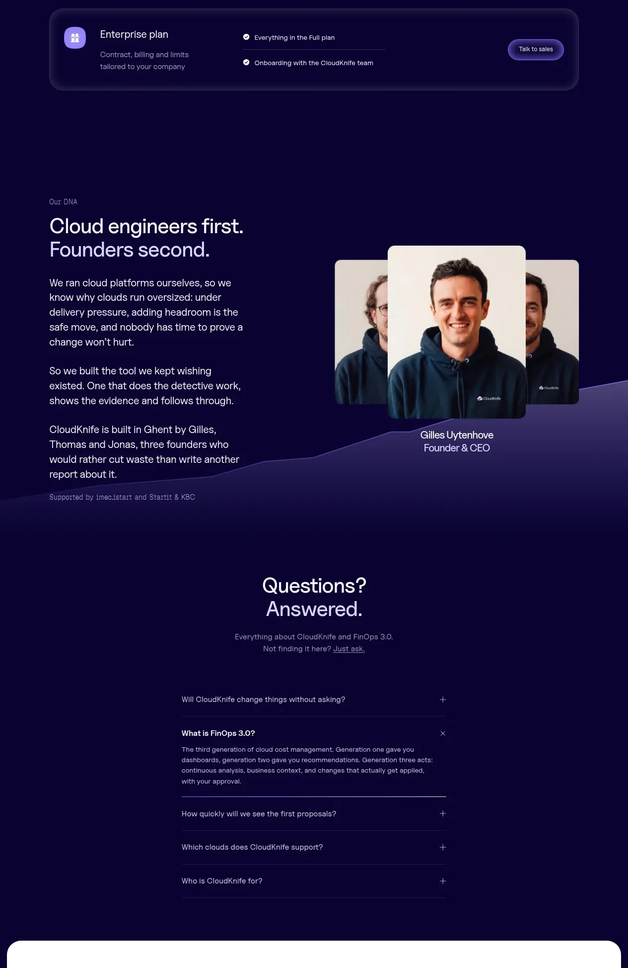
 Tiered pricing table
CloudKnife · Pricing table
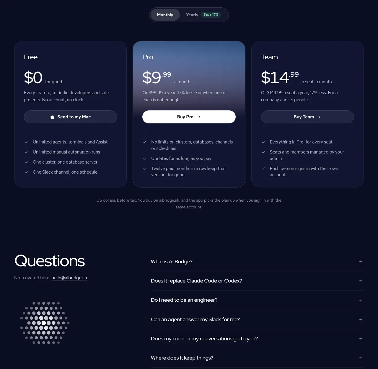
 Three-plan pricing table
AI Bridge · Pricing table
V
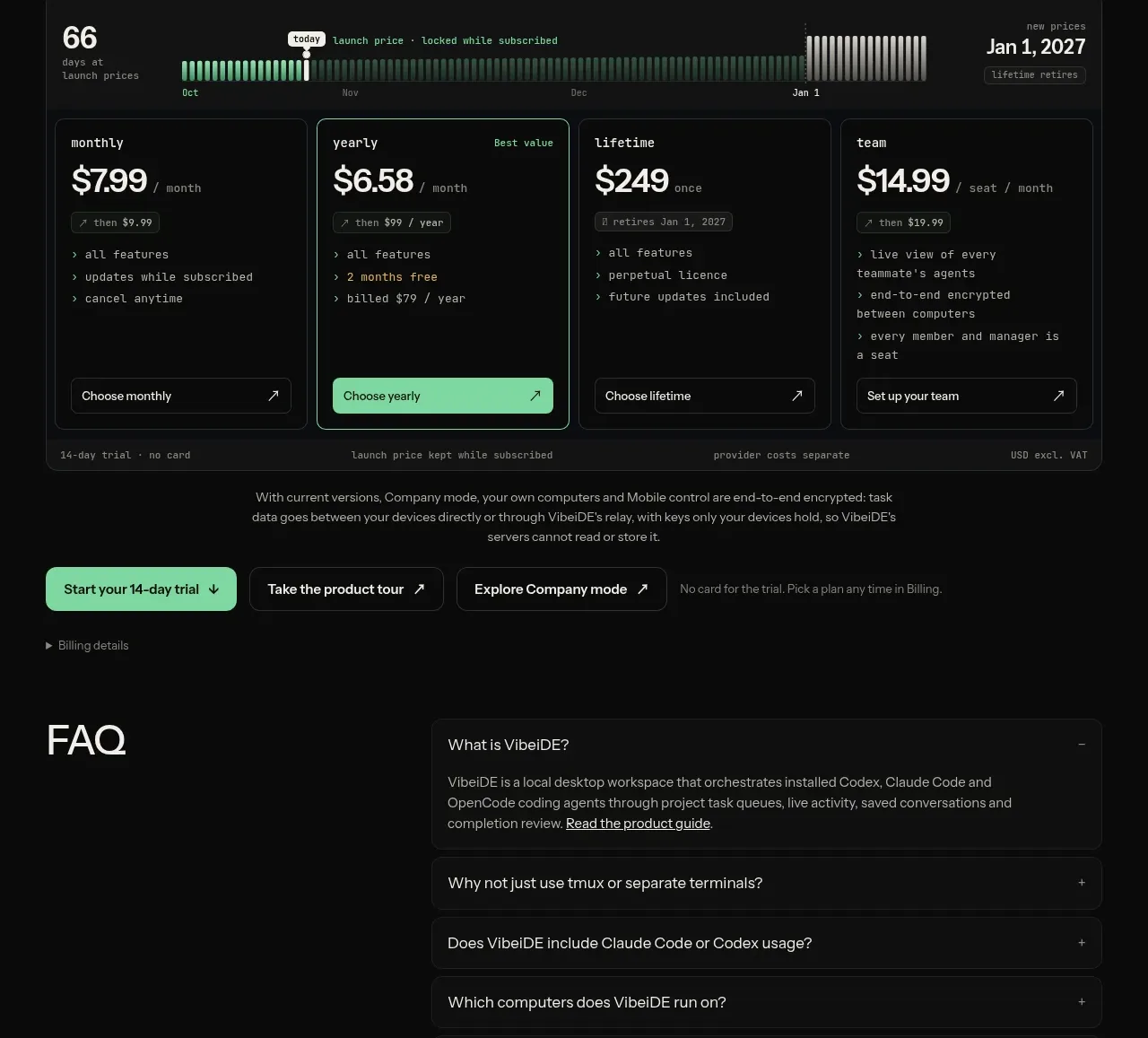
Four-plan pricing table
VibeiDE · Pricing table
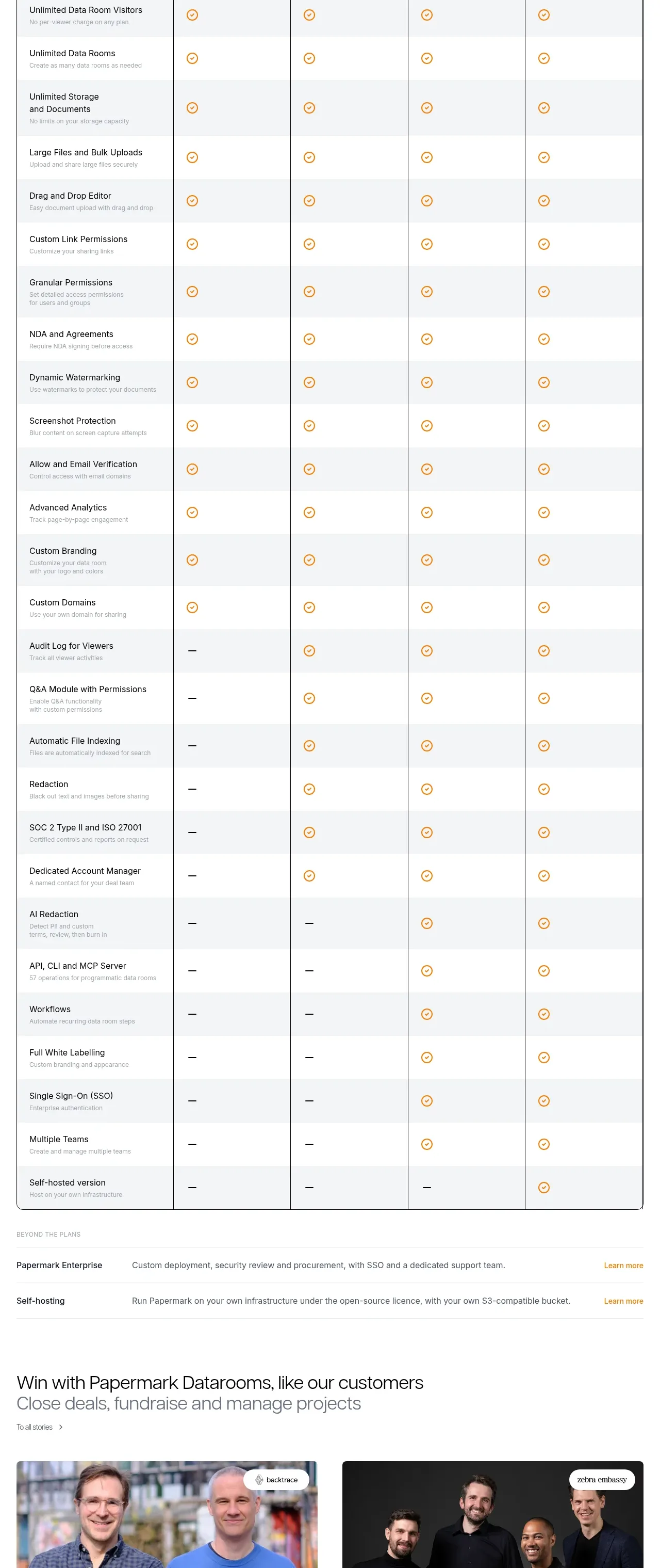
 Plan comparison table
Papermark Data Rooms · Pricing table
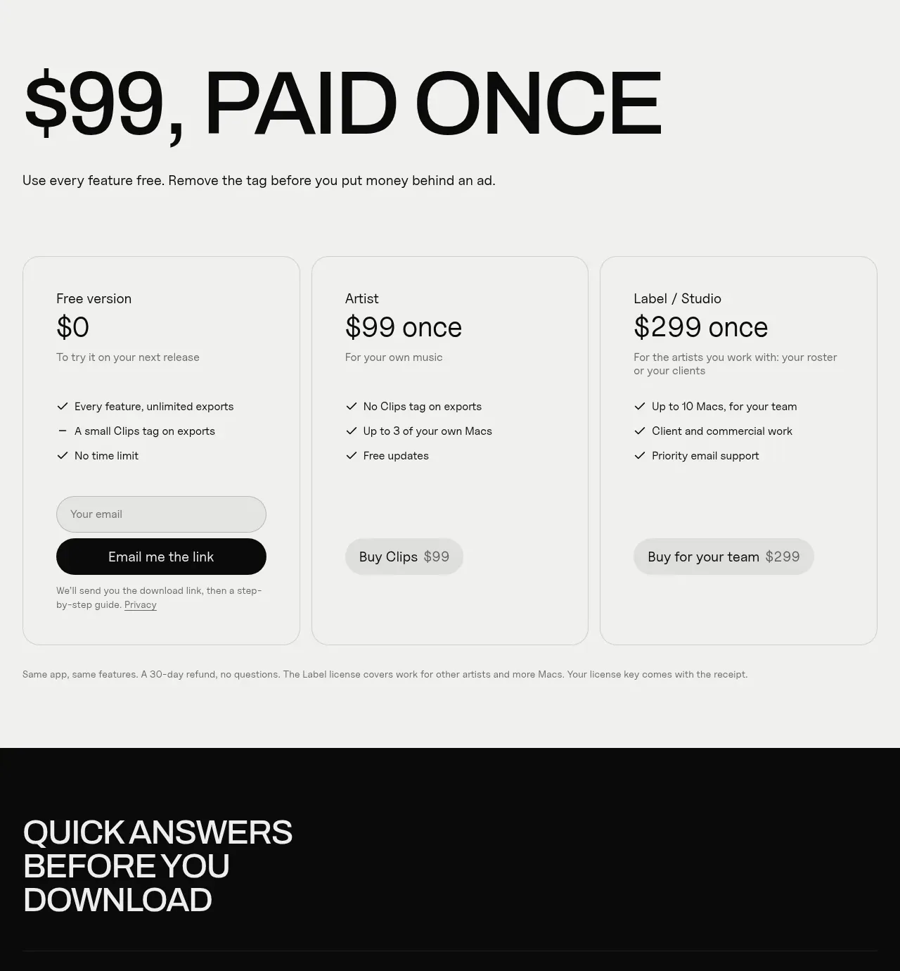
 One-time purchase pricing
Clips by Plastic · Pricing table
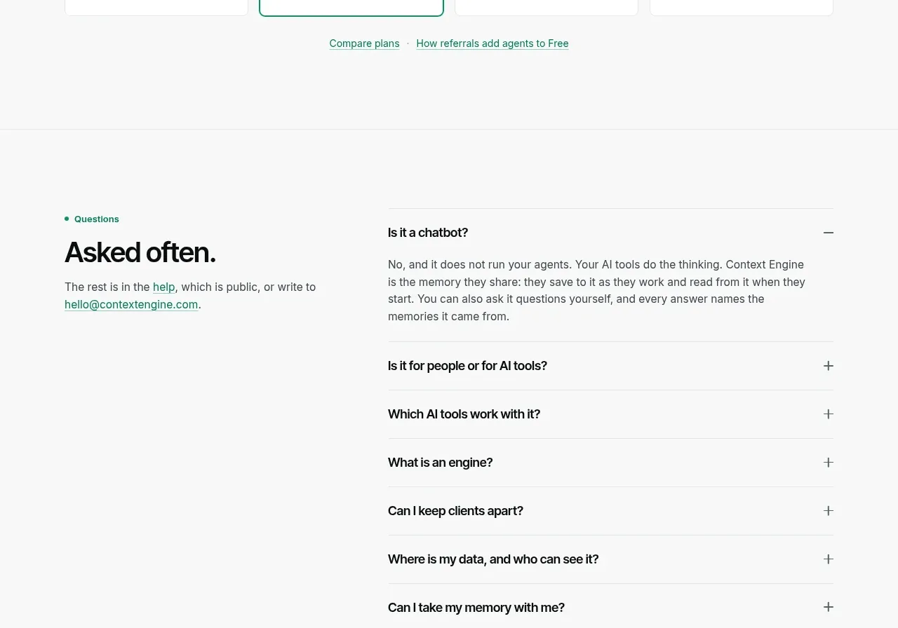
 Per-unit pricing table
Context Engine · Pricing table