 kage
kage
quiethint.com
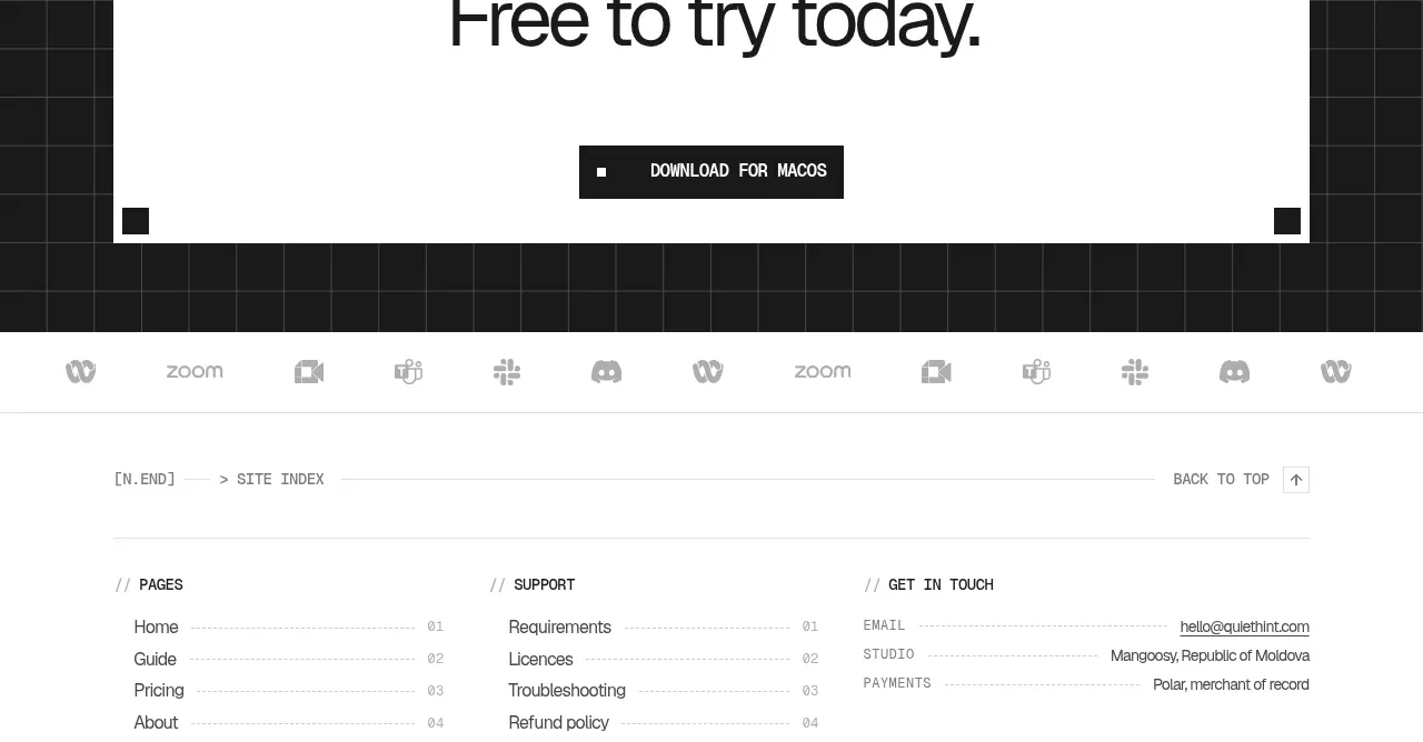
Design analysis
A framed white panel inside the dark grid creates a decisive final conversion moment. The centered headline, orange bracketed accent, and single download action make the next step unmistakable.
Prompt preview
## Reference images

Study these alongside the description below: hierarchy, rhythm, spacing, colour. Build for the product you are asked about, using this design language.

- Component: https://kage-design-assets.t3.tigrisfiles.io/components/quiethint-r/a06c27ca-94cd-4cb7-8750-fd2be8cedd1f-1789711427-10.webp
- Full page it was cut from: https://kage-design-assets.t3.tigrisfiles.io/screenshots/quiethint-r/a06c27ca-94cd-4cb7-8750-fd2be8cedd1f-1789711327026-full.webp
- Component on Kage: https://kage.design/component/quiethint-r-cta

## Before you start
Ask me what the most valuable next action is for my product and what reassurance a user needs before taking it. Then build an original closing CTA.

Create a dark full-width band around #171817 with a centered white rectangular panel framed by a 3px near-black border and small square corner markers. Inside, center a tiny uppercase eyebrow, a large two- or three-line headline, one highlighted phrase in orange #ef5b16, and a single primary CTA. Use a bold but airy sans-serif for the headline, condensed uppercase text for the button, and generous vertical padding. Keep the panel almost square-cornered, with no gradients or stock imagery. The primary button should be black with white text and a tiny square marker; add a visible hover inversion and a strong keyboard focus ring. The message should emphasize the user’s outcome and reduce commitment anxiety without overexplaining.

Never use the reference's logos, product names, copy, illustrations, imagery, or exact CTA wording.
More components
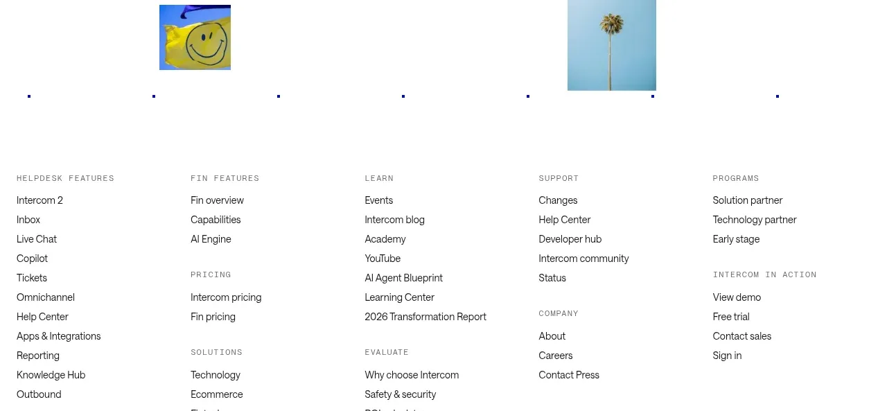
 Final customer experience call to action
intercom.com · Call to action
Final customer experience call to action
intercom.com · Call to action
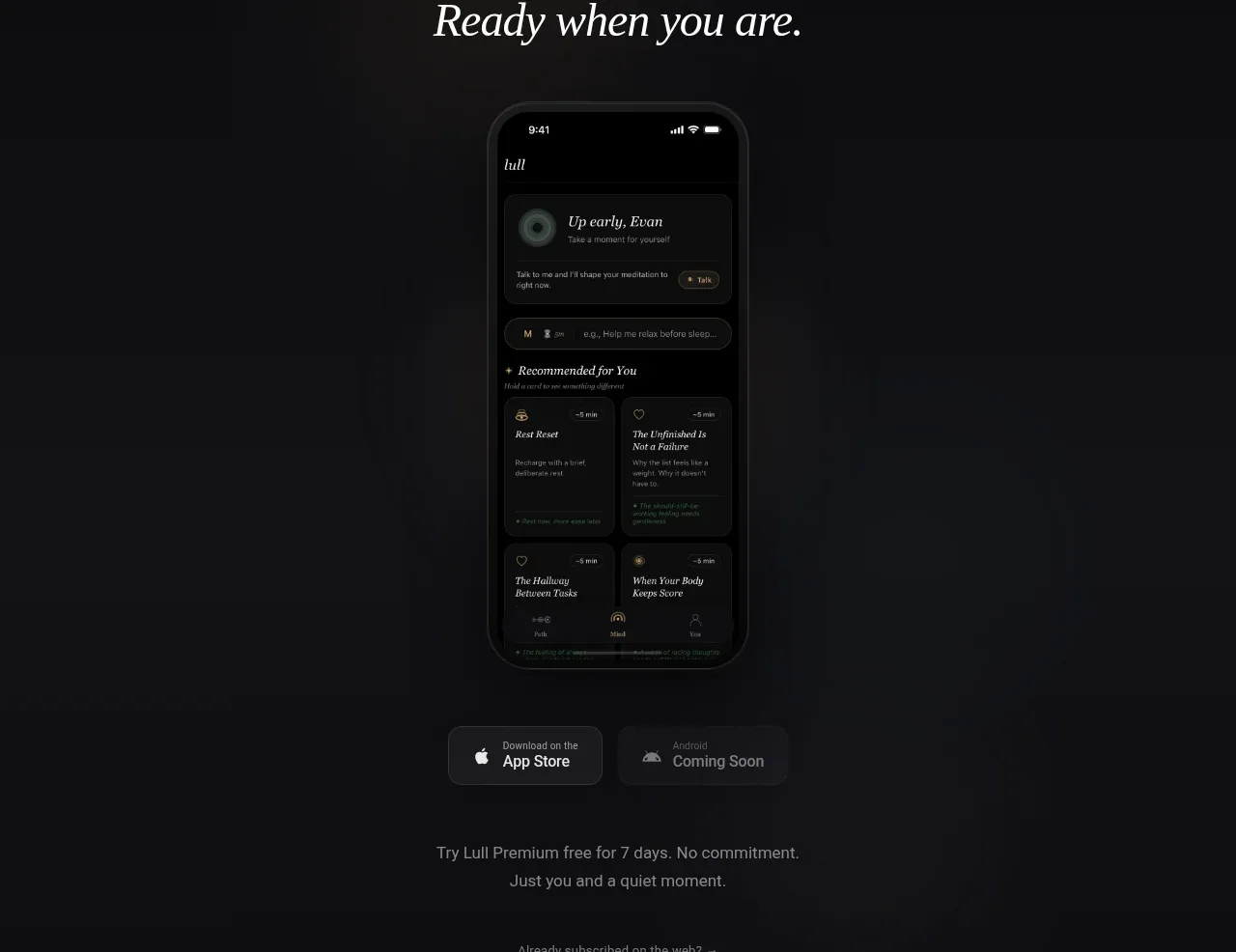
 App download conversion
Lull · Call to action
App download conversion
Lull · Call to action

 Centered final call to action
ApplySeed · Call to action
Centered final call to action
ApplySeed · Call to action
F
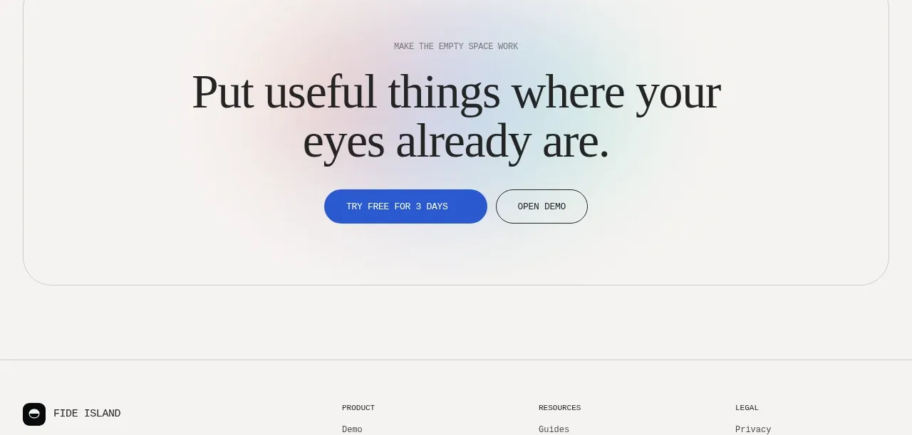
Final conversion call to action
Fide Island · Call to action

 Inline conversion banner
QAgent · Call to action
Inline conversion banner
QAgent · Call to action
A
Final signup call to action
Axiom · Call to action