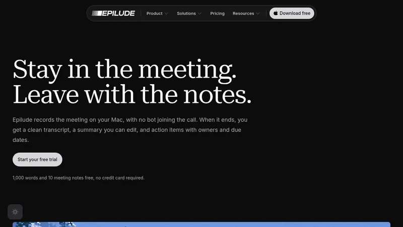
kage
kage
quiethint.com

Design analysis
A long-form product page uses a strict editorial grid, compact monospace metadata, oversized black sans-serif headings, and orange as a restrained technical accent. The page alternates airy white sections with dense charcoal feature panels, moving from hero and compatibility proof into feature cards, privacy visualization, overlay demonstration, workflow steps, guide, testimonials, pricing, roadmap, FAQ, and a framed final CTA; thin rules and square-cornered controls maintain a utilitarian interface feel throughout.
Prompt preview
## Reference images

Study these alongside the description below: hierarchy, rhythm, spacing, colour. Build for the product you are asked about, using this design language.

- Full page: https://kage-design-assets.t3.tigrisfiles.io/screenshots/quiethint-r/a06c27ca-94cd-4cb7-8750-fd2be8cedd1f-1789711327026-full.webp
- Above the fold: https://kage-design-assets.t3.tigrisfiles.io/screenshots/quiethint-r/a06c27ca-94cd-4cb7-8750-fd2be8cedd1f-1789711324046.webp
- Design on Kage: https://kage.design/designs/quiethint-r-landing-page

## Before you start
Ask the user what they are building, who it is for, and what brand assets they already have, including the name, colours, typography, logos, and imagery. Wait for their answers before designing. Apply the reference’s principles to their product, not to QuietHint.

## Page structure
1. **Technical masthead:** Start with a dark charcoal header over a fine square grid. Place a compact segmented navigation at the upper left, a boxed primary action at the upper right, a small product/status line below, and a subtle scroll cue.
2. **Hero:** Use a wide white content area with a large multi-line sans-serif headline on the left, highlighting one phrase in orange bracket-like treatment. Put a compact explanatory paragraph, small qualifier, primary dark button, and secondary text link on the right.
3. **Compatibility strip:** Add a bordered panel explaining that the product works with existing tools, followed by a row of muted service marks or categories and a small disclaimer line.
4. **Process banner:** Use a pale dotted/grid texture with a centered, monospace-like sequence showing the product flow from local processing to output, with orange words and simple directional symbols.
5. **What-it-does section:** Introduce the section with a tiny numbered metadata label, a thin horizontal rule, a large two-line heading, and a download action. Follow with three equal bordered cards, each containing a pixel-like monochrome icon, item number, feature title, and short bottom caption.
6. **Privacy section:** Pair a large heading and privacy-policy button on the left with a four-cell numeric proof panel on the right. Below, show a wide orange vertical-bar data visualization with a small legend and explanatory footnote.
7. **Dark overlay section:** Switch to a charcoal full-width panel. On the left, show small orange category labels, a selected feature description, and muted secondary feature rows; on the right, show a dark framed product-overlay mockup. Finish with a large heading and a three-column bordered benefit row covering broad compatibility, staying out of the way, and no account requirement.
8. **How-it-works section:** Return to white. Use a numbered heading and download action, then a four-column step grid with short descriptions above an orange divider and an orange step title/icon below.
9. **In-call example:** Create a two-column block with a pale textured browser/transcript mockup on the left and a large outcome-focused heading, button, and example use-case list on the right.
10. **Guide section:** Use a heading and guide button on the left, with a concise practical description. On the right, place two bordered guide-preview cards with small metadata, thumbnails, and view links.
11. **Testimonials section:** Use another dark charcoal panel with a heading, arrow controls, and a horizontally arranged row of bordered quote cards. Each card has an orange category tag, a short user problem, and a practical suggested response.
12. **Pricing section:** Present a large heading with a compact billing toggle, then four adjacent pricing cards. Keep the cards white and rule-based, differentiate the recommended plan with an orange border/marker, show price, action button, inclusions, and fine-print notes, and place payment/legal text below.
13. **Roadmap section:** Use a two-column white layout: a large shipped/next heading and status note on the left, and a vertical timeline on the right with now/next/later labels, compact status markers, and short roadmap descriptions.
14. **FAQ section:** Add a large question heading followed by a full-width accordion list. Each row has a small numeric label, question text, and a black square plus control aligned to the right.
15. **Pre-footer logo rail:** Insert a narrow white strip containing a repeating row of muted category/service symbols before the final CTA.
16. **Final CTA:** Place a dark gridded background behind a centered white, square-cornered framed panel. Add tiny status text, a large multi-line headline with one orange bracketed word, and a centered dark download button. Use small black corner blocks as framing details.
17. **Footer navigation:** Repeat the restrained service-symbol rail, then provide a site-index area with three columns for pages, support, and contact details, plus a back-to-top control.
18. **Brand footer:** End on a very pale grid background with a large black product-neutral brand lockup area, small attribution/legal text, and compact policy links.

## Design language
- Build hierarchy with oversized geometric sans-serif headings, compact body copy, and tiny uppercase/monospace metadata labels; use roughly 56–72px desktop section headings, 18–24px card headings, and 10–12px utility text.
- Keep the page on a centered wide grid with thin one-pixel rules. Alternate spacious white sections with dense dark sections so the long page changes rhythm without changing its underlying system.
- Use near-white backgrounds around `#ffffff` and `#f7f7f5`, charcoal panels around `#202020`, black text around `#111111`, muted gray around `#777777`, and a vivid orange accent around `#f45112` or `#ff5a12`.
- Reserve orange for highlighted headline fragments, labels, dividers, data bars, selected pricing states, and small status details. Keep most icons, service marks, and secondary text grayscale.
- Pair a clean neo-grotesk sans-serif for headings and body copy with a condensed or monospace face for labels, numbering, buttons, disclaimers, and technical sequences. Use bracketed fragments and slash-like section markers as recurring typographic punctuation.
- Prefer square corners, thin gray borders, hard-edged black buttons, and almost no conventional shadow. Use subtle dotted or square grid textures behind dark mastheads, process banners, mockups, and the closing CTA.
- Make cards feel like printed interface modules: clear internal padding, strong alignment, numbered labels, bottom captions, and dense fine print. Let pricing and FAQ rows use explicit dividers rather than floating containers.
- Use small blocky/pixel-inspired monochrome icons where an icon is needed, but keep them subordinate to text. Avoid decorative illustration and photography.
- Keep motion restrained: use subtle hover inversion or orange emphasis on buttons, accordion expansion for FAQs, horizontal movement for testimonial cards, and smooth scrolling between the anchored sections. Do not add flashy parallax or gradients.
- Ensure the mobile version preserves the editorial sequence: stack columns, keep bordered cards, reduce heading scale, turn horizontal rails into scrollable rows, and maintain accessible contrast and tap targets.

## Never
- Do not copy QuietHint’s logos, wordmarks, product name, tagline, exact copy, screenshots, icons, service marks, or distinctive brand lockup.
- Do not use the reference’s product or present the result as QuietHint.
- Do not import its illustrations, photography, pricing values, testimonials, legal text, or roadmap content; create content appropriate to the user’s product.
- Do not turn every section into a card or add generic SaaS gradients, rounded glass panels, or heavy drop shadows that contradict the rule-based editorial system.
Components from this page
All components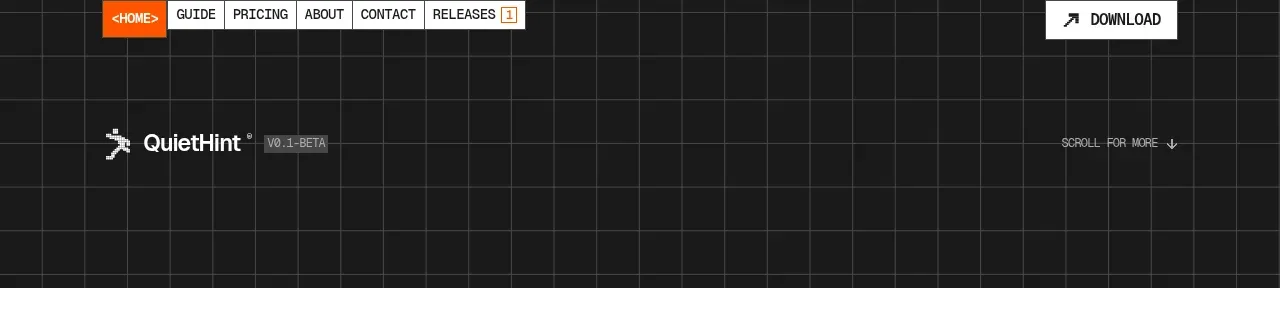
 Utility navigation and product masthead
QuietHint® · Navigation
Utility navigation and product masthead
QuietHint® · Navigation
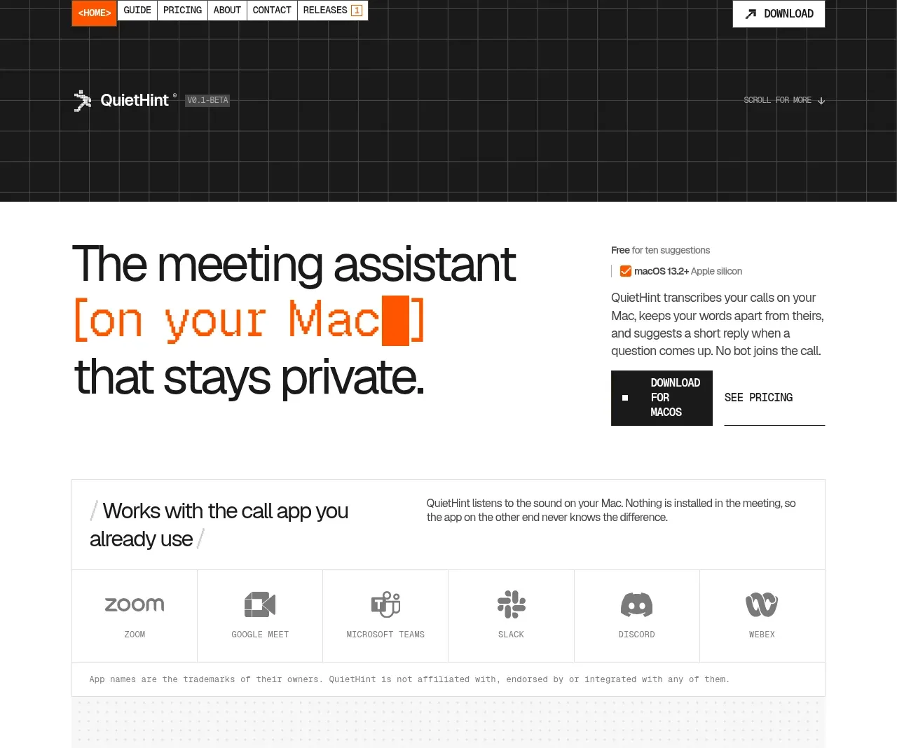 Privacy-first meeting assistant hero
QuietHint® · Hero
Privacy-first meeting assistant hero
QuietHint® · Hero
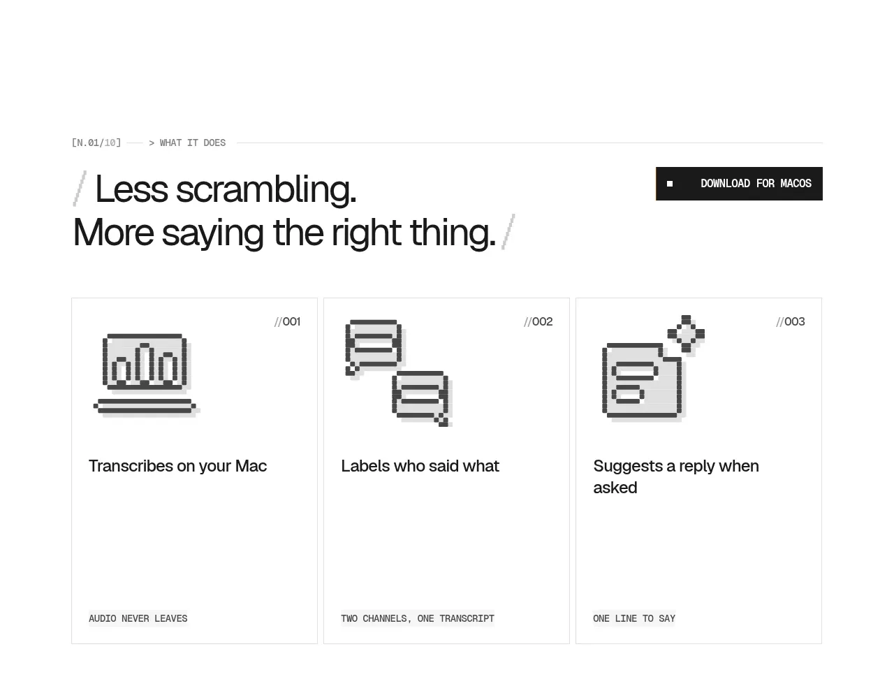 Three focused product benefits
QuietHint® · Feature grid
Three focused product benefits
QuietHint® · Feature grid
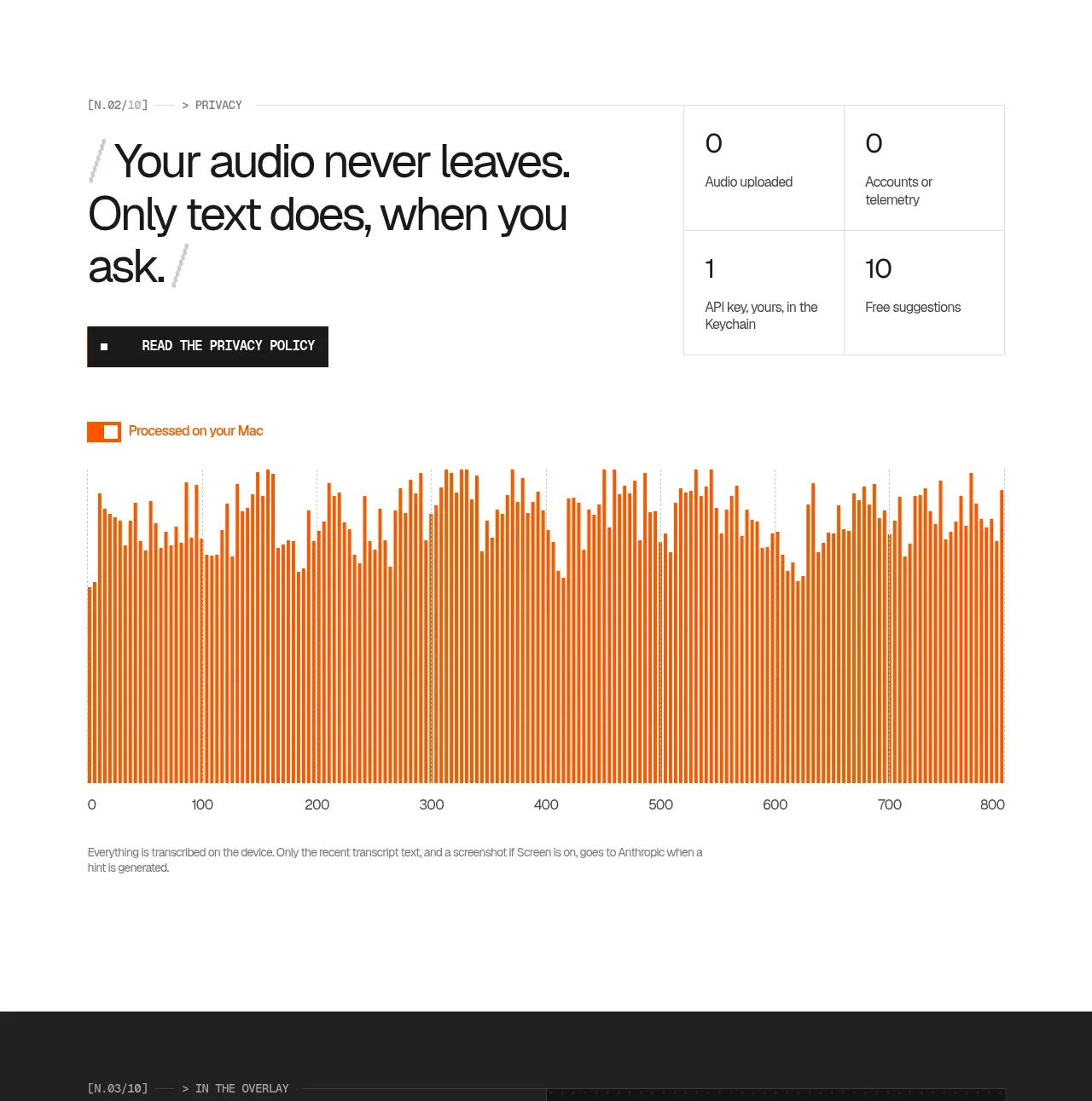 Privacy promise with processing chart
QuietHint® · Stats
Privacy promise with processing chart
QuietHint® · Stats
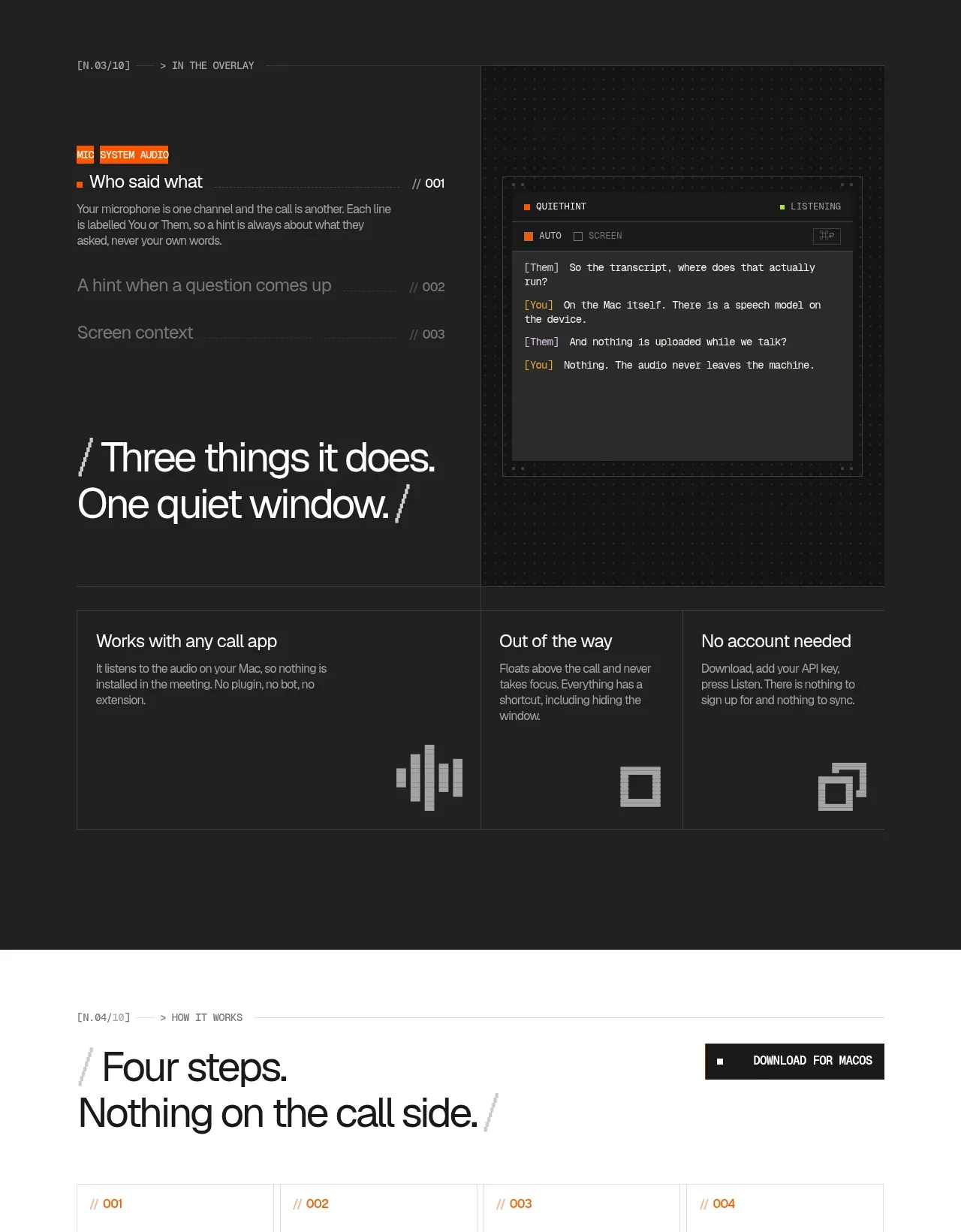 Dark overlay workflow section
QuietHint® · Feature grid
Dark overlay workflow section
QuietHint® · Feature grid
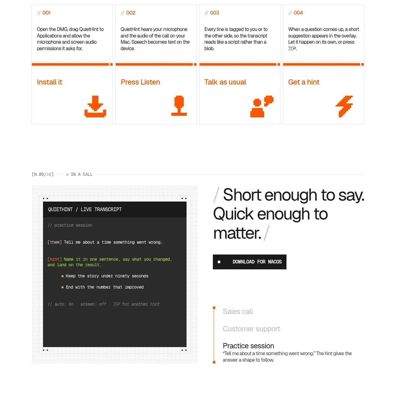 Four-step setup guide
QuietHint® · Feature grid
Four-step setup guide
QuietHint® · Feature grid
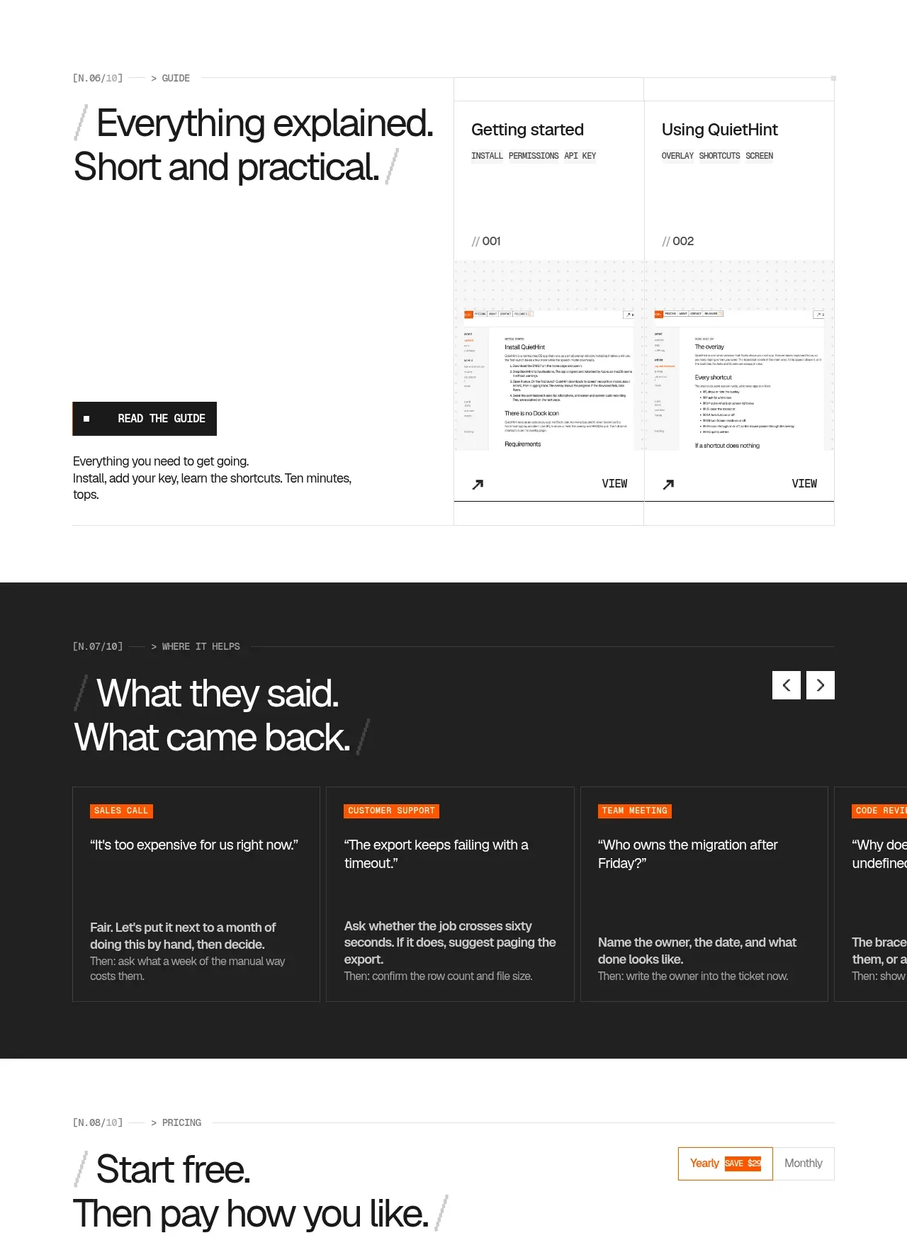 In-context transcript and practical guide
QuietHint® · Gallery
In-context transcript and practical guide
QuietHint® · Gallery
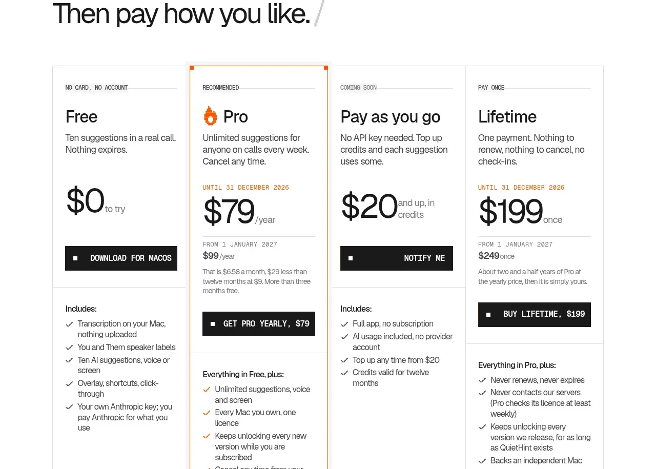 Objection-to-response examples
QuietHint® · Testimonials
Objection-to-response examples
QuietHint® · Testimonials
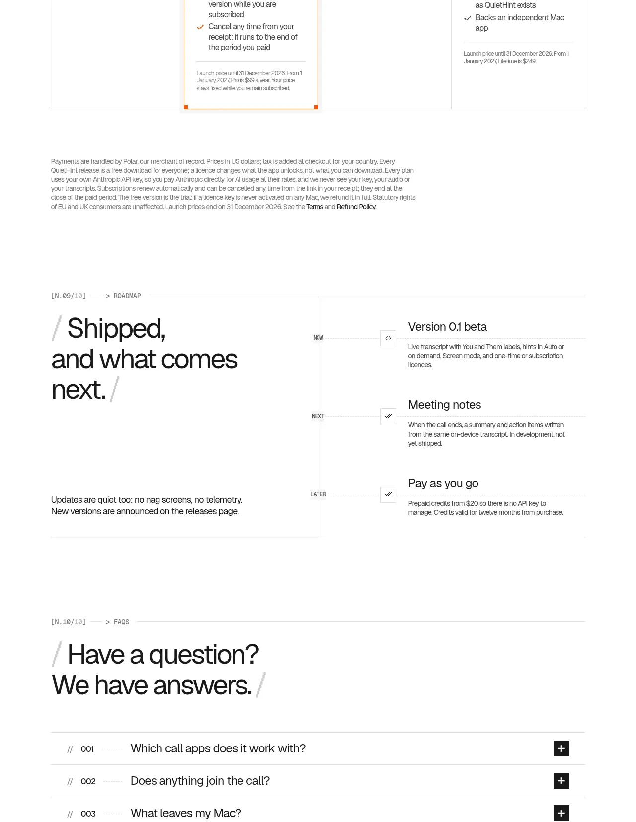 Flexible four-plan pricing
QuietHint® · Pricing table
Flexible four-plan pricing
QuietHint® · Pricing table
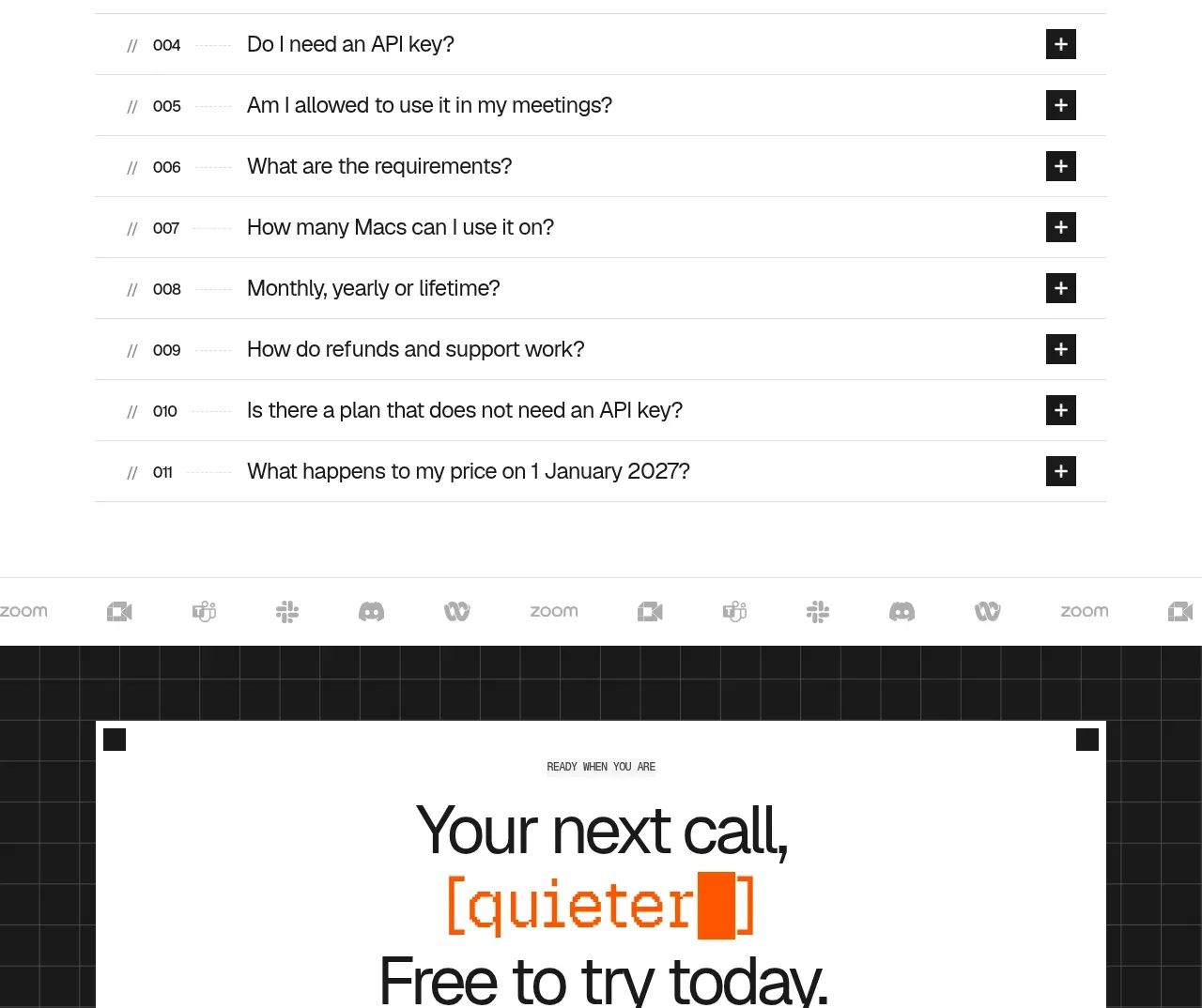 Expandable product FAQ
QuietHint® · FAQ
Expandable product FAQ
QuietHint® · FAQ
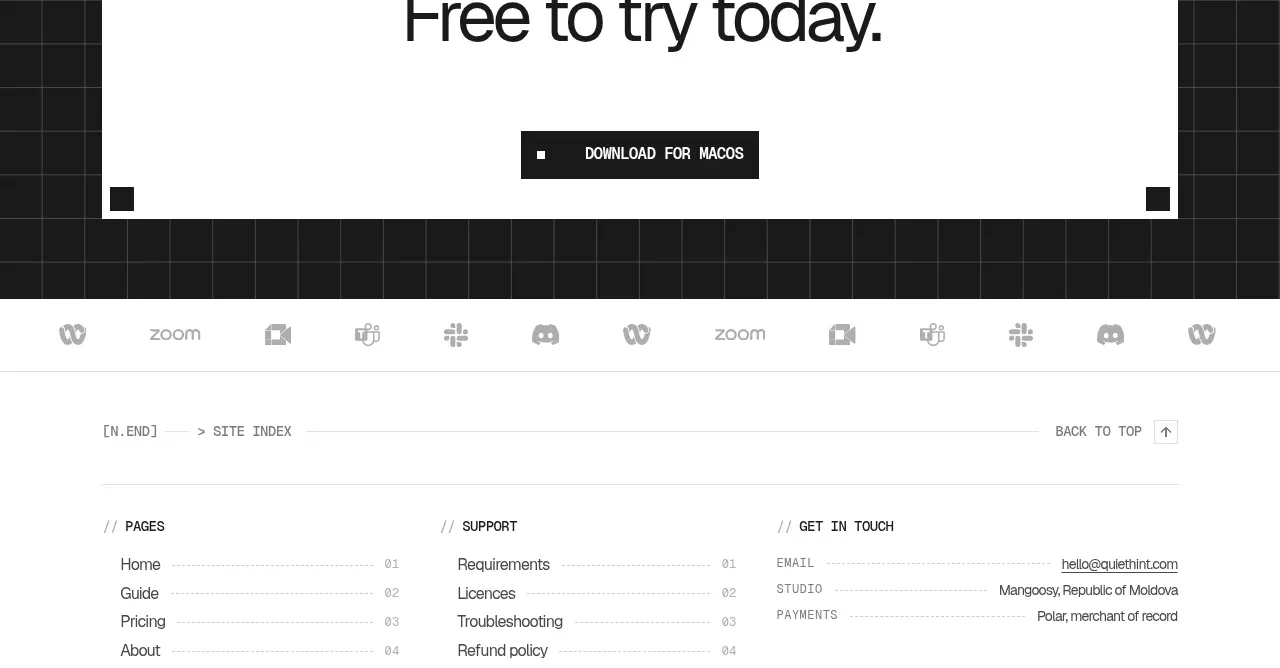 Final free-trial call to action
QuietHint® · Call to action
Final free-trial call to action
QuietHint® · Call to action
 Site index and legal footer
QuietHint® · Footer
Site index and legal footer
QuietHint® · Footer