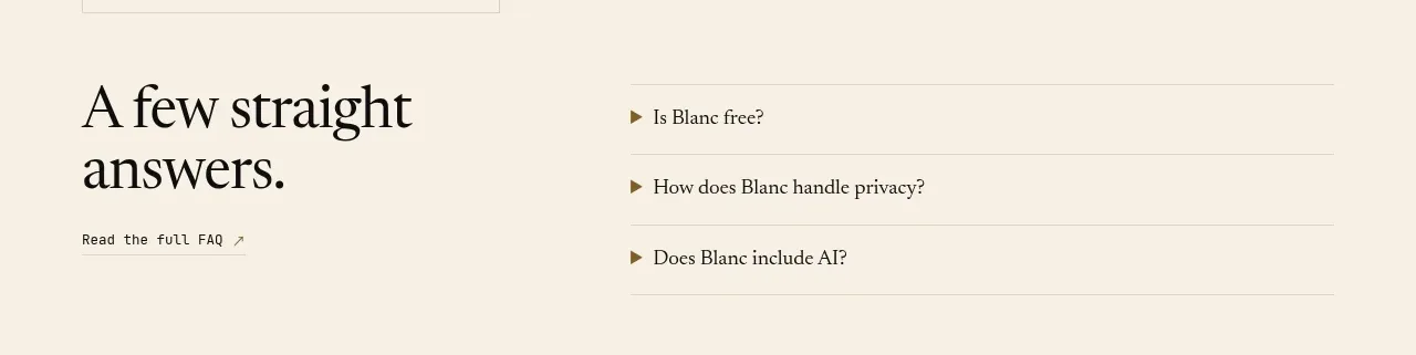
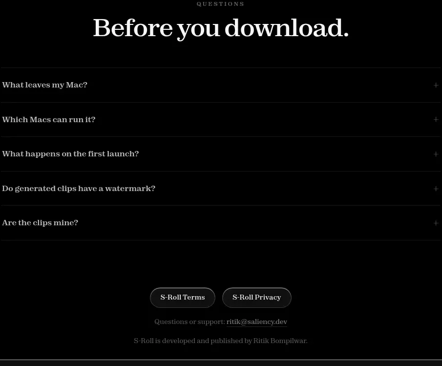
kage
kage
quiethint.com
Design analysis
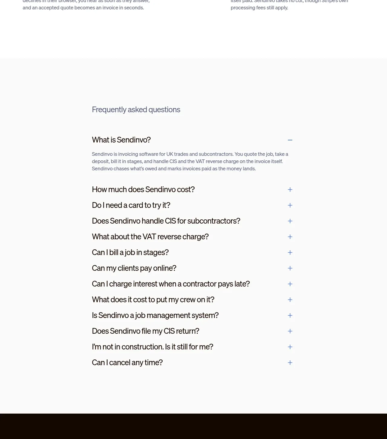
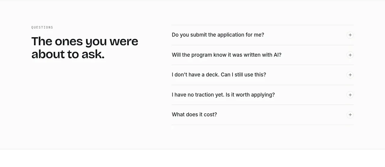
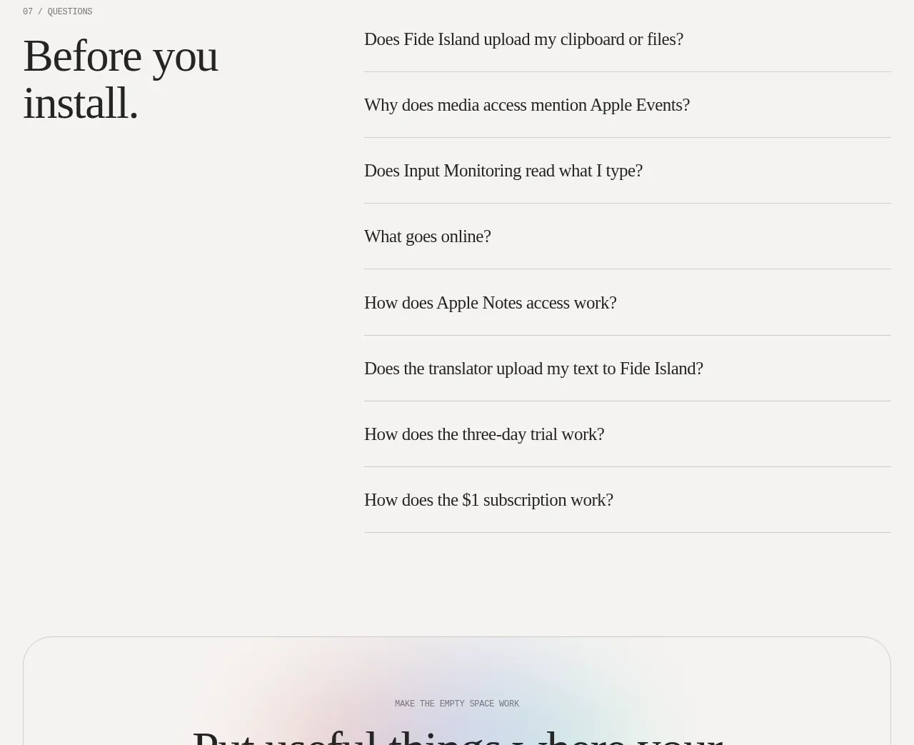
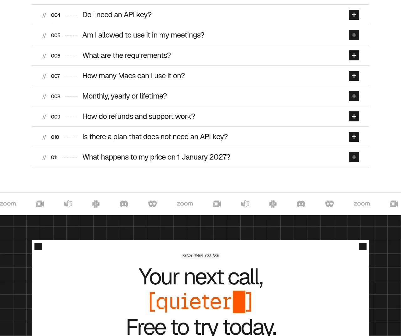
A large question-led heading introduces a long, highly scannable accordion. Numbered rows, hairline separators, and square plus controls make the support content feel systematic and easy to browse.
Prompt preview
## Reference images

Study these alongside the description below: hierarchy, rhythm, spacing, colour. Build for the product you are asked about, using this design language.

- Component: https://kage-design-assets.t3.tigrisfiles.io/components/quiethint-r/a06c27ca-94cd-4cb7-8750-fd2be8cedd1f-1789711426-9.webp
- Full page it was cut from: https://kage-design-assets.t3.tigrisfiles.io/screenshots/quiethint-r/a06c27ca-94cd-4cb7-8750-fd2be8cedd1f-1789711327026-full.webp
- Component on Kage: https://kage.design/component/quiethint-r-faq

## Before you start
Ask me which questions customers repeatedly ask about my product and which answers are legally or technically important. Then build an original FAQ using this structure.

Create a centered FAQ section with a small mono index and a large two-line heading. Below it, render a vertical accordion of numbered questions separated by 1px #e5e5e0 rules. Each row should have a compact index at left, the question in readable black text, and a square black expand button with a white plus at right. When opened, the plus should rotate or become a minus, and the answer should appear beneath the question with comfortable line height and muted gray text. Use white or #fafaf8 background, #171817 text, and orange #ef5b16 only for active accents. Keep row heights generous and maintain a 600px-ish reading rail. Support keyboard navigation, aria-expanded/controls, reduced motion, and deep-linkable questions.

Never use the reference's logos, product names, copy, illustrations, imagery, or exact questions.