kage
kage
quiethint.com
Design analysis
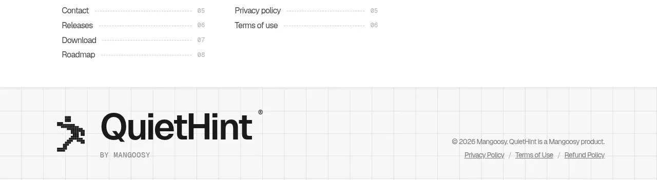
The footer repeats the grid language while providing a compact site index, support links, contact details, back-to-top affordance, and a final brand lockup. It closes the page with useful navigation rather than visual clutter.
Prompt preview
## Reference images

Study these alongside the description below: hierarchy, rhythm, spacing, colour. Build for the product you are asked about, using this design language.

- Component: https://kage-design-assets.t3.tigrisfiles.io/components/quiethint-r/a06c27ca-94cd-4cb7-8750-fd2be8cedd1f-1789711427-11.webp
- Full page it was cut from: https://kage-design-assets.t3.tigrisfiles.io/screenshots/quiethint-r/a06c27ca-94cd-4cb7-8750-fd2be8cedd1f-1789711327026-full.webp
- Component on Kage: https://kage.design/component/quiethint-r-footer

## Before you start
Ask me what pages, support resources, legal links, contact details, and brand elements my product needs. Then build an original footer using these principles.

Create a full-width footer with two layers. The upper layer is white with a centered rail, a small site-index label, a back-to-top control, and three or four compact link columns such as pages, support, and contact. Use thin dotted or solid dividers, small uppercase or mono headings, and muted #747570 body text. The lower layer uses a very pale grid texture around #f5f5f2 and contains a large original wordmark or product name on the left, a small descriptor beneath it, and copyright/legal links on the right. Use #171817 for primary text and orange #ef5b16 only as a tiny accent. Maintain generous top and bottom padding, clear link hover states, and responsive stacking on mobile. Ensure legal links and contact information remain readable and keyboard accessible.

Never use the reference's logos, product names, copy, illustrations, imagery, or copied footer labels.