kage
kage
quiethint.com
Design analysis
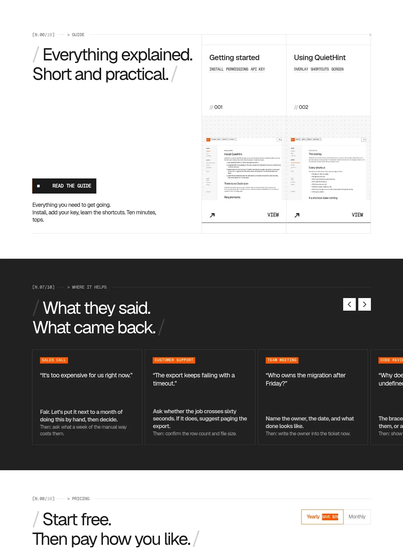
Two editorial panels show a practical transcript example and a guide preview. The split layouts keep the product tangible without turning the page into a conventional software dashboard.
Prompt preview
## Reference images

Study these alongside the description below: hierarchy, rhythm, spacing, colour. Build for the product you are asked about, using this design language.

- Component: https://kage-design-assets.t3.tigrisfiles.io/components/quiethint-r/a06c27ca-94cd-4cb7-8750-fd2be8cedd1f-1789711425-6.webp
- Full page it was cut from: https://kage-design-assets.t3.tigrisfiles.io/screenshots/quiethint-r/a06c27ca-94cd-4cb7-8750-fd2be8cedd1f-1789711327026-full.webp
- Component on Kage: https://kage.design/component/quiethint-r-gallery

## Before you start
Ask me what real-world moment my product helps with and what proof would make a new user trust it. Then create original demo panels using these principles.

Create two consecutive editorial demo blocks in a centered rail. For the first, place a pale, lightly textured preview frame on the left containing a generic dark transcript or activity window, and place a large explanatory heading, CTA, and contextual labels on the right. For the second, use a heading and short practical description on the left and two compact guide/document preview cards on the right. Use generous white space, thin gray borders #e5e5e0, near-black #171817 text, and orange #ef5a16 as a small accent line or status marker. The faux UI should be legible but clearly invented: use generic rows, timestamps, labels, and placeholder shapes rather than copied content. Give preview cards a small metadata header, image area, and clear text action. Add hover states that slightly darken borders and reveal the action, while preserving reduced-motion support.

Never use the reference's logos, product names, copy, illustrations, imagery, or copied screenshots.