kage
kage
reasonmachines.com
Design analysis
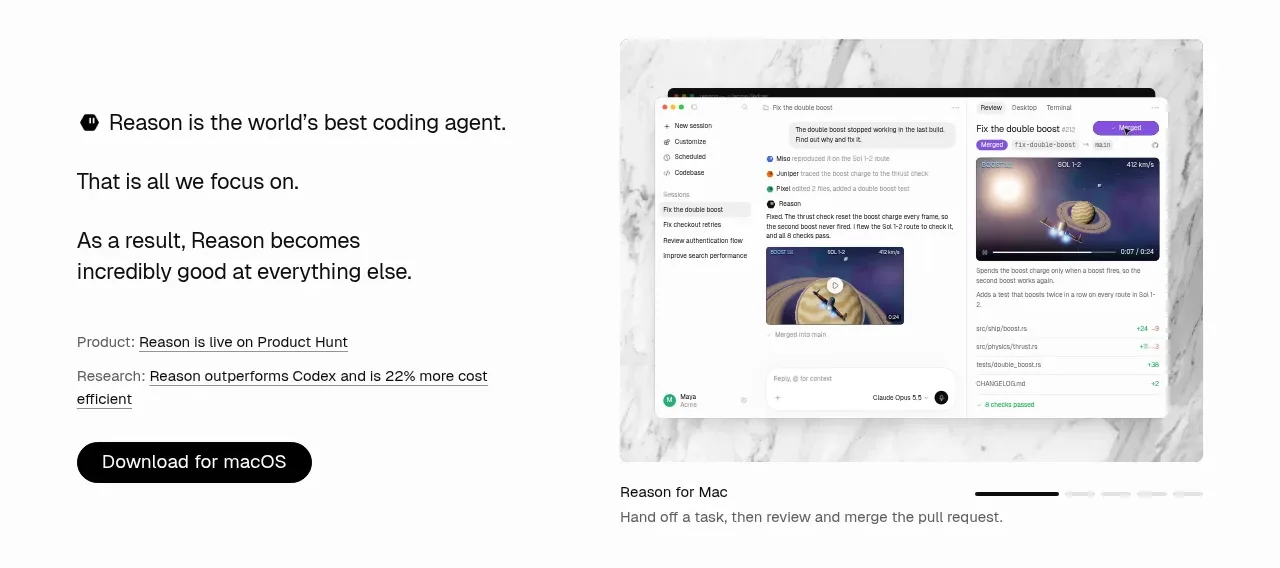
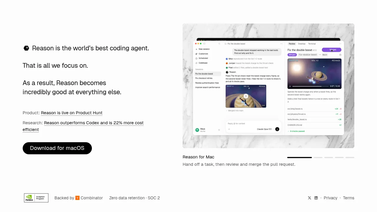
A confident single-viewport landing page with no top navigation, split roughly 40/60 between a narrative text column and one large product screenshot. The left column builds a three-line argument (claim, focus, outcome) in a modest-scale grotesque, with a single italic-serif phrase for emphasis, then backs it up with label-value link rows ('Product:', 'Research:') and one solid-black pill CTA. The right side holds a light-mode macOS app shot on a marble-textured rounded card; below it the page drops in density to a carousel caption with dash indicators, then closes with a quiet footer of backing badges (Y Combinator, NVIDIA Inception), compliance claims and legal links — two colours plus tiny third-party accents carry the whole page.
Prompt preview
## Reference images

Study these alongside the description below: hierarchy, rhythm, spacing, colour. Build for the product you are asked about, using this design language.

- Full page: https://kage-design-assets.t3.tigrisfiles.io/screenshots/reason/2bab5115-4041-4830-a11d-e755b25d1e85-1792044194874-full.webp
- Above the fold: https://kage-design-assets.t3.tigrisfiles.io/screenshots/reason/2bab5115-4041-4830-a11d-e755b25d1e85-1792044192789.webp
- Design on Kage: https://kage.design/designs/reason-landing-page

## Before you start
Ask the user what they are building, who it is for, and what brand assets they already have (name, colours, typefaces, logo, product screenshots). Wait for the answers before writing any code. Everything below is applied to *their* product, not to the reference site.

## Page structure
Build a single-viewport landing page with **no navigation bar** — the page opens straight into the hero. Sections top to bottom:

1. **Hero, left column (~40% width, vertically centred)**: a small circular logomark sits inline at the start of an opening one-line claim in bold. Below it, two follow-up statements, each on its own line, the last one containing an emphasised phrase. Then two label–value link rows (e.g. `Product: …`, `Research: …`) where the label is small grey text and the value is a black underlined link. Close with exactly one call-to-action: a solid near-black pill button.
2. **Hero, right column (~60% width)**: one large rounded card with a subtle stone/marble texture background containing a single light-themed product screenshot (a desktop app window with traffic lights). Nothing else competes inside the card.
3. **Carousel caption (directly under the card)**: a row with the product/platform name in bold on the left and five short dash indicators on the right (first dash active/darker), and below it one plain sentence describing what the screenshot shows. Additional screenshots swap in place; the active dash moves.
4. **Footer (single quiet row)**: on the left, a third-party programme badge, a short backing statement with a small partner mark, and compliance claims separated by middots; on the right, two social icons and `Privacy · Terms`. All small grey type, separated from the page by whitespace only.

## Design language
- **Composition**: one viewport, two asymmetric columns, generous margins, content vertically centred. Density *decreases* down the page: dense screenshot → one caption line → one footer row.
- **Hierarchy through sequence, not size**: three short declarative lines where each answers the previous one. Bold only the opening claim; reserve *italic serif* for exactly one emphasis phrase inside the sans text — that contrast is the page's signature move. Do not inflate the hero type; ~30–36px is enough.
- **Colour**: near-white page (`#FAFAF9`–`#FFFFFF`), near-black text (`#111111`), mid-grey for labels and meta (`#8A8A8A`), hairline grey (`#E5E5E5`) only if a rule is truly needed. Colour must never be used as page decoration — it appears only where real third-party marks or in-app states (success greens, tag pills) require it.
- **Type**: one grotesque sans (Inter/Söhne class) for everything; a serif italic used once for emphasis. Scale: hero 30–36px, captions/body 15–16px, footer 12–13px, relaxed ~1.5 line-height in the narrative block.
- **Links**: two-part rows — grey label, black underlined value. Underlines are the only link affordance on the page.
- **Buttons**: exactly one CTA. Solid near-black pill (fully rounded), white 14–15px label, no gradient, no shadow.
- **Imagery**: one large light-mode product screenshot inside a rounded card (16–24px radius) set on a tactile texture (marble/stone) with a soft, low shadow. The screenshot must show the user's own product.
- **Carousel pattern**: dash-style progress indicators, right-aligned, with captions below the image rather than overlaid on it; subtle ~200ms crossfade between slides is the only motion.
- **Footer rhythm**: no columns, no newsletter — trust signals as small text or badges separated by middots, legal links far right.

## Never
- Do not reuse Reason's name, logomark, copy, claims (e.g. "world's best coding agent", performance percentages) or its app UI content.
- Do not fabricate Y Combinator, NVIDIA, SOC 2 or any other third-party badges or endorsements unless the user actually has them.
- Do not copy the marble photograph; choose a different texture or drop the texture if the user has no asset.
- Never present the result as Reason or imply any of its affiliations.