 kage
kage
relic.space
Design analysis
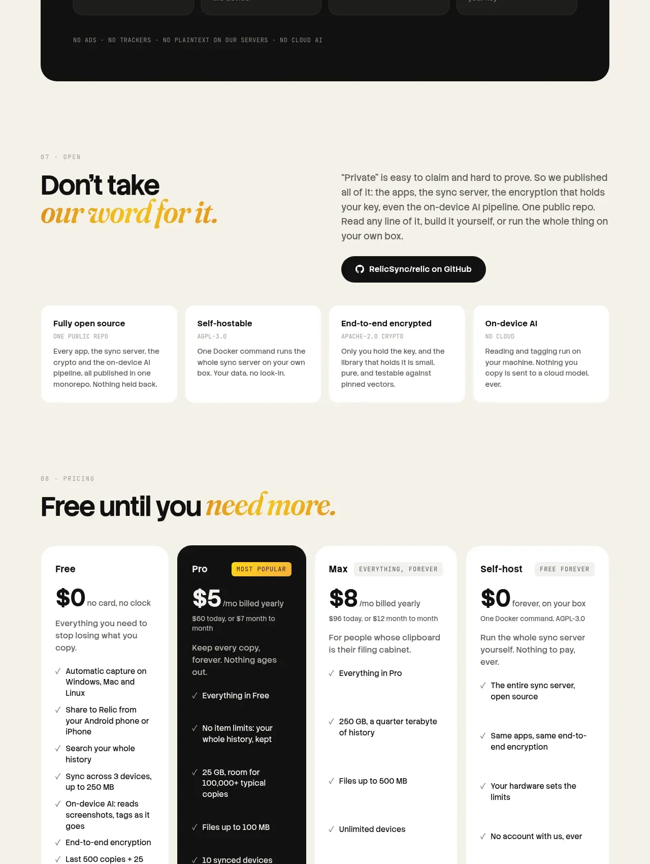
Four pricing cards create a clear progression from free to premium, with the recommended tier visually inverted and each card ending in a direct action.
Prompt preview
## Reference images

Study these alongside the description below: hierarchy, rhythm, spacing, colour. Build for the product you are asked about, using this design language.

- Component: https://kage-design-assets.t3.tigrisfiles.io/components/relic/11197dbe-e39c-44cc-b0a1-5cdca0c05213-1789279383-8.webp
- Full page it was cut from: https://kage-design-assets.t3.tigrisfiles.io/screenshots/relic/11197dbe-e39c-44cc-b0a1-5cdca0c05213-1789279305759-full.webp
- Component on Kage: https://kage.design/component/relic-pricing-table

## Before you start
Ask what the user's plans, billing model, limits, and most important conversion tier are. Build a truthful pricing comparison around those details.

Create a four-column pricing section with an eyebrow and a large heading that uses an italic accent. Each plan card should include plan name, optional badge, price, billing qualifier, short description, a check-list of included capabilities, and a full-width CTA. Give the recommended plan a near-black background with cream text and a bright amber CTA; keep other cards white on a warm cream page. Use `#f5efe3`, `#fffdf8`, `#111210`, and `#f4bb17`, with 18–22px radii, 1px low-contrast borders, 20–28px padding, and consistent card heights. Make monthly/annual switching explicit if needed, ensure feature lists are comparable, and stack cards on mobile.

Never use logos, product names, copy, illustrations, or imagery from the reference.
More components
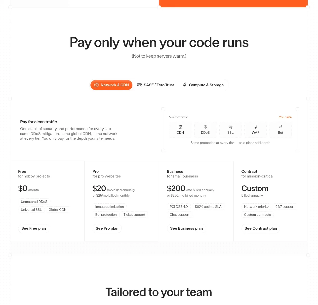
 Usage-based pricing plans
cloudflare.com · Pricing table
Usage-based pricing plans
cloudflare.com · Pricing table

 Platform download cards
Moji · Pricing table
Platform download cards
Moji · Pricing table

 Four-tier monthly pricing
termsquad.com · Pricing table
Four-tier monthly pricing
termsquad.com · Pricing table

 Two-tier pricing table
tryobra.com · Pricing table
Two-tier pricing table
tryobra.com · Pricing table

 Trial and subscription pricing
copilot.money · Pricing table
Trial and subscription pricing
copilot.money · Pricing table

 Premium comparison
rocketmoney.com · Pricing table
Premium comparison
rocketmoney.com · Pricing table