 kage
kage

Design analysis
A warm, paper-toned long-scroll landing page for a clipboard manager, built on cream/beige backgrounds with a signature mustard-yellow accent. Hierarchy comes from pairing a clean grotesque with italic serif accent words ("no place", "Summon it anywhere.") that carry the brand voice through every section heading. Rhythm alternates between full-bleed product screenshots (dark app UI on a yellow gradient card), three-up feature cards, a five-column platform grid, a story timeline, a compact bento of "small things", a dark inverted privacy section, a four-tier pricing row, and an accordion FAQ — so density and background shift every couple of viewports to keep the long scroll fresh. Small mono uppercase section labels (01 CAPTURE, 06 · END-TO-END ENCRYPTED) add editorial structure throughout.
Prompt preview
## Reference images

Study these alongside the description below: hierarchy, rhythm, spacing, colour. Build for the product you are asked about, using this design language.

- Full page: https://kage-design-assets.t3.tigrisfiles.io/screenshots/relic/11197dbe-e39c-44cc-b0a1-5cdca0c05213-1789279305759-full.webp
- Above the fold: https://kage-design-assets.t3.tigrisfiles.io/screenshots/relic/11197dbe-e39c-44cc-b0a1-5cdca0c05213-1789279301254.webp
- Design on Kage: https://kage.design/designs/relic-landing-page

## Before you start
Ask the user what product they are building, who it is for, and what brand assets they already have (name, colours, typefaces, tone of voice). Wait for the answers before writing any code — everything below is applied to their product, not to the reference site.

## Page structure
Build a long-scroll marketing landing page in this order:

1. **Sticky top nav**: small wordmark left, center links (Features, Help, Self-host, Blog, Pricing), right side "Sign in" text link + one solid pill CTA button + overflow menu icon.
2. **Hero**: eyebrow label in mono uppercase, then a large 3-line headline where the final phrase is set in an italic serif accent style, a short 2-sentence sub-paragraph, two buttons (solid dark pill + soft yellow pill "See how it works"), and a photographic/collage artifact bleeding in from the right edge. Below the hero, an "in action" section with the same italic-serif-accent heading pattern and a full-width laptop mockup screenshot.
3. **Section 01 – Capture**: heading with italic serif second line, short intro paragraph, then a row of 3 equal feature cards (lettered A/B/C, small icon, title, 2–3 sentence body) on white cards with hairline borders, plus a full-width prose paragraph beneath.
4. **Section 02 – Recall**: split layout — left column is a heading + intro + stacked small explanation blocks with yellow-highlighted inline chips showing example queries; right column is a dark product UI screenshot card with a caption in mono uppercase.
5. **Section 03 – Hotkey**: heading + paragraph, then a big rounded card filled with a soft yellow-to-cream gradient containing a centered light-mode screenshot mockup.
6. **Section 04 – Platforms**: heading with italic serif line, short paragraph, then a row of 5 outlined tiles (Windows, macOS, Linux, Android, iPhone) with icons, followed by a one-line mono terminal install command with a copy affordance.
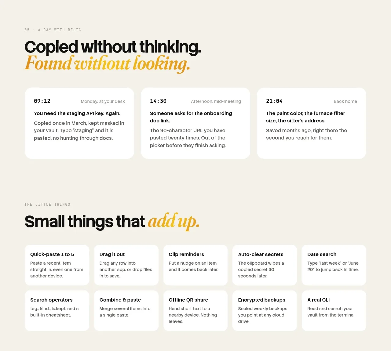
7. **Section 05 – A day with the product**: 3-card horizontal timeline of timestamped mini-stories (mono timestamp, small scenario label, 2-sentence vignette) — narrative storytelling instead of feature bullets.
8. **Small things bento**: heading with italic accent, then a 2-row grid of 8 compact cards (bold title + one-line description) separated by hairline borders, dense and scannable.
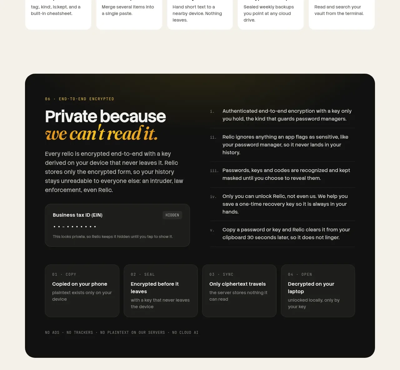
9. **Dark privacy section**: full-width near-black rounded panel, mono eyebrow, heading with italic serif line, left explanatory paragraph + a dark screenshot, right a numbered list (i., ii., iii., iv., v.) of privacy claims; below it a row of 4 tiny step cards (COPY / SEAL / SYNC / OPEN); footer strip of mono uppercase trust badges (NO ADS · NO TRACKERS · NO CLOUD AI).
10. **Open source section**: heading with italic accent left, pull-quote paragraph right, one GitHub button, then a 4-column grid of short claim cards with mono uppercase headers.
11. **Pricing**: heading with italic accent, then 4 pricing columns side by side — middle "Pro" column inverted to black with a yellow badge; each column: mono label, huge price, one-line gloss, checklist, one button (yellow on the dark column, outlined/dark elsewhere). Small footnote paragraph underneath.
12. **FAQ**: heading with italic accent, accordion list on white hairline rows; first item expanded, chevrons on the rest.
13. **Help/guide section**: heading + paragraph + button, then a 5-column row of guide-link cards (title + one-liner + "Read the guide →").
14. **Final CTA band**: full-width yellow card, large dark headline echoing the hero, short line, dark pill button, mono uppercase platform list.
15. **Footer**: wordmark + copyright, two rows of small text links.

## Design language
- **Palette**: warm paper background ~#F2EFE6 / #EDE9DE; pure white cards; near-black ink ~#111 for text and dark panels; one saturated mustard-yellow accent ~#F5C518–#E9B824 used for CTAs, highlight chips, badges and the final band. No blues or purples anywhere. The dark section uses the same yellow sparingly on black.
- **Type pairing**: a neutral grotesque for all UI/body text, paired with a display italic serif used ONLY for the accent phrase at the end of each section heading (e.g. "Copy it. Name it. *Summon it anywhere.*"). This one repeating device unifies the whole page — apply it to your user's own headlines.
- **Section labels**: every section opens with a mono uppercase eyebrow ("01 — CAPTURE", "06 · END-TO-END ENCRYPTED") that gives editorial numbering and orientation.
- **Hierarchy**: black-on-cream for light sections, white-on-black for the inverted privacy section; the italic serif phrase is the loudest element after the headline itself. Body copy is small (~15px), max ~60ch measure.
- **Surfaces**: cards are white with 1px warm gray hairline borders, ~10–14px radius, essentially no shadows — flatness sells the paper feel. Big containers (screenshot cards, dark section, CTA band) use ~24–32px radius.
- **Rhythm**: alternate densities and backgrounds down the page — airy hero → screenshot → 3 cards → split → gradient card → dense bento → dark panel → pricing → FAQ — so no two adjacent sections feel alike.
- **Buttons**: pill-shaped (fully rounded); solid black primary, soft yellow secondary, outlined tertiary on dark. Yellow pill reserved for the highest-intent CTA per section.
- **Motion**: restrained — accordion expand/chevron rotation, hover elevation on cards, subtle screenshot reveals. Nothing flashy.
- **Copy tone**: short declarative sentences with personality ("Describe it the way you remember it", "Private because we can't read it"). Keep sentences under ~15 words; let headings carry wit and body copy carry facts.

## Never
- Never reuse the Relic name, wordmark, tagline, logo, screenshots, illustrations, or any of its copy.
- Never present the result as Relic or imply affiliation.
- Never import the same icon set or photographic collage style verbatim; choose assets appropriate to the user's product.
Components from this page
All components
 Top navigation
Relic · Navigation
Top navigation
Relic · Navigation
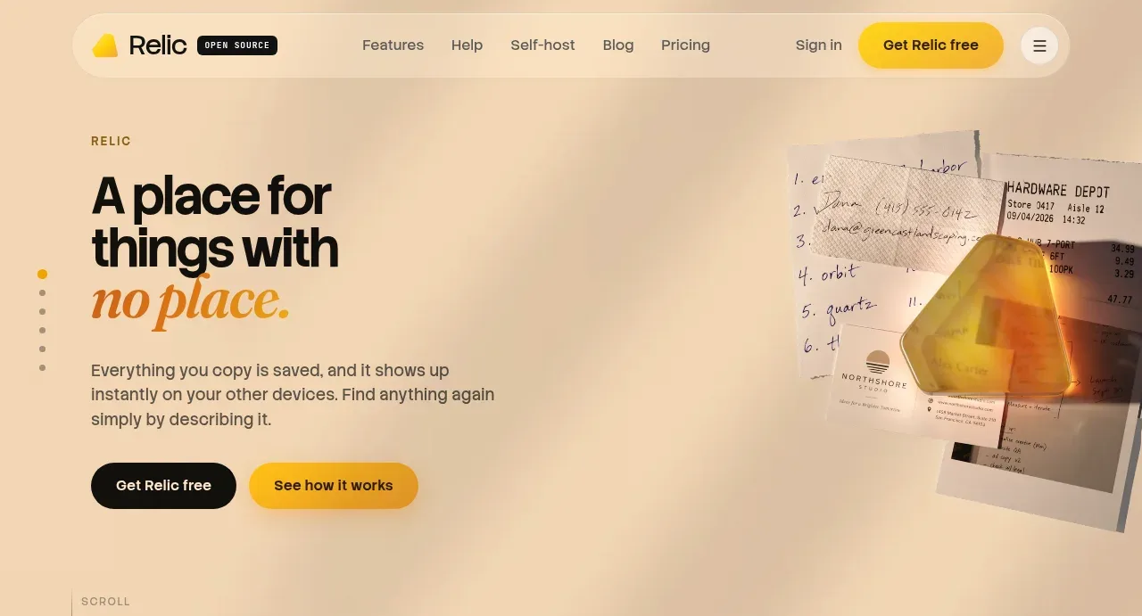 Warm product hero
Relic · Hero
Warm product hero
Relic · Hero
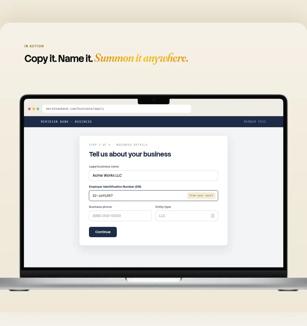 Automatic capture and search
Relic · Feature grid
Automatic capture and search
Relic · Feature grid
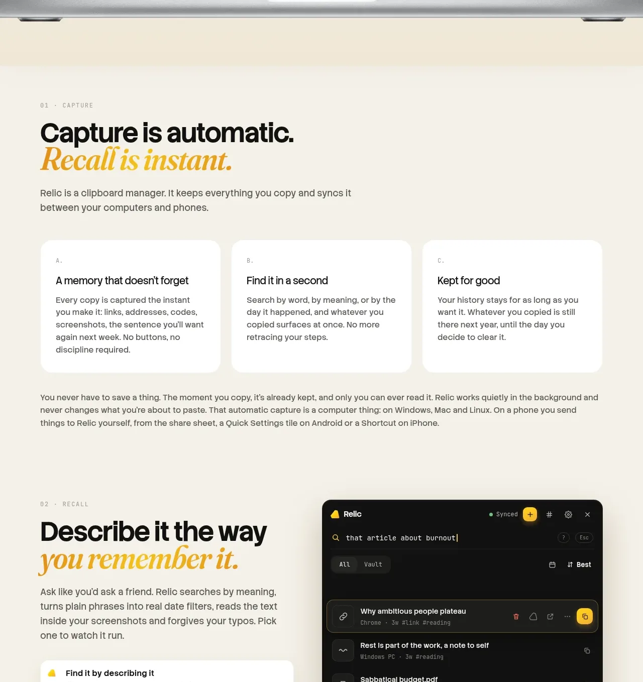 Descriptive memory workflow
Relic · Feature grid
Descriptive memory workflow
Relic · Feature grid
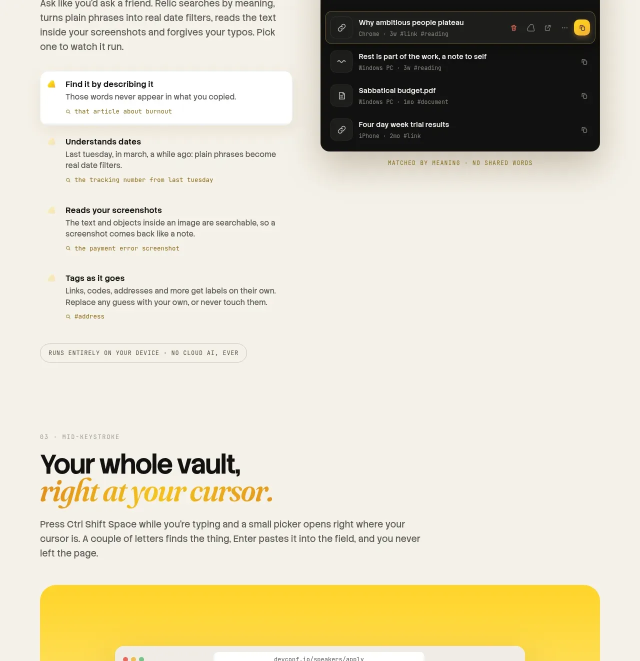 Cross-device capture
Relic · Gallery
Cross-device capture
Relic · Gallery
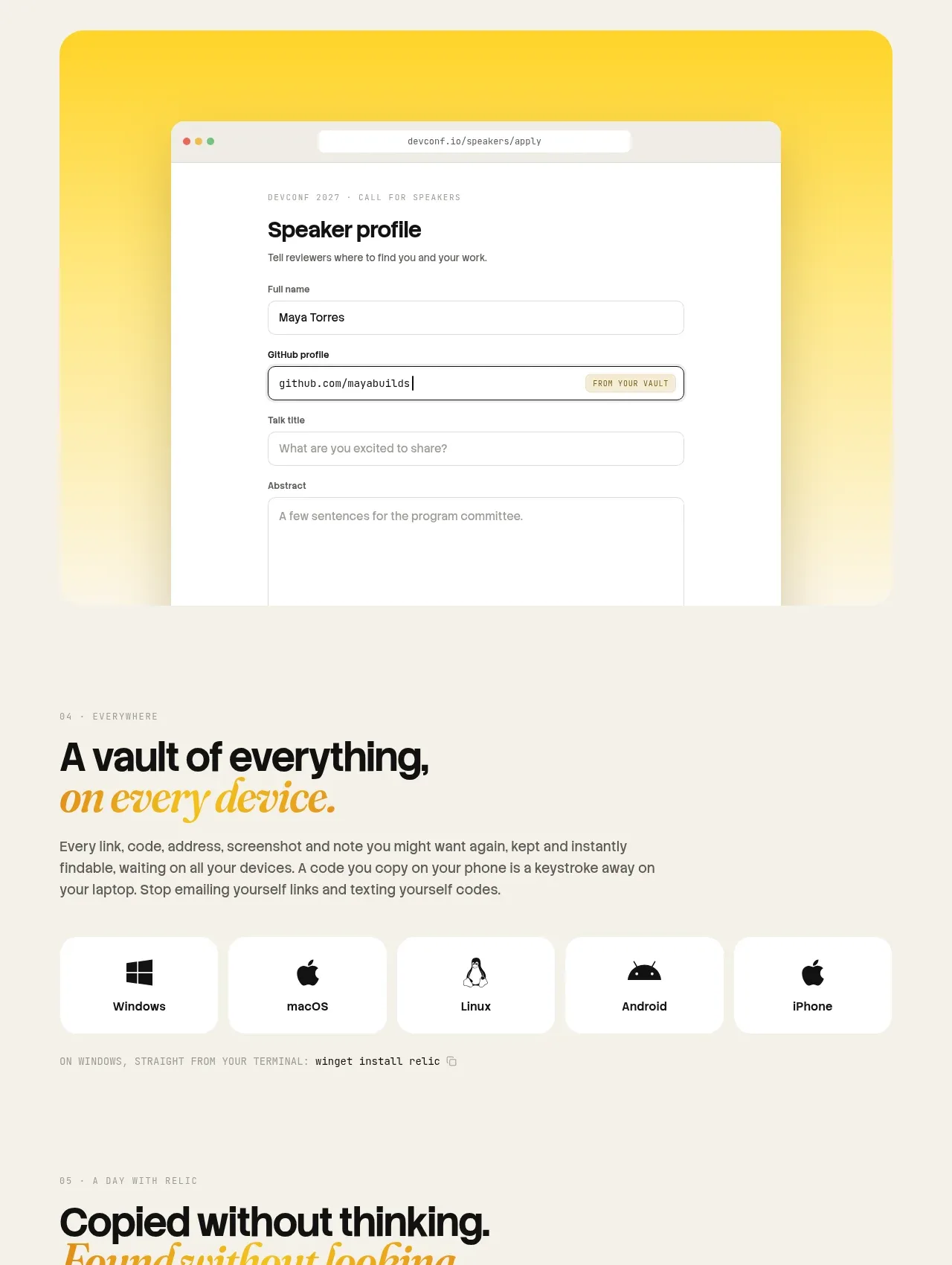 Platform availability and everyday uses
Relic · Feature grid
Platform availability and everyday uses
Relic · Feature grid
 Privacy and security promise
Relic · Card
Privacy and security promise
Relic · Card
 Proof and open-source credibility
Relic · Testimonials
Proof and open-source credibility
Relic · Testimonials
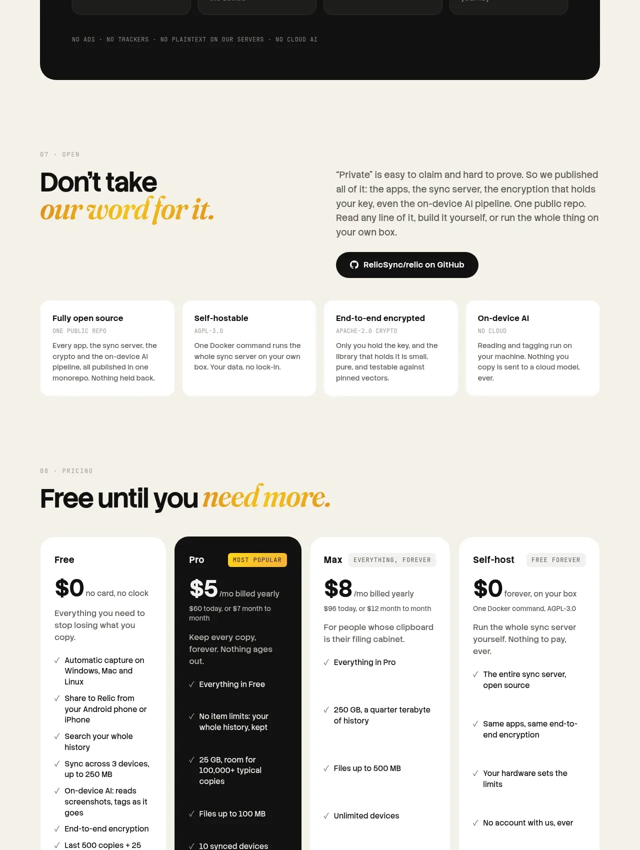 Tiered pricing
Relic · Pricing table
Tiered pricing
Relic · Pricing table
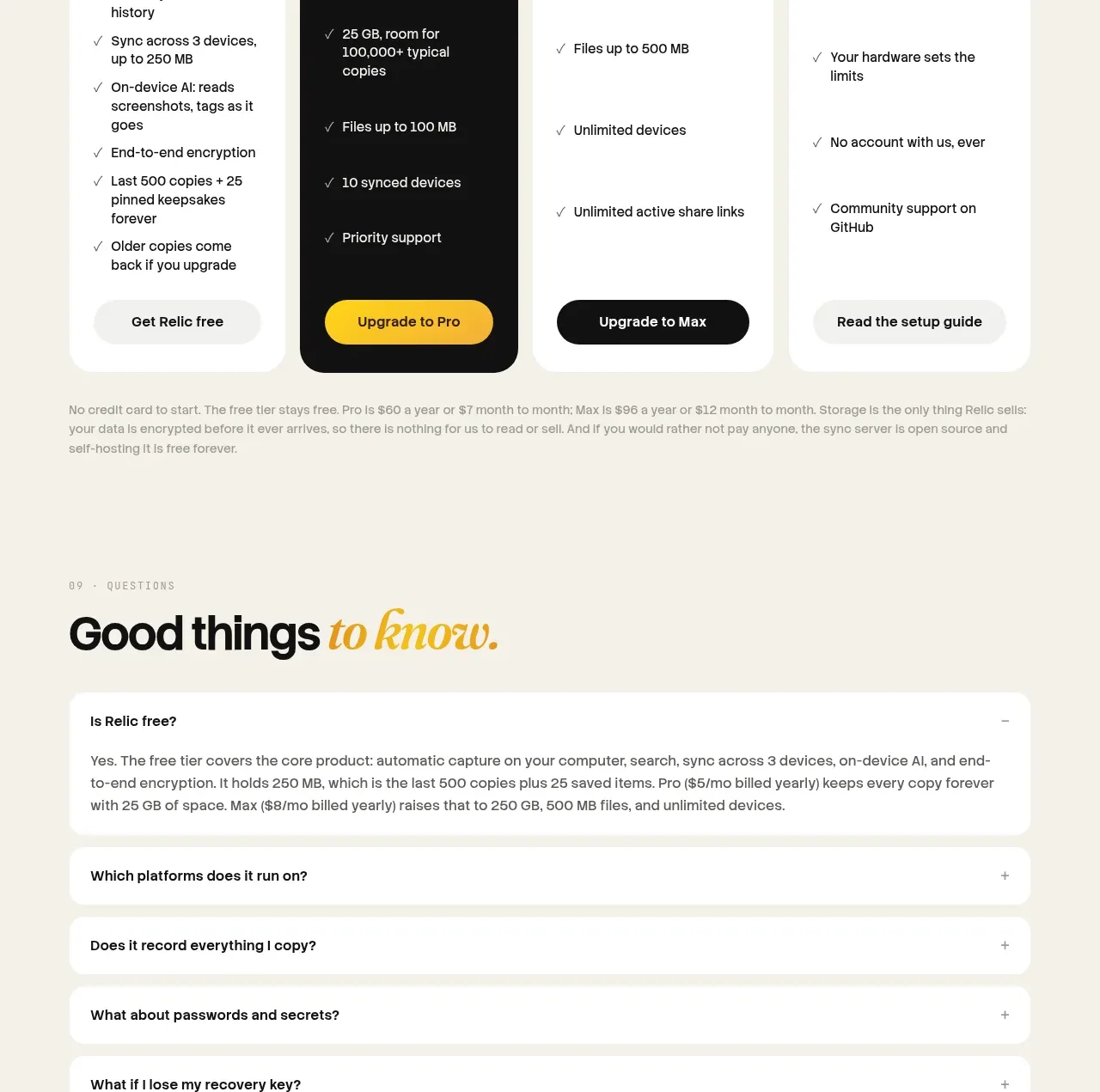 Frequently asked questions
Relic · FAQ
Frequently asked questions
Relic · FAQ
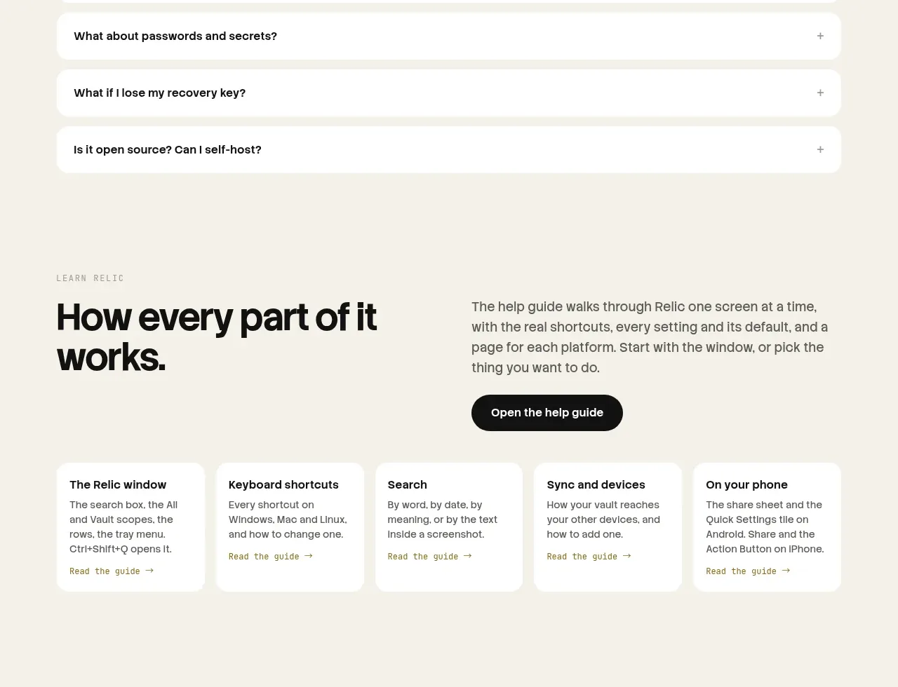 Help guide
Relic · Feature grid
Help guide
Relic · Feature grid
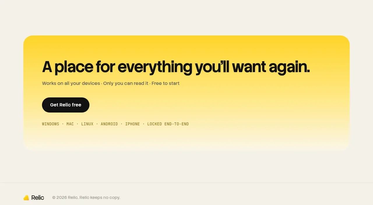 Final conversion banner
Relic · Call to action
Final conversion banner
Relic · Call to action


