 kage
kage
requesteagle.tokarev.work
Design analysis
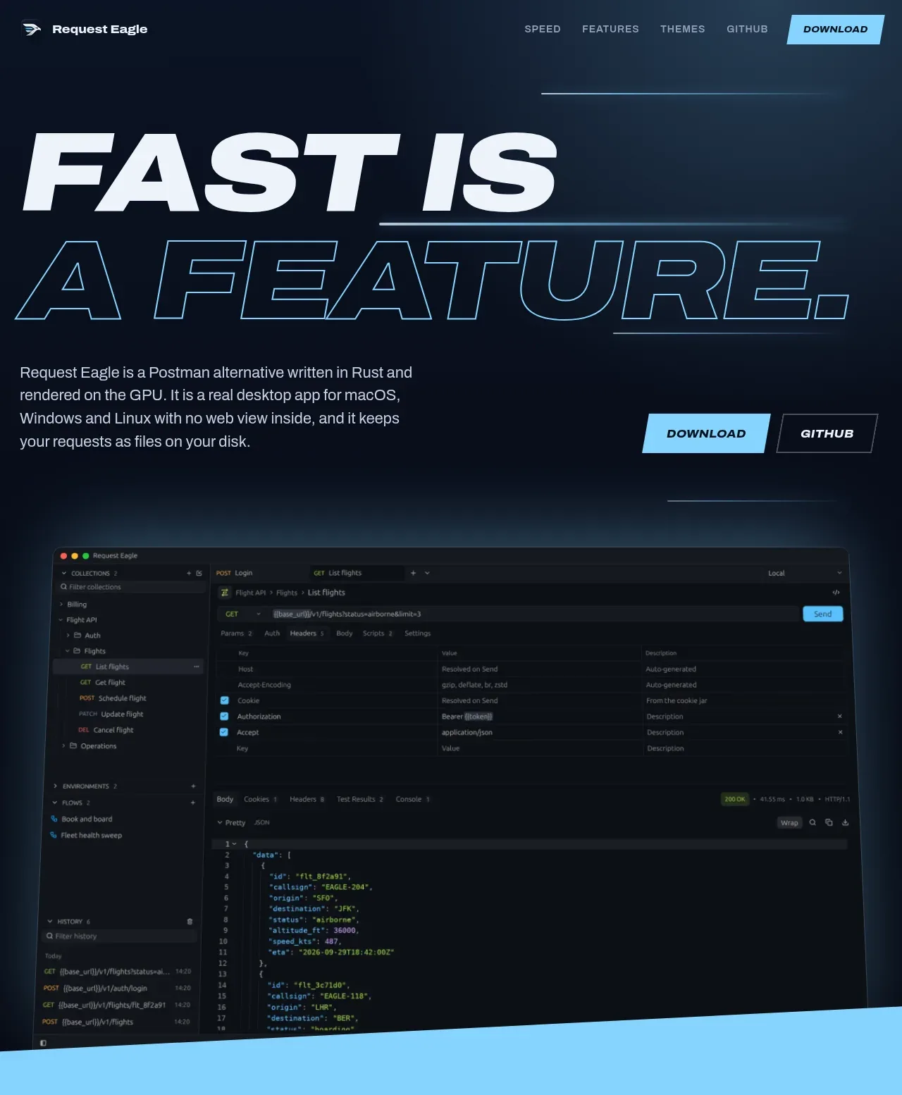
The hero uses extreme display typography, a short explanatory paragraph, paired calls to action, and a large dark application screenshot that anchors the promise. Glowing horizontal rules and an angled transition add motion without competing with the product preview.
Prompt preview
## Reference images

Study these alongside the description below: hierarchy, rhythm, spacing, colour. Build for the product you are asked about, using this design language.

- Component: https://kage-design-assets.t3.tigrisfiles.io/components/request-eagle/fb8c7e5d-6253-47fd-b840-135fd368731b-1791612075-1.webp
- Full page it was cut from: https://kage-design-assets.t3.tigrisfiles.io/screenshots/request-eagle/fb8c7e5d-6253-47fd-b840-135fd368731b-1791612032869-full.webp
- Component on Kage: https://kage.design/component/request-eagle-hero

## Before you start
Ask what the user's product is, what its strongest promise is, and what brand colors and visual assets are available. Apply the principles below to that product rather than copying the reference.

Create a dark, high-impact hero for a developer tool. Start directly below the navigation with a two-line oversized headline where the first line is solid light text and the second is outlined text. Make the headline the dominant visual: heavy condensed italic sans-serif, uppercase, roughly 88–120px on desktop, tight line-height, and responsive scaling. Use a deep navy-to-black background around `#07101d` with faint cyan atmospheric glows and thin horizontal technical rules.

Below the headline, place a constrained paragraph in muted gray-blue around `#c0cad8`, then a right-aligned or inline pair of actions: a filled cyan button around `#79cff2` and a transparent dark button with a cool-gray border. Keep content aligned to a generous max-width around 860px. Place a large rounded application screenshot or product UI visual below the copy, with a subtle cyan glow, thin border, and enough overlap/negative space to feel editorial. End the hero with a diagonal section edge or angled color transition into the next band.

Use broad vertical spacing: 48–72px between headline and copy, 24px before actions, and 72–110px before the product visual. Buttons should be clipped/chamfered rather than pill-shaped and should brighten on hover. Ensure mobile typography and screenshot scaling remain usable.

Never use logos, product names, copy, illustrations, or imagery from the reference.
More components
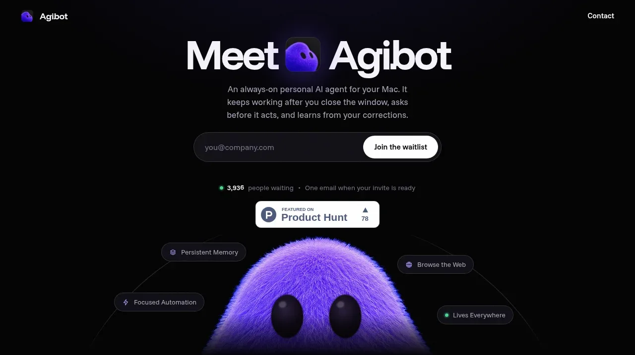
 Waitlist hero with character visual
Agibot · Hero
Waitlist hero with character visual
Agibot · Hero
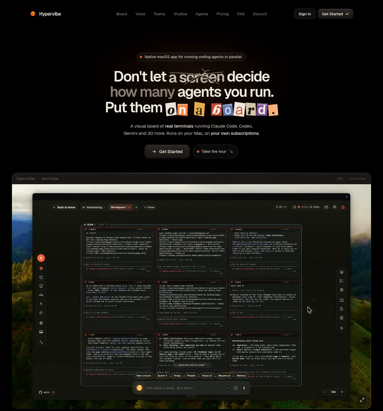
 Hero with product visual
Hypervibe · Hero
Hero with product visual
Hypervibe · Hero
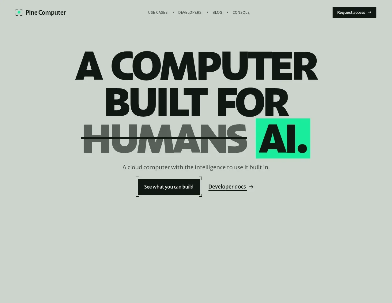
 Oversized human-first hero
Pine Computer · Hero
Oversized human-first hero
Pine Computer · Hero
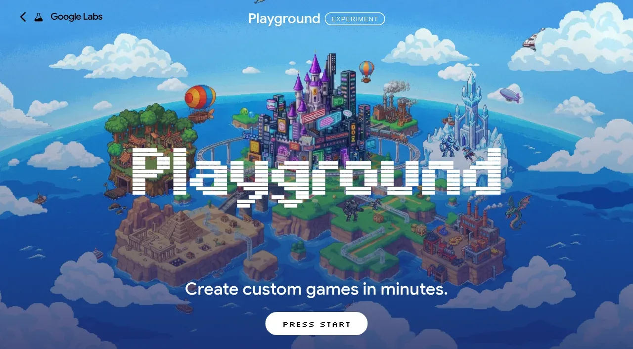
 Pixel-art world hero
Playground by Google Labs · Hero
Pixel-art world hero
Playground by Google Labs · Hero
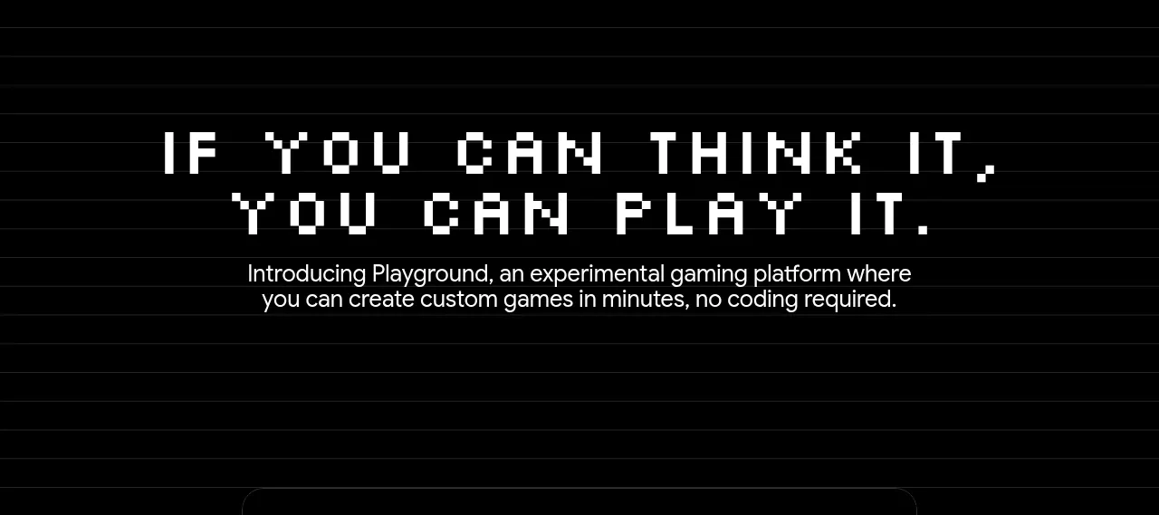 Introductory product statement
Playground by Google Labs · Hero
Introductory product statement
Playground by Google Labs · Hero
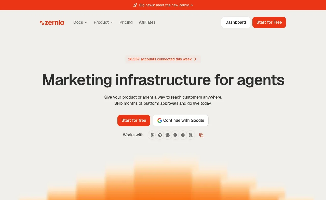
 Marketing infrastructure hero
Zernio · Hero
Marketing infrastructure hero
Zernio · Hero