 kage
kage
resurf.so

Design analysis
A simple closing CTA repeats the product promise, provides one strong download action, and adds a small compatibility note without adding competing content.
Prompt preview
## Reference images

Study these alongside the description below: hierarchy, rhythm, spacing, colour. Build for the product you are asked about, using this design language.

- Component: https://kage-design-assets.t3.tigrisfiles.io/components/resurf/ff64fde5-ed9d-4c90-b5a1-3641329afaa7-1789365708-6.webp
- Full page it was cut from: https://kage-design-assets.t3.tigrisfiles.io/screenshots/resurf/ff64fde5-ed9d-4c90-b5a1-3641329afaa7-1789365667481-full.webp
- Component on Kage: https://kage.design/component/resurf-cta

## Before you start
Ask what the user's primary conversion is, which platforms or plans are available, and what final reassurance removes hesitation. Apply those answers to this closing CTA.

Create a centered closing call-to-action with a two-line editorial serif heading, one dark rounded button, and a small muted line beneath it describing eligibility, pricing, trial, or platform support. Keep the section visually quiet and spacious so the action feels intentional after the product showcase. Use `#fafafa` background, `#202020` heading and button, white button text, and `#858585` supporting text. Use a 36–46px heading, 14px button text, 10px radius, 16px horizontal padding, and 72–104px vertical spacing. Include a clear hover state and a visible keyboard focus ring; on mobile, let the button reach a comfortable tap width.

### Never
- Never use logos, product names, copy, illustrations, or imagery from the reference.
- Never add multiple competing CTAs at the very end.
- Never hide important pricing or platform conditions in tiny text.
More components

 Website migration CTA
Neopress · Call to action
Website migration CTA
Neopress · Call to action
 Build or migrate services CTA
Neopress · Call to action
Build or migrate services CTA
Neopress · Call to action

 Final trial call to action
Epilude Notetaker · Call to action
Final trial call to action
Epilude Notetaker · Call to action

 Dark conversion call to action
DockFix 5.0 · Call to action
Dark conversion call to action
DockFix 5.0 · Call to action
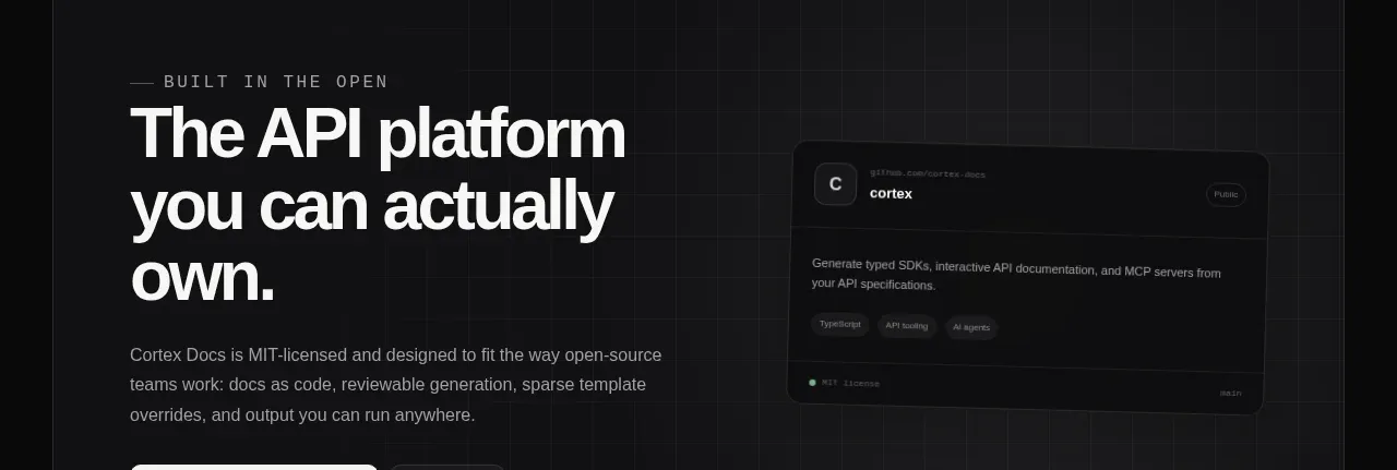
 Final conversion banner
Cortex · Call to action
Final conversion banner
Cortex · Call to action
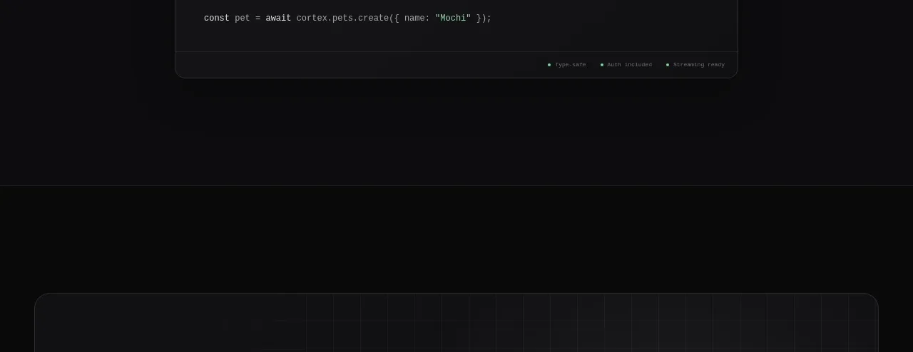 Open-source platform callout
Cortex · Call to action
Open-source platform callout
Cortex · Call to action