kage
kage
resurf.so

Design analysis
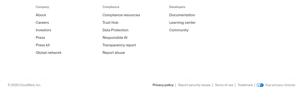
A restrained footer closes the page with a small copyright line and a single row of low-contrast utility and legal links.
Prompt preview
## Reference images

Study these alongside the description below: hierarchy, rhythm, spacing, colour. Build for the product you are asked about, using this design language.

- Component: https://kage-design-assets.t3.tigrisfiles.io/components/resurf/ff64fde5-ed9d-4c90-b5a1-3641329afaa7-1789365708-7.webp
- Full page it was cut from: https://kage-design-assets.t3.tigrisfiles.io/screenshots/resurf/ff64fde5-ed9d-4c90-b5a1-3641329afaa7-1789365667481-full.webp
- Component on Kage: https://kage.design/component/resurf-footer

## Before you start
Ask which legal, support, company, and product links the user's site needs, and what footer tone fits the brand. Build only the relevant set.

Create a minimal footer with a centered copyright or ownership line and a compact row of secondary links beneath it. Use generous top padding, small neutral sans-serif type, and plenty of whitespace. Set the background to `#fafafa`, primary footer text to `#8a8a8a`, link text to `#999999`, and hover text to `#333333`; use no heavy borders, or a barely visible `#eeeeee` divider. Keep text 11–13px, use 16–24px gaps, and wrap links gracefully on narrow screens. Ensure all links have clear focus and hover states.

### Never
- Never use logos, product names, copy, illustrations, or imagery from the reference.
- Never include irrelevant legal or marketing links.
- Never make the footer visually louder than the page content.