kage
kage
rtrvr.ai

Design analysis
A warm editorial landing page uses a pale beige canvas, near-black typography, thin rules, and coral accents to give an AI product a tactile, magazine-like character. The hero combines oversized type with a painted outdoor scene and a small task-board overlay; below it, the rhythm moves from trust logos and floating testimonial cards to a bordered, tabbed use-case demo, then unusually large blank intervals before a dense mosaic of video cards and a contrasting mint-to-black footer. Strong section labels, restrained borders, and varied card scales keep the long page legible while making the lower content feel curated rather than dashboard-like.
Prompt preview
## Reference images

Study these alongside the description below: hierarchy, rhythm, spacing, colour. Build for the product you are asked about, using this design language.

- Full page: https://kage-design-assets.t3.tigrisfiles.io/screenshots/retriever-ai/4363ca9a-43f9-447c-8e7d-56b17f2dfed5-1792044106345-full.webp
- Above the fold: https://kage-design-assets.t3.tigrisfiles.io/screenshots/retriever-ai/4363ca9a-43f9-447c-8e7d-56b17f2dfed5-1792044097267.webp
- Design on Kage: https://kage.design/designs/retriever-landing-page

## Before you start
Ask the user what they are building, who it is for, and what brand assets they already have (name, colours, type choices, logo, imagery, and content). Wait for their answers before designing. Apply the following system to their product, not to the reference product, and use their own brand assets wherever available.

## Page structure
1. **Announcement strip:** A thin coral-orange bar sits above the navigation, with a small announcement, underlined link, and close control aligned on one horizontal line.
2. **Primary navigation:** Use a warm off-white navigation row with a compact brand mark area at left, evenly spaced text links in the middle, and utility links plus two right-aligned CTAs. Finish the row with a thin dark bottom rule.
3. **Hero:** Create a tall split-feeling hero on a pale background. Put a small eyebrow, very large bold headline, short supporting paragraph, and two contrasting CTAs on the left; place a full-bleed illustrated or photographic environmental scene behind and to the right, with a small floating workflow/task board near the bottom. Add a low-key proof/stat line beneath the CTAs.
4. **Customer proof:** Introduce the section with a tiny uppercase label and centered headline. Follow with a horizontal row of customer marks, then a row of five unevenly positioned white testimonial cards with small red star ratings, serif review text, generous padding, rounded corners, and soft shadows.
5. **Use-case explorer:** After a ruled section break, center a small uppercase label and a large question-style heading. Build a bordered tab bar with five numbered use-case tabs; make the active tab coral. Beneath it, show a large coral demonstration panel with a paper-like headline label, a speech/request bubble, and a central workflow mockup connected by dashed lines to result cards. Treat the panel as a framed editorial illustration rather than a conventional product screenshot.
6. **Intentional breathing space:** Preserve a very large pale-beige interval after the use-case panel, separated by fine horizontal rules. This long pause is part of the composition and prevents the following media section from feeling crowded.
7. **Real-runs/media section:** Center a small uppercase label, a bold headline, and a muted one-line description. Below, build a responsive masonry-like grid of video and social-content cards: use two wide columns for large cards, then smaller cards in varied widths and heights. Give each card a distinct cropped image, gradient, or abstract texture, rounded corners, a small circular yellow play button, platform badge, title, and short caption. End with a centered row of social-channel links.
8. **Second breathing space and transition:** Leave another oversized pale section below the media grid, ending at a strong horizontal rule and transitioning into a full-width mint-green band.
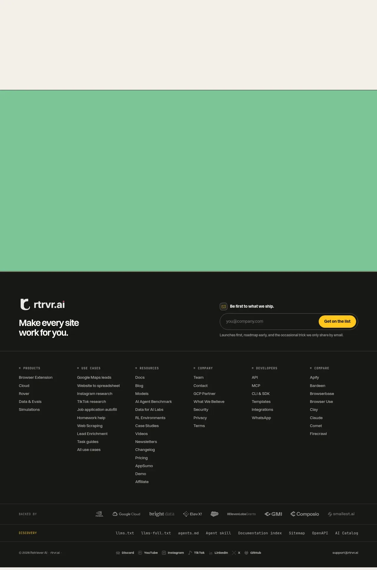
9. **Footer identity and signup:** Use the mint band as a quiet colour transition, then switch to a near-black footer. Place the brand lockup and short positioning statement on the left; place an email signup module on the right with a small label, dark outlined input, and bright yellow submit button.
10. **Footer link directory:** Add a ruled multi-column directory of grouped links. Use small uppercase category labels and compact lists for product, use cases, resources, company, developer, and comparison areas.
11. **Footer metadata:** Finish with a subdued partner/backer row, a thin discovery/resources row, and a final legal/social row containing copyright, social links, and support contact. Keep the footer dense but carefully aligned.

## Design language
- Build hierarchy through contrast in scale: tiny monospaced or letter-spaced uppercase section labels, large heavy sans-serif display headings, compact sans-serif utility copy, and occasional serif italic or serif body text for editorial warmth.
- Use a restrained warm palette: pale cream/off-white around `#F3F0E7`, near-black around `#141513`, coral-orange around `#F87562`, soft mint around `#7BC596`, and yellow CTA/play accents around `#F5C51B`. Keep most of the page cream and reserve saturated colour for announcements, active states, illustrations, and transitions.
- Keep the grid wide and deliberate, with generous side gutters and thin `1px` near-black rules. Let sections alternate between centered editorial compositions, framed interactive demos, dense media grids, and intentionally oversized empty space.
- Treat borders as visible structure rather than decoration. Use square or lightly rounded framed panels for navigation and demos, with moderate rounded corners on testimonials and media cards. Use soft, diffuse shadows only beneath floating white cards; avoid glossy effects and heavy elevation.
- Make imagery feel tactile and slightly unexpected: use painted or photographic scenes in the hero, abstract colour-blocked thumbnails in media cards, and product UI fragments as collage elements. Crop images boldly and overlay small labels rather than surrounding every image with explanatory chrome.
- Make interaction states obvious but quiet: coral marks the selected use-case tab, yellow marks play and primary attention, buttons use solid fills with dark borders, and cards can lift subtly on hover. Keep motion limited to gentle image/card transitions and tab-panel changes.
- Change density across the page on purpose: spacious hero, proof section with floating cards, compact framed use-case demo, a very long pause, then a highly varied media mosaic and a dense dark footer. Do not fill every available vertical area with content.
- Align repeated elements precisely: section labels and headings should share a central axis, logos should sit on one baseline, testimonial cards should use consistent internal padding, and footer columns should form a stable multi-column grid.

## Never
- Do not copy the reference product’s logos, wordmarks, product names, taglines, customer names, review text, UI copy, illustrations, photographs, video thumbnails, social badges, or icon sets.
- Do not present the result as Retriever AI or imply an affiliation with it.
- Do not reproduce the exact hero artwork, task board, use-case mockup, testimonial content, or media-card compositions; create original equivalents for the user’s product.
- Do not turn the page into a generic SaaS dashboard. Preserve the editorial pacing, tactile imagery, framed interaction demo, intentional whitespace, and dense dark footer while adapting all content and branding to the user’s product.
Components from this page
All components
 Announcement bar and primary navigation
Retriever AI · Navigation
Announcement bar and primary navigation
Retriever AI · Navigation
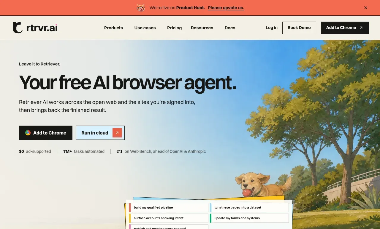 Browser agent hero
Retriever AI · Hero
Browser agent hero
Retriever AI · Hero
 Customer trust and brand logos
Retriever AI · Logo cloud
Customer trust and brand logos
Retriever AI · Logo cloud
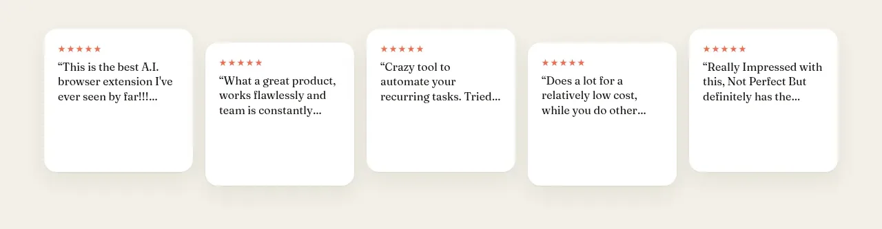 Compact testimonial cards
Retriever AI · Testimonials
Compact testimonial cards
Retriever AI · Testimonials
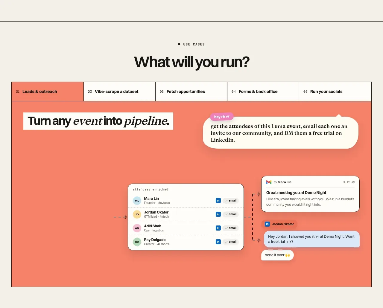 Use-case selector and interactive showcase
Retriever AI · Tabs & steps
Use-case selector and interactive showcase
Retriever AI · Tabs & steps
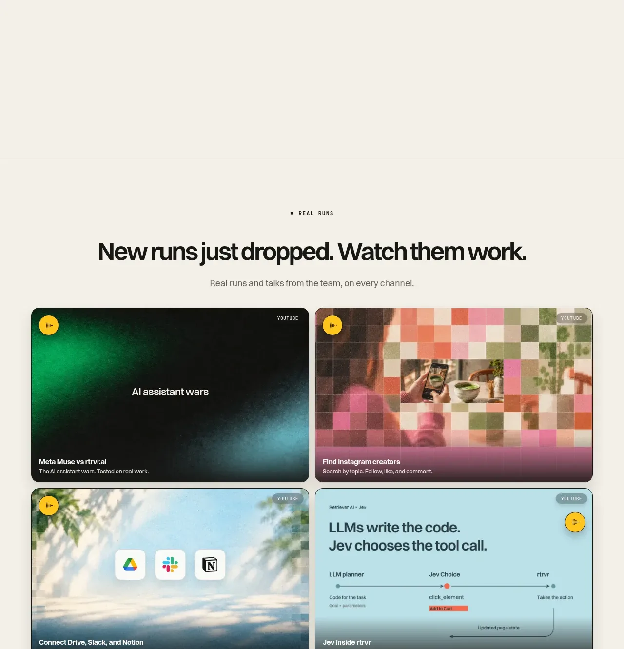 Real runs media gallery
Retriever AI · Gallery
Real runs media gallery
Retriever AI · Gallery
 Newsletter footer and site navigation
Retriever AI · Footer
Newsletter footer and site navigation
Retriever AI · Footer