kage
kage
saidtrace.com
Design analysis
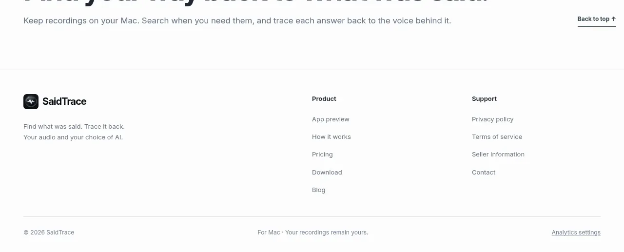
The footer closes with a small brand summary, grouped product/support links, and a thin legal row that preserves the page's understated tone.
Prompt preview
## Reference images

Study these alongside the description below: hierarchy, rhythm, spacing, colour. Build for the product you are asked about, using this design language.

- Component: https://kage-design-assets.t3.tigrisfiles.io/components/saidtrace/da2a1190-1b0d-4dc6-9c61-691af1a5c9a8-1792130577-8.webp
- Full page it was cut from: https://kage-design-assets.t3.tigrisfiles.io/screenshots/saidtrace/da2a1190-1b0d-4dc6-9c61-691af1a5c9a8-1792130502177-full.webp
- Component on Kage: https://kage.design/component/saidtrace-footer

## Before you start
Ask what the user's product and brand are, then apply the principles below to that product rather than copying the reference.

Build a spacious footer with a top border and a max-width container. Use a brand block on the left with a compact mark, short description, and optional social links, plus two or three link columns on the right with clear headings and vertically spaced links. Finish with a thin divider and a bottom row containing copyright, a small product/legal note, and an analytics or privacy-settings link. Use #fbfbfa or white, #20252b headings, #6b737a body text, and #dfe3e5 dividers. Keep type small but legible at 12–14px, use 24–40px column gaps, 48–72px top padding, and understated hover underlines. Stack the columns on mobile and preserve strong focus states.

Never use the reference's logo, product name, copy, illustrations, or imagery.